NYX Ditech

Categories
Design UI Design UX Design

Modern Vintage Graphic Designs Are Back In Trend!

Whenever we talk about material goods, “vintage” refers to any contemporary designs that is more than 20 years old but less than 100 years – to be considered antique. The term can be used more freely in design, although it still refers to an earlier style created during previous times. Now and again, we see a revival of classic designs in a variety of sectors. The majority of them evoke memories of decades – or perhaps centuries ago.

When appropriately used, vintage elements and marketing strategies attract high-value consumers. It compels people to participate in your old storyline and maintains their loyalty. What is it about them that make them so enticing to the audience? What makes them popular? Let us investigate!

How Is Vintage Designs Defined?

By definition, the term “vintage” refers to a period when anything of value was created or to a high-quality product, idea, or philosophy developed in the past. At the moment, the term “vintage” refers to anything that evokes memories of a bygone era or fashion style. Vintage designs use features, colors, and items that reflect popular styles of a particular age.

Distinguishing Retro From Vintage Designs

Many individuals do not take some time to grasp the distinctions between these phrases properly, and as a result, the terms are commonly misinterpreted. Retro is a term that refers to something relatively modern (a commodity, a style) that emulates something from the past. Retro is not original but is influenced by the original to seem authentic. Vintage denotes something unique, original, and has a lifespan of between 20 and 100 years. It is scarcer and hence more valuable than its retro cousin.

What Are Modern Vintage Designs?

Modern Vintage Designs incorporate aspects from the past and present, as well as a touch of futurism. This technique may help modern audiences connect with antique designs or perhaps serve as a center point for older and younger generations.

Modern Vintage Graphic Designs enable us to create and make use of the best of all worlds. We can approach current and antique eras from a variety of angles. This creates limitless opportunities for creativity to develop. For instance, we may reproduce old images from the 1980s or 1990s in contemporary surroundings and give Gen Z the same vibe.

Why is Vintage Design Becoming So Popular?

Individual Appearance – There are several explanations behind vintage popularity. One of them is that customers think conventional fashion has lost its individuality and supermarket fashion has become too generic. Vintage has an inherent quality that elevates it above things picked for their fitting, authenticity, and design value.

Trends That Never Fade – Consumers recognize that antique clothing may be adapted to current trends while still serving as timeless classics that can become wardrobe mainstays. It’s one of the primary reasons vintage has gained popularity.

Personality and Expression – Being unique is a critical component of looking trendy. It reveals a great deal about your character and lifestyle. Vintage clothes enable individuals to express themselves while also aiming to create a fashion contradiction.

Soul and History – Vintage clothing encompasses much more than simply worn-out garments. They are historically and artistically significant, and they are brimming with the tales and experiences of those who came before us and wore them. Possessing and wearing antique clothes help preserve those individuals, their heritage, and their talent alive.

Conclusion

Vintage clothing never fades away. Retro styles are constantly resurfacing. Whether your firm is in fashion, information technology, travel, education, or another area, you will occasionally need to adapt to modern vintage graphics. Contact Us today to know more.

Categories
UI Design Web Design

Try These 5 Web Design Principles To improve Your Conversion Rate

Every business wants to grow and increase its sales. Companies put a lot of time, effort and money into devising marketing strategies to boost their revenues. A website is one way to market their offerings to the people using the internet (which, by the way, is huge in number). A lot of marketers boast the importance of SEO, social media, creating lead magnets that convert, etc. Yet, creating a brilliant website is the first and most important step. 

Stanford University’s research stated that 46.1% of people say a website’s design is the top criteria for deciding a company’s credibility. Therefore, it’s highly critical that your design looks professional. This article will share five web design principles that will boost your conversion rate, thereby creating more revenue for our business.

1. The 8-Second Rule

Studies have suggested that you only have 8 seconds, on average, to get a visitor’s attention. The human attention span on the internet is too short. There’s a very tiny window of opportunity for you to engage a user once they land on your website; every second count. Here’s what you can do:

  • Use a crisp, benefit-driven, pin-pointed headline in large font
  • Include multimedia such as audio, video or other interactive content.
  • Use eye-catching, attention-drawing imagery to convey the prime purpose of your page
  • Use the imagery as a guide to the call-to-action button
  • Make signup buttons large, simple and straightforward.
  • Write powerful copy to entice and engage users.
  • Use hover effects on your buttons 
  • Use animated exit popups to re-engage visitors who are on the verge of bouncing off

2. The Rule of Thirds

One of the key web design principles is to follow the famous photography principle – The Rule of Thirds. To apply this rule, you’re supposed to visually divide an image (in this case, your website page) into thirds, both vertically and horizontally, giving you nine equal squares. The rule says, the four middle intersections are key, strategic places of interest. It creates the most impressive image or design when objects are placed at these points.

Remember that you don’t need to design your entire website strictly by the rule of thirds. Only use it as a tool to help you perfectly place crucial elements. Take a screenshot of your website, only above the fold part or just your header section; divide it into nine equal squares. Analyze it according to the principle and take a call if you want to make any changes or not.

3. The Hick’s Law

Hick’s Law is a famous theory cited by many individuals for various purposes; it is also frequently referenced in web designing. The law is named after a British psychologist, William Edmund Hick. The law states that the time it takes for an individual to decide is directly proportionate to the possible choices they have. In other words, by decreasing the number of choices, the decision time is also decreased and vice-versa.

Using this principle in web design, you can boost conversions by restricting the number of choices users have. And, where do you offer the most number of choices on your website? In the navigation bar. Don’t offer too many links to the users; it makes it challenging for them to choose. The user will lose interest in them altogether. 

4.The KISS Rule

This one is a common rule, being applied in several fields. It means Keep It Short And Simple and applies to web designing too. Simplicity is super essential when it comes to improving conversions. pThe moment you create a page, ask yourself whether you can make it more simple or the simplest. The results are more aesthetically pleasing, and conversions are increased.

It is similar to the earlier discussed Hick’s Law. However, simplicity is more than just limiting the options. The aim is to create a clean overall design that is uncluttered and minimizes distractions. Like Hick’s Law, people can only handle a limited amount of information at one time. Visually stuffing the website will overwhelm and bother users. Creating a great user experience on your website requires you to eliminate everything that unnecessary to the design.

Apple is one of the most significant examples of simplicity in web design. Countless other brands have followed their style for its effectiveness.

5. Negative Space

Whitespace is often referred to as negative space in web design. Positive space includes all the elements on your site, while negative space is the empty space in between. Don’t go by the name. Negative space is actually a good thing in web design; without negative space your website would be unusable and unreadable.

Negative space doesn’t just refer to the space between your page’s larger elements, such as the space between your header and your content or space between your sidebar and your content. It also refers to the space between all the more minor elements on your page – the space between lines of text, the space between paragraphs, and even the space between letters. Pay attention to the negative space on your site, in all forms, to keep everything legible, scannable and easy on the eyes. All of this leads to increased conversions.

Conclusion

Now that you understand these five web design principles, put them to good use by taking a hard look at your existing design. A thorough evaluation of your website will let you know the strengths, shortcomings, and areas of improvement. Need an expert opinion? Talk to our team.

READ MORE: Here are 5 pro tips that will come in handy while designing a visually stunning and user-friendly website

Categories
Blog Design Technology UI Design

The Golden Ratio For Balancing Your UI Design

The key element of an effective design is a clear UI Design. Each and every element must be well-balanced and placed in sync so that users could easily perceive the information on the screen and interact with a product without efforts.

Art, science, and basic mathematical theories, all come in handy when it comes to creating an efficient design composition. Amongst the most commonly used tools for designing is a mathematical proportion known as the ‘golden ratio’. In the article, we’ll define this technique and check out the benefits of using this ratio in design.

The Golden Ratio

The Golden Ratio is a formula that has been derived basis a general observation that everything designed by mother nature has a specific shape that’s near perfect. People enjoy everything which has a natural touch. In pursuit of discovering the secrets of shapes and the mystery behind creation, mathematicians calculated a formula that appears in the majority of things on the Earth.

In simple words, the golden ratio is a mathematical proportion between the elements of different sizes which is thought to be the most aesthetically pleasing for human eyes. The golden ratio equals 1:1.618, and it is often illustrated with seashell-shaped spirals.

UI Design Golden Ration

The golden ratio is believed to be followed for 4000 years now. The likes of Leonardo Da Vinci and Salvador Dali were known to use the golden ratio theory in their artworks.

Use Of Golden Ratio In UI Design

Striking the right composition and balance is a core part of any design. The elements need to work well with each other and complement each other to maximize the viewing experience. Also, the elements should be created with a balance within themselves. 

Graphic designers are keener to apply the golden ratio as it is a great way to understand how to work with proportions. Designers use this ratio to create various graphics, especially for the small but meaningful design elements such as a logo. The golden ratio allows creating illustrations where each element is placed in harmony and appropriate proportion to the others.

The UI design needs to have a clear visual presentation of the components so that people could use a product without problems. The golden ratio is often applied to place UI Design elements effectively. First of all, it can be used at the stage of wireframing. This way you can plan a structure for the layout placing and sizing user interface components according to the golden proportion. In addition, the golden ratio scheme can help professionals to crop images for web design so that it could make sure the composition of the photo remains balanced.

Advantages of The Golden Ratio

Well-balanced content

Designers often face the situation when a product needs to contain a great amount of various content and each part of it is vital and cannot be replaced. To unite all the components in a pleasant composition, the golden ratio can be applied. Divide the layout into different sections using a proportion of 1:1.618 and put the content in the sectors according to their importance. Such a content composition is sufficient for users’ perception and it helps to organize all the components.

Effective visual hierarchy

Speaking of the content organization, we can’t forget about visual hierarchy. As we mentioned in our previous articles, it’s a technique of efficient structuring content components. Combining principles of these two techniques designers maximize the chances of building a powerful UI design composition.

Powerful typography levels

To create efficient typography, designers need to divide copy content into different levels. They usually include various kinds of copy including headers, subheadings, body copy, caption, etc. Applying golden ratio professionals can quickly define an appropriate proportion between the typographic levels, for example, you can choose a certain size for the header and then divide it by 1.618. The result will show you the most appropriate size for subheaders.

Pleasing first impression

When users try a product for the first time, they scan the user interface to understand if they like it or not. The psychology principle known as a visceral reaction states that people decide whether they like something or not within a few seconds of looking at something. This reaction goes faster than our consciousness so we don’t even realize it. That’s is why it’s vital to make sure the first impression of a product will be pleasing. UI Design created by using the golden ratio has a positive influence on users’ minds and their visual perception and it works from the first sight at a product.

Appropriate white space

White space is the area between elements in design composition. Designers always need to care about the amount of white space in the UI since the unity of composition highly relies on it. The golden ratio can make the process of spacing much easier and faster. Applying golden proportions you will be able to define the right white space which will work well for the UI design.

To discuss more on your design needs, talk to our team of experts.

Categories
Brand & Identity Design UX Web Design

Web Designing While Accounting Human Errors

We often hear the phrase ‘To err is human’, and it can’t be truer in every aspect of our lives. We all make mistakes. Users on your websites are no different. Sure, you can’t stop them from making mistakes, but, can you follow some aspects of web designing while designing your website in a way that it leaves a scope of making mistakes?

Even the most careful and diligent users are bound to make mistakes at some point in time; others will make more mistakes. Therefore, it is critical to consider this fact while designing your website. The errors in web designing can be as simple as mistyping a URL, providing incorrect information in a sign-up form, adding info in wrong fields, etc. The mistakes could even be as disastrous as accidentally sending thousands of dollars to the wrong person via PayPal. So, here are a few tips that you can follow to account for human error while designing your websites. 

1. Provide Straightforward Instructions

A lot of times, we assume that the users are by default aware of the most basic instructions. Thus, we don’t feel it necessary to provide these basic instructions to them. Moreover, people often see basic directions as a bit snooty. It’s human to assume you know everything you need to know for a simple-seeming task. This causes errors.

Don’t assume they know what you mean. An imperative when delivering clear instructions is not to assume the recipient knows what you mean. This can be for anything from commonly used acronyms to simple navigation instructions.  Mixed messages, assumptions and multiple options mean that the message received might differ from what we actually meant.

2. Give Clear Warnings During

Just like the instructions, users must get a clear understanding of the consequences of actions taken on the website. And, sometimes they need to be informed and explained the implications, that too in detail. Still, there would be users who would keep ignoring your warnings, but there’s not much you can do for them in any case.

There’s also a second web designing approach which you can proceed with. A majority of people will leave your site when they face a warning message which they don’t fully understand. Else, they may look for help to understand the warning, which again may lead them to bounce off. You’ll have to decide whether you would rather deal with potential inaction from some customers, or more errors. Both approaches have their pros and cons.

3. Always Confirm Actions While

You may think that all users are completely sure of what they are doing on the website, or they may get annoyed with questions asking them to confirm their actions. A confirmation dialog may seem like an irritating and useless extra step; however, the truth of the matter is a quick “Are you sure you want to do that?” message can be invaluable. The user may be taking action for the first time, or the tenth time, it’s irrespective. A confirmation will only increase chances that the user takes the correct, intended action.

4. Validate Forms

Form validation may not be a full-proof solution, but a potent tool, and a great way to gently guide the user in the right direction. While proper form design can help keep users from simply putting the wrong text in the wrong form, form validation is excellent for double-checking information and catching typos and forgotten fields.

Improper validation of form data is one of the leading causes of security vulnerabilities. It exposes your website to attacks such as header injections, cross-site scripting, and SQL injections. It is important to note that client-side validation is beneficial, but it is not enough. If you’re going to implement client-side validation, it would be good to have some of the server-side too, just to be safe.

5. Use Appropriate Form Labels

In our last article, we listed out some essential tips for selecting the right button labels. The labels on the forms are equally important and can lead users to commit an error, if not used properly. There are tonnes of websites on the Internet with so many vaguely-labeled forms. Worse are the forms that use industry jargons on a client-facing website. In some of the sites, the labels and input fields are even misaligned. That’s just a strict NO-NO!

6. Improve Usability Through Color and Contrast

The colors and contrast are often used on a website most simplistically. People only go as far as using red and its shades to portray bad, and green and its shades to show good. But that’s not enough. It doesn’t necessarily help differently-abled users. A website should be usable by everyone, so various disabilities should be kept in mind. Disabilities can include but are not limited to, the inability to use a mouse or see the screen.

When someone has low visual acuity, specific color palettes on websites may make it difficult for that person to see and understand the website content fully. You must find a way to add contrast to your elements, in such a way, that they’re clearly and easily distinguished from each other. Pay special attention to this if two options use similar text, but do radically different things.

7. Provide ‘Undo’ Option Where Possible

We all know how handy the ‘Ctrl+Z’ option comes in every day while performing various tasks. The ability to undo an action is such a boon to everyone. We wish we had an undo button for our lives. Coming back to reality though, if you’re building a web app, you might seriously consider implementing some sort of “Undo” function for just about every action with permanent consequences.

You cannot ensure error-free browsing on your website; neither can you take a generic call on the abilities of your users. But, considering human errors while web designing, will increase the chances of good user experience and fewer errors. Speak to our experts to discuss more on it.

Categories
Technology

Tips To Design An Amazing Ecommerce Product Page

The most important element of any ecommerce website is its usability. The user journey, from product display to check out, is a long process and there are so many elements involved in it. Therefore, it becomes crucial to address the usability of every web page of your website. Product pages are very tricky to design. More often than not, designers lose out at the usability front while ensuring that the products are displayed as best as they can be. Here are a few tips to design a successful and appealing product page for your Ecommerce website.

1. Add an Alluring, Strong CTA Button

This is probably the most important part of any ecommerce product page. A page’s call-to-action button is the crucial element that draws interest and entices a user to take an action. On a product page, this should be your “add to cart” button. It’s the one thing that’ll get people moving through your funnel to actually convert, which is the primary goal of any ecommerce website.

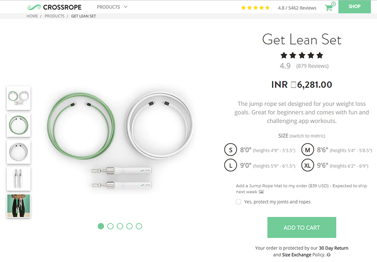
Take a look at the product page of Cross Rope. They feature a pretty simple design and the clear CTA button is colored bright green which immediately grabs attention and stands out against the background. That’s exactly the job of a “add to cart” button. For all CTAs, you ideally want to select a color that grabs attention and differentiates itself from everything else on that page. That said, its essential to blend the colour into your layout and make it feel natural.

crossrope

2. Price Must Be Easily Visible

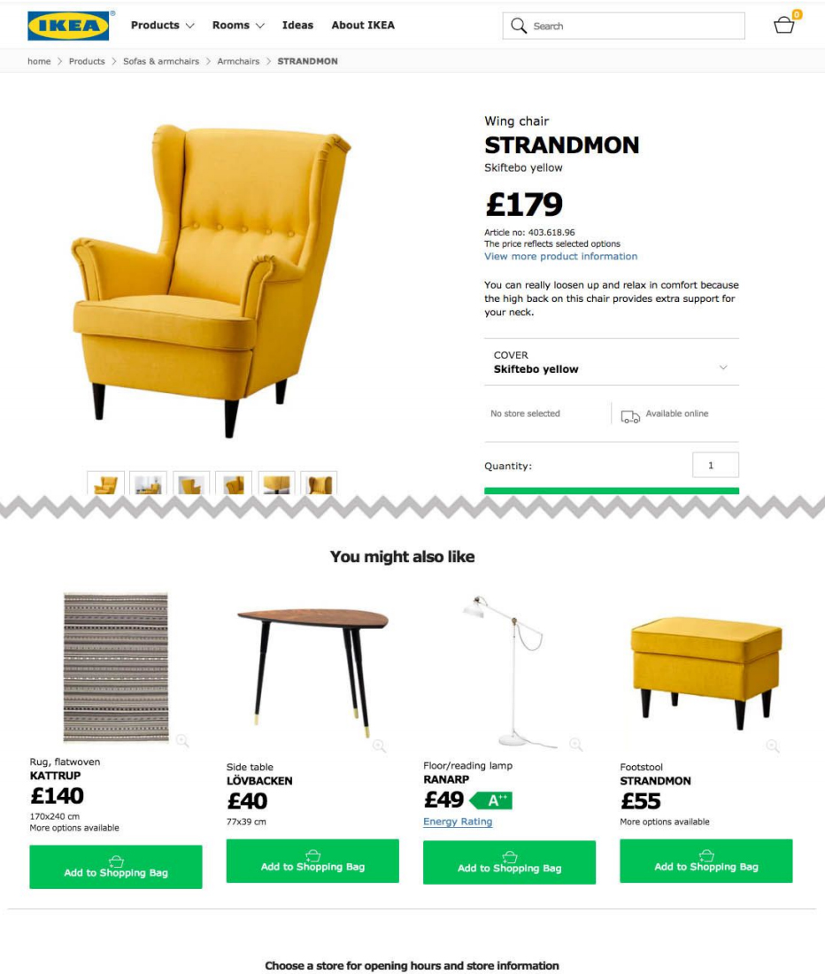
One of the biggest roadblocks to entry for most customers is the price of a product. No matter how much they like what you’re selling, but if it’s too pricey then it’s just not an option. Some designers think it makes sense to hide the price so users won’t notice. Well, that’s an awful idea. It is very obvious that at some point in time you will need to show the price to the customer and chances are more that he will not buy it. On the contrary, you want your price to be clearly visible and accessible at a glance. Give visitors the info right away so that they waste time looking at a product they can’t afford or just wouldn’t buy.

Take a look at the below image. You really don’t need big red text for your product pricing but it should be clearly visible at a glance. The best color and positioning for your site will depend on how your layout is structured.

3. KISS – Keep Information Short & Skimmable

We often come across so many ecommerce websites with heavily detailed product pages because of which it becomes very stressful for users to read through the information. As a web designer, you should know that people don’t really read the entire content but they actually skim content and quickly look for what they need. Therefore it’s best to provide them with required information upfront, in the style they prefer. Crucial information on a webpage must be organized into page sections. It should be easily visible, easy to read, with clear language and very few obstructive page elements. Check out the Haier’s design. It has a list of features in bold text for the key points. These work like mini-headlines where the content is dark, bold and super easy to read. A great design choice that places attention on the consumer’s needs.

haier

4. User Reviews & Ratings

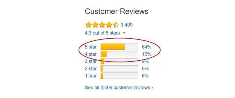
A product is easy to sell if it comes with a social approval stamp. Product reviews are incredibly valuable and most ecommerce platforms use this feature. You should highly encourage user reviews and push these towards the front of the product page whenever you can. Most ecommerce sites rely on a star-based rating system which works well. This gives a visual indicator of what most buyer’s think of the product. Visitors can quickly go through the star ratings and then see how many people have left used and reviewed a particular product. If you only see 2 or 3 reviews then you know the star rating isn’t really reliable. However, 30+ reviews mean that this is a good basis to gauge the product’s value. We can find this on plenty of ecommerce sites including Amazon, the king of modern Internet retail.

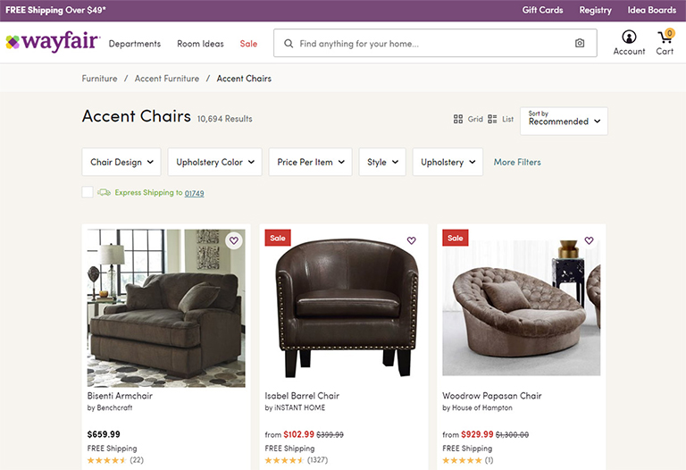
5. Clear Breadcrumb Trail

Another popular feature that many Ecommerce product pages have is breadcrumbs. You can add breadcrumbs to any page with ease and they don’t require a lot of space. In fact, they often take up empty space you never use. The benefit of a breadcrumb is the increased user engagement with relevant links to top-level parent categories for each product. Your goal should be to design similar breadcrumb-style navigation bars. But again, usability is key to everything and therefore your links should be easy to read and the breadcrumb categories should make sense.

wayfair


Categories
Web Design

Designing Websites Applying User Behaviors

Every website is developed with an objective. The objective can be anything; connecting, selling, informing, transacting etc. Every website is designed and developed to complete these goals. Whether the goal is connecting with friends or searching something on the internet, it remains the core of developing a website. As a designer, it is very important to understand this concept of user behaviors to create better user experiences. The basic idea is to keep the usability first and everything else like visual elements second. Here are a few web design tips which are based on understanding user behavior and will help you to design profoundly usable websites.

1. Design Must Be Determined by User Goals

If you don’t know the question, how are you going to answer it? It’s as simple as that. Before even thinking about the design of a website it is important to know what is actually required. If you don’t know what the users want, you will never be able to prepare a useful design. Analyse the KPIs because these will define your goals. Do you want people to instantly take actions and transact on your website, or you want to increase direct sales, or you just want them to spend more time on your website? You can design sites intuitively based on assumed goals, however, the best way to design is merging your goals with the user’s goals into one cohesive final product.

2. Test It and Track It

Analyse and assess your ideas based on KPIs and implement your understandings. You should always be testing new ideas to see if you can optimize any parts of your website. One of the best methods to do so is through A/B testing. Think about what you want should happen and how will you be able to make it happen. Take an example of a content heavy website, say an e-newspaper. A lot of these kinds of websites face high bounce rate problems and the main reason for users bouncing off is not being able to navigate themselves to more content. A simple addition of infinite scroll is the answer to this problem which radically improves the user experience and helps people who are stuck around to read content.

When working to improve certain metrics, think about the user experience, because this is really how design should be done. Imagine what the user would think and feel while using your website and how can you improve their experience. Some factors can be very simple and direct. Like the color of links on your site. Just changing colors can have a surprising effect on CTR, signups, or actions taken by a user.

3. Be Open to Changes

The willingness to adjust and change at different time intervals is essential while designing. A few quick halftime adjustments come in very handy, as a lot of times you face design roadblocks and changing a few components is the only way around. If you’re testing something that clearly isn’t working then don’t waste more time on it. The same goes with any new feature as well, which the users are complaining about and clearly needs to be replaced or worked upon. You should know when to call quits and start on something new.

At the end of the day, it’s your users who really matter and if something is not working for them, it has to go down the drain, irrespective of how dear it may be to you as a designer. Your personal feelings should not interfere while taking a decision on what works and what doesn’t. Be open to changes, new strategies and ideas based on new evidence and analysis.

4. Take a Holistic Approach

Every design that you create must comprise of smaller usable pieces which together contribute to a larger composition. This is the best holistic approach to any and every design. You know what they always say, “look at the bigger picture” and focus on understanding how every visitor will perceive it. Question yourself -is your homepage user-friendly, will the user easily understand ‘what to do’ when he lands on the homepage, will he be able to easily navigate through the website? Both the composition and overall design quality play a big role in how people perceive a website.

People need to rely on authoritative designs that work well and serve a purpose. Unfortunately, many designers do look at the big picture, but still, fail to use it and implement the ideology. This leads to a visually pleasing design, which is a useless interface. Design is not just about aesthetics and appearance. It’s about ease of use, practicality of the design, user experience, responsiveness of the website, page load time and a lot more. A holistic approach to design considers more than what you can see. It’s also about what you experience by using the website.

5. Provide Visual Feedback to Users

It’s very important to inform users when are they correctly interacting with your interface and also when they are not doing so. Visual cues and messaging show users whether their interaction is producing the desired results. One of the simplest examples of this can be changing the visual styling of a button when the user hovers over it or even when they click on it. This will give them a sense of confidence that they are heading in the right direction, and on the other hand, will give them a sense of caution if they feel they are not going in the correct direction. Visual cues may not be a direct way of giving feedback, but it certainly is a very effective medium of doing so.

If you consider the user experience at every stage of the design process, designing a user-friendly design will not be an uphill task. All it needs is to put yourself in users’ shoes and analyse every action that they can take and normally do. However, it’s very easy to lose focus and get into a self-centered mode and design something completely to satisfy your own needs and preferences.

Talk to our design experts and discuss your design needs.