NYX Ditech

Categories
Brand & Identity Design UX Web Design

Best Practices For Designing A Search Box

Site search is one of the most important yet most overlooked functions of a website. Search acts like a convertor between the user and the app or website. It is highly unlikely to predict and offer all the information, that users may look for, on the landing page itself. The user expresses their information need as a query, and the app or website communicates its response as a set of results. Users expect smooth experiences when searching. They are typically judgmental about the quality of a website, primarily based on the effectiveness of its search results. Hence, it’s essential to give thought to some things while designing the UI behind search and results. In this article, we will discuss some of the best practices for designing search, which will not only simplify your UI but will also enhance the user experience.

You may want to explore the roadmap of website design

Designing Search: First of all, let’s understand when do we need a search feature on the website?

The essential determiner is the amount of content on a website. Smaller websites, with a limited amount of content, are better off without the search option. Search becomes increasingly central as websites grow in size and complexity.

E-commerce sites are probably the most common use cases for utilizing search because users are searching for specific products. In large e-commerce websites, search bars move out of the header and take on a central role in the UI. According to research, about a third of total visitors use the site search tool. People who use the search tool are looking for something specific; they know exactly what they’re looking for and are generally more aware as compared to other visitors.

Read more about designing the E-Commerce Product Pages

Few Useful Tips:

1. Show Search Field Notably

The most important rule in designing search box is to make it easily noticeable. If the search is an essential function for your website, it should be displayed prominently. Search can be the fastest route to discovery if users can quickly locate it. Retain an open text-entry search field. Users want a place where they can quickly go to type in their search query.

Search hidden behind an icon has negative consequences. It makes the search feature less noticeable. When used without an open-entry text field, the icon takes up less space. Visually, it’s less prominent and, therefore, less noticeable. Users have to take extra action to access the search box, which creates a negative user experience.

2. Strengthen Your Predictive Text, Autocomplete and Error Correction

How often have you typed a word in the Google search box and got amused by the suggestive results it shows? It’s amusing at times, but there’s a super-strong algorithm behind it, based on the searching patterns of billions of users. Search options need to be intuitive and smart.

Don’t expect your users to know the product names, how to correctly spell everything or anything else for that matter. They might not even know what they are looking for. Your site search function should be intuitive and smart enough to anticipate where the search is headed. It must begin listing suggestions while the shopper is still typing. Artificial intelligence (AI) and onsite search are like perfect partners.

3. Always Pair The Search Box With A Magnifying Glass

Users are accustomed to a few things on the web, and they expect the same everywhere, like icons. There are a few icons that have mostly universal recognition from users. Icons are, by definition, a visual representation of an object, action, or idea. The magnifying-glass icon is one such icon which has a universal meaning attached to it. Users recognize a magnifying-glass icon as meaning ‘search’ even without a text label.

One of the things to remember while designing search magnifying glass is not to make it complicated. The simplest version of the magnifying glass is the most effective one because lesser graphic details speed up recognition.

4. Place The Search Box Where People Expect It

The best place for the search box on a website is a heated topic of discussion, with several theories floating around it. However, many of the popular websites such as YouTube, Amazon, IMDB, BEST BUY, etc. place the search boxes towards the top center or top right of the page. A study conducted by A. Dawn Shaikh and Keisi Lenz found that the most convenient spot for users would be the top right or top left of every page on your site, where users could easily find it using the common F-shaped scanning pattern.

Placing it somewhere unexpected means users need to put in extra effort to find the search box. That’s more like searching for the place to search, which is not the ideal thing you want your users to do. Search boxes at the expected places would reduce the search time as well and will create a positive UX.

5. Tell Users What Can They Search

It is highly recommended to include a sample search query in the input field to suggest to users what queries can be used. As discussed earlier, users are not every time sure of what they are looking for, or what all things they can search using the search box. Providing them suggestions and sample queries will smoothly guide them. If the user can search for multiple criteria, use the input hint to explain that. However, ensure to limit your hint to just a few words, else, you will increase the cognitive load.

Placeholder text gives users clues about what to look for. In some cases, placeholder text may create an accessibility issue. When placeholder text is designed to be lighter in color than regular text, it creates a contrast problem. In addition, placeholder text is not widely supported by assistive technologies, making it more difficult for these users to fill out forms accurately.

A lot of designers don’t spend the required thoughts and time while designing search box. A search box is a useful tool to elevate user experience and increase business. We hope that these tips will come in handy when you design your next website with a search box. In case you wish to discuss in more detail, feel free to talk to our design experts.

Categories
Brand & Identity Design Technology UX Web Design

Benefits Of A Copy-First Approach In Designing

It has been a little over six years now that I have been writing for websites, and every now and then I find myself participating in the never-ending debate between Designers, Product Managers, and Writers – Copy-first approach or Design first approach? Many writers feel that the designers should get the ball rolling and based on the design, the words should be tailored. However, I stand on the opposite side of this belief. For me, a copy-first approach to any kind of design project is the best way to go about it. 

Read More: Content Or Design First

The very first step of a design project, of any nature, or size, is to construct and shape the thought behind it. Thoughts are also content; words in our mind form the base of the very-first content, which needs to be articulated through the copy. Jeffrey Zeldman, the famous entrepreneur, and web design expert, once said “Content precedes design. Design in the absence of content is not design; it’s decoration.” This may sound a bit harsh, especially to my designer friends. However, one thing is clear to me, be it a stand-alone page, a new website, or a website re-design, the copy-first approach can make your project more efficient. Let’s discuss some key benefits of a copy-first approach to website designing.

Better Timeline Setting and Deadline Planning

The initial content doesn’t need to be written by the Content Writer or the Content Strategist. It can come straight from the client or any other team member, which can be further validated and polished by the Content Writer. If the copy and a content plan are ready, right at the beginning of the project, it allows you to think on realistic timelines. You can set accurate deadlines based on it.

There are a lot of tools available which can be used to manage tasks and their progress. High-level tasks must be clearly outlined in order of operations to move the project smoothly, and not jumping from idea to idea. No matter which software you use, the entire team should be able to see the task list, to be on the same page.

A rough draft at the beginning is good to kick-off the project. The final and complete copy takes some time, depending upon the size of the project. Moreover, it isn’t required to create all the content assets in one go. A simple indication of where you want to use a photo, or mentioning when the photo shoot may take place in the project timeline is enough to start with.

Proper Site Planning

This majorly benefits larger projects, like new websites or full-blown corporate website redesigns. Preparing the copy and content plan upfront helps the team to plan the project and lets you focus on the overall strategy. It allows you to estimate the scope of the project; it lets you understand how extensive the website and its different pages are. 

On the other hand, in case of a small project, like a single page, looking at the copy and the content plan shows how extensive the page could be. Here, you can check the user flow and analyze how well it fits into the scheme of the existing website.

With copy written upfront, we know exactly what the header, footer, and other sections will look like. We know what kind of images we need to source or create, where the CTAs will be placed, and what they were going to say. In short, we have an excellent plan for the page right from the start.

Having a site map early in the project is very fruitful; irrespective of the way it is documented, the important thing is that everyone involved must have access to it. A sitemap is the best way to keep content organized, linked, and accessible. It presents a better picture to you of what’s missing, what needs immediate attention, and what’s ready to move on to the next stage.

Offering Concise Content

Deciding what amount of copy is a good amount of copy is a very tricky and challenging task. Besides, there are specific sections on a webpage or website which needs to have more copy as compared to other sections and vice versa. Steve Krug, the author of the famous UX book ‘Don’t make me think’ once said: “Get rid of half the words on each page, then get rid of half of what’s left”. That’s a powerful statement; however, studies have suggested that too much text on web pages isn’t suitable for any of the following – user experience, usability, readability or site metrics.

That said, we still come across websites that are stuffed with the copy. Trimming the copy by more than 50 percent is a strategic move and results in some serious decluttering. Decluttering improves user flow, site map, sales funnel, and navigation. If the path to purchase is improved and becomes more accessible, removing a whole page or a whole section is worth it.

Constant Comparison Against Set Goals

As the project is moving along, you should also be always able to check the content against your set goals; both user goals and business goals. On a large scale, you’d be checking content alignment with the intended user and business goals; and if each page aligns to the goals? Similarly, on a smaller level, check if individual sections and sentences also align.

If you find deviations in the planned copy and content, from those goals, it’s best that you re-write them. Even if the content deviation is minor, this allows you to start optimizing it. Re-wording the copy and adjusting content assets to be more direct is a great way to strategize. It leads to higher conversion rates and lower bounce rates.

Clearly Defined Visual Design

A copy-first approach helps to define and set up the visual design. It helps with a variety of design aspects, especially layout. The copy-first approach is a highly collaborative process. The designers, copywriters and marketers, all need to work together while deciding the content. Even developers actively participate in the process. The plus point is that these conversations start at the early stage of the project. This leads to better collaboration and results. The copy-first approach lets the visual designing process kick off from the very first step.

Because of the collaborative and planning nature, the copy-first approach helps to eliminate revisions and strengthens the UX. By the time the visual and UI design stages come, all the pages and sections are already agreed upon, by everybody involved in the project. It’s a great way to lead design projects most effectively. Talk to our design experts to discuss more on the same.

Categories
Design Technology UX Web Design

Pro Tips To Offer An Amazing User Experience in 2019

We are in the middle of 2019. In the past six months, we have witnessed a few new User Experience trends blooming, while some of the anticipated trends did not live up to the expectations. Amidst all the latest growing practices and the fading out ones, some User Experience tactics and methods stand firm to amplify user experience at every level. Here are some of the best, tried and tested tips to design a ‘WOW’ user experience.

1. Design A Responsive & Mobile-friendly site

With Google enabling mobile-first indexing by default for all new websites starting 1 July, designing a responsive and mobile friendly site becomes paramount. Smartphones are driving massive traffic for several websites, making it essential for sites to be a responsive one. To cater to mobile internet users and ensure better visibility, a mobile-friendly website is a must. But, don’t compromise at the quality front while including the responsive elements. Many responsive design testing tools help check the responsiveness of websites, so use one of them and analyse your website.

2. Provide Engaging content

Content is the king; it is indeed the key ingredient to a pleasant website user experience. Browsing a website is more than a transaction; it has become an experience. Expectations of users have increased multiple folds, which makes it essential for web designers to consider these expectations while designing UX.

An effective way to accomplish this is by choosing an engaging content strategy. Effective content strategies focus on telling a brand’s story to build a relationship between a business and its client.

Content can be offered through blog posts, pictures, vlog or a separate website altogether. Using content to establish a brand identity helps to ensure that potential clients get acquainted with your brand. Tailor-made content, based on the audience, will increase users’ trust in your business.

3. Use Enticing CTA

CTA is the key element on your website, which will drive all the business. They must be strategically placed on the site, to ensure that visitors take the intended step. CTAs should be easily accessible on every page across the website. It will not only improve the conversion ratio but will also enhance the user experience.

Make sure you place the CTA above the fold. At this placement, users can easily view the button and respond. Your conversions are bound to increase if you provide an easy chance for the visitors to find and react to your Call-To-Action. Moreover, users are delighted to experience the ease of access and clarity on how and when to take actions.

4. Use Hamburger menu

Hamburger menus have gained popularity over the last few years. Hamburger is a typical icon which upon clicking opens a side menu. It indicates that there is something hidden for users. It leaves them curious to find out more about the features and functionalities of the website. It is a very effective way to keep the audience engaged on the site.

Users are not bombarded by all the information in one go, so they feel comfortable. They will reach out to the Hamburger menu if they seek more information. They can navigate their way precisely to the information they seek. It is a boost to the overall user experience of visitors.

5. Provide Concise Information In An Effective Manner

The primary objective of visitors to go to any website is to seek information. There’s something that they are looking for, and they feel they can get it on your website. Designers should design the website keeping this fact in mind. Always provide information in a structured and straightforward way.

Designers are slowly drifting towards simpler designs. Presenting information in a concise format is the best way to deliver your message. Bullet points are one of the ways to convey information and get good results. Clearly providing information is also profitable to the businesses as it helps to draw attention to relevant elements.

6. Track User Activity

One of the effective ways to improve UX design is to understand what users do on your websites. A tool like Crazy Egg can be used to track and analyse user activities. It provides visual heat maps and scroll maps that show you where users click and what they do. Basis of this study, you can add elements that improve a user’s experience.

7. Use Customer Surveys

As stated earlier, customers these days are looking for an experience and not just transaction interactions. Therefore, it’s essential to provide high-quality customer service and ensure that a proper communication channel is built between the business and its users.

Users must be able to reach your customer support team and the technical team, depending upon the nature of your business, during all hours. Immediate action on problems must be taken, and the website processes must be regularly scanned to make it better for customers.

The importance of UX has been recognized across the world of web. Designers must understand that a business’ success fairly depends on understanding and fulfilling users’ expectations and offering them an amazing user experience. Get in touch with our experts and learn more about best UX practices.

Categories
Design UX Web Design

Top 5 UX Myths Busted

The world of UX design is full of terms, trends and principles. However, often the things which we consider to be true, or the principles which we believe in, are mere myths or UX Myths which we will be discussing. These can be hurtful to your overall user experience. In this article, we will highlight some of the top UX myths that must be busted for good.

Myth 1: Simplicity and Minimalist Design are the same

Simplicity is the key to exceptional and innovative product design. However, it is often considered similar to minimalist design, which is not the case. Simplicity is the reduction of complexity, while a minimalist style is more of reducing the elements. As a matter of fact, simple looking, minimal product UIs often bring hidden complexity. In a quest to reduce, a lot of design decisions can easily add more friction and cognitive load, leading to a much more complicated user experience.

Like icons without text labels are difficult to understand, non-standard gestures provide no obvious affordance. There are proven instances, not one but many, where the hamburger menu has performed poorly.

Striving for simplicity is must, but we must refrain from overdoing it, just for the sake of minimalism.

Myth 2: White space is wasted space

White space or negative space refers to the empty space between and around elements of a design or page layout. A lot of times designers undermine its importance and neglect it. Their argument is that this space is wastage of valuable screen estate. That’s absolutely not true. White space is an essential element in web design and must be considered as an active element, rather than a passive background.

White space is responsible for readability and content prioritization. It plays a vital role in the visual layout and brand positioning. It guides users on a page by enhancing readability and scannability.

Space around graphics and images, line-spacing and letter-spacing within text content, Margins, paddings and gutters, space between columns are few of the important elements of White Space.

Myth 3: You can design a website without content

A lot of designers create wireframes and comps with “lorem ipsum” filler text. Using dummy text often results in an aesthetically pleasing design, but the design is often an unrealistic one. Moreover, it creates the impression that content is secondary and has no major impact on the user experience, which is false.

The fact is that users come to the website, and stay on the website, for content and not the design. Content is by far the most important element in user interface design. A webpage with a simple structure but superior quality content is likely to perform far better in terms of usability in comparison to a visually pleasing page with subpar text.

Using dummy content or fake information in the web design process can negatively impact websites; it leads to unrealistic assumptions and potentially serious design flaws.

Myth 4: People don’t normally scroll

Gone are the days when people don’t use to scroll on websites. The scenario and user pattern have changed drastically over the last decade. Nowadays it’s absolutely natural to scroll. Specifically, for websites with lengthy content, like an article or a tutorial, scrolling provides better usability than dividing the text to several separate screens or pages.

You don’t have to squeeze everything into the top of your homepage or above the fold. That said, it is important to follow certain design principles to ensure that people scroll down. The utmost important thing is to provide appealing and intriguing content to readers; content that keeps your visitors interested.

But let’s not forget that the content above the fold will still get the most attention. Therefore, it is necessary to that piece of content to get people engaged. The quality of that content will decide whether your page is worth reading at all or not.

Myth 5: People read on the web

Not a lot of reading takes place over the internet. Users are always in a hurry. The time span of their attention is minimal. If you want users to read word-by-word, your content must be interesting.

They usually skim the pages looking for specific keywords, meaningful headings, short paragraphs and scannable list. Since they’re in a hurry to find the very piece of information they’re looking for, they’ll skip what’s irrelevant for them. So avoid long text blocks, unnecessary instructions, promotional writing and small talks. Get straight to the point and offer the relevant information as quickly as you can.

To conclude

When you’re flooded with a plethora of old-school design principles, and new ones getting added to the list every day, it gets difficult to duck the myths. Hopefully, this list will be of help for you next time you start a design project. For more info and insights on web designing, speak to our experts.

Categories
Blog Design UX Web Design

Design To Delight Your First-time Users

Design To Delight: The world of web is getting bigger and bigger with every breath we take. There are millions of websites, apps and businesses over the internet and everyone is hustling to differentiate itself from the other. This has resulted in fierce competition. In order to cope up with competition and make a unique identity, it’s very important that you’re able to create a solid first impression when you introduce yourself to the world. No matter how good your product or solution may be, first-time users will still need a lot of reasons to stick around.

In this article, we will discuss the importance of creating a delightful first-time experience that makes users stick around. Designing to delight first-time users can help in creating a long-term association with your users.

1. Introduction and Onboarding

As stated earlier, creating a wonderful product or solution is not enough to sell it into the market. Unless the user is told about the value creation, and how he will be benefited by using your app or solution, they are not going to be around for long.

Every new user will have some basic questions, which must be answered as early as possible when they interact with your app. They would be curious and will question themselves – is this the app I want? What does it actually do? How does it work? Where should I start from? The purpose of onboarding is to offer a quick intro to your product, and it’s key features.

The best answer to these questions is a welcome screen and onboarding process that draws a user into your product’s experience right away. The first thing a user will see is your launch screen, so it shouldn’t be an afterthought during the design process. Your launch screen is also significant for first-time users because it’s where you’ll put any legal disclaimers or age restrictions that may be necessary. This transparency avoids any surprises for users.

2. Onboarding Flow

Users are usually very impatient. They’ll quit if it takes too much effort to get what they want. According to a report, an average app loses 77 percent of its daily active users within the first three days of installation. Users just want to figure out what your product is supposed to do and how to do it.

Make the learning process as smooth as possible for new users. Offer them info in chunks, which they can easily digest. Strictly avoid offering too many first choices as it will only result in a confused user.

Collect basic information from the users, like their first name, so you can add it automatically to the intro content. This will give a personal touch to the onboarding process and the user will feel much more comfortable while moving forward. You can create a virtual tour guide to step-by-step introduce users to the app. Also, it’s important to periodically let new users know how much longer it will take to get started.

3. Minimum Information Collection

In today’s world, users are not reluctant to provide their personal information. However, they provide info only when they see the value, and only to get something in return. Remember, this is the first time they are interacting with you, so go easy on them. Don’t bombard them with questions seeking too much information.

Adding more functionality to the onboarding process will also give scope to users to get acquainted with your app. It gives first-time users a chance to get comfortable with your app, before you ask for a full sign-up. Yes, this would require more coding, but the extra effort will increase the chances of your success.

4. Filler Graphics and Animation

It is possible that an app’s dashboard is set to empty when a new user first downloads it. But, this can make the users feel that the app is not personal or useful to them. To counter this situation, filler graphics should be used as they can effectively minimize emptiness.

The other way to resolve this problem is to use animation during the onboarding process. This is a great method to show the potential of your product to first-time users. For example, you can show an animated app intro about how the app will look like when friends list, message notifications and dashboards are populated. Pop-up prompts can also be used to remind new users to invite friends to download the app.

5. Outside App Interactions

The user interactions must not be restricted to the app; outside app interactions play an important role in enhancing the overall user experience. Once you have initial user info, keep your first-time users engaged with follow-up emails. If you’re offering discounts on specific paid features, let them know this. A well-designed and friendly welcome email can also encourage new users to become regular users.

Following up with the users make them feel valued and keep them well-informed about your product, its features and benefits. It increases the chances of a long-term association with your product. However, you should be very careful about the content and frequency of the follow-up emails. There is a very thin line between an informative, inquisitive email and a spammy one.

Conclusion

Adjustments and improvements is a continuous process and they can be always be done at a later stage. But that doesn’t mean you should jump in with something which is not just good enough. You must design to delight right from the word go. Remember, the majority of users will decide to stay with you or uninstall (and maybe never come back) basis their initial interaction. Therefore, try to make the first interaction unforgettable and delightful. Reach out to our design experts to discuss more on designing for user experience.

Categories
Blog Design Technology UX Web Design

Learn and Become a UX Designer By Following These 5 Steps

The importance of UI and UX has accentuated tremendously over the last few decades. UX Designer is quickly becoming one of the most popular career choices in the design industry. The design heads of the industry have realized that creating a positive user experience for a product or service is crucial to achieving their brand and business goals.

There are a lot of perks attached to being a UX designer; you get to do a lot of creative work, flexible working hours, and not to mention the attractive salary. Now we know why people get enticed by the job role of a UX designer. However, most of them are confused about how to get started. If you’re curious about becoming a UX designer, but have no idea where to start, you are not alone. In this article, we will guide you on how to start your journey of becoming a UX designer, and that too a successful one.

Who Can Become A UX Designer?

First things first, anyone can become a UX Designer. One of the biggest myths out there is that you need to be a born artist or some kind of design prodigy, but that’s simply not true. There is no specific professional or educational background necessary. Yes, you need a certain skill set, but that can be learned.

It’s not necessary that you start your career as a UX designer. Many people get into UX designing quite late in their career. However, it is very important to understand that UX is a very diverse field and before you take the first step, it’s important to understand the diversity of the field, to see if the various skills you’ll require complement your current skill-set and interests.

This is how you can start learning UX and become a successful UX designer:

1. Choose Your UX Design Field

The field of UX design is absolutely vast and it is essential to zero-down your focus on certain UX areas or fields. Decide what parts of user experience you want to learn and focus on. Ask yourself, what type of designer you want to be? The answer can be anything from an interaction designer, UI designer, motion designer, or product designer?

There may be a case that you want to focus on both design and research. It’s absolutely critical to understand the difference between various disciplines by exploring them and focus on the ones you enjoy the most or are keen to learn.

2. Get Educated – Read and Watch

Whenever you start learning something, it’s important to learn how to do it properly. There are several popular ways you can learn UX design, like academic learning at a university, applying for a UX training program, self-learning, etc. Breaking a common myth here – You don’t necessarily need a university degree to become a UX Designer.

While you can opt self-learning or go to a university, applying for a training program is a better option. A training program can help you learn the theory behind UX practices in a structured manner which will make the process of learning UX more straightforward.

Other resources to gain knowledge are social media channels, podcasts, Youtube channels, blogs etc. If you follow social media sources, you might end up being overloaded with information, and not all of it is useful. It can create a lot of confusion and may even lead you in a direction that you don’t want to go. Try to stick to 1-3 sources at the max. Follow verified and renowned industry experts. Prepare a list of 10 best UX blogs and subscribe to them to get regular learning material.

3. Get Involved in The Community

Meeting people and getting in touch with the design community will help you in not just learning the art, but also understanding how things are done in this industry. Join slack communities, local communities, participate in conferences, industry meetups, UX seminars, events etc. to get started. You will be able to share your thoughts and understand what other people think, who have been in the industry for some time now. Get into conversations with people across the UX community to understand what you actually want to learn or improve.

⁣Find mentors who can help you with your questions. Finding yourself a mentor is great advice, no matter what industry you want to break into. Especially in UX, where project work is so important, a mentor can really help you to improve your work and educate you about industry standards.

4. Master the Right Tools

In terms of software, it’s absolutely crucial that you get apt prototyping software. In a research, it was concluded that problem-solving skills are the most important skills which hiring managers look for while hiring a UX designer, followed by knowledge of UX tools. That said, it’s not easy to choose the right tools. There’s a plethora of tools available in the market and often the best option is unclear.

The task of choosing a tool can be even harder for someone who has only taken their first step into the field of UX. It’s advisable to select a tool that will help you iterate your design; a design tool should allow you to swiftly move from a rough low-fidelity prototype to a high-fidelity implementation.

5. Get Advanced

Once you have gained the basic knowledge of UX designing, learned whatever you could from various resources, it’s time to deep dive in the vast ocean of UX. Put some of this new-found knowledge into practice and find a way to apply UX in actual project work. This will help you gain vital experience. You can take on small UX projects in your current company, find a local non-profit organization and offer to design for free, or even redesign your favorite online service.

With enough practical experience, you will be ready to take up a full-time UX designer role in a design house or a company. To further enhance your skills and career, you may opt for a Master’s degree specializing in UX designing. Once you get a specialized degree in UX design, there are various avenues to explore. You may choose to specialize in UX research, information architecture, or even voice design.

The time is almost perfect to get into the field of UX designing. The world of designing has long identified the importance of creating a pleasing user experience through design. Therefore, the opportunities for a UX designer have grown multiple folds. Still have questions? Talk to our UX experts.

Categories
Brand & Identity UX Web Design

Some Tips to Get Rid of the UX Debt

A lot of times you will find yourself facing a situation wherein your product will show an inconsistent behavior or performance. This occurs due to the long-term sacrifices you have made over time for short-term gains, or what we call ‘UX debt’. In our previous article, we discussed Design Debt. We covered what it really means, its identification, impact and common causes. In this article, we will cover the ways through which you can erase UX debt most effectively and efficiently. It’s very common for a company to release a bunch of features in one go to gain market share as they focus on quick user acquisition. As a result, the cleanup work gets delayed and is pushed back for later sprints.

Getting rid of the UX debt takes time, and cannot be completed in one go. If you think that you can get rid of the UX debt in your next release, then you probably need to re-think. It’s best to create a plan and follow it meticulously to eliminate your debt. Follow the below-mentioned points to erase your UX debt:

Make a UX Debt Inventory

The first step towards erasing UX debt is to understand the debt. Whether you are a new hire or an existing team member, you must be aware of what you’re up against. This starts with creating an inventory.

For this, you need to roll up your sleeves and get your hands dirty. Use the product yourself and highlight anything you find unintuitive or confusing. Keep noting down your comments as you use the product. Another great way of performing this activity is by maintaining a spreadsheet within your team’s cloud folder and evaluating the heuristics together. The team can review the system based on some important criteria including findability, accessibility, clarity of communication, usefulness, credibility, learnability, overall aesthetics, persuasive design etc.

Evaluation process

You can create a clear picture of UX gaps by involving the whole team. The evaluation process may last a couple of weeks. Once the evaluation process is over, make sure you keep a realistic and manageable target date to slowly fill up the UX gaps.

This exercise is highly informative, however, you’re not the intended user. After conducting a UX debt inventory, you need to validate your findings by observing actual users and subject matter experts. This will help you better prioritize the work with product managers for the payback sprints or the backlog.

Prioritize Your Work

Once the UX debt inventory is ready, you must prioritize the tasks in order to address them in realistic stages.

The selection must consider a few factors:

1. How severe is the issue?

The severity of an issue must be the first factor to be considered as it may create a huge impact. How critical and big is the issue? Is it stopping users from doing their work? Is there a safety or security risk? If the issue is causing a potential customer to turn around and look to a competitor’s product, then you know that it is super critical. These kinds of issues must be right at the top of the to-do list.

Now, look at the flip side. It’s not necessary that only problems and roadblocks should be considered on high priority. If some improvements save hours of time in the course of a month, reduce errors and substantially add to the user experience, they must also be considered on high priority.

2. How long is it going to take to fix?

If all you have to do is tweak the CSS, you might slip it into the next build. On the other hand, if it’s going to require a significant amount of development or will have to be thoroughly regression tested, it may make sense to hold off until it can be resolved with other issues requiring similar treatment.

3. Who will be tasked with addressing the issue?

If the task has to be done by the UX team, and they have the bandwidth, it may be given a high priority. If it requires the attention of a specific developer who is already assigned to other high-priority work, then it will have to wait.

Make And Follow a Schedule

After prioritizing your debt, the next step is to work with product management to get it into your release schedule. Agile is the most popular approach to software development these days.

If You Aren’t Using Agile –

If you’re not using Agile, your work is most likely planned basis a release cycle. The management of your organization takes a call on what will go in the next release. They consider various factors like development effort, need of the feature, selling points, what bugs exist and how bad they are, etc.

It is recommended that UX debt issues must be handled as bugs. The real benefit of this approach is that the debt items can be entered and tracked using the same tools and business processes as bugs. This ensures timely review and treatment. Ideally, a representative from the UX team should work closely with product management when releases are scheduled.

If You Are Using Agile –

Companies that employ a healthy Agile process to prioritize debt and other types of works find it easy to manage everything. They don’t face any problems in prioritizing debt with other types of work, assigning it story points, and fitting it into sprints.

UX debt should be understood as the responsibility of the entire organization and not just the UX group. There must be a great synergy between all the teams. That said, the best way to eliminate UX debt is always avoiding it in the first place. Our UX designers will be happy to discuss your UX, UI and other design requirements; talk to them now!

Categories
Brand & Identity Design UX Web Design

UX and UI: Connected, But Completely Different

User Experience, or more commonly known as UX is not a new term for the world of graphics and designing. It has been around for as long as the modern day revamping of the design techniques, ideas, tools and philosophy has evolved; so is the case with User interface or UI. They both do compliment each other and often go hand-in-hand, however, a lot of us think that they are the same thing, which is not true. User interface is, let’s say, a part of user experience. Not clear yet? Let’s clear the smoke and try to understand what are the basic differences between UX and UI designs. Let’s go!

User Experience

It refers to a person’s interactions with a product, application, website, or operating system. Which means, creating a UX design involves defining the way a product operates and how it meets a user’s needs. Some of the obvious benchmarks are that a UX should be clear, comfortable and user-friendly. Moreover, a great UX is cautious and elaborate; you will most probably won’t even notice it while browsing through a website.

A good UX aims at simplifying the user journey. It makes the website navigation simple; simple enough that even a layman finds it a walk in the park. If a user finds it difficult to perform some of the most basic functions on a website, like to sign up, change their password, or get to their shopping cart, then there’s a clear problem with the UX. An effective UX smoothly guides a user through a website or an application.

A UX designer is responsible for all aspects of a user’s interaction, which means a UX designer is not just responsible for the technology behind a product, but they’re responsible for how a user interacts with a company, both online and offline, including customer service and other aspects.

User Interface

While User Experience is the accumulation of tasks specifically focused on the optimization of a product for enjoyable and effective use, User Interface Design is its complement; the look and feel, the presentation and interactivity of a product. User interface (UI) is anything a user may interact with to use a digital product or service. This includes everything from screens and touchscreens, keyboards, sounds, and even lights.

A UI designer’s responsibilities are more cosmetic than a UX designer’s. A UI designer is mostly responsible for the presentation of a product. That said, it’s not that a UI designer randomly picks some pictures and logos and use them blindly.

A UI Designer takes care of the Interface design, prototyping design, interaction design, user testing and optimal design. Towards the end of development, a UI designer takes control over the app’s appearance, including on-screen forms, images, buttons, links and icons. Without a user interface designer’s intervention, a design would not appear beautiful and appealing.

Key Differences

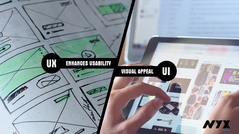
UX enhances the usability, UI enriches the visual appeal

The core objective of UX design is to make the product more useful for users. UX designers are responsible for ensuring that the company delivers a product or service that meets the needs of the customer and allows them to seamlessly achieve their desired outcome. On the other hand, UI designers are more inclined towards creating a visually appealing and aesthetically pleasing website design for users. Additionally, UI design must help users navigate through the website by designing buttons in different sizes, to show priority. UI designers take care of minute visual details to make the site look attractive.

UX Design is first, followed by UI

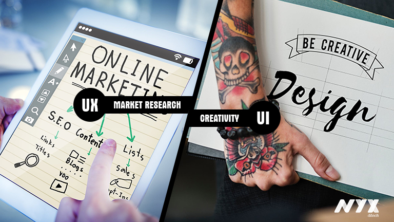
Normally, UX design and research is the first thing that designers dive into when deciding whether to build a product or application. They start with a competitive analysis and market research to come up with insights which improve site functionality. UI design comes much later; once the prototype has gone through several iterations and is almost finalized, all the wireframes are in place, then the UI designer steps in. Here is where the creative spirit of designers is put to test. They work on the visual design and micro-interactions.

UX pertains to products, services and interfaces, but UI only pertains to interfaces


The scope of UX is much broader than UI. UX design is garnering a lot of attention and is becoming more popular day-by-day. It’s no longer restricted to the companies with a web presence, but many others that develop products or provide services are identifying the importance of researching the market, users and validating them before they build. The scope of UI is however restricted only to user interfaces. That said, it doesn’t mean that UI is limited to graphical user interfaces of computers, tablets and mobile devices. A lot of other products also need a touch of UI designing these days, like watches, washing machines, car dashboards, vending machines etc.

UX has a social component, UI has an artistic component

UX is more about people; it has a social component as it deals with market research, analysis, identifying a customer’s pain points and how the product will solve these problems. User personas, journey maps and product user scenarios are accounted through UX research like contextual interviews, focus groups and prototyping, involving people. UI design has an artistic component as it relates to the design and interfaces with the product. It is about the aesthetic value and visuals. It affects what the end-user sees, hears, and feels.

Concluding notes

It is evident that UX and UI are completely two different things and focus on different aspects. But, they both complement each other and go hand-in-hand. It is almost impossible to bail out UI from UX and UX from UI. In a nutshell, UX design helps users accomplish meaningful tasks across platforms and services, while UI design makes compelling and aesthetically pleasing interfaces that connect with humans.

Categories
Blog Design Technology UX

Golden Rules of Modern Day Navigation

Users access websites to get access to various kinds of information. Whether they want to learn more about an organization, purchase an item, donate to a cause, or access a resource, they are dependent on the site navigation to find out what they’re looking for. However, navigation on websites is seldom as smooth that it should be in an ideal condition. It somehow manages to lead the user to the information that they’re looking for, and that too after some struggle. That’s why it becomes important for designers to follow some best practices which allow them to create more effective, clearer navigation experiences. Navigation is more important than search on a website. If the words that the users are looking for matches the words in the links, it is more likely that they will click on that link. So what are the rules for designing great navigation? Let’s check it out.

Plan Out for Consistency

Navigational inconsistencies are sometimes a result of content that doesn’t fit properly into various sections of the site, and that’s why it’s listed on its own. Other times, people may need to quickly access something that sits way deep within the website, so the designers add quick links to the navigation. However, there are other solutions that avoid making inconsistent additions to navigation. Subpages and landing pages are one example. But, consistency should be maintained here; either all navigational elements should display their subpage links or none of them.

All primary navigation items should link to landing pages, or at least all should be section headers for secondary navigation links. If only some primary navigation items are links, people will try to click on non-links, they will be confused and get frustrated. The visual design should also clearly indicate whether the primary navigation items are links or are only headers.

Effectively Use Breadcrumbs

Another important aid for navigation is Breadcrumbs that help orient people within a website. This kind of orientation is especially important if people are directed to deeper pages on the site from external sources. But breadcrumbs must accurate to be effective; they can’t miss levels, or misrepresent the hierarchy of pages. For small websites with only two levels, breadcrumbs aren’t necessary, but when they are required, they need to be consistent.

Interactions Must be Clearly Identifiable

When a site visitor is confused about which items are interactive, or what interactions to expect, it creates a problem. Therefore, thoughtfully designing interactions to be clear and understandable is the best way to go about it. Visual changes clarify what interactions to expect on a site. For example, swapping an expand icon for a collapse icon indicates that something has changed, and how to reverse the change. When the icon doesn’t update, people may miss the result.

Differentiate Icon Links

Sometimes icons can replace text links. Including a label with an icon will reduce ambiguity. According to a study, users are roughly 37% faster at finding items within a list on a web page when visual indicators vary both in color and icon compared to text alone. Differentiate icons that are links from icons that are purely informational or categorical. Varying the color of the icons, in addition to the icon design itself will help people to more easily and quickly process that the icons serve different purposes.

Opt for Flat Navigation

In order to create a great navigation, the Information Architecture (IA) and hierarchy of the website must support it. As the sitemap is developed, go for flat navigation, where the user can access the deepest nested page in the site within a few clicks. Menus need to be short enough to scan, but long enough to be clear. Ideally, the fewer levels people need to click through, the quicker and least confusing it should be for them to access what they want. Most often, there are three or four levels of hierarchy for most websites. This keeps things accessible while making sure the site navigation isn’t too broad.

Design for Responsive Compatibility

Great navigation translates easily to mobile and tablet. Design a navigation that works across all devices, or consider two similar navigations that don’t require people to adjust to a different mental model when moving from desktop to mobile. Primary navigation often displays the secondary links on hover; however, it doesn’t always work for mobile. Utilizing a hover interaction that can’t be used on mobile introduces inconsistency between the two devices.

People will not know instinctively how to access something on mobile that they used a menu hover to access on a desktop. If you need to provide two interactions in association with one link, consider having two distinct places to click associated with that link. While it may seem like extra effort to design and develop separate designs for the devices.

Ease of navigation adds to the user experience of visitors. Discuss more with our design experts and get answers to your design needs.

Categories
Blog Design Web Design

Use Video And Movement To Exemplify User Experience

The ever-changing world of UX web design has witnessed a plethora of changing trends over the last decade. With a new year, we expect a lot more changes, and new design trends will come to the surface. If you look back to your user experience with websites over the last year, you would probably be able to think of a few websites which really stood out and few which were absolutely shady, in terms of user experience. A bad user experience leads to a negative brand image. Therefore, it’s very important to move along with the changing trends, in order to keep up the user experience level, or even enhance it.

You might have noticed that a lot of designers these days are taking help of video, visuals and movement in order to enhance the UX of a website. It not only enhances the user experience, but it also makes the website more appealing. Here are some of the ways in which you can use video and movement opportunities to grab the users’ attention and keep visitors on the page for longer periods of time.

Non-Traditional Scrolling

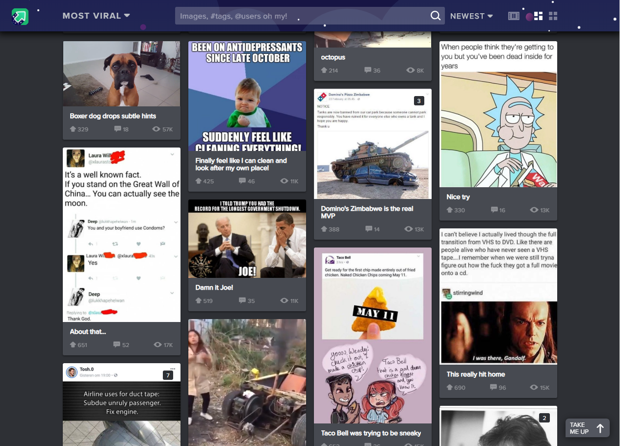
More and more websites are now experimenting with different scrolling techniques to create a unique user experience. Instead of using the conventional vertical scroll designers can try out other non-conventional scrolling patterns like long scrolling, fixed long scrolling, infinite Scrolling, or tasteful parallax scrolling. Creative scrolling patterns let you adjust the pace, delivery, and interactivity of the content. Considering that our attention span on the web is less than 10 seconds, a delightful scrolling experience certainly prolongs user interest. Take a look at the imgur website. It uses infinite scrolling pattern, which loads the content as needed to provide a more paced experience. Infinite scrolling proves useful for single-page sites with more than a few screens worth of content, especially with multimedia galleries.

User Experience Video

Rotating Animations

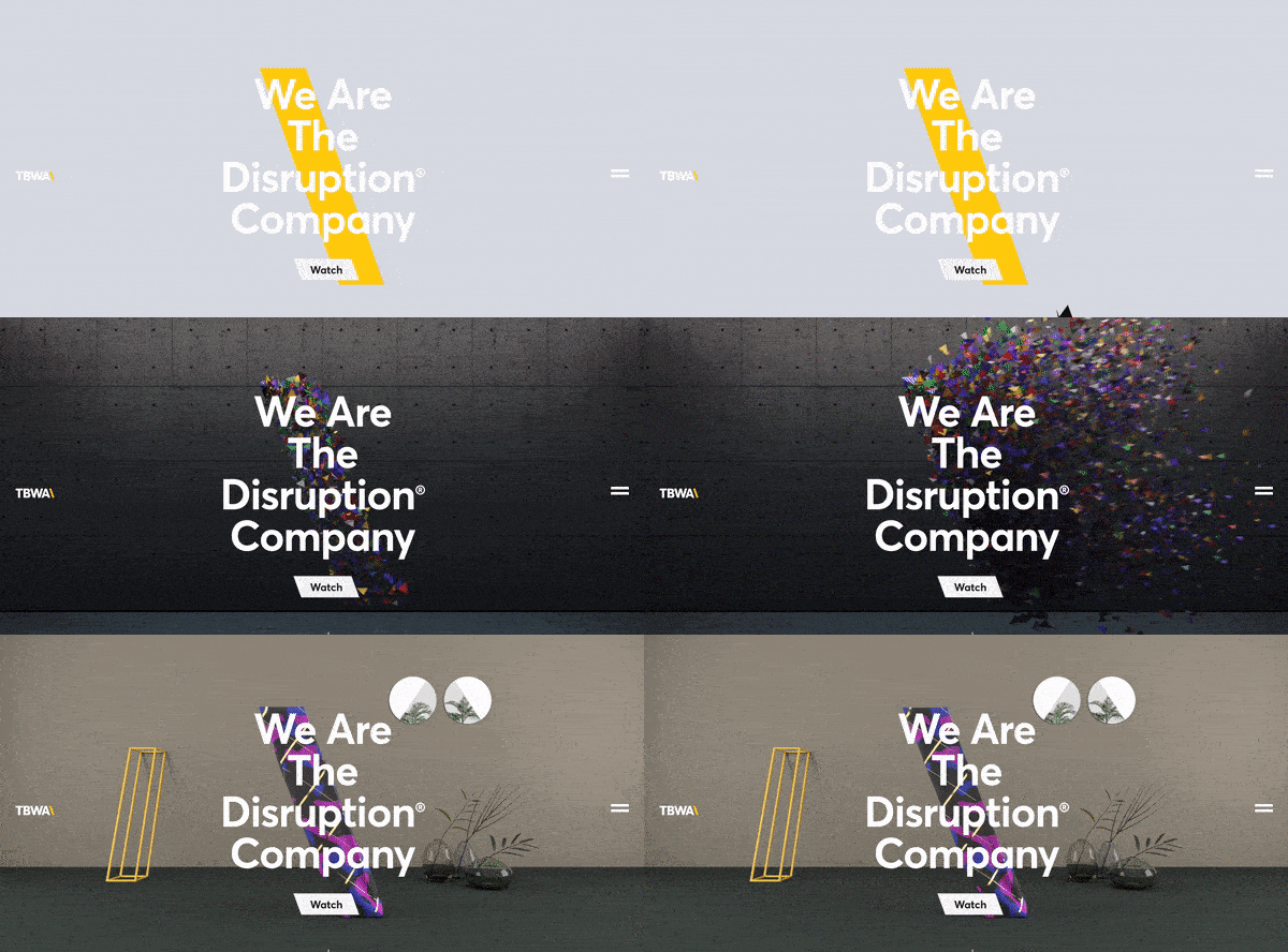
The best web design strategy that will keep users coming back to your website is the Switching Strategy. The more you keep switching your content, more the people will be intrigued. See the Disruption company website. It leaves users curious for more because every time you refresh the homepage you’ll see a new and innovative brand video they’ve created for the homepage. We’ve seen some brands rotate the titles of articles or call-outs as well. These options could leave users with a unique experience on your website every time they visit.

User Experience Example 1

Interactive Web Designs

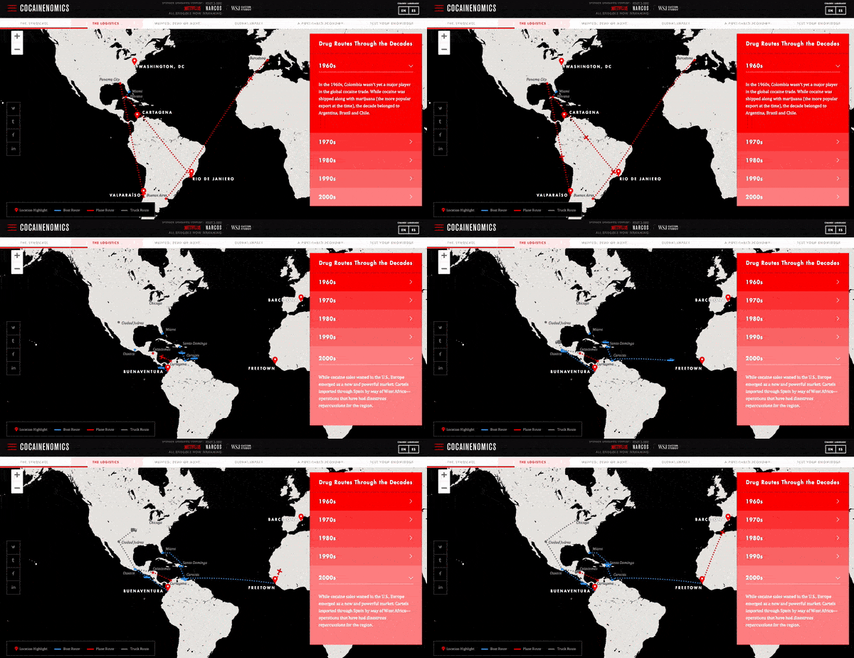
The inclusion of user interactivity has become more popular and will only continue to grow. Users are spending more time on pages of responsive websites that utilize features with user interactivity. The hindrance with this UX design trend is that the clients hesitate to pay for the advanced interactivity. Even if their own team wants to include features like these, they still shy away. Our team predicts more automated development processes will appear and will hopefully cut the cost for clients who want unparalleled, interactive features on their sites. A great example of user interactivity can be explored on Cocainenomics from the Wall Street Journal. This type of web design not only showcases a visual design talent, but it increases the website’s time on page and brand awareness.

User Experience Example 2

UX-Driven Diagonal Lines

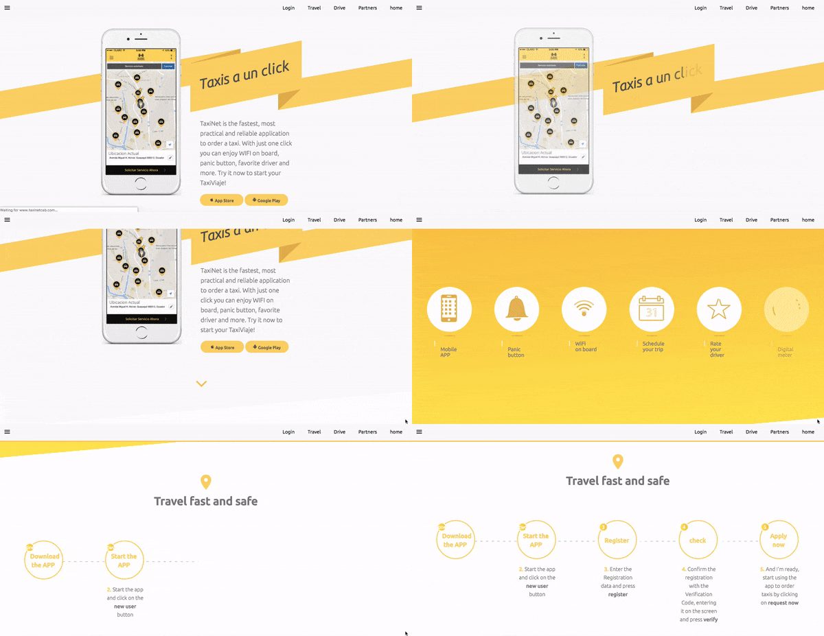
Over the years, it has been a common trend to use straight, horizontal lines to distribute sections on a website’s page. A lot of UX research was done on the topic by various design experts and their teams which discovered that using diagonal line design is not only visually intriguing, but it facilitates the visual flow of users. it guides them to follow down the page or to points to a call-to-action. Using diagonals in your designs will increase the number of users that scroll through the entire length of the site. TaxiNet has beautifully implemented this trend on their website to enhance the user experience.

User Experience Example 3

Large, Eye-catching Titles

Today, we live in a hustling and bustling society, which is always on a move. Users seem to have less and less time to spend on websites due to their busy lives. Therefore, designers have identified the need of creating a design which instantly grabs attention and conveys the message right at the start of user interaction. They are adapting and including large, bolded titles and shortened messaging to capture their audiences and expedite their time to convert. The increased size of these heading tags is usually matched with much smaller sub-text copy if more information is desired. Austin Eastciders demonstrates this alliance of font sizes throughout their homepage design and uses a video in the background to showcase different occasions to enjoy their tasty ciders.

User Experience Example 4

A lot is changing in the world of design. Rich user experience is no longer a luxury; it’s more of basic and elementary. Speak to our design experts and learn how you can infuse visually appealing design elements which elevate the user experience.