NYX Ditech

Categories
Design Mobile Apps UX

5 Key Uses of Animation in Mobile App UI

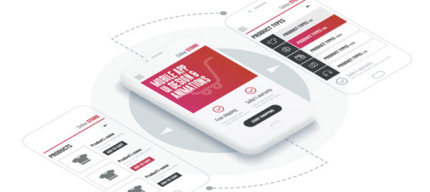
The advancement of technology has led to several new improvements and trends in web and mobile designing. Animation was once a visual luxury but has now become a functional requirement. Users expect to face animations at some stage while browsing a website or an app. Animation infuses life into interfaces and makes them more rousing and visually appealing.  The proper use of animations accentuates the responsiveness of an app. In this article, we will discuss five critical applications of animation within a mobile app UI design.

Animation infuses life into interfaces and makes them more rousing and visually appealing.  The proper use of animations accentuates the responsiveness of an app. In this article, we will discuss five critical applications of animation within a mobile UI design.

1. System Status

There are plenty of tasks and processes like downloading and uploading data, calculations etc. that continuously run in the backdrop while the app is running. While these processes run in the background, users often feel that the app is frozen, as there is no activity at the front end. You must always indicate the status of all the ongoing processes through visual signs of progress. It provides a sense of control over the app to the users.

Page loading time is unavoidable, however, it is a very stressful time for users. Using animations can’t shorten the loading time, but can provide comfort to the users while they wait. Creative progress indicators can reduce a user’s perception of time. If users can watch something visually pleasing, while they wait, they are more likely to divert their mind on the animation, rather than the wait time.

Similarly, “pull down to refresh” is also a well-known system status indicator that reloads the page. Pull-to-refresh animations should match the design outline of the app. Movement and visually pleasing items naturally draw attention and create interest. Animating your notifications is a pleasant way to notify users about things, without hampering their experience.

2. Visual Feedback in Mobile App UI

Visual feedback is critically important for any user interface. It helps users to know and understand their current context in the system at any given time. User interface elements like buttons and controls should appear to be tangible, as they interact with them in the real world.

But, bridging the gap between the physical world and on the web is challenging. Visual and motion cues must immediately recognize the input and animate in ways that appear to be direct guidance. Animations enhance various points of interaction and reinforce the actions taken by a user.

3. Structuring Information

Animation allows proper structuring of information across the app. An animation draws users and shows what content to look for and where can it be found. The menu bar is one of the most common places where this can be implemented. 

There are many elements on the main screen of the app. When we activate one of them, the app should change the picture and display a whole new app section based on the selection. Animation helps users to know that it is the same element but with different form and scale.

4. Navigation & Transitions in Mobile App UI

Usually, users take the help of menu bar to navigate inside an app. A lot of apps have a complicated structure to show the list of app sections or features, which is confusing for users. Animation works as a visual navigator. 

A user should notice a changing picture on the screen while selecting or changing app sections. This lets them know that they are navigating to a different section or using a feature. Animation is a great way to transport users reasonably between navigational contexts. 

Read more about Mobile App Navigation

5. In-app Guide

Some apps have a more complex structure compared to others. If you don’t want to scare-off or irritate your app subscribers, you should clearly explain to them how an app works at the very beginning. Animation comes in handy here. A user gets brief instructions about the app in very less time via animations. Usually, an animated guide opens up when the app runs. However, users should have access to the guide whenever they need.

Animations are really pretty, but as mentioned earlier there role is no longer confined to adding beauty to an app. So make animations with purpose and use it in the app UI design to simplify user interaction with the user interface.

Let us know if you are looking for designing your new or existing mobile app. Our UI and UX team will be happy to assist. Contact Us today

Categories
Blog Design Technology UX

Golden Rules of Modern Day Navigation

Users access websites to get access to various kinds of information. Whether they want to learn more about an organization, purchase an item, donate to a cause, or access a resource, they are dependent on the site navigation to find out what they’re looking for. However, navigation on websites is seldom as smooth that it should be in an ideal condition. It somehow manages to lead the user to the information that they’re looking for, and that too after some struggle. That’s why it becomes important for designers to follow some best practices which allow them to create more effective, clearer navigation experiences. Navigation is more important than search on a website. If the words that the users are looking for matches the words in the links, it is more likely that they will click on that link. So what are the rules for designing great navigation? Let’s check it out.

Plan Out for Consistency

Navigational inconsistencies are sometimes a result of content that doesn’t fit properly into various sections of the site, and that’s why it’s listed on its own. Other times, people may need to quickly access something that sits way deep within the website, so the designers add quick links to the navigation. However, there are other solutions that avoid making inconsistent additions to navigation. Subpages and landing pages are one example. But, consistency should be maintained here; either all navigational elements should display their subpage links or none of them.

All primary navigation items should link to landing pages, or at least all should be section headers for secondary navigation links. If only some primary navigation items are links, people will try to click on non-links, they will be confused and get frustrated. The visual design should also clearly indicate whether the primary navigation items are links or are only headers.

Effectively Use Breadcrumbs

Another important aid for navigation is Breadcrumbs that help orient people within a website. This kind of orientation is especially important if people are directed to deeper pages on the site from external sources. But breadcrumbs must accurate to be effective; they can’t miss levels, or misrepresent the hierarchy of pages. For small websites with only two levels, breadcrumbs aren’t necessary, but when they are required, they need to be consistent.

Interactions Must be Clearly Identifiable

When a site visitor is confused about which items are interactive, or what interactions to expect, it creates a problem. Therefore, thoughtfully designing interactions to be clear and understandable is the best way to go about it. Visual changes clarify what interactions to expect on a site. For example, swapping an expand icon for a collapse icon indicates that something has changed, and how to reverse the change. When the icon doesn’t update, people may miss the result.

Differentiate Icon Links

Sometimes icons can replace text links. Including a label with an icon will reduce ambiguity. According to a study, users are roughly 37% faster at finding items within a list on a web page when visual indicators vary both in color and icon compared to text alone. Differentiate icons that are links from icons that are purely informational or categorical. Varying the color of the icons, in addition to the icon design itself will help people to more easily and quickly process that the icons serve different purposes.

Opt for Flat Navigation

In order to create a great navigation, the Information Architecture (IA) and hierarchy of the website must support it. As the sitemap is developed, go for flat navigation, where the user can access the deepest nested page in the site within a few clicks. Menus need to be short enough to scan, but long enough to be clear. Ideally, the fewer levels people need to click through, the quicker and least confusing it should be for them to access what they want. Most often, there are three or four levels of hierarchy for most websites. This keeps things accessible while making sure the site navigation isn’t too broad.

Design for Responsive Compatibility

Great navigation translates easily to mobile and tablet. Design a navigation that works across all devices, or consider two similar navigations that don’t require people to adjust to a different mental model when moving from desktop to mobile. Primary navigation often displays the secondary links on hover; however, it doesn’t always work for mobile. Utilizing a hover interaction that can’t be used on mobile introduces inconsistency between the two devices.

People will not know instinctively how to access something on mobile that they used a menu hover to access on a desktop. If you need to provide two interactions in association with one link, consider having two distinct places to click associated with that link. While it may seem like extra effort to design and develop separate designs for the devices.

Ease of navigation adds to the user experience of visitors. Discuss more with our design experts and get answers to your design needs.