NYX Ditech

Categories
Web Design

Step-By-Step Approach To Create A Successful Website

Creating a high-quality, high-conversion website has become a basic necessity for any kind of business these days. No matter how large or small your business is, the success is significantly driven by the type of interaction users have with your business through your website. For this reason, it’s important to devote a considerable amount of time, thought and vision to website development. This 7-step approach for creating websites helps to deliver a stunning and successful website almost every time and every web design & development team must take a note of it.

1. Discovery Phase

Before starting any bit of the website development, it is important to understand the core business of any company, its competitors, current online presence and the desired outcome from the company’s website. It normally takes around 5-6 meetings and a few telephonic discussions.

In this phase, the Key Performance Indicators (KPIs) for the new site’s success like more traffic, more sales, more enquiries etc. must be decided. It’s basically an introduction phase to get to know the business and its online potential. Once the information has been gathered, the discovery process documents are handed over to the project manager who can take things forward.

2. Architecture Phase

With the information gathered in the discovery phase, the project manager will take the website project onto the next stage which is the architecture phase. Here, the project is split into tasks and each task is assigned to a team member with a deadline. This phase includes mood board creation and wireframes for key pages, in addition to collecting all the text, images, files and documents needed for the website. Copywriting also falls into this phase. Once everything is gathered together, one can move onto the graphic design element and mock-ups.

3. Design Phase

In comes the most exciting phase – the design phase. The team of graphic designers will now create all the graphics required for the project. Throughout this period, the project manager will be in constant touch with the design team to ensure that the design work is carried on based on the exact requirements. The design phase can include mock-ups of the final website pages, logo designs and stationery. Once this work is complete and you have finalised the designs, it’s time to start creating the website.

4. Development Phase

Once all of the designs have been approved, the team of web developers will begin to create the website. At this stage, the project manager must ensure that everything is running on time, to plan and on budget. Development process normally includes some re-work and poses many unexpected challenges; a realistic deadline for completion of the development work must be set keeping these challenges in mind.

5. Testing Phase

This is one of the most important phases in the website building process. Once the website is fully built, the testing can take place. The professional developers and managers test the functionality, navigation, logic and everything else related to your website to find out any possible issues from the build process. They follow a systematic process to find, note and analyse all the issues found, and thereafter, ensure that all the bugs and issues are totally fixed before the website goes live. Testing is not limited till the pre-launch period. A lot of issues come up only once the website goes live. Therefore it’s a good practice to also test the website once it’s launched, at least for the early phase.

6. Launch And Training Phase

That’s it! It’s launch time. The time which is awaited by everyone. After performing all the above steps, it’s safe to say that the website is good to go live. Once it goes live, a few basic checks must be performed to see if the website is performing the same as it was on the test server. A certain amount of staff training is also required including the business stakeholders and website operators to get them familiar with the website. The level of detail and difficulty entirely depends on the trainees. Keeping the back-end of the website safe and secure is paramount, and therefore, training on how to update software and anti-virus must also be provided.

7. Marketing Phase

A typical website development cycle ends at the sixth step. However, in today’s world, it’s not enough. There are billions of websites floating on the web and all the efforts and pain taken in creating a wonderful website will go in vain if nobody knows that it exists. That’s where marketing, digital marketing to be precise, comes into the picture. Proper marketing channels and mediums must be selected to promote your brand and its website.

Social media is one of the strongest marketing channels and must be fully leveraged to extend your website’s reach and boost its presence. The marketing efforts depend on the marketing budget of the business, however, small or big, marketing efforts are a must.

It’s hard to find a perfect team, set of people with various skills required during each phase of website creation. Moreover, it becomes difficult for businesses to focus on the whole process. That’s where a professional digital agency like NYX ditech comes to the rescue. Our dedicated team of professionals draw on its vast knowledge and experience to deliver a stunning, successful, high-quality and high-conversion website. Talk to us and discuss your requirements.

Categories
Technology

6 Brilliant Ways To Enhance Mobile App Security

Mobile application development has been on a roll and has scaled new heights in the last few decades. The development process has also lead to simplification of the entire process of application creation. With advanced methods, simpler plugins and intuitive platforms, the development process has improved a lot. However, developing a truly useful and likeable application is involves a lot more than simply creating an app.
One of the crucial factors which plays an important role in the application development process is the integration of safety into the interface. It’s critical to ensure that your application is safe for the users especially when it asks them for sensitive and personal details such as account password and username. Here are a few ways in which you can enhance the security of your mobile applications.

Secure Your App’s Code

Similar to any software project, mobile software security needs to be a priority from day one. However, native apps are different from web applications, where data and software exist securely on a server and the client-side (or, browser) is just an interface. With native apps, however, that code resides on the device once it’s downloaded, making it more accessible to those with malicious intent.
Network and Data security components are important, but the security should start from the app itself. Vulnerabilities can be caused by developer error or failure to test the code which should be timely checked and avoided.

Encryption

The use of encryption for device safety is the best way to secure your mobile application. The use of good encryption like that of 256-bit AES encryption allows you to encrypt the data transmitted from the user’s device. This encryption will make it difficult for a hacker to steal and make sense of any data.

Rigorous Testing

While testing, don’t stick to a single testing method. Follow multiple methods of software testing to make sure that you cover all the important bases. Some of the important testing methods include regression testing, exploratory testing as well as automated testing. It’s important that you dedicate a considerable amount of time for testing while preparing a timeline for the application development. Moreover, it is better to test on the go than dedicate a time towards the end since it helps in solving the issues faster.

Prototyping

Prototyping is a great way to keep track progress of the development process. By making prototype application while developing the application, you are creating restore points for the application. In case addition or removal of a particular function or a feature fails, you can restart the application development process from the last successful prototype.

Use Of Reliable Certificates

Make sure you develop your application for a variety of mobile devices. You must mention the name of the devices in the application description in case your application does not support a particular range of devices. The use of certificates from the device will help your application integrate its source code with the hardware architecture a little better.

Regular Updates

Minor modifications to the source code of the application on a regular basis will ensure that there are no security threats to your application. The updates should be regular, rather than a just-for-the-sake-of-it monthly update for the addition for functionality or removal of bugs.

If you are looking for a highly secure mobile app, it is a must that you get in touch with experienced mobile app development professionals like the ones we have here in NyxDitech. Speak to an expert now!

Categories
Design

5 Design Elements That Can Spice Up Your Contact Page

There are plenty of elements which you consider while designing a compelling and user-friendly website. You start with a stunning homepage and move on to an engaging about us page, a high-conversion landing page, and an informative blog. However, not a lot of thought is given to the contact us page, even though this page is a medium for your audience to connect with you. This page gets more traffic than any other page of a website and therefore needs equal attention.

Building Trust
Today, you will find a whole lot of online stores floating around the web and thus, building trust in your brand is an important success factor for any online store. Visitors will prefer buying from you if they are confident about your offerings and trust your brand. Even the existing customers will choose you over others and will become repeat buyers only if they trust you.

Designing your website keeping the human element is an effective way to earn the trust of your prospects. Visitors must always be able to visualize that there is a real person behind your business who is always ready to solve their problems. A contact us page can help customers solve their concerns regarding any aspect of their purchase cycle.

In this article, we will learn about a few important elements which can elevate the purpose of your contact us page while making it more user-friendly.

1. Should Be Easily Accessible

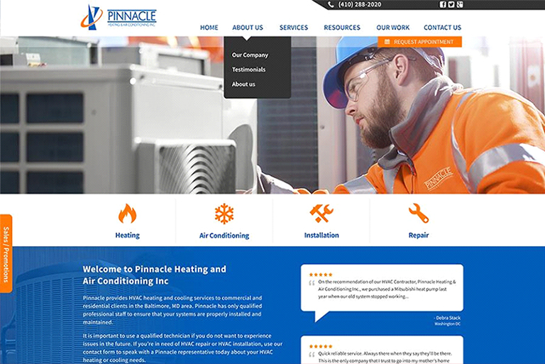
No point in creating a contact us page if your visitors can’t find it or take ages to find it. Ensure that your contact us page is easy to find so visitors can easily get in touch when they need to talk to your team. The navigation bar and the footer of every page on your website are the two major traffic sources for this page. By placing the contact us page in the main navigation, you make it instantly obvious and directly guide your website visitors towards it.

Pinnacle

Source: Pinnacle

2. Personalization Is The Key

You can use friendly images of real people to elevate the credibility and trustworthiness of your company while making it seem more human and personable. Another way to do this is by integrating a catchy call to action like “Talk to a Human” or “Talk To Jack ”on your contact page, which will compel your prospects to contact you. Check out this incredible call to action from Choice Screenings with a personalized message.

Personalization-Is-The-Key

3. Relevant Contact Information

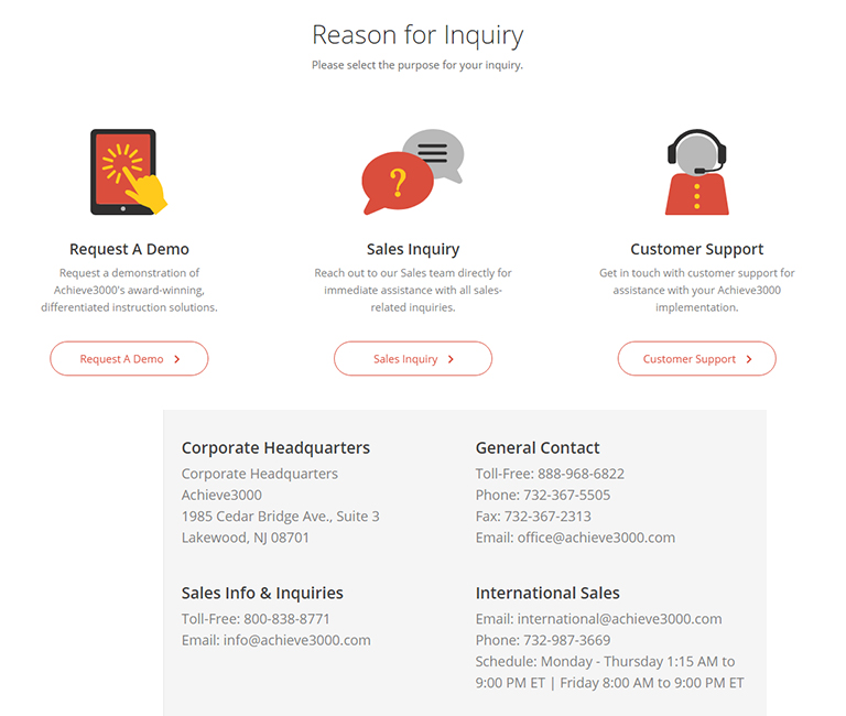
When a visitor visits your contact us page, they should get all the required information on this page itself. Add your email address, business phone number, physical location, business hours, social media accounts and any other essential information to your contact page. That said, do not clutter the page; arrange all the information in an organized manner.

achieve3000

Source: achieve3000

4. Add a Catchy Call To Action

Including a captivating call to action to your contact us page is the best way to keep your visitors’ hooked to your website. It ensures that the visitors stay a little longer on your website even if they don’t want to complete the intended action at that particular moment. There are a lot of ways to keep them glued to your website. You can invite them to download your eBook, signup for a newsletter, check out your latest blogs and bestselling products or simply ask them to follow your brand on social media.

Catchy-Call-Action

5. Mobile-Friendly Design

Majority of the websites get a chunk of their traffic from mobile and other smaller devices. Therefore, it is essential to design a responsive contact us page so that visitors can easily fill the contact form using mobile devices. Moreover, Google ranks responsive and mobile-friendly websites higher on their search engine result pages. Make sure that all your website pages, including your contact page, are mobile-friendly. You can use large, bold and easily clickable CTA buttons, and large form fields to provide a seamless mobile experience.

Weifield-Group

Source: Weifield Group

To Conclude

Your contact page is the first place where your customers go for help. An amazing, user-friendly contact us page can help customers find solutions and engage with your business. You can incorporate the aforementioned elements on your page to create an engaging and welcoming contact us page. Use our contact us page to speak to one of our design experts and discuss your design needs.

Categories
Technology Web Design

How To Optimize Your Website Using Google’s PageSpeed Insights

Today, the entire web revolves around Google, and therefore it becomes very critical to analyse our websites based on Google’s algorithm, to do necessary changes. According to Google, a website can lose almost half of its visitors while loading. This highlights the importance and criticality of keeping the page load times to a minimum, to maximize user experience. That’s valuable information, but what’s the next step? Google’s PageSpeed Insights tools may be just what you need to leverage data collected through speed testing.

PageSpeed Insights

There are a lot of factors like too many large images, files, and plugins, which slow down a website speed or server response times and that is where PageSpeed testers come in. It’s a known fact that Google offers a variety of helpful resources for web developers and PageSpeed Insights is just one of the many free web performance tools that can help you check your speed score, boost your page load times and significantly improve the user experience. PageSpeed Insights is designed to direct your actions against slow speeds, resulting in bad performance. You’ll get a swift operation across all devices.

PageSpeed Insights is not an advanced level tool (which developers use for advanced analysis of slow load times), but a relatively lower-level tool that is useful for small websites, particularly those that run on a content management system (CMS) like WordPress.

To use PageSpeed Insights, all you have to do is enter a URL into the address bar on the PageSpeed Insights page, then click “analyze.” The test will take a few seconds to complete, and results for both mobile and desktop devices will be displayed in separate tabs. You’ll want to repeat this test for each page on your site or at least those with concerning speed issues.

Now that you know about Google PageSpeed Insight, here’s how you can optimize your website to achieve a better page speed using the insights from PageSpeed.

Optimize Images

High-quality, heavy images are the most common factor contributing to slow loading of a web page. This warning from Insights is best solved by installing a plugin such as Optimus Image Optimizer from KeyCDN. With a bulk optimization feature and a focus on compression without any loss, this plugin can drastically decrease the image size, without affecting the quality. With one click, you can compress your entire existing library, and all images will be compressed upon upload. To top it up, the plugin can compresses images to the .webp format, which can be used in combination with WordPress Cache Enabler to ensure much faster download.

Minify Javascript And CSS

Minification is the process of removing unnecessary or redundant data without affecting how the resource is processed by the browser. A Javascript or CSS issue can be highlighted by the PageSpeed Insight tool and it can also be fixed by installing a plug-in. The Plugin by the name of Autoptimize is the best way to deal with this issue. Within Autoptimze’s settings, you have the option to enable HTML, JavaScript, and CSS code optimization.

Render-Blocking Resources Above the Fold

Any JavaScript or CSS file that is above the fold is render-blocking. This issue can crop up from two sources – JavaScript/CSS files and Fonts. If the issue is of JavaScript/CSS files, it can be fixed by saving the following settings in Autoptimize:

Uncheck “Force JavaScript in <head>” under the JavaScript Options section
Check “Inline all CSS?” under the CSS Options section.

Some fonts can be problematic since they use CSS above the fold. Depending on what type of font you use, whether it’s Font Awesome, Google Fonts or any other type of font, all workarounds require you to bring these elements below the fold code-wise.

Use Browser Caching

This is an issue that can be solved with the KeyCDN plug-in alongside WordPress CDN Enabler. These two plugins deliver assets with cache-control headers. However, there are some cases in which themes or certain elements are not delivered with the CDN. In this case, you will need to play around a little bit with the code in .htaccess file in order to manually add cache-control headers to the server of origin.

Reduce server response time

Server response time (SRT) is the amount of time it takes for the web browser to receive a response. If the server response time of your website is relatively high, then that can lead to slow loading of web pages. If this pops up, you would need to first ensure that you have sufficient resources to handle your traffic. Choose your web server carefully, and optimize your web servers and database.

Talk to our experts to get more info on Google PageSpeed Insights and how it can be used to efficiently optimise your website.

Categories
Web Design

5 Must Have Features Of Any B2B Website

It’s a daunting task to get potential customers on your website and keep them around once they’ve arrived. For B2B websites, this is particularly difficult. As a rule, business customers are much savvier than your average B2C consumers, they know exactly what they are looking for and what you’re trying to feed them. Utilizing the maximum potential from a website’s traffic requires understanding a few fundamental things. You should know who your audience is, what they want, and how your website can help them get it. Here are a few important components of your website which add to the success of a B2B website.

Navigation

Website designs are becoming simpler day-by-day and that should always be kept in mind while designing. If your website loads the user with too much information, chances are they’ll decide that it isn’t worth their time and will quickly bounce off and may not return ever. Keep everything as simple as you can, especially the navigation. The navigation tab on your home page shouldn’t feature more than about 4-6 tabs. It should include ‘about us’, ‘services’, ‘contact’ and ‘blog’, as it’s a familiar structure that will make navigation through your website quick and efficient.
B2B customers want to be properly informed before making any decisions. That’s why they would likely want to speak to somebody before doing so. Your website should therefore be well optimised to direct readers towards content that answers their questions, with routes to conversions optimised towards contact-based CTAs.

High-Quality Content

The core of every digital marketing campaign is high-quality, relevant content. Consumers expect to find information online in relation to a product or service through all possible channels and mediums. Blogs, eBooks, case studies, customer reviews, white papers etc. All these resources help them to make an informed purchase decision. Moreover, they expect to be able to access and receive information in real-time. Without content, B2B companies have no way of engaging and retaining the interest of potential prospects. Without good content, prospects will not be attracted to the website even if they would be looking for the exact products and services the business offers.

Blog

Every B2B company, at the very least, should have a blog. Even if they only blogging frequency is once a week or month, it’s a great opportunity to create a new web page that targets a specific keyword and uses a unique URL, all of which will help prospects to find the website. Think of a blog like a repository of quality information. A prospect can turn to your blog to find out more about your products and services. It takes time and effort to create an engaging blog, but it’s almost free and can produce amazing results.

Branding

A lot of people think that branding and aesthetics are largely the same things. But that’s not the case. If aesthetics relate to the raw colours and images on your website, then branding is the way they’re used. Branding should be coherent and consistent throughout the website. Having a specific logo and colour scheme is a pretty popular way of achieving this.
It’s important that your branding efforts go alongside the website’s navigation. Potential customers should leave your website with a concrete idea of what your business is about, what its values are, and whether it’s a right fit for theirs.

Call To Action

Calls to action, or CTAs, are common features of most blogs and website pages. If you’re trying to sell something, a CTA draws attention to the action you would like your visitors to take. Like, if you’re trying to divert traffic towards content that explains more about what you’re selling, the CTA is the text, graphic or link that does that.
B2B consumers also generally know what they’re looking for and want to be able to quickly distinguish whether a website, product or blog page is worth the time they’re going to spend reading it. Therefore, a decent B2B CTA has ‘this is the information you need to know’, or something very similar, implied quite heavily within. That said, make it snappy and attractive so that it really stands out and attracts attention.
These five features may sound very basic, but holds a greater significance in context of building a successful B2B website. We have a team of expert designers who can guide you more. Talk to them to get a better understanding.

Categories
Web Design

Looking To Develop a Professional Website? Keep These Tips Handy

A compelling design or enticing content is not enough for a successful, professional website. There must also be a sense of style that feeds your website’s user experience and functionality while being easy to understand at first glance. That said, different people prefer different styles, and preferences can be poles apart. But still, there are a few ground rules that should be followed when deciding on the appearance of your website. Here are 5 quick tips that you can follow to keep your website professional and successful.

Keep A Minimalistic Homepage

People don’t really read on the web. They simply scan pages, picking out keywords and sentences. Keeping this in mind, it’s better to target on emotions rather than word count. The lesser the information you feed visitors, better are the chances of them to remember. That makes it more likely for them to do what you wanted them to do in the first place. Text and calls to action are necessary, of course, but make sure to break them up with larger subheadings and legible paragraphs. Moreover, use images or icons as alternative ways to communicate.

Design With Visual Hierarchy In Mind

We’ve evolved a lot over the years. With computer screens and smartphones, as the technology to display information evolves, it remains the designer’s job to arrange the content in a clear manner. The amount of time to grab someone’s attention and tell them what your site is about, is very less. With a clear hierarchy to your information, readers can’t help but unconsciously follow the breadcrumbs you have left for them. Then apply color, contrast, size and spacing for further accentuation, remaining conscious of what is drawing attention on your page and making sure that it’s always intentional. Strips are one of the best design elements for creating a strong visual hierarchy.

Easy To Read Content

Readability measures how easy it is for people to recognize words, sentences, and phrases. When your site’s readability is high, users will be able to efficiently scan your site and take in information from text without much effort. Fonts on your website must be clear and readable. A typical rule of thumb you’ll see on the web is to keep your body text at least 16pt. That said, it largely depends on the type of font that you use. Sans Serif (without serif) are typically the best choice for online texts. As a rule, don’t use more than three different typefaces throughout your website. However, there might be a need of more than that, but if you do choose to use a variety of fonts, the overall effect should be harmonious, not cluttered.

Smooth And Easy Navigation

Having a professional website that’s tough to navigate is like owning an expensive copy machine that faces frequent paper jams. People will get irritated, frustrated and will simply bounce off. A lot of websites are still confusing, cluttered, and difficult to navigate, even though they look pretty. Starting with the navigation bar, you’ll want to make sure that you choose the right categories for it, ensure that you separate your product groups properly and don’t have too many categories. Also, make your navigation bar sticky. A sticky navigation bar means that it stays at the top of the screen no matter how far a user scrolls down.

Mobile Friendly

Let’s admit, mobile has become an integral part of our lives and a majority of people use their smartphones to access your website. So it becomes important to ask, what do my visitors see when they access my website on the go? That’s why you need to keep a mobile-first approach while designing your website, so that you can keep pace with the increasingly mobile world. If you take a look at mobile design trends over the last two years, you will notice a lot of attention is given to minimalism and simplicity of design. Put yourself into your users’ shoes, and test out every page, user action and button.

For developing a professional website, it’s important to keep these tips in mind. However, these are not the only things. There are a lot of other tips, tricks and thinking which goes behind developing a good website. Talk to our experts and discuss more on it.

Categories
Technology UX

Why React Is The Best Choice For Frontend Development?

There are plenty of frameworks and libraries available for frontend development. But, not all of them are good for you. React is one of the most popular and widely used libraries (by the way, it’s not a framework) for frontend development.

What Is React?

React is an open-source JavaScript library used for frontend development, which was developed by Facebook. Its component-based library lets you build high-quality user-interfaces for web apps. This library allows you to place HTML code inside JavaScript and it works with Virtual DOM.

If you are even remotely associated with website development, chances are that you would have heard of React. This post will explain the benefits of using React and why you should choose React for frontend development.

Easy To Learn

React is very easy to learn as there’s no rocket science behind it. This is one of the most important reasons to choose this library. Since it’s not that tough to learn, it takes less time and you can quickly begin to build things with it. React is easy to learn not just because there are a great number of easy-to-understand tutorials available on the internet, but mainly because it’s a very simple library. Unlike Angular, it’s not a complex tool. The learning process becomes easier when you have great JavaScript skills.

Rich UIs

React lets you build rich user-interfaces easily. Quality of user-interfaces is important because a poorly designed user-interface is generally less user-friendly and majority of the users will not like. If your web app has cool, high-quality UIs, your users will love to use your app. So building high-quality user-interfaces is crucial to business success. That said, you can build amazing interfaces with other technologies too, but React lets you do it easily using the declarative components.

Swift Development

You can increase your productivity by using the reusable components and development tools. Developer’s productivity is important because if you can get things done quickly, you can earn more money in less time, which is a common goal of companies and startups. If it takes a huge amount of time to build a simple thing, you’ll lose money. On the contrary, if you can deliver products quickly, you can earn cash quickly and your clients will also be happy. There are plenty of development tools available for React which speed up your work. For example, there’s a browser extension called React Developer Tools, which can make your coding work a lot easier.

Trusted Resource

React is used by great companies and startups such as Facebook, Dropbox, Khan Academy, CodeAcademy, Netflix, Airbnb, PayPal, Walmart, Tesla Motors, IMDb, and so on. There are many, many popular apps that use React. The reason why so many popular companies are using React is because it’s undoubtedly a very high-quality tool for frontend development. Considering that super successful companies like Facebook and PayPal use React, that must mean that it’s a truly useful library.

Strong Community Support

One of the biggest reasons why you should choose React for frontend development is that it has a very strong community support. A large community of developers are making React better as it’s an open-source library and coders from around the world are helping people learn the technology in different ways. Some people upload free React tutorial videos on YouTube while others write useful tutorials, in-depth articles, and blog posts.

It’s evident from the above-mentioned points that React has a list of benefits attached to it; this makes it a great option for frontend development. Talk to our experts and know more about React.

Categories
Technology

Apple Unveils The New iPhone XS, iPhone XS Max and iPhone XR

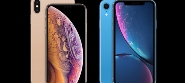
Apple has finally unveiled its new iPhone for 2018 – iPhone Xs, iPhone Xs Max and iPhone XR. The iPhone XS and iPhone XS Max are virtually the same, with the only difference in screen sizes. The former is 5.8-inch (458 ppi) while the latter is 6.5-inch (458 ppi). On the other hand, iPhone XR showcases Apple’s attempt to pack a less expensive phone into the premium iPhone mix.

This is not the first time that Apple has tried its hands on cheaper iPhones. iPhone SE and iPhone 5C were launched by Apple following a similar strategy, but they looked too different from the mainstream iPhones, and thus didn’t last. However, the latest iPhone XR shares the design and many of the same specs as the top-tier iPhones. It is offered in bright colors and has a smaller battery than the iPhone XSes.

Prices

64GB 128GB 256GB 512GB

iPhone XR                   $749        $799            $899             N/A
iPhone XS                   $999         N/A          $1,149        $1,349
iPhone XS Max       $1,099          N/A          $1,249        $1,449

On The Exterior

The new iPhone looks identical to last year’s iPhone X. This means that all-metal body has made a return, complete with notched 5.8 inches and 6.5 inches edge-to-edge screens, chamfered edges and softly rounded corners. Both the Xs and Xs Max also feature a similar bulging out dual-camera arrangement as last year’s top-end phone. A lot of Apple fans would be disappointed with the lack of design changes. The iPhone Xs is available in ‘Gold’, with ‘Silver’ and ‘Space Grey’ colourways back, too. While the iPhone XR comes in flashy colors like coral pink, yellow and blue.

What’s Inside?

All three models are the first to feature Apple’s homegrown A12 Bionic CPU, the first commercially available 7nm processor. The all-new 7nm A12 Bionic has a 6-core processor: two of which are high-performance cores that deliver 15% more power, while the rest of the four cores are ‘high-efficiency’ cores. The latter result in better battery life in non-intensive tasks.

But, that’s not it, the A12 Bionic has a 4-core GPU, which Apple claims to be 50% faster than last year’s A11 Bionic. Finally, the chip has an 8-core Neural Engine chip that brings everything together.

Camera

There are dual rear-facing cameras in iPhone XS and XS Max, while iPhone XR has a single rear-facing camera. A f/1.8 12-megapixel wide angle lens and a 12-megapixel telephoto lens that has an aperture of f/2.4. The cameras capture more detail than before – it can take Smart HDR photos, which is better than any iPhone has in the past.

Display

The biggest difference to most will be the ultra-smooth 120Hz display – a first in an iPhone. This 120Hz display provides a better experience when scrolling through the web, and even in games. Colour-accurate Super Retina display also returns, as we saw on last year’s iPhone X. It’s an OLED display, too. The OLED display covers a wide colour gamut, which makes colours pop when watching movies; with HDR10 and Dolby Vision supported natively, you’ll get the most out of movies and shows that support it. Moreover, the display has True Tone and a Tap to Wake function as well.

Full Specs

iPhone XS iPhone XS Max iPhone XR
Display size, resolution 5.8-inch Super Retina OLED; 2,436×1,125 pixels 6.5-inch Super Retina OLED; 2,688×1,242 pixels 6.1-inch LCD Retina Display; 1,792×828 pixels
Pixel density 458 ppi 458 ppi 326ppi
Dimensions (Inches) 5.7×2.8×0.3 in 6.2×3.0x.3 in 5.9×3.0x0.33 in
Dimensions (Millimeters) 143.6×70.9×7.7 mm 157.5×77.4×7.7 mm 150.9×75.7×8.3
Weight (Ounces, Grams) 6.24 oz; 177g 7.3oz; 208g 6.8oz; 194g
Mobile software iOS 12 iOS 12 iOS 12
Camera Dual 12-megapixel Dual 12-megapixel Single 12-megapixel
Front-facing camera 7-megapixel with Face ID 7-megapixel with Face ID 7-megapixel with Face ID
Video capture 4K 4K 4K
Processor Apple A12 Bionic Apple A12 Bionic Apple A12 Bionic
Storage 64GB, 256GB, 512GB 64GB, 256GB, 512GB 64GB, 128GB, 256GB
RAM N/A N/A N/A
Expandable storage None None None
Battery N/A, but Apple claims it will last 30 min. longer than iPhone X N/A, but Apple claims it will last 90 min. longer than iPhone X N/A, but Apple claims it will last 90 min. longer than iPhone 8 Plus
Fingerprint sensor None (Face ID) None (Face ID) None (Face ID)
Connector Lightning Lightning Lightning
Headphone jack No No No
Special features Water-resistant (IP68); dual-SIM capabilities (nano-SIM and e-SIM); wireless charging; Face ID, Animoji Water-resistant (IP68); dual-SIM capabilities (nano-SIM and e-SIM); wireless charging; Face ID, Animoji Water-resistant: IP67, dual-SIM capabilities (nano-SIM and e-SIM); wireless charging; Face ID, Animoji
Price off-contract (USD) $999 (64GB), $1,149 (256GB), $1,349 (512GB) $1,099 (64GB), $1,249 (256GB), $1,449 (512GB) $749 (64GB), $799 (128GB), $899 (256GB)

At a time when phones are becoming more and more expensive, Apple’s decision to embrace the new “X” family is important and it further strengthens its new strategy. This is a welcome move that will set the tone for other phone makers, moving into the next year.

Categories
UX

5 UX Element Which Shined Throughout 2018

There’s no denying that user experience was big in 2017, and continued with the same pace in 2018 as well. Anticipating user expectations in future is tough and that’s why it’s a bit tricky to live up to user expectations. However, for designers, it’s important to at least be proactive to anticipate user expectations. The following 5 UX element have created a buzz throughout the year and can act as a guide for designing a satisfying and successful user experience in future.

1. Simplified Journey

There’s always some intention in a user’s mind when they interact with a website or mobile app; they want to achieve the intention as quickly as possible. To create a user-friendly application or website it is essential to simplify a user’s journey with time-saving designs. In simple terms, reduce the number of steps users have to take in order to achieve their goal. All the applicable information must be presented in an easy-to-use format and with a smooth navigational flow. Displaying only the most relevant information specific to the user context is instrumental in creating an optimal user experience.

2. Personalized Experience

Personalization is a technique embedded within the strategy of time-saving designs. It is important to recognize the need and importance of shifting from creating generic experiences to individually targeted experiences. To achieve this, designers need to identify the wants and needs of users on a deeper level. With the help of individualized data and advances in machine learning, technology is becoming capable of adjusting automatically for specific users. One of the best examples is the incorporation of personalized recommendations based on user behaviors. These suggestions increase chances of a user taking an action on your website.

3. Human Factor

Due to technological advancements like touch and voice recognition on smartphones and other digital devices, user expectations have changed a lot. People now expect to interact with digital products just like they would typically interact with another human. Therefore designers need to put pay attention on providing a more human experience to users while they interact with your websites. The popularity of humanizing digital experience is correlated to connecting with user emotions. Users should feel connected to their devices in an emotional way.

4. Focus on Content

Well-organized, comprehensive and readily available content plays a big role in making websites and mobile applications appealing to users. Recent trends concentrate on removing all unnecessary elements which can distract a visitor and places the spotlight on content. Content-centered experiences can be created in two ways – either using a design that highlights content or allowing the content itself frame the design. The ultimate goal is to ensure there are no obstructions in a user’s exposure to your website or application’s content. Start by removing excessive visible clutter, so that the message you want to convey easily reaches the visitors.

5. Voice-Based Interaction

Hardware devices that we use to access the web have become more streamlined, which calls for a more streamlined UX. With every new update, more and more buttons are vanishing from smartphones, tablets and even laptops. As a result of this progression, voice user interface (VUI) has surfaced. VUIs have become integrated into most major technologies, such as products from Google, Amazon, Apple, and Microsoft. A fair amount of web searches are performed through voice inputs. With your users most likely using tech from one of these innovative VUI pioneers, it is a good idea to analyze how your website can benefit from adapting.

It’s always a good idea to take cues from currently trending UX trends to anticipate future user expectations and tailor future UX based on it. For more insights on latest web design trends, talk to our design experts NOW!!

Categories
Web Design

5 Vital Ingredients Of Designing A Delicious Food Website

It looks delicious! Has it ever happened with you that you literally start drooling by merely looking at a dish or its picture? We bet you’ve experienced this. Long gone are the days when food websites relied on PDF format menu cards and boring stock images. They have undergone a major transformation and now use a splendid UI design, magnificent photographs, vibrant colors, striking fonts, and high-quality content on their websites. So what are really the ingredients that contribute to the recipe for a lip-smacking food website? Let’s find out.

1. Drooling Pictures

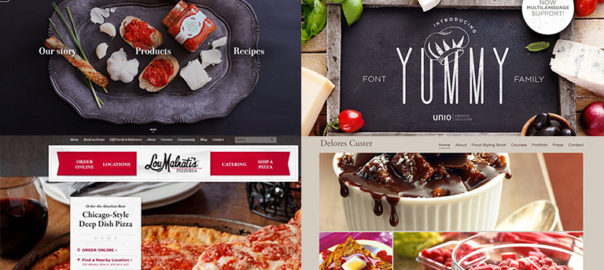
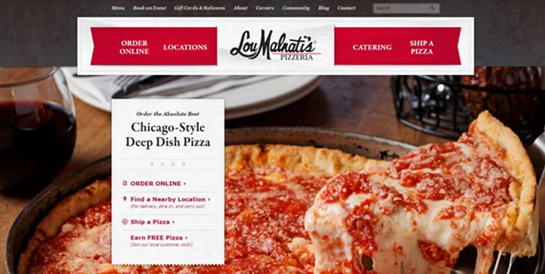
It goes without saying that visuals create the best impact on users visiting a website. That said, food photography is an art; it is the base of any food website and is a major contributor to its success. The food should look delicious, full of flavors, colorful, fresh and must make everyone drool. Every food brand must give a good amount of thinking to it. It’s not just the food, but its plating, cutlery, look and feel of the ambience, everything contributes.

Drooling-Pictures
LouMalnati’s

2. Delicious Colors

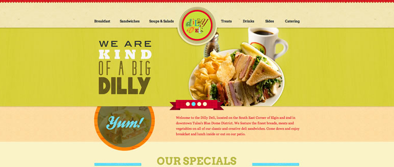
Yes! Colors can create an aura of taste and can easily make a food either look tasty or boring. Don’t be afraid of playing around with vibrant colors, however, don’t go too loud and over the top. A tried and tested trick of the book while selecting a background color is to sample colors from the food itself, and darken or lighten them; the food will look attractive. For typography, do the reverse (lighter or darker) than the background.

Delores-Custer
Delores Custer

3. Appetizing Content

Content is the king, and in every context. Enticing photographs and attractive colors may make a visitor inquisitive, but its the content which will eventually engage users. Users will be interested in what value proposition you have for them and how you can increase their knowledge while providing food for their thought and interests. Content is really important, but just because it’s important, don’t complicate it. Keep your content simple, fun, and in a light tone. After all, you’re talking about food, not a world crisis.

Appetizing-Content

4. Flavorful Typography

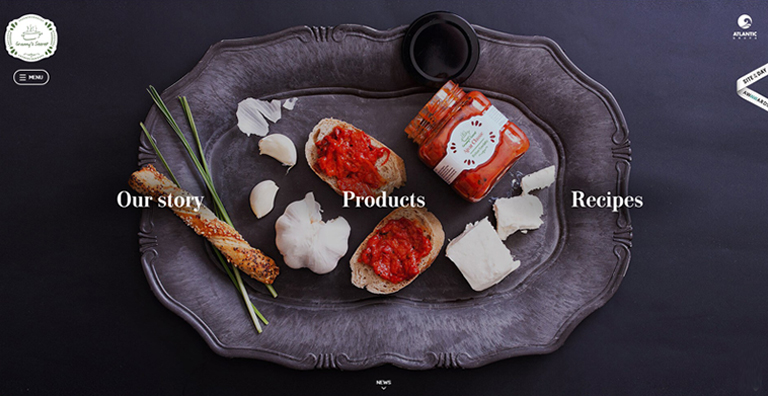
Your food fonts should be good enough to eat. Fonts should compliment your food photographs as well as the appetizing content that you have put on your website. Draw inspiration from restaurant menus, cookbooks, or recipe books. They are an ocean of knowledge as far as the fonts are concerned. Create a unique style between the headings, subheadings and base text to create a visually pleasing style.

Flavorful-Typography
Unio

5. Yummy Interface

An effective interface is pivotal for any website, and a food website is no exception. A simple yet persuasive user interface ensures that the user is not lost on the website at any given point in time and can carry out the desired purpose without any distractions. A good UI is an unsung hero; it swiftly elevates the user experience while working in the background. All functions must be crisp, clear, and intuitive. A user must be aware of how to perform a certain action and what would be the result of it.

Yummy-Interface

The food industry is growing by leaps and bounds, competition is increasing day-by-day. It is very important for a food business to give more thoughts on how they present themselves over the web, as the internet has now become the predominant way of interacting with any sort of business. Engage in a quick chat with our web design experts to know more on how you can elevate your business through effective web designing.