NYX Ditech

Categories
Technology

Android 9.0 Pie Launched: Features And Launch Date Revealed

Google has officially announced the launch of its latest Android 9.0 and has sweetly named it Android Pie. This latest version of the Android mobile operating system will not be available for all devices initially and will be rolled out to select smartphones only. One of the key features of the latest Android version is its shift towards artificial intelligence, which will enhance user experience on the operating system. The company has rolled out the Go edition of the OS specifically for smartphones with low-end specifications. A blog post from the company claims that the Go edition Android Pie will provide users with additional storage, faster boot times, better security, and many more improvements for entry-level smartphones.

In a quest to make your phone more personal, more efficient, and easier to use, Google has updated the Android 9.0 Pie with rich features, with subtle design improvements, helpful shortcuts, and a big focus on AI through adaptive settings. According to Google, Android 9.0 Pie will start rolling out to entry-level smartphones later this fall.

So which all devices will allow a free update to Android Pie?

Google Pixel 2
Google Pixel 2 XL
Google Pixel
Google Pixel XL
Essential Phone

Additionally, Android Pie will be available for below-mentioned mobile device makes from 21st December 2018:

Sony
Xiaomi
HMD Global
Oppo
Vivo
OnePlus
Android One phones (Select)

Let’s take a look at some of the key features of Android 9.0 :

Digital Wellbeing

Digital Wellbeing is Google’s initiative aimed at helping users understand whether they are spending too much time on mobile devices and if they need to adjust their behavior. The all-new dashboard is designed to help people analyze how much time they’re spending on each app. Also, there is an App Timer that sets limits on the time which a user spends on specific apps. If the limit is reached, users are locked out unless they override the function.

There’s also a Wind Down mode that fades the screen into greyscale during night time to help people sleep, while also initiating a Do Not Disturb mode to mute notifications before bedtime.

Adaptive Battery & Adaptive Brightness

Another interesting feature is the Adaptive battery which understands and deciphers apps’ functioning. This feature ensures that only essential apps are run, thereby saving a substantial amount of battery life. Based on apps’ consumption, artificial intelligence adjusts the brightness level of screen along with user preferences and environment.

App Slices

With Android 9.0 Pie, apps are bound to get faster. App Slices feature highlights relevant parts of your favorite apps by creating interactive snippets at different places. It displays information from apps directly within the Google search app, just like Google displays snippets of information in its web search results.

App Actions

App actions is another addition to Google’s AI-integration, which seeks to predict not only the app that you want at any particular moment, but an action from within that app too.

Improved Navigation

With a complete focus on navigation and user experience, Android 9.0 Pie features a single home button on the screen. This change is done keeping taller displays and higher aspect ratio in mind. On the lines of Apple iPhone X, Android Pie gives similar swipes and gestures for navigation.

Stringent Privacy Measures

Android 9.0 comes with robust security features to empower encryption of Android backups with a client-side secret. One of the key features is a biometric authentication prompt which enables consistent authentication throughout the Android ecosystem. Access to phone’s microphone, camera, or other sensors will be restricted when an app is idle in the background. Android 9.0 also brings vital improvements to protect web communications and offers private web surfing.

It’s certainly a happy news for the Android users and surely they will rejoice the feature, technology enhancements in the latest version. Moreover, it would rather be interesting to see how app developers mould and adapt to best utilise the features of Android Pie. Talk to our design experts to know more about it.

Categories
Design

Mid Year Round-Up of Latest UI Design Trends

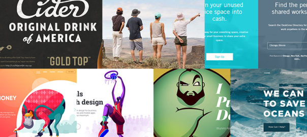
Half the year has gone by and we can say this was a pretty interesting year in terms of web designing, especially UI designs. A lot of new design trends surfaced, while a few faded away. Here’s a list of the hottest UI design trends which were highly popular by far in 2018.

Storytelling with Character Design

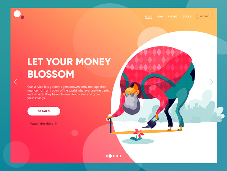
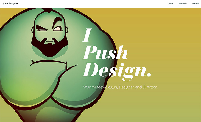
The trend of custom graphics has opened doors for personalization and developing personalized special characters. Character design for storytelling in the interfaces is swiftly gaining popularity. More and more websites and mobile apps turn to specially designed characters for storytelling, setting the tone, conveying messages or showcasing the benefits in a way that matches the mood and voice of the platform. The interactions are more human-like when original characters are involved and thus creates a strong visual association with the real world. Moreover, the characters make the page or screen compelling and vibrant.

Full-Screen Background Images

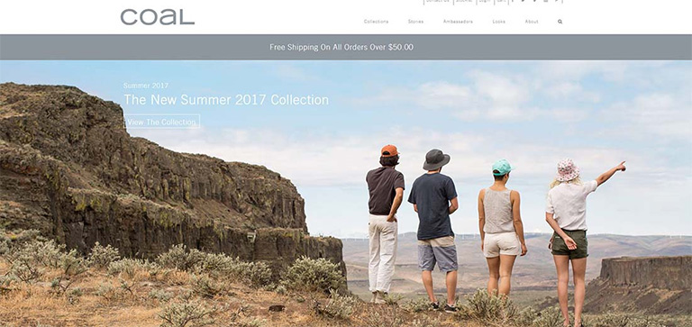
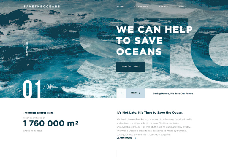
More and more websites have now started using full-screen background images, be it photos or specially rendered visualizations. Use of these images not only visually enhance the websites, it makes them emotionally appealing. It is the most effective way of captivating visitor’s attention and sets the tone for an ideal user experience even when the site is loading, in addition to boosting the UI. Only high-quality images must be used as background images; the recommended background image size is 1250×800 or anything higher than that but with the same proportions.

Custom Digital Illustrations

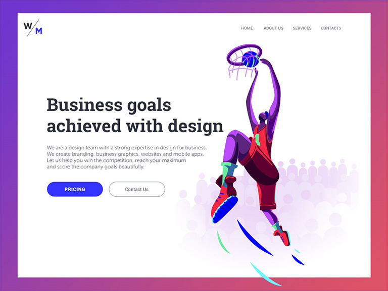
Some trends continue to be popular for years. Custom digital illustrations are one of them; its presence on the web and mobile user interfaces is increasing every day. Custom graphics effectively support the quick perception of information provided on the page or screen; they set a solid ground for originality. Custom mascots, icons, illustrations are some of the most common forms of custom graphics which designers use to enhance the look of a page or screen, as well as boost usability and intuitive navigation. Another growing trend is creating digital illustrations as title images for blog articles.

Hero Images

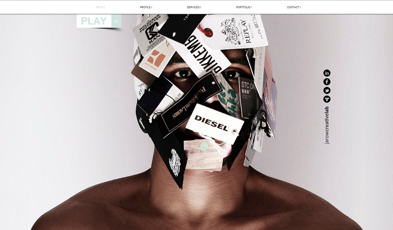
A hero image is the first, main photograph or graphic that you see at the top of a web page. Its primary objective is to grab immediate attention and show visitors what your site, content is all about. They are flashy, pretty and keep visitors engaged. Moreover, as well as any other striking graphics on web pages, this is a kind of content which is both informative and emotionally appealing. This might be the reason why designers often turn to this technique to add diversity to landing pages.

Split Screens

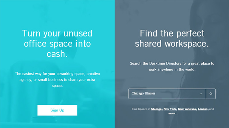
One of the hot trends of this year is the active usage of split screens in both web and mobile interfaces. However, this trend is not really a new one. We have noticed that it fades away, only to make a comeback in various spheres of design, and looking at the year so far, it’s safe to say that it’s definitely back and alive. Split screen approach is believed to be more effective in responsive designs as you can work around with different content variations without missing the consistency. Additionally, it offers liberty to designers to try different color combinations and experiments. Some websites even use split screens to show two options of equal importance.

Multiple Interactive Layers

UI designers never shy away from experimenting and infusing creativity in their designs to find new, interesting ways of making the web page interactive and highly engaging. One of the growing trends is applying several interactive layers that make scrolling experience and interactions look original. By playing around with the positioning of various items on the scroll, they create an amazing parallax effect that provides a deeply layered experience.

Bold Typography

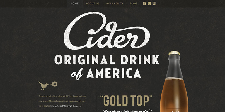
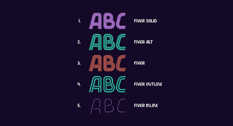
This UI trend has become very popular over the last few years and continues to do so in 2018. Bold and catchy typography can be seen all across the web and mobile layouts. In most cases, it becomes one of the key design elements and designers pay plenty of attention towards keeping it readable and scannable. Typographic hierarchy along with thoughtfully chosen fonts are among the core tasks of every UI design project.

Apart from these, there are many other UI design trends which have been the talk of the designer’s town. Share the ones you like in the comments section. Even better, talk to our design experts and know in-depth about the latest design trends.

Categories
Technology Web Design

Web Development Evolution Over the Years

Change is the only constant. With other things, web development has also witnessed an evolution comprising many changes over the years. New ideas and technologies have raised the industry standard of web development to a whole new level. In this article, we will highlight how web development has changed over the years and what’s the contrast between yesterday and today.

Many Visually Appealing Fonts Available

Rollback the clock, or ask designers from yesteryears, they will go on and on talking about how standard the fonts were those days. You only had a handful font style, patterns to play around with. Every second website looked more or less similar. There weren’t any multi-font graphics that are available today. Today, you can not only find almost any font you think of, but can even create your own font.

User experience is critical and therefore a lot of emphasis is given on customization of elements, including the fonts. Fonts customization has become fairly easy, owing to the readily available tools (both paid and free). You may think what’s the need of so many fonts to convey the message through the website? Well, it’s not just about the text or what the text is trying to communicate; it’s more about the overall user experience and how well the fonts settle with other design elements of the website to enhance the experience, look, feel of the website.

Many Visually Appealing Fonts Available

GIFs Have Replaced PNG and EPS

Low page loading time is a vital element for any website’s success. In the past, designers and developers were very reluctant to use high-quality images as their large size hampered the page loading time. Therefore they used low-quality, stock images. However, the time has changed and users now expect HD images. Best WordPress page builders understand the importance of images and offer many options for integrating them into your site seamlessly.

PNG offers a wide range of images, but you may still notice a low pixel resolution of images, especially while viewing in different resolution. This is where EPS images have come in to minimize the distortion. Being based on vector imaging, they eliminate distortion or bad resolution. Moreover, they quickly upload, since they are compressed. The GIF is seeing a comeback, and they are no longer restricted to funny cat memes, they hold more visual importance now and is one of the most effective formats for animation.

GIFs Have Replaced PNG and EPS

Social Media is Everywhere

We don’t really need to push on how drastically social media has grown during the past ten years and is now a crucial part of our lives. Facebooking is now an action, messaging someone is a typical part of a conversation and our websites understand the language because we have to be social on our websites. Plenty of viral and news content floating throughout sites and social media is a normal occurrence. The number of people accessing news on Twitter or Facebook before one of the popular news shows is almost double.

It’s imperative for every business to have a solid social media strategy in order to survive in today’s world. Integrating social media into a website is a regular step in today’s web development process. Developers work hard to help users navigate their way over to “like” and “follow.” Developers nowadays don’t even ask “Do you need to integrate social media channels into your website?” It’s given, an unwritten rule given the current scenario.

Social Media is Everywhere

Development Simplified, Good Content Gained Importance

You no longer need to be a coding ninja to develop a website. HTML is not as necessary these days as it was a decade ago. If you want to build a website, you can use a drag and drop page builder and have a website up and running quickly. It looks great and most of the time functions in line with visitors expectations.

Meta tags are still here, but the importance is less than what it used to be a decade ago. Search engines will still pay attention to your metadata, but if you look at how important it was ten years ago and how important it is now, you will notice a major difference. That said, high-quality organic content is much more important in the search engines than any data you type in.

Good Content Gained Importance

As the times continue to change, we have to change and adapt to make sure that we are not left behind with a website from yesteryears. There is no reason to not set yourself up for success with a stunning website with great functionality and the ability to give its users an experience they will want to repeat. Talk to Our experts and know how you can do that?

Categories
Blog Web Design

Best Way Of Using Search Option In Your Web Design

Often visitors find themselves in a clueless situation while trying to find particular information on a website; especially on a website with a lot of content. A search option comes to their rescue in this situation. Moreover, it acts as a crucial navigation tool and guides users to the intended information. Most of the websites offer a clearly visible search button on the homepage. Search button acts as an assistant to the users and thus needs to be designed properly. Without a well designed and easy to navigate search button, viewers won’t stick to your website and will simply bounce off. If your content is growing at a rapid pace, you surely need a search box, and make sure you design it good. Here are a few tips to keep in mind while designing and putting a search box to effective use.

1. Use The Universal Magnifying Glass Icon

When you are designing your search box, keep the familiar magnifying glass icon. This helps visitors to easily locate the search box. When viewers are trying to find some information or a product which they don’t find easily, you really don’t want them to put more efforts in looking for a search box. While looking for a search bar, natural instincts force them to look for a magnifying glass, as it is a universal search icon. Continue with the same icon because a majority of visitors, if not all, are familiar with the icon.

Magnifying Glass Icon

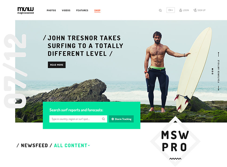
2. Search Bar Must Be Prominent

While displaying the search bar, ensure that the design is prominent so that it can be easily found. When answers are hard to find, your search bar needs to be available as a quick and easy solution. Not just the icon, but the text field should also be easily visible so that your viewers know where to ask their question. Placement of the search bar has been a matter of discussion among designers since ages. The truth of the matter is that it should be placed where the user expects it to be; which is either at upper right-hand corner or upper center section of the page. Top corners of the page are often where people expect it to be, as a lot of popular websites place it over there.

mswpro

courtesy:mswpro

3. A Submit Button Is Must

The search button on your website is like Google. The difference is that Google searches the query across the web, whereas search box looks for answers from your website. As a result, it should be reasonable for viewers to expect that by typing in a question, they have to submit their query by clicking on the ‘enter’ button. However, it does help to have a large submit button which shows your viewers what to do. It helps to make this area large so that viewers don’t have to click and point the mouse or tap a narrow area on a phone or tablet. Many viewers will click on ‘enter’ instead of submit. When designing your website, you can test that the enter button will work in order to produce the correct results.

4. Search Box On Every Page

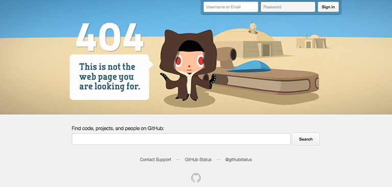
Placing a search box on every page increases the efficiency of your website. Visitors may get stuck on any of your web pages and at that time can easily navigate their way using the search option. They might reach to a web page from the home page using the search option, and they may even be happy with the content they find there, but they may wish to explore more. If there’s no search box on that web page, they will again get lost. Search bar should also be included on dead end links such as any 404 pages, so that your viewers will be able to find information they are looking for and return to your main site should they need to.

github

courtesy:github

5. Long Search Field

When your viewers type a query into your search field, you must have enough space there so that they can see what they are doing. This way, they will be able to review or edit their query. Ideally, your text box should allow 27 characters or more because most queries will be contained in this amount of space. Set your width using ems, or the size of one letter m. This will enable you to judge your space effectively. In order to save space, an expanding search field, which grows as the user types in a question, should be used.

courtesy:Cnet

6. Auto-Suggestions Enabled

Autosuggestion is a blessing for visitors who are typing their queries into the search box. It prompts them to quickly reach to what they are looking for. Framing queries is a tricky business and not everyone is good at it. If visitors don’t find any relevant answers to their query, it’s very hard for them to rephrase the question without being prompted. By using the auto-suggestion box, users are able to search for content effectively.
courtesy:Cnet

Conclusion

A search bar offers your viewers the opportunity to navigate your site quickly and efficiently in order to find the content they are searching for. This aids user experience and provide them with some sense of control. It should be bold and easy to find, so that the user is never confused about how to find information. User experience is a vital part of web designing and plays a pivotal role in the success of your website.  Our experts  are ready to guide you on how to design a UX rich website.

Categories
Web Design

Why Is Whitespace So Important In Web Designing?

The term whitespace is often perceived as white empty sidebars between which the content is squeezed. But that’s not the case. whitespace, also known as negative space is also the empty area around images or other elements on the web page in addition to the spacing between letters in your titles and text. Irrespective of the design style you follow, it is very important to include and use whitespace wisely to create a visual appeal. It may not eat a lot of your screen real estate, but surely makes your website look refined. Here are a few benefits of using whitespace in your design.

1. It Grabs Attention

We may get into a never-ending debate zeroing down on the best strategy to attract user attention online. However, one thing we all may agree on is to what doesn’t grab attention- emptiness, blank space, nothing. This simple fact helps in putting blank space to best use. whitespace can be used to draw and funnel attention to the important elements which you want to highlight.

Grabs-Attention

You may clutter a page with images and texts, and highlight the important page elements; you can choose to leave more space around vital images or even go for larger fonts to make them stand out. You can do this on your homepage, landing pages, portfolio pages, conversion funnels etc. Empty space around the key object eliminates distracting elements or clutter around it, thereby extracting all of user’s attention towards the object itself.

2. Demonstrates Visual Hierarchy

It’s very important to distinguish important elements from the ‘not so important’ ones. Mostly, this is done by playing around with the size of elements. In addition to the size of the elements, size of whitespace is also critical, especially from a design point of view. Vital elements have more whitespace around them and the size of whitespace keeps on decreasing with the importance level of elements. This establishes a visual order or visual hierarchy.

Demonstrates-Visual-Hierarchy

By implementing this hierarchy of visual priorities and effectively using whitespace, your design will exhibit a smooth visual flow that eliminates ambiguity. The viewer knows what’s important and where to go next. Landing pages are usually the best examples of this. There’s a large title with more whitespace than the text that will follow, and that test runs up till a large ‘Subscribe Now’, or ‘Buy Now’ button that has the most amount of whitespace around it.
3. Sets Groups Apart

A lot of minds think whitespace is really waste of space, but when used appropriately and wisely, it actually saves space. If you find yourself running out of screen real estate and still have a huge list of products, services, or anything else that you want your viewer’s attention towards, then you may end up placing items too close together. This will make items in that section appear to be similar and will not get the desired attention as they’ll blend in with the noise.

Sets-Groups-Apart

To rectify this, instead of highlighting your products, you just alter the size of them, change their layout and orientation, or combination of the two. This will create some whitespace between the objects, set them apart from each other, and make it easier for viewers to pick up on that.

4. Improves Readability

Whitespace is the backbone of text readability. You wouldn’t be able to read through this text if it was all crammed together with minimal spacing. Text looks all packed up and hard to read if you leave very little whitespace. That said, leave too much space and you end up wasting it. This is the reason why the world’s top designers emphasis so much on fonts and typography.
Different fonts employ different amounts of whitespace, depending on the font style. However, font size holds equal importance. Headings are larger and use more space in order to draw viewers’ attention. Some other areas that use whitespace to improve and enhance the reading experience include line spacing and paragraph margins.

If one has to describe whitespace in a poetic way, it could well be “a perfect amalgamation of art and science.” A scientific application of this art is required for the design to be effective. One can achieve beautification through simplification by effectively utilizing whitespace. Intrigued by learning this?  Talk to our experts to know more.

Categories
UX

7 Valuable UX Tips To Design A High-Converting Landing Page

A website can have a bunch of web pages, out of which, a landing page is the most important one. Majority of times, homepage of a website serves as a landing page. But, that’s not the case always. Any web page on which a user lands, through a search query (on search engines) or through paid campaigns etc. is a landing page. Over the last few years, many brands have begun to build their homepages following the same principles as they were targeted landing pages. The primary business goal of a landing page is conversion rate optimization (CRO). This article covers some UX design tips which can be used to create high-converting landing pages.

1. Turn Your Main Business Goal into a CTA

Often, landing pages want to achieve too much at the same time. This leave the visitors confused due to information overload and forces them to bounce off the page. Before you start the design of your landing page, ask yourself, what is your primary business goal? Is it to increase the number of downloads, get more beta testers, launch a new product, or to increase your newsletter sign ups? Once you find answer to that question, turn it into a call-to-action (CTA).

2. Clearly Cite The Main Benefit In The Headline

It’s so imperative to have a crisp, well-targeted, to the point headline to create a high-converting landing page. Try to highlight product benefits from users’ point of view, rather than from the company’s point of view. A headline can turn visitors into prospects only if it shows the product’s advantages from the user’s point of view.
3. Offer An Insight On How The Product Works
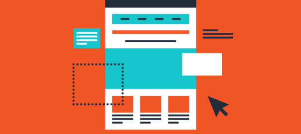
People often believe in what they see. Showing visually, how a product works, entice users to consider a purchase. For illustrations, its advised to use a header image. Header images, are full-width images residing above the fold and serving as background for the headline, sometimes a short description, and the call-to-action button(s).

4. Use Unique Graphics And Layouts

Unique graphics or unusual layouts serve the same purpose. They intend to make the page stand out of the crowd and create a lasting impression on the viewer. You would have come across a number of different ways web designers put unique graphics to use. Hand-drawn product photos, custom icon sets, well-crafted characters representing the users or the creators, and even comic strips.

5. Use Data or Statistics

A lot of designers these days use numeric data on web pages to enhance the user experience. The average time spent by the user on a web page is less than a minute. That’s why it becomes critical to provide them the best and most impactful info firsthand. Showing users data visually, by either featuring numbers or percentages and including graphs or charts in the design, can help you gain their trust.

6. Make Chat & Contact Easily Available
If you want to achieve high conversion rates, your landing page also needs to offer customer service so that visitors can get answers to their questions. Whether you provide them with an email form, a live chatbot, or a direct call button, the most important thing is that the contact option must always be highly visible and easily accessible.

7. Repeat the CTA at the Bottom of the Page

Repeating the call to action at various locations of the landing page is a well-known marketing technique. The call to action with a headline, short description, and recognizable button must always be shown above the fold. A lot of designers choose to repeat the button in the sticky header, to enhance visibility when the user scrolls down the page. However, if you have a long scroll landing page it’s probably even a better idea to repeat the CTA at the bottom of the page.

Following these steps will boost the on-page time and conversion ratio while reducing the bounce rate.  Talk to our experts to learn other website design and development tricks.

Categories
UX

5 UX Rules Every Startup Must Recognize

Anyone who’s familiar with best practices in design fields knows how important it is to commit time and resources to UX development. But tech startups tend to spring up almost from nowhere, boosted by programmers who may not have a great understanding of the importance of user experience. The result – UX designs that confuse, infuriate, and ultimately leads to tons of questions. Here are 5 UX rules that are the most important for tech startups to recognize as early as possible in the development process.

Rule 1: Let Go the Vanity Designs

Your back-end tech ideas may be wholly revolutionary, but it doesn’t mean that any design you come up with is automatically fit for purpose. The only opinions that really matter when it comes to UX are those of the users, and they don’t usually leave much room for vanity design. Every designer thinks he knows a lot. But don’t try to reinvent the wheel. Unless you have an incredibly compelling justification, adhere to existing UX standards, and give your users something recognizable instead of something revolutionary (familiarity beats novelty). Being creative is fun bit don’t try and over do it.

Rule 2: User Psychology is Key

Content is king is the common belief, but that isn’t really true. User psychology is king. Content is just one way of affecting it, and UX is another. In fact, top UX designers are masters of psychology, carefully studying how and why users take particular actions.

Startups can easily get stuck in an infinity loop when it comes to psychology, imagining one type of end user and getting trapped by their perspective. People are more complex than that. Users will vary in countless ways. You can’t account for them all, but you can do a good deal of research and come up with general personas that cover most of your target audience (try using a guide on how to create personas).

Rule 3: KISS (Keep It Simple, Stupid)

The best user experiences are streamlined, trimmed down for speed and efficiency. You might think this simply calls for compressing images, using clear language, and avoiding unnecessary data entry, but there’s almost always more to be done.

When prototyping a UX, you should cast an eye over every single element; every image, CTA, paragraph, button, or piece of styling and after careful review, ask “Is this really necessary?”. If you get rid of it, does the end user lose anything of significance? Will they find it harder to achieve their goal, or like the site any less? If an element doesn’t justify its presence, scrap it. Smooth out the friction. A simple design is easier to demonstrate, understand, run, and maintain.

Rule 4: Maintain Consistency

Some layouts can be extremely confusing, with variable design elements and unclear contextual clues. That’s why making your UX design consistent across every aspect of the project is essential. Think about basic visual elements like icons. We don’t really pay that much attention to them when they’re used correctly, but they glaringly stand out when they’re used poorly.

You can get a solid idea of what you can and can’t play within a layout by taking one look at the themes. Change the colors? No problem. Change the font? Also fine. Alter the icons or the basic navigation? Not the best idea. Get it slightly wrong and users will have no idea what’s happening. You don’t want to make your users think.

Rule 5: Get Rid Of Lorem Ipsum

At some point in UX design history, someone decided that creating layouts and populating them with fake text (usually Lorem Ipsum) was a good idea. It really isn’t, and the sooner you get out of the habit of using empty copy, the better off you’ll be. At the very least, this is because text is a core component of UX. It steers people away from certain areas and towards others, and has a knock-on effect on how the rest of the interface is perceived. Iterating upon copy is just as important as iterating upon any other UX element.

UX can seem like a distant concern for a tech startup focusing on functionality and scaling, but where there’s software of any kind, there’s a demand for great UX that cannot be overlooked talk to our UX experts and discuss your requirements.

Categories
Technology

Top 5 Speakers Equipped With Alexa

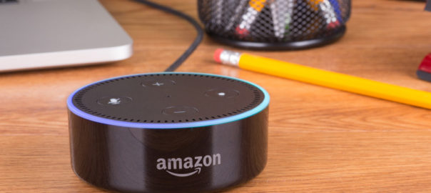
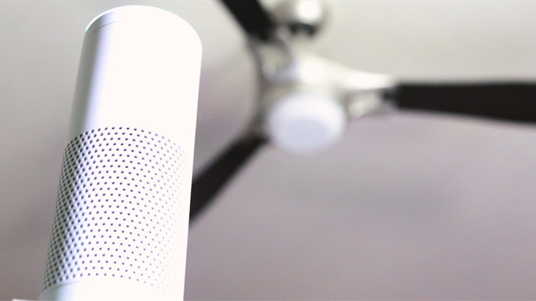
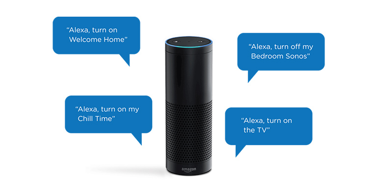
Since Amazon has launched Alexa, it has been the talk of the town. It can smartly control all the smart home products, answer any questions you may have and play your favourite music as well. All of this can be done through the Amazon Echo speaker, however, Echo is not the best in the business when it comes to playing music.

Since Amazon opened its technology behind Alexa for everyone, several manufacturers have embraced Alexa and installed her in their own devices. The majority of them fall under the speaker category.

Here’s a list of top 5 speakers other than Amazon Echo which are equipped with Alexa and produce amazing sound.

1. KitSound Voice One

The KitSound Voice One is essentially an Amazon Echo, but with some serious audio grunt. It has been developed in collaboration with Amazon, to allow full Alexa experience. KitSound Voice One can answer questions, play music from various sources and control smart home devices. Also, It can hear you speak from the other side of the room and up to eight Voice One speakers can be connected together for multi-room playback.KitSound

2. Libratone Zipp

The Libratone Zipp is a portable speaker with interchangeable jackets and has an amazing sound output. Sound is produced 360-degrees and the overall profile can be adjusted using the companion app. The latest version has been updated to support Amazon Alexa as well, which means you can shoot commands at it, to change the music that’s playing, or turn your kitchen lights off. You can take Libratone Zipp on the go as well as it’s totally portable.

Libratone Zipp

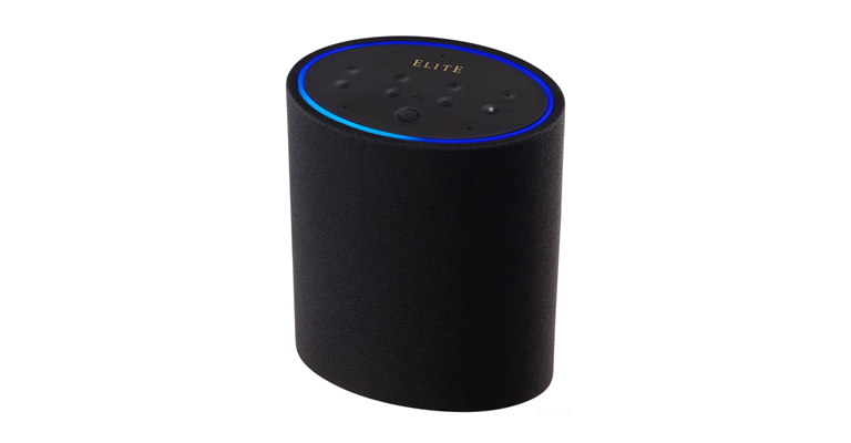
3. Onkyo P3

The Onkyo P3 was first shown off at IFA 2017 and is now available to buy. With dual full-range drivers, dual passive bass radiators and DSP switching amplification, the Onkyo P3 has some serious sound power. With complete Alexa support, it is a great alternative to the Amazon Echo.

OnkyoP3

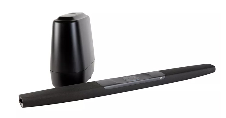
4. Polk Audio Command Bar

American audio manufacturer Polk Audio claim’s the title for world’s first soundbar with Alexa built in with the Command Bar. It essentially merges an Echo Dot with a full-fledged soundbar. That means the Command Bar can do anything which a Echo Dot can do, including controlling smart home products as well as source input, volume and bass levels.

Polk Audio Command Bar

Although it is set up for movies and TV shows first, it does great while playing music as well, which makes it a viable Echo alternative. It comes fitted with 1.25 x 3.25-inch full-range drivers, two 1-inch tweeters and ported wireless 6.5-inch subwoofer which are capable of producing loud and clear sound, thanks to the Polk’s Voice Adjust technology

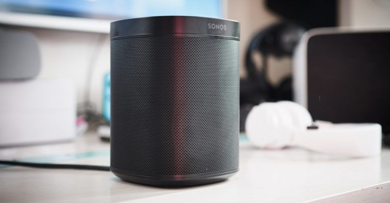
5. Sonos One

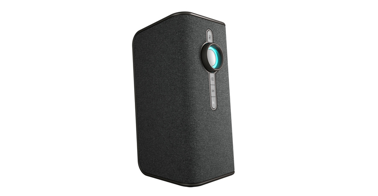
If you want one of the best sounding speakers around, with multi-room capabilities and Alexa built-in, look no further. Sonos has made a powerful entry in the Alexa-enabled speaker market with the Sonos One. Later this year it will also offer Google Assistant, making it one of the most capable smart speakers around. It sounds fantastic and looks very attractive. It has the same design as the Play:1 except for on the top where there is a new control panel in place of the volume button on the Play:1

Sonos One

As soon as Amazon allowed the world to use the technology behind Alexa, a large number of companies included it into their products and posed a competition against Amazon’s own product equipped with Alexa. Only time will tell if it was a good move by the company. For more info on Alexa and the technology behind it, talk to our experts.

Categories
Technology

Alexa, What’s The Technology Behind You?

It was the early 90’s when speech recognition first took off with significant DARPA funding being invested in various research projects conducted by the top universities. However, the data available at that time was simply not sufficient for the technology to grow on. But that changed over the last decade due to substantial digital advancements that led to the availability of data at hand to train models. The biggest milestone achieved in the sphere of voice recognition technology is the Amazon Alexa that has used extremely complex machine learning processes to revolutionize the way we conduct everyday tasks.

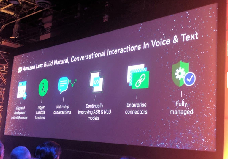
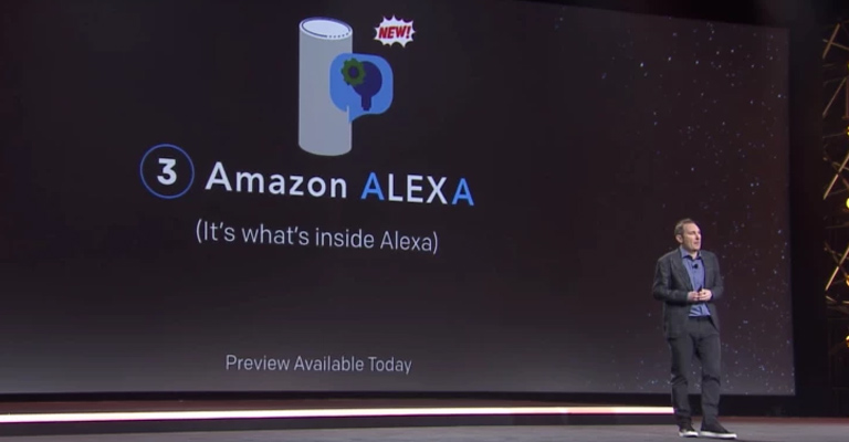
Last year, Amazon opened up its technology behind Alexa, called the Lex. The system combines natural language understanding technology with automatic speech recognition and can be used by developers who want to build their own conversational applications like a chatbot. According to Amazon, the technology can be used to serve a variety of purposes especially web and mobile applications.

alexa-voice-text
image:techcrunch.com

So How Does This Technology Works?

1. Signalling Process

It all starts with the signal processing. This allows the device to make sense of the audio input by cleaning the signal. It’s one of the most crucial challenges in far-field audio. The primary objective is to recognise the target signal which can only be done by first identifying and minimizing ambient noises like the TV or the dishwasher. These issues are handled through beamforming which uses seven microphones to identify the source of the signal so that the device can focus on it. Moreover, acoustic echo cancellation knows when it’s playing and can eliminate that signal so only the important signal is left.

alexa-signalling-process

2. Wake Word Detection

Once the signalling is done the next task is Wake Word Detection. It determines if the user has said one of the words for which the device is programmed to turn on, such as ‘Alexa’. This is very important as voice commands could be picked from conversations around and may result in accidental purchases and angry customers. Furthermore, it needs to identify pronunciation differences as well and that too with limited CPU power and everything needs to be quick, so it requires high accuracy and low latency.

alexa-word-detection

3. Audio To Text Conversion

If the wake word is detected, the signal is then sent to the speech recognition software in the cloud. Here the audio is converted into text format. This process is performed by converting a binary classification problem into a sequence-to-sequence problem. It needs to browse through all the words in the English language to determine the input and produce the desired output. That’s huge, and the cloud is the only technology capable of scaling it sufficiently. The input is not a one-word query. It can be any possible question and therefore you need the context of it.

alexa-conversion

4. Natural Language Understanding (NLU)

Natural Language Understanding (NLU) is used to convert text into a meaningful representation. So, let’s say you ask for the weather in New York. Here, the intent would be weather and New York. But, the problem pops up with cross-domain intent classification. For example, if someone said ‘play remind me’, this is very different to remind me to go play. However, it could easily be misinterpreted. Additionally, there are a lot of commonly used words which sound the same but has completely different meanings. Like ‘BY’ can be misinterpreted as ‘BUY’ leading to unwanted consequences. Out-of-domain utterances are also eliminated at this stage if they don’t make any sense. This prevents the device from mistakenly hearing commands from televisions and the likes.

alexa-naturalimage:techcrunch.com

Researchers are working constantly to improve the speech recognition software. Further improvements will see Alexa better hold a conversation, remember what a person has said previously, and applying that knowledge to consequent interactions. Get into a discussion with our technology experts and analyse the future of Alexa.

Categories
Web Design

Should It Be Content Or Design First?

Designing a website is an entire process and needs proper planning. The key element during planning is to decide the course of events and order of events. Amongst these decisions, the most critical and tricky one is to decide whether the content should be written first and the design should follow it or vice versa.

With advancements in technology and evolution of new design trends, a lot of new design elements have surfaced. Swirly animations, smooth java, embedded flash plug-ins, parallax scrolling, white space usage, customized fonts and shades, there’s a lot on the plate of a designer to beautify a website. That said, even the most alluring websites will not succeed if an equally enticing content doesn’t compliment it. There are quite a few challenges in creating content based on a ready design. The question ‘whether design should be decided first or the content?’ is a tricky one. Although, we feel that deciding content first and framing a design based on that is a better practice because of the following reasons:

Content Will Go Heywire With A Pre-Decided Design

A lot of designers start browsing through umpteen web design templates right from the word go and select a template which looks the most attractive. However, this poses a big challenge for content developers as they need to frame and twist the content according to the template and its categories. This is a bad practice and will result in negative business consequences.

Content First Speeds Up Production

Deciding a copy for a website is a tedious process and takes substantial time. Moreover, there’s hardly a chance that the initial copy will turn into a final copy. The designer will have his own inputs about the type and amount of content in certain sections plus the use of specific words, which means a lot of revisions. The production and launch will be delayed if the design is finalized before the content due to the revisions until the best copy is created. Now imagine, what if the content is worked on before the design? The launch process will speed up as finalizing a design based on the approved content will comparatively take lesser time.

SpinningThe Design Based On The Content Is Much Easier

It really becomes difficult for designers to visualize and implement a design with no content available. If the designers have a copy available, they can start developing design templates to fit to the tone of the content. Furthermore, there’s every reason for the content team to take a headstart. Moulding the design based on content will be easier and appealing as compared to go the other way round.

Design Is Expensive

It’s not a great idea to start designing without content in your hand. It can cost you a fortune. The initial design might look all fancy and attractive. But, if you analyse the costing for it, it won’t come out frugal. It’s possible that your’s is a content-heavy website and there might not be room for already implemented fancy filters or distractions. Alternatively, your content might be very simple and was depending on the design to uplift it. But, the final design may be as minimalistic as the content, making it very ordinary.

Content Hooks a Visitor

Surely the design may be important to attract viewers during the initial phase but it’s the content that hooks them. The design will elevate the overall user experience if it’s framed on the basis of the content. That’s because both will be speaking the same language and tone. This will result in more on-page time and a lower bounce rate.

These points highlight the importance of a content-first approach and how it’s beneficial to the success of a website. However, there are a lot of theories which favour the opposite approach. You can contact and discuss this at length with our design experts for a better understanding.