Globalisation and internationalism have been boosted with the advent and growth of the Internet. The reach of traditional marketing mediums is often restricted to a particular geography. However, websites, on the other hand, have an extended reach and cater to a much broader audience across different geographies. Therefore, it becomes pivotal to design and develop a website which works well across the globe.
Going Global is the ‘Need of the Hour’
Growing globalism has pushed businesses to constantly look for new markets around the world. What could be a better and effective way to globally market a business than the Internet. It’s the best medium for a business to advertise and promote its products or services. This fact has become obvious for most of the businesses. They understand that a website designed with an international flavour will only boost their global brand presence. However, still there are a lot of companies which are hesitant to embrace this change. Well, web designers can help these businesses extend their reach beyond a localized clientele.
In order to tap global markets, it’s important for your website to be internationally understood. Apart from in-depth research of target markets, there are a bunch of other things which play a crucial role in helping a website reach its full potential. Most important ones amongst them are a proper navigation strategy, website design, the right tools, suitable images and localised web content. Here are a few tips to infuse internationalism in your web designs.
1. A Globalized Visual Style
The visual design of your website plays an important role in determining its success. It’s really necessary to give deep thought to the visual style of your designs and the impact that they make on international audiences. In order to make your website internationally acceptable, thoroughly review the entire website design. People from different geographies, nationalities and cultural backgrounds will have different ways of perceiving visual information, and the same goes for a website’s design.
One of the ways to handle this is to develop one single corporate theme and adapt it to different countries/regions. Keep the branding uniform in the design, but slightly tweak the layout, language, and content from one site to another. This is a time-saving method because you just have to design one encompassing “brand” for the site. But, be careful of not going out too loud. You should try to keep the colors and design of the website subtle and basic. A basic and less complicated design is easier to be consumed by almost everyone around the world.
The second way is to design completely different websites for different regions or cultures. This is quite a time-consuming process. Although, it will enable you to put your message across to different people of the world in a much more targeted way. If you go ahead with this approach, you will need to divide the world into different segments – cultural division, country-wise division, regional division or continental division. Irrespective of the kind of division you choose, there should be a fair bit of research behind it.
2. A Global Design, But With Local Content
Regardless of whether you opt for a common design for all the regions of the world or make a different design for specific area’s target audience, the written text or the content of the website should always be localized for better comprehension. The tone and style of marketing material change considerably between cultures. Even if a design stays the same from one country to the next, the content will ideally shift in terms of language and tone.
Writing effective website content for a particular demographic requires in-depth knowledge of different cultures of the target audience. Therefore, if you want to create a localised version of your website, it’s best that you hire a local professional copywriter and translator to develop effective content.
3. Strategic Navigation
Navigation is another important element that influences the effectiveness and overall user experience of your website. Navigation will play a critical role in ensuring that your website is understood properly across geographies. Give special attention to reading preferences of different cultures. Ensure that your site is navigable for languages that read both left-to-right and right-to-left. Requesting users to specify their language at the very first interaction, via a simple navigation system, is a good start. You can install a horizontal navigation bar, rather than a vertical one, to eliminate the need of moving your navigation bar from one side to the other. Also, you can go with symmetrical web design, so that if the script on your page is flipped, it won’t knock down everything else. Better navigation means a better understanding of your website.
4. Relevant Images
Images and other visual elements play a vital role in attracting the viewer to your website. It is important to make sure that the images on your website are relevant to your target audience. While bringing internationalism in your business website, keep a few things under consideration when choosing images for it. Avoid images that are considered offensive by conservative cultures. Also, when using images with the human element in it, make sure that the people displayed should belong to the same race, country or region you are targeting at. Jewish people posing on a Chinese website makes no sense at all. Localization practices are followed by several multi-national companies in the world. If you want to go for a universally accessible website, it is advisable to use general images, not specific to any culture. But don’t blatantly bombard visitors with stock photos; it will kill the connect and authenticity.
5. Country Specific Keywords
No matter how hard you try and how good you implement these tips, it will all go down the drain if your website does not rank well in search results. Keywords are the most important words on the Internet. They not only enable users to find exactly what they want, but they also allow website managers to provide the users exactly what they have to offer. When adapting your website for a foreign country or region, give special attention to the keywords.
In order to manage keywords for different demographics of the world, create a list of the keywords you use on your English language website. Get them translated by a professional linguist belonging to the target country. They can even suggest alternative keywords or variations of keywords that are more likely to work in that particular region. Make sure that you compare your keywords with what Internet traffic stats say by using a tool like Google Analytics.
Spread your business across the globe by implementing these tips on your website. There are many other techniques which can help you in the process. Talk to our experts and know more about it.


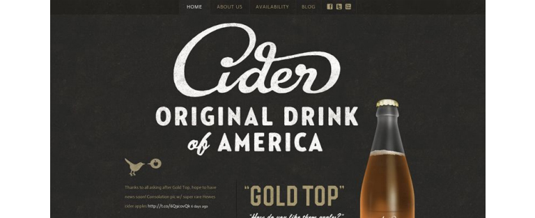
 source:Mclaren
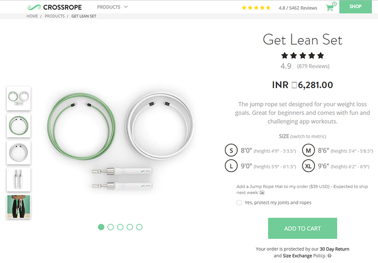
 source:Telegraph
 source:Wallmob
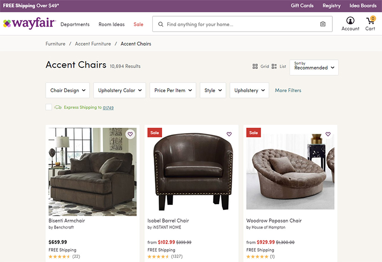
 source: square