NYX Ditech

Categories
UX

5 UX mistakes That Can Kill Your Content

A great website is a mix of many things. You need to have a good design, awesome content and not to forget, a bit of luck too. While it all sounds pretty straightforward and obvious, a project can easily turn into something unexpected if not shabby. Here are 5 very common UX mistakes which can easily sidetrack a customer’s interest and ruin the intended actions of the interface:

Inconsistent alignment

A lot of people argue about which type of alignment is best from a design perspective. To be honest they have their own merits. The key is not the type of alignment, but the consistency in alignment. All the elements and types must fit properly within the grid. Also, there shouldn’t be any broken corners.

A poor alignment kills the visual flow and customer can’t easily move from one element to another of the design. An inconsistent alignment may easily push customers to miss out on the most important content.

Incomprehensible Typography

It’s a common practice these days to play around with fonts. A lot of bold typefaces are used these days. There isn’t anything wrong in that, but sometimes while going down this path people end up with unreadable content. I mean what’s the point if people can’t even read it.

There is a great possibility that a few characters and words might look good in a particular typeface while others may look really weird. Understand the content and see if the content has those kinds of characters. Another important thing to remember is that a fancy typography best works with lesser content. It’s better to stick with the most commonly used typography.
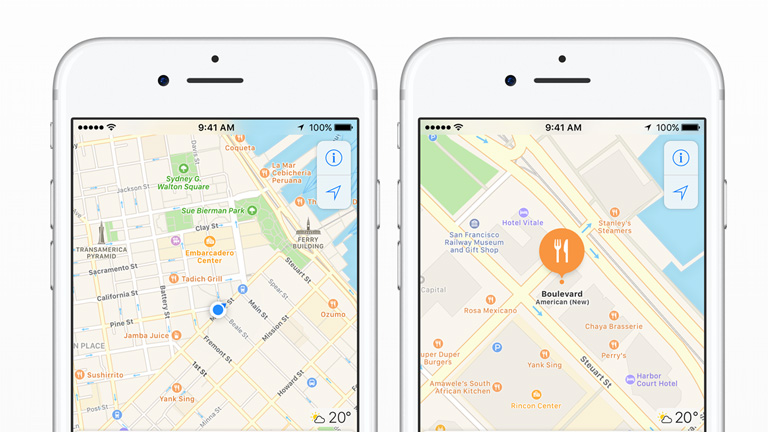
Poor Imagery

Imagery plays a very important role in terms of user experience. The images must always compliment your content. Poor or unrelated images will leave your customers confused and disinterested. Uninteresting images will overshadow the core content. Don’t use silly/unrealistic stock images, poor quality images, low resolution, and out of focus images. Audit your website and identify images that fall under any aforementioned NO NOs. You can simply remove these images without replacements unless you have a related one.

Crazy Colors

In an urge to create something unique and enticing, a lot of designers throw almost all the available colors in the palette. You might find some successful multicolored designs, but for every one such design there would be 100 failed designs. Too many colors hide the content and distract customers.

Select a very strong color palette. Start with a couple of dominant colors followed by secondary colors. If you wish to play around a bit, use shades and tints of same color.

Creating A Dead End

Even if you may have come up with the greatest of the designs for your landing page, it all goes in vain if the user finds himself asking himself what to do next?
The intention is to make the customer touch base with maximum amount of content.

Every page of the design must include the call to action option. Users should be able to easily interpret the objective of every page. Attractive icons/tabs should be used to entice customers into clicking on them. Crisp user instructions can also come in handy.

Sometimes smallest of the mistakes can be deal breakers. There are a plenty of other UX mistakes which prove fatal for the content. Talk to our design experts who understand the importance of minute UX design details and get a perfect web design.

Categories
Brand & Identity

Here’s The Essential Guide For Your Startup Business Branding

We are living in an era of startups. Every second person in today’s world either has his own startup or else dreaming of having one. It starts with an idea which shapes into a business model which eventually lays the foundation of a company. There are plenty of things involved in the whole process. The idea, planning, execution, market study, competitor analysis and the list just goes on and on. Startup owners have so much stuff on their plates that they often neglect one of the most important topic – Branding. In this article, we will highlight some important guidelines for your startup business branding.

It’s very important that you get your branding correct right from the start. How you brand your business will set your image in a customer’s mind. But, Mind it, it’s a one-way road without looking back. Once the image is set, it’s very challenging to change it.

Half The Game Is In The Name

Zeroing on a name for your company is a very crucial, tiresome, and time-consuming process. It takes a lot of efforts and time to come up with the perfect name but, the wait is surely worth it. Customers start judging your business and your company the moment they hear the name of your company. A non-impactful or bad name might lead customers into falsely judging your company even before knowing what you do and other important details.

An effective name will assure a distinct and rock-solid place in the market. It helps in distinguishing yourself as a company and conveying your business vision along with creativity. A strong and impactful name can be the difference maker in being just another firm or a category-defining iconic brand.

Maintain An Impressive Visual Identity

If you underestimate the effect of a brand’s visual components on people, then you’re calling trouble. We always hear sayings like “Never judge a book by its cover” but let’s be honest, an attractive cover will always grab more eyeballs. It helps in getting noticed by people which will eventually lead to a long term business relationship. Logos, business cards, color schemes, graphics, taglines, fonts and many other visual components need super attention.

It can easily communicate your intended message to the customers. If the design is used in an efficient manner, it instantly communicates your business values- Trust, strength, innovation, creativity, luxury, value for money or anything your brand identity stands for.

Differentiate Yourself Through Branding

It’s a rare possibility that you won’t face any competition while running a business. Even if you are the first one to start any kind of business, competition will crop up in no time. It’s very important to differentiate yourself from all the other companies in the same business. Use your branding to create that difference. If properly done, your branding can make a huge difference in cutting through the clutter and placing you above your competitors.

Develop A Brand Personality

A lot of businesses fail to understand the importance of building a brand personality. Their websites look boring filled with all unnecessary jargons, words from the founder etc. These tend to repel customers and many times there is stuff on websites which totally confuses them. Irrespective of the business or the industry, everyone needs a brand personality. A brand personality should be designed carefully, thoughtfully and must be executed properly.

It might take more than one go to find the best brand personality but the effort is definitely recommended. Try out different methods until you hit the bull’s eye.

There are a lot of commitments to fulfill in the initial period when you’re planning to launch your startup or just started it. It’s very much possible that you forget about important aspects like your branding requirements. Share your vision and business objectives with our branding experts and fulfill all your branding requirements.

Categories
UX Web Design

5 Tips For Creating A Familiar and Intuitive UI

Barge into a conversation between two designers and it’s inevitable that you will come across the term Intuitive User Interface in most part of their conversation. The term is so buzzing within the designers across the globe, it has almost become an adjective to a design project. Intuitive UI sits right on pinnacle of the pyramid of essentials for any design job. But, even if everyone is talking about it, do we really understand what it is?

What is Intuitive UI?

A user interface can be termed as intuitive when users understand its behavior and result without any assistance, experimentation, reasoning, or special training.
Let me put this in a layman’s term. Say if you see something on a web page that looks like a button, you immediately know that you can click on it. Similarly, if you see any link on the website, you know that it will result in opening of an external or internal link/web page.

A non-intuitive design is one which pushes a user into an unfamiliar situation and diverts his focus which leads to non-completion of the desired task.

So HOW do you create a Familiar and Intuitive UI?

Here are a few tips:

1. Avoid New Patterns

As humans, we are very reluctant to any kind of a change. We never like changes in our set patterns. People who have migrated from Mac to Windows or vice versa can totally co-relate to this fact. The Minimise, Maximise and Close options are on the left side in Mac OS whereas they are on the right side in Windows OS. We are used to certain patterns, and a change is just not user-friendly.

2. Minimum Steps Involved In Completion Of A Task

No one is ever interested in providing their life history just to complete the signup process. The signup process must be lesser than a minute, ideally 30 seconds. Thus the unnecessary steps involved must be eliminated. That’s the reason why almost every website provides an option to signup through Facebook to cut down on the steps involved.

3. Consistency Is The Key

Every soul browsing the internet is inquisitive as well as highly impatient. A slight distraction can easily erk them and lead to bounce away from your web page. That calls for an utmost focus on creating consistency across all your web pages. A user has certain defined expectations when he browses your website. If there is a change in the expectation, it only causes distraction and frustration.

Flipping between using a sidebar with navigation links to a top navigation bar on another page is a perfect example of causing needless distractions and frustration. This will only add to your website’s bounce rate.

4. Use Integrated Help Messages And Tooltips

No matter how hard you try and even achieve a spectacular UI, it’s almost impossible to create a universal UI. Some users may find your UI intuitive while others might beg to differ. To counter this, use integrated help messages and tooltips that act as a guide for users, educating them how the website works. The assistance is provided on a real time basis which saves a lot of time and makes the user experience smooth, clear and effective.

5. Page Load Time Should Be Minimum

No one likes to wait for a web page to load. It’s imperative that your web page loads quickly, else there are high possibilities that the user will simply close your web page and even would not consider coming back ever again. If you have heavy web pages, it is advised to display some part of the content or at least a loading bar to keep a user on the page.

A website that has a lot of distraction and confusing elements will never be intuitive. It is very important to focus on intuitive design along with core design factors like perfect color scheme or content structure. Your visitors are bound to move to a competition if you don’t offer an intuitive UI that is easy to understand and helps in completion of planned tasks.

Get in touch with our design experts to satisfy all your design needs.

Categories
UX

5 UX Trends and Mobile Designs To Boost Conversions In 2017

With great hopes and expectations, we warmly welcomed 2017. Every year is an opportunity to explore new realms in the sphere of technology and innovation. A lot of new design trends will swamp the designers this year as well. As a designer, it is a merry situation with so many options available at disposal. But, will any of these trends have a meaningful impact on the overall user experience and conversions. In this article, we will cover 5 UX trends and mobile designs which will ensure a better conversion in 2017.

1. Age Responsive Design

Let’s face it. You can’t serve the same dish to everyone. Audience from different age group will react differently to different content, layouts and aesthetics. With an availability of new kind of metadatas you can tweak the user experience based on their perceived age. It raises your chances to connect with your audience when and where it counts the most.

2. Shopping Cart Marketing

Did you know? Upsells and cross-sells are responsible for up to 30% of the overall eCommerce revenues. It is almost 10 times difficult to sell to a new customer as compared to converting a sale by upselling to an existing customer. By providing bundled offers, cross-sell offers and upselling options during checkout you can substantially increase your revenues.

3. Lively Call-To-Action Buttons

The CTA button is the star of any web page. It needs to be always placed at the best position on the web page. But that’s not all about it. By adding a slight animation to the button you can instantly draw attention. Having said that, avoid doing something over the top fancy. Subtle movements every few seconds works well and are highly recommended.

4. Persuader NOT Explainer Videos

Animated explanatory videos were the IN thing a few years ago. But its heydey is more than over and videos showcasing real people have made its way. By using real people in your videos you create a sense of authenticity. With the use of customer testimonials and product demos, you can easily overcome all sorts of customer apprehensions, objections and successfully close the sale.

5. Value Based Exit Overlays

We all can admit that when we’re ready to leave a site, and a pop-up appears on the screen, it’s really annoying at times. You are not in any mood to fill out a form and leave your details like email address, phone number etc. Unless you’re Really Really interested. How about an exciting bonus? A discount, freebies, free shipping, or any other gift will definitely grab your attention. Provided it has no catch to get you signed up for future marketing. These kind of offers are highly attractive and increase conversions.

Plenty of other design tricks and UX trends are bound to rule the charts in 2017. It’s not important just to know these trends, but to understand how these tricks and trends can be fit into your design structure to boost your conversions. Contact our design experts today and start a path-breaking discussion.

Categories
Blog

iPhone Turned 10 This Week. This Is How iPhone Completely Changed The World

Something very special happened on Jan 9, 2007, which engraved this date in the history books forever. Apple CEO Steve Jobs introduced iPhone that went on to change the world. Nokia was leading the mobile phone markets until 2007 and was all set to launch Windows Vista back then. Little did they know that this newbie from Apple will put Nokia and others to bed. As iPhone turned 10 this week, here is how iPhone has completely transformed the way we live.

1. On the Go 24 X 7

There were days when connecting to the internet was a daunting task. Switch on your computer, connect to the WiFi, open the browser and then connect. iPhone led the revolutionization of mobile internet which was followed by other manufacturers soon. People were connected to the internet all the time without any hassles through their WiFi network or cellular network. For the first time, use of the internet was not painful but useful.

2. Boost To The Aftermarket Mobile Accessories Market

The mobile related accessories before iPhone were fairly limited to an earphone and a mobile cover. iPhone brought in a lot of other complimentary products along. iPad which was a bigger version of iPhone for use at home or an Apple watch which is tethered to the iPhone. To add to it, there are a whole bunch of accessories which incited by the popularity of iPhone. Bluetooth speakers, charging docks, headphones, mobile cases and what not.

The mobile accessories market is growing at a rapid pace and shows no sign of slowing down.

3. Now Everyone is a PapaRazzo

Mobile cameras were a known concept even before iPhone. But, when iPhone was released it completely changed the mindset of users and added a new dimension to mobile photography. iPhone’s ease of internet connectivity and apps like Instagram shook the photographer inside every other person. Dragging the actual camera around faded out as a trend.

iPhone Camera
P.C. : macworld.com

4. Fingers Became The New Pointing Devices

Touchscreens were not really popular back in 2007. However, 10 years from then we are swiping and making hand gestures around literally everything. From mobiles to even smart refrigerators, touchscreen is everywhere. When Steve Jobs introduced iPhone he said: “We are all born with the ultimate pointing device – our fingers – and iPhone uses them to create the most revolutionary user interface since the mouse.” Well! he couldn’t be more correct.

5. No Longer a Lost Tourist

Google maps and Apple maps are the two most widely used mobile apps. With, the introduction of mapping in iPhones, carrying a physical map when in a new city or country was completely eliminated. Apple has added new features time and again on Apple maps to make it more user-friendly and accurate.

iPhone Map

6. The Next Level of Gaming

iPhone revived the gaming concept to a whole new level. With the touchscreen concept in front seat, games like Angry Birds became hugely popular. Another big change was that most of the games and apps became free. The revenue model of apps tilted from an upfront download charge to in-app purchases and ads.

7. Goodbye Cash

Yes! Mobile payments were even talked about before iPhone but it got extremely popular with the iPhone. The popularity of mobile payments grew exponentially and touched even the non-techy users. iPhone’s mobile wallet helps you manage your payments, retail coupons, rewards cards, movie passes, flight passes and a lot more.

8. The Appification

Interestingly, the first version of iPhone didn’t have the app store and third-party apps option. It was in the next version (iPhone 3G) when Apple introduced the App Store. iStore made iPhone a must have device. iPhone has produced industries which couldn’t have been thought of without the app store. Think of Uber, Snapchat, Instagram and thousands of other businesses that totally depend on apps.

9. Life Becomes Live

iPhone has played a vital role in enhancing the real-time connectivity between people. With ease of access to the internet and camera that acts as a cam recorder too, people can connect to their friends and families across the globe. Services like Facebook live or Periscope allows users to report mishaps and incidents on a real time basis.

iPhone-live

10. The No More Effect

iPhone literally killed a lot of age-old tools and services. People needn’t carry a calculator, Flashlight or Mp3 players anymore. Apple Basically killed Adobe Flash and video voicemails provide ease of skipping forward to in a message. With Podcasts, the real-time radio was no longer required.

It’s nearly impossible to sum up 10 golden years of iPhone in mere 10 points. However, one thing is for sure that iPhone has definitely revolutionised the concept of mobile phones. Apple has set a new benchmark for not only itself but for every mobile device manufacturer, only to benefit the consumers. Congratulations Apple iPhone on completing a scintillating decade.

Categories
Brand & Identity

5 Things to Consider While Building a Brand Identity Style Guide

The world is flooded with brands and companies. There are umpteen number of companies catering to any and every need of a consumer. Therefore it is very important for a company to build and maintain its own unique identity for cutting through the clutter. In order to so a company needs to define certain branding rules & guidelines and follow them religiously. The document that defines all these guidelines is called the Identity Style Guide.

From corporate giants like Nike, Adidas, McDonald etc. to even tiniest of the startups; Everyone needs to have an Identity Style Guide. It’s commonly called the Brand Bible of a company. It may range anywhere between a couple of pages to several hundred pages. It voices out the personality of a company and drives every communication from the company to its consumers. The communication includes all forms – social media, personal, advertising, design etc. There are a few factors which lead the entire process of designing an Identity Style Guide. Let’s check them out:

1. Use of Logos

Needless to say, a logo is the most important factor considering the branding of a company. It’s the actual face of a company and plays a pivotal role while reflecting the essence of the company. There are majorly 3 sizes used to standardise the use of these tags.

Brand Identity Style Guide

Once the logo is decided, its integrity is maintained across all platforms including the placement and alterations. The logo of your company helps people to identify your brand and thus needs to be consistent across all collaterals, documents, and communications.

2. Color Scheme

A well-defined colour scheme is another important aspect of the Brand Bible. Colors play a very vital role in distinguishing a brand and are very appealing. The Big golden M sign along with red color signifies Mcdonald in the most striking way. We bet any other color scheme wouldn’t have been that effective.

The Brand Identity Style Guide must explain each color and its use. This includes colors used in a logo to colors that are used in text, backgrounds and other design elements. Each color must be defined by a particular name and color value. The document must define each color with values for print and digital projects separately.

Colour Scheme

3. Fonts And Typography

The Brand Identity Style Guide must properly define every bit of the type used across print and digital communication. It must contain the rules of use, acceptable typefaces, use of typefaces, styling, size, and color guidelines. There must ideally be two different set of rules. One for print and one for digital communications. But ensure both have some familiar link.

Firstly, select the primary typeface followed by a secondary typeface and substitute typeface. Having said that, a brand must not use more than five typefaces.

Fonts And Typography

4. Images

Images are another very important element and the Brand Bible must define guidelines for use of images across brand communications. The Identity Style Guide must define what, when and how images are to be used. Should photography be used or illustrations or both? Is clip art acceptable? What are the guidelines to edit pictures? Should the tone of images be black & White or colored ? These questions must be answered in the identity style guide.

Images

5. Text And Tone

The text that you use in your communications is of utmost importance and you must communicate to your customers in their language. Understand your customers and speak in their own words. The Brand Identity Style Guide must define the tone and content type of all the text that you use. It includes the text used across all mediums including headlines of ads, press releases, text on the website, blog posts etc.

The brand bible must answer to questions like Whether the text should be formal or friendly? Should the text be very wordy or compact? What should be the overall tone of your text?

These are only the basic (but still most important) factors which drive the Identity Style Guide. However, there are plenty of other aspects which are covered while preparing the Brand Bible. Get in touch with our expert brand advisers today and get your own Brand Identity Style Guide.

Categories
SEO

How Massively Does Google’s AMP Impacts Your Online Marketing?

2017 is just around the corner, and we are more excited than ever. The year 2016 was full of innovative excellence and technological enhancements. We saw the rise of many promising technological implementations which make us eagerly await 2017. Google’s AMP has been a hot topic amongst digital marketers across the globe. It has created ripples across news biggies, web owners and SEO experts and Google seem to be in no mood to tone down its pressure on websites to adopt it.

What Is Google AMP?

Google AMP (Accelerated Mobile Page) is a method developed by Google that helps search content load up to 10 times faster than the traditional model. It has a specific type of HTML called AMP HTML which strips down the content. Due to this, the users will see articles that contain only basic text and images with respect to their searches.
AMP enabled content is indicated by a lightning symbol against it.

AMP - Accelerated Mobile Page

AMP’s Importance For SEO

Google has always been clear on the aspects which decide the placing of content in its search engine rankings pages (SERPs). Page speed and mobile readiness are the most important aspects among others which impact the ranking of a page. With faster page load speed and mobile friendly content, you are bound to get more traction on your web pages.

Google is not merely a search engine that directs users to different websites. Google has moulded itself to be the company that provides answers to user queries. “Featured Snippets” has been the method of providing answers to questions. However, it works well only with simple questions. Like it will give an answer to the question Who won the 2016 U.S. presidential election? But, if you ask Why did Donald Trump win the 2016 U.S. presidential elections? Then, it will look into the depth of articles and a new page will load which may be slow on mobile devices. Google’s AMP project is an effort in this direction to provide you links that quickly load straight away in SERPs.

Positive Impact of AMP on Online Marketing

1. Higher Ranking for AMP Enabled Articles

AMP enabled articles are displayed at the top of a Google search. This differentiates them from the clutter. Currently, they are displayed as a swipeable horizontal merry-go-round. The paid option is not available as of now but you can expect it in the future.

AMP Enabled Articles

2. Google’s AMP is for Everyone

Facebook has a restriction which allows only a handful of publishers to participate in its Instant Articles section. But, Google has no such restriction. Anyone with a little knowledge can format his/her content to be accessed by a huge number of readers and that too at a lightning speed.

3. AMP Is Open Source

Google’s brightest and best developers are not the only people who can contribute to AMP. It’s open source and anyone with a bright idea can contribute to it. The publishing world is constantly changing and Google plans to adapt to this world more readily.

4. Paid Impressions Will Increase

The common tendency of users after seeing AMP enabled content is to click back on the SERP to see what all is on offer. This will have a positive impact on the paid search impressions in coming times.

5. AMP Analytics Are Coming Up

A lot of analytics giants like Adobe Analytics, ComScore, Chartbeat, Parse.ly etc. have already started developing analytical services to provide performance analysis to publishers. This will help publishers to understand how well their AMP enabled content is doing and using this analysis they can implement necessary changes.

If your website is already receiving a great deal of mobile traffic, then Google’s AMP is something you should seriously consider. It’s a must for a blog, a news site and a recipe website. For an ecommerce website it will be an exciting experiment with Google’s AMP. They can test it out on one of its product category. However, the real strategic choice of an ecommerce website should always be PWA (Progressive Web Apps).

Get in touch with our experts here at NYX Ditech to know more about Google’s AMP and how you can use it to boost up your website performance.

Categories
Technology

Check Out How Google’s Mobile First Indexing Impacts Your Website

Google announced the mobile first indexing back on November 4th this year. In the announcement, Google stated:

“To make our results more useful, we’ve begun experiments to make our index mobile-first. Although our search index will continue to be a single index of websites and apps, our algorithms will eventually primarily use the mobile version of a site’s content to rank pages from that site, to understand structured data, and to show snippets from those pages in our results. Of course, while our index will be built from mobile documents, we’re going to continue to build a great search experience for all users, whether they come from mobile or desktop devices.”

But do you know how it’s going to affect your website? Well, if you missed out on this important piece of information then here is your chance on learning the important bits and implementing them on your websites.

What’s The Change?

Currently, Google evaluates the content of a webpage’s desktop version based on its relevance to the user. On the basis of the desktop index, Google then ranks these pages and even shows a snippet to the users.

It’s an obvious understanding that Google has taken this decision as most of the people now search for things using their mobile devices. Google will not separately index the mobile pages and will continue with a single index of the desktop version. But, it will now lay emphasis on mobile pages while indexing a web page and deciding on its ranking.

What Do You Need To Do?

You don’t need to sweat if you have a mobile responsive website displaying the same content as the desktop version. However, if your website has different content on mobile and the desktop then you might want to make a few adjustments.

Here Are a Few Tips:

  • The first step you must take is to check how Mobile friendly is your website. Run a simple Mobile Friendly Test to check your website’s compatibility, speed and performance on mobile devices. You can refer to Google’s primary mobile guide for more information.
  • Use a structured markup for both mobile and desktop version. You can run structured data tests for both desktop and mobile URLs to compare the output. Adjust any errors that are highlighted, but avoid adding anything that isn’t required for mobile sites.
  • The accessibility of your mobile website version to GoogleBot will be the key for indexing. You can use the Fetch and Render tool in the Google Search Console to perform a test. Mention the mobile:smartphone user-agent and take a look at the preview once the fetch and render is complete.
  • If you use canonical links then you are on the right track. Google specified that the websites using canonical links need not to make any changes. It will use these links to provide search results to users searching on desktops or mobiles.
  • It’s time to add and verify your mobile version on the search console. Verifying only the desktop version will not be enough.

If you have very less content on your mobile site as compared to your desktop site than you are in for some trouble. With Google stating that it will give more weightage to mobile site now, chances are that they may not even look at your desktop site. But don’t get dejected. This provides you with an opportunity to add a lot of expandable content.

While reviewing the desktop version, Google doesn’t give a high weightage to content in tabs, expandable boxes or other hidden areas. However, when it comes to mobile sites, expandable content is given full weightage as it makes more sense on mobiles.

The bottom line is that if your business depends on online traffic for revenue generation, then this update is very critical for you. But, no need to get all confused and panicky. Just follow the aforementioned guide to make your website mobile ready. Once done, you can monitor the rankings and shift in traffic.

CONTACT US for more detailed analysis and design.

Categories
Brand & Identity

Golden Rules of Brand Extension Every Company Must Follow

You can be the biggest company in your nation or any small scale organisation, a day would come in the history of your company to spread your arms into new categories or a new product line. Entering into a different product category altogether is very tricky. It takes years and decades in some cases for a company to establish itself as a valuable brand. A name that people trust on. If not implemented properly, this move can bring serious damage to the overall brand image and profitability. Brand Extension is the most appropriate way to go about it.

What exactly is Brand Extension?

In simple terms, it’s a marketing strategy practised by companies in which they introduce a new product or a new category using their existing brand name. Like every strategy or plan, the Brand Extension also has certain rules for it to be successful. Let’s take a look at the top 5 rules to follow during Brand Extension.

1. Identify Your Brand Equity

The companies attempting to dive into a new product category have surely achieved some brand equity. If your company is still under the process of building its brand name, then entering into a new category would mean starting from scratch. The Brand extension process would become very tedious and will also mount uncertainty about the success of the process. So identify your brand’s real value and analyse how much the customers are loyal towards your brand.

2 . Classify The Core Characteristics of Your Brand

The first and the most important rule is to identify your brand persona and the core characteristics of your brand. You must be aware about how people perceive your brand. Like if your attributes are rough & tough, street smart and you want the extended product to be smart and classy than that will be something out of your alignment.

Ensure that the new products wear the mask of your brand. You can play around with the colour schemes, logo, imagery etc. for the same. The goal is to keep the branding intact with only a slight variation to highlight the difference in the new product.

3. Back Your Step With Solid Reasoning

The decision of Brand Extension should have a solid backing up. Perform a thorough analysis to analyse the current position of your brand. Understand the challenges involved in the process and measure the chances of success. Many prominent brands have failed in the past while entering into a new product category only because they jumped into it without having any solid reasons to do so.

4. Understand Your Brand Architecture

You must identify if you are a House of Brands, Branded House or a Hybrid? Brand architecture is an important aspect which needs to be considered while extending the brand. A House of Brands depends on multiple single brands while the parent brand sits quietly in the background. A branded House runs multiple brands but all in the same brand name. And, as the name suggests Hybrid is a combination. The model of your Brand Extension should be designed based on your brand architecture.

5. Test Before You Go All In

The success of your new product is not certain. If you have a loyal customer base then you can do a pilot test before you hit production. Getting your customers’ input on your plans will be a huge contribution to a long-term success. Form a small test group and record their feedback for validating your product. It’s the best start for Brand Extension.

To conclude, if you follow these rules along with some expert advice, the extension of your brand can be done very efficiently. Never lose the essence of your primary brand as it will be the foundation of any brand extension effort. Talk to our Brand experts today and explore your Brand Extension possibilities.

Categories
Technology

The Imminent Security Fiasco of IOT

Everyone in this world has their own baggage.

Nothing in this world is so perfect that it has no drawbacks. In our last article, we shared with you how Internet of Things is the next big thing in the world of technology. It is definitely going to be a revolution in the field of internet and would change the way we live in today’s world. But, it really raises a big concern in terms of our privacy and security. With more and more daily appliances being connected to the same network through IOT, we become extremely vulnerable to online hackers. The concept of Internet of Things opens broad doorways for them to intrude into over privacy.

Companies are under a process to smarten your everyday appliances like the toaster, electrical sockets, refrigerators etc. A washing machine which was used only for washing clothes can now send an email to us on our smartphones when the clothes are done and are resting for a long period in the machine. You can control your toaster from halfway across the globe. All this sounds fascinating but seriously insane at the same time. It’s estimated that about 20 Billion things would be connected to the internet by the year 2020. 5 Billion things are already connected to the internet. The figure is huge and every one of us only sees the bright future of IOT, completely ignoring its dark side.

Let’s see an example – Many Internet of Things devices are connected to a smart hub for convenient access and use. Devices right from your smart refrigerator to your smart security lock system are all connected to the same network. Unfortunately, some of the things connected to the smart hub are very vulnerable. An attacker can walk up to your front door and open your smart lock which is connected to the same smart hub. For specific smart hub products, it’s absolutely certain if the attacker gains access over home’s WiFi network. Vulnerability among some of these devices (GPS device specifically) may allow cyber criminals to search and locate these smart locks while you drive around the city. This concept is commonly known as “War Driving”. Attackers can even monitor your activities through the security cameras once they hack into your smart hub or WiFi network.

The makers of these smart devices are sweating it out on manufacturing the next model of these products every day. But, they aren’t spending any time in improving the security of these devices. Probably that’s because they don’t have anything to lose. The sad truth is that Internet of Things has no safety standards or laws enforcing these companies to comply with.

There are various other security threats as well. Imagine your next-gen smart toilet paper holder is connected to the internet under IOT. Now this device barely has any information stored. But, if a hacker hacks into this device he can easily target your laptop connected to the same WiFi. Your laptop will have very valuable information like your passwords to several accounts, Social Security Number, banking information and lot more. All these information will be exposed to the hacker and the consequences can be dreadful.

During the inception of ‘Internet’, the idea of security was never kept in mind. This resulted in constant security challenges faced by the world every now and then. Hackers have always taken advantage of this mistake and sometimes have managed to achieve disastrous results. The mistake committed at that time should not be repeated in the case of IOT. We cannot afford to overlook the security concerns while developing the Internet of Things.