NYX Ditech

Categories
Design UX Web Design

Top 5 UX Myths Busted

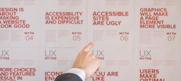
The world of UX design is full of terms, trends and principles. However, often the things which we consider to be true, or the principles which we believe in, are mere myths or UX Myths which we will be discussing. These can be hurtful to your overall user experience. In this article, we will highlight some of the top UX myths that must be busted for good.

Myth 1: Simplicity and Minimalist Design are the same

Simplicity is the key to exceptional and innovative product design. However, it is often considered similar to minimalist design, which is not the case. Simplicity is the reduction of complexity, while a minimalist style is more of reducing the elements. As a matter of fact, simple looking, minimal product UIs often bring hidden complexity. In a quest to reduce, a lot of design decisions can easily add more friction and cognitive load, leading to a much more complicated user experience.

Like icons without text labels are difficult to understand, non-standard gestures provide no obvious affordance. There are proven instances, not one but many, where the hamburger menu has performed poorly.

Striving for simplicity is must, but we must refrain from overdoing it, just for the sake of minimalism.

Myth 2: White space is wasted space

White space or negative space refers to the empty space between and around elements of a design or page layout. A lot of times designers undermine its importance and neglect it. Their argument is that this space is wastage of valuable screen estate. That’s absolutely not true. White space is an essential element in web design and must be considered as an active element, rather than a passive background.

White space is responsible for readability and content prioritization. It plays a vital role in the visual layout and brand positioning. It guides users on a page by enhancing readability and scannability.

Space around graphics and images, line-spacing and letter-spacing within text content, Margins, paddings and gutters, space between columns are few of the important elements of White Space.

Myth 3: You can design a website without content

A lot of designers create wireframes and comps with “lorem ipsum” filler text. Using dummy text often results in an aesthetically pleasing design, but the design is often an unrealistic one. Moreover, it creates the impression that content is secondary and has no major impact on the user experience, which is false.

The fact is that users come to the website, and stay on the website, for content and not the design. Content is by far the most important element in user interface design. A webpage with a simple structure but superior quality content is likely to perform far better in terms of usability in comparison to a visually pleasing page with subpar text.

Using dummy content or fake information in the web design process can negatively impact websites; it leads to unrealistic assumptions and potentially serious design flaws.

Myth 4: People don’t normally scroll

Gone are the days when people don’t use to scroll on websites. The scenario and user pattern have changed drastically over the last decade. Nowadays it’s absolutely natural to scroll. Specifically, for websites with lengthy content, like an article or a tutorial, scrolling provides better usability than dividing the text to several separate screens or pages.

You don’t have to squeeze everything into the top of your homepage or above the fold. That said, it is important to follow certain design principles to ensure that people scroll down. The utmost important thing is to provide appealing and intriguing content to readers; content that keeps your visitors interested.

But let’s not forget that the content above the fold will still get the most attention. Therefore, it is necessary to that piece of content to get people engaged. The quality of that content will decide whether your page is worth reading at all or not.

Myth 5: People read on the web

Not a lot of reading takes place over the internet. Users are always in a hurry. The time span of their attention is minimal. If you want users to read word-by-word, your content must be interesting.

They usually skim the pages looking for specific keywords, meaningful headings, short paragraphs and scannable list. Since they’re in a hurry to find the very piece of information they’re looking for, they’ll skip what’s irrelevant for them. So avoid long text blocks, unnecessary instructions, promotional writing and small talks. Get straight to the point and offer the relevant information as quickly as you can.

To conclude

When you’re flooded with a plethora of old-school design principles, and new ones getting added to the list every day, it gets difficult to duck the myths. Hopefully, this list will be of help for you next time you start a design project. For more info and insights on web designing, speak to our experts.

Categories
Blog Design UX Web Design

Design To Delight Your First-time Users

Design To Delight: The world of web is getting bigger and bigger with every breath we take. There are millions of websites, apps and businesses over the internet and everyone is hustling to differentiate itself from the other. This has resulted in fierce competition. In order to cope up with competition and make a unique identity, it’s very important that you’re able to create a solid first impression when you introduce yourself to the world. No matter how good your product or solution may be, first-time users will still need a lot of reasons to stick around.

In this article, we will discuss the importance of creating a delightful first-time experience that makes users stick around. Designing to delight first-time users can help in creating a long-term association with your users.

1. Introduction and Onboarding

As stated earlier, creating a wonderful product or solution is not enough to sell it into the market. Unless the user is told about the value creation, and how he will be benefited by using your app or solution, they are not going to be around for long.

Every new user will have some basic questions, which must be answered as early as possible when they interact with your app. They would be curious and will question themselves – is this the app I want? What does it actually do? How does it work? Where should I start from? The purpose of onboarding is to offer a quick intro to your product, and it’s key features.

The best answer to these questions is a welcome screen and onboarding process that draws a user into your product’s experience right away. The first thing a user will see is your launch screen, so it shouldn’t be an afterthought during the design process. Your launch screen is also significant for first-time users because it’s where you’ll put any legal disclaimers or age restrictions that may be necessary. This transparency avoids any surprises for users.

2. Onboarding Flow

Users are usually very impatient. They’ll quit if it takes too much effort to get what they want. According to a report, an average app loses 77 percent of its daily active users within the first three days of installation. Users just want to figure out what your product is supposed to do and how to do it.

Make the learning process as smooth as possible for new users. Offer them info in chunks, which they can easily digest. Strictly avoid offering too many first choices as it will only result in a confused user.

Collect basic information from the users, like their first name, so you can add it automatically to the intro content. This will give a personal touch to the onboarding process and the user will feel much more comfortable while moving forward. You can create a virtual tour guide to step-by-step introduce users to the app. Also, it’s important to periodically let new users know how much longer it will take to get started.

3. Minimum Information Collection

In today’s world, users are not reluctant to provide their personal information. However, they provide info only when they see the value, and only to get something in return. Remember, this is the first time they are interacting with you, so go easy on them. Don’t bombard them with questions seeking too much information.

Adding more functionality to the onboarding process will also give scope to users to get acquainted with your app. It gives first-time users a chance to get comfortable with your app, before you ask for a full sign-up. Yes, this would require more coding, but the extra effort will increase the chances of your success.

4. Filler Graphics and Animation

It is possible that an app’s dashboard is set to empty when a new user first downloads it. But, this can make the users feel that the app is not personal or useful to them. To counter this situation, filler graphics should be used as they can effectively minimize emptiness.

The other way to resolve this problem is to use animation during the onboarding process. This is a great method to show the potential of your product to first-time users. For example, you can show an animated app intro about how the app will look like when friends list, message notifications and dashboards are populated. Pop-up prompts can also be used to remind new users to invite friends to download the app.

5. Outside App Interactions

The user interactions must not be restricted to the app; outside app interactions play an important role in enhancing the overall user experience. Once you have initial user info, keep your first-time users engaged with follow-up emails. If you’re offering discounts on specific paid features, let them know this. A well-designed and friendly welcome email can also encourage new users to become regular users.

Following up with the users make them feel valued and keep them well-informed about your product, its features and benefits. It increases the chances of a long-term association with your product. However, you should be very careful about the content and frequency of the follow-up emails. There is a very thin line between an informative, inquisitive email and a spammy one.

Conclusion

Adjustments and improvements is a continuous process and they can be always be done at a later stage. But that doesn’t mean you should jump in with something which is not just good enough. You must design to delight right from the word go. Remember, the majority of users will decide to stay with you or uninstall (and maybe never come back) basis their initial interaction. Therefore, try to make the first interaction unforgettable and delightful. Reach out to our design experts to discuss more on designing for user experience.

Categories
Brand & Identity UX Web Design

Some Tips to Get Rid of the UX Debt

A lot of times you will find yourself facing a situation wherein your product will show an inconsistent behavior or performance. This occurs due to the long-term sacrifices you have made over time for short-term gains, or what we call ‘UX debt’. In our previous article, we discussed Design Debt. We covered what it really means, its identification, impact and common causes. In this article, we will cover the ways through which you can erase UX debt most effectively and efficiently. It’s very common for a company to release a bunch of features in one go to gain market share as they focus on quick user acquisition. As a result, the cleanup work gets delayed and is pushed back for later sprints.

Getting rid of the UX debt takes time, and cannot be completed in one go. If you think that you can get rid of the UX debt in your next release, then you probably need to re-think. It’s best to create a plan and follow it meticulously to eliminate your debt. Follow the below-mentioned points to erase your UX debt:

Make a UX Debt Inventory

The first step towards erasing UX debt is to understand the debt. Whether you are a new hire or an existing team member, you must be aware of what you’re up against. This starts with creating an inventory.

For this, you need to roll up your sleeves and get your hands dirty. Use the product yourself and highlight anything you find unintuitive or confusing. Keep noting down your comments as you use the product. Another great way of performing this activity is by maintaining a spreadsheet within your team’s cloud folder and evaluating the heuristics together. The team can review the system based on some important criteria including findability, accessibility, clarity of communication, usefulness, credibility, learnability, overall aesthetics, persuasive design etc.

Evaluation process

You can create a clear picture of UX gaps by involving the whole team. The evaluation process may last a couple of weeks. Once the evaluation process is over, make sure you keep a realistic and manageable target date to slowly fill up the UX gaps.

This exercise is highly informative, however, you’re not the intended user. After conducting a UX debt inventory, you need to validate your findings by observing actual users and subject matter experts. This will help you better prioritize the work with product managers for the payback sprints or the backlog.

Prioritize Your Work

Once the UX debt inventory is ready, you must prioritize the tasks in order to address them in realistic stages.

The selection must consider a few factors:

1. How severe is the issue?

The severity of an issue must be the first factor to be considered as it may create a huge impact. How critical and big is the issue? Is it stopping users from doing their work? Is there a safety or security risk? If the issue is causing a potential customer to turn around and look to a competitor’s product, then you know that it is super critical. These kinds of issues must be right at the top of the to-do list.

Now, look at the flip side. It’s not necessary that only problems and roadblocks should be considered on high priority. If some improvements save hours of time in the course of a month, reduce errors and substantially add to the user experience, they must also be considered on high priority.

2. How long is it going to take to fix?

If all you have to do is tweak the CSS, you might slip it into the next build. On the other hand, if it’s going to require a significant amount of development or will have to be thoroughly regression tested, it may make sense to hold off until it can be resolved with other issues requiring similar treatment.

3. Who will be tasked with addressing the issue?

If the task has to be done by the UX team, and they have the bandwidth, it may be given a high priority. If it requires the attention of a specific developer who is already assigned to other high-priority work, then it will have to wait.

Make And Follow a Schedule

After prioritizing your debt, the next step is to work with product management to get it into your release schedule. Agile is the most popular approach to software development these days.

If You Aren’t Using Agile –

If you’re not using Agile, your work is most likely planned basis a release cycle. The management of your organization takes a call on what will go in the next release. They consider various factors like development effort, need of the feature, selling points, what bugs exist and how bad they are, etc.

It is recommended that UX debt issues must be handled as bugs. The real benefit of this approach is that the debt items can be entered and tracked using the same tools and business processes as bugs. This ensures timely review and treatment. Ideally, a representative from the UX team should work closely with product management when releases are scheduled.

If You Are Using Agile –

Companies that employ a healthy Agile process to prioritize debt and other types of works find it easy to manage everything. They don’t face any problems in prioritizing debt with other types of work, assigning it story points, and fitting it into sprints.

UX debt should be understood as the responsibility of the entire organization and not just the UX group. There must be a great synergy between all the teams. That said, the best way to eliminate UX debt is always avoiding it in the first place. Our UX designers will be happy to discuss your UX, UI and other design requirements; talk to them now!

Categories
Blog

All You Need To Know About Design Debt

It’s a bit unusual to connect an economic term ‘debt’ with the world of design and development. But, debt is an important term and concept here. Cutting corners with technology and releasing software too quickly can result in additional costs after the launch. We choose to quickly develop the code when a better path is available but would take longer. Technical debt is helpful for software development, where it’s about borrowing time. Technical debt supports fast iterations and experiments before the borrowed cash runs out. Design debt is a similar concept.

What is Design Debt?

In simple terms, design debt is all the good design concepts or solutions that you skipped in order to reach short-term goals. Cutting corners during or after the design stage is termed as design debt.

Debt can also increase naturally over time as the original design can’t handle additional features. The original UX was designed to create a cohesive experience around a specific set of features. The addition of new features over time breaks that cohesion, reducing consistency and creating a UX that feels increasingly disjointed. In some cases, design debt is consciously maintained within an existing product because there’s a fear that changing the status quo will upset users.

Identifying Design Debt

Design debt is somewhat necessary and is present most of the times while designing a software product. If you have zero design debt, you may be not learning or hesitant of adapting to changing needs. The design teams are the experts and can advise on when design debt needs to be actively managed down, but others on the team can also contribute to identifying this debt. A lot of times the sales teams will find that competitors are beating them in an overall sense of professional user experience and they can flag it up.

Impact of Design Debt

Too much technical debt can slow down the development process and likewise, too much design debt can reduce the selection of new features and slow growth. Existing users find it more difficult and time-consuming to use the product, while new users are frustrated by the learning curve.

As design debt builds, designers will be tempted to exceed timelines and insist on many more revisions to the work than anyone else wants. Designer’s woes grow with their inefficiency. They should focus on bigger impact stuff, but instead, they try to track down and update every small feature.

Even in the case of an established product whose users complain about any change, it will become increasingly difficult to fit-in new features without changing the design.

Common Causes

It is important to regularly refactor the design. Numerous disjointed and unrelated elements in a single field of view, all of which are competing for the user’s attention. Projects that are especially at risk for this commonly include a few of the following characteristics:

Fire drills:

When teams are dealing with aggressive goals and tight deadlines, they’re likely to cut together elements and test them in a quest to quick, short-term wins. This comes at the expense of long-term viability and it incurs substantial design debt. Making sure that you set reasonable deadlines and expectations can be really helpful in this situation.

Competing teams:

Particularly as organizations scale, they may have multiple teams working on different areas of a single product. When these teams suffer from competing goals, conflicting opinions, or poor communication, they’re very prone to build designs that are inconsistent and lack cohesion. Having a clear alignment on design goals, strong leadership, and healthy communication can help solve this.

Feature testing:

When a product doesn’t have a clear direction, teams are more prone to test abundances of features. This is to see what works and what doesn’t work. This is great for closing in on product-market fit, but as more features are tested, more debt is incurred. For early products, this can be avoided and the best remedy is regular refactoring. For older products, there is still room for this

Technical Debt:

Saving on the codebase can also have effects on the integrity of the design. This is especially the case when organizations try to solve infrastructure problems through design. Whenever a design change is recommended, it should first be determined whether or not the problem at hand is best served by a design solution.

Adopting an iterative and experiment-driven process is undoubtedly one of the best ways to learn about an audience and develop a design that truly works. By all measures, designers should be doing more of it. But it’s important to always consider the debt that can be taken on by a design over time, and plan for refactoring as necessary. Talk to our design experts to learn more about design debts.

Categories
Brand & Identity Design UX Web Design

Design Arrest: A New Way To Design Your Dreams

To grow an in-house design team or get the services from a professional design agency is a heated topic of discussion. While there are still people who believe that it’s best to have an in-house team, the majority of experts from the industry strongly believe that a professional design agency is the best option and drives the business growth.

With changing times, the design needs, trends and philosophies have also witnessed a makeover or revamp. With these changes, the process to cater to design needs also needs to upgrade, in order to provide 360-degree design solutions in the most viable manner.

Design Arrest is one such creative job-stop that revolutionizes the process of designing graphics. It is a creative agency that aims to transform your ideas and thoughts into captivating designs. Here are a few differentiating factors of Design Arrest which make it stand out from other creative agencies.

Personal Graphic Designer

The biggest challenge while dealing with creative agencies is to find a single point-of-contact. Often the person working on your request is different from your point-of-contact. Moreover, multiple people work on your project which makes it difficult to strike consistency in the design language. It’s a tiresome and time-consuming task to again and again convey your thought behind designs, brand vision and requirements to different people, every time when you make a fresh request. At Design Arrest, you don’t need to sweat it out. A personal, dedicated Graphic Designer is assigned to you, who will be available round the clock to fulfil unlimited design requests.

Design Your Dreams


Flat Rate

Generally, the cost of every design request is calculated basis the type of request, required efforts, time required and nature of the request. This leads to variable costing and often shakes the planned budget for designing. Design Arrest understands the importance of budget-forecasting and values your money. They charge a flat fee, $300 per month, for all your design requirements. There are no hidden charges, taxes, or service charges at any given point-in-time. They believe in clarity, trustworthiness, and developing mutually benefitting, long-term relationships.

Flat Rate

Unlimited Requests / Revisions

Here comes the best part. There are absolutely no bars on the number of requests you raise or the number of times you request revisions. Until you are fully satisfied with their work, the team will not rest. The objective here is to completely satisfy the design needs. Putting a cap on the number of requests will require clients to hand pick the requests, normally the most critical and significant would be passed on, however, a lot of essential requests may not come through only because of the restriction on the number of requests. But, with unlimited requests and revisions, all your design requirements are bound to be fulfilled.

Daily Output

The design process is not a one day job. Some projects last for weeks or months, and some may even be a continuous task for years to come. It becomes difficult for project managers to track the progress and status of the design requests, especially when there’s a provision of shooting unlimited requests. The team at Design Arrest allows you to raise requests every business day and get them served with desired output on a daily basis. This makes your job easy to track the progress and analyze how the work is going on.

No Commitment, No Contract

Unlike many creative agencies, Design Arrest doesn’t bind you in any kind of contract. In case you find any reason to end its services, you’re free to discontinue from that moment itself. You are not at all bind by any regulations or conditions. You are billed on a monthly basis, get the services on a monthly basis and can stop any time you want. Everything that is created by Design Arrest for you is completely editable and belongs to you. They claim no ownership even after you discontinue its design services. Also, they do not disclose or share any information related to your project or business with anyone else.

One-Stop Design Hub

Design Arrest simply designs everything. Be it websites, banners, downloadable, brochures, or anything on web or print media, they design it for you. No matter how diverse or intricate your design needs are, you are sure going to get the solution, with its widespread services ranging across logo design, business collaterals & literature, promotional merchandises, mobile apps, web pages, e-stores, social media creative, presentations and infographics.

Design Arrest certainly stands out in terms of delivering high-quality design solutions at a reasonable price with feasible payment options, and is backed by result-oriented, trend-driven, highly enthusiastic creative brains who are striving to create a difference. You can check out their work here.

Categories
Brand & Identity Design UX Web Design

UX and UI: Connected, But Completely Different

User Experience, or more commonly known as UX is not a new term for the world of graphics and designing. It has been around for as long as the modern day revamping of the design techniques, ideas, tools and philosophy has evolved; so is the case with User interface or UI. They both do compliment each other and often go hand-in-hand, however, a lot of us think that they are the same thing, which is not true. User interface is, let’s say, a part of user experience. Not clear yet? Let’s clear the smoke and try to understand what are the basic differences between UX and UI designs. Let’s go!

User Experience

It refers to a person’s interactions with a product, application, website, or operating system. Which means, creating a UX design involves defining the way a product operates and how it meets a user’s needs. Some of the obvious benchmarks are that a UX should be clear, comfortable and user-friendly. Moreover, a great UX is cautious and elaborate; you will most probably won’t even notice it while browsing through a website.

A good UX aims at simplifying the user journey. It makes the website navigation simple; simple enough that even a layman finds it a walk in the park. If a user finds it difficult to perform some of the most basic functions on a website, like to sign up, change their password, or get to their shopping cart, then there’s a clear problem with the UX. An effective UX smoothly guides a user through a website or an application.

A UX designer is responsible for all aspects of a user’s interaction, which means a UX designer is not just responsible for the technology behind a product, but they’re responsible for how a user interacts with a company, both online and offline, including customer service and other aspects.

User Interface

While User Experience is the accumulation of tasks specifically focused on the optimization of a product for enjoyable and effective use, User Interface Design is its complement; the look and feel, the presentation and interactivity of a product. User interface (UI) is anything a user may interact with to use a digital product or service. This includes everything from screens and touchscreens, keyboards, sounds, and even lights.

A UI designer’s responsibilities are more cosmetic than a UX designer’s. A UI designer is mostly responsible for the presentation of a product. That said, it’s not that a UI designer randomly picks some pictures and logos and use them blindly.

A UI Designer takes care of the Interface design, prototyping design, interaction design, user testing and optimal design. Towards the end of development, a UI designer takes control over the app’s appearance, including on-screen forms, images, buttons, links and icons. Without a user interface designer’s intervention, a design would not appear beautiful and appealing.

Key Differences

UX enhances the usability, UI enriches the visual appeal

The core objective of UX design is to make the product more useful for users. UX designers are responsible for ensuring that the company delivers a product or service that meets the needs of the customer and allows them to seamlessly achieve their desired outcome. On the other hand, UI designers are more inclined towards creating a visually appealing and aesthetically pleasing website design for users. Additionally, UI design must help users navigate through the website by designing buttons in different sizes, to show priority. UI designers take care of minute visual details to make the site look attractive.

UX Design is first, followed by UI

Normally, UX design and research is the first thing that designers dive into when deciding whether to build a product or application. They start with a competitive analysis and market research to come up with insights which improve site functionality. UI design comes much later; once the prototype has gone through several iterations and is almost finalized, all the wireframes are in place, then the UI designer steps in. Here is where the creative spirit of designers is put to test. They work on the visual design and micro-interactions.

UX pertains to products, services and interfaces, but UI only pertains to interfaces


The scope of UX is much broader than UI. UX design is garnering a lot of attention and is becoming more popular day-by-day. It’s no longer restricted to the companies with a web presence, but many others that develop products or provide services are identifying the importance of researching the market, users and validating them before they build. The scope of UI is however restricted only to user interfaces. That said, it doesn’t mean that UI is limited to graphical user interfaces of computers, tablets and mobile devices. A lot of other products also need a touch of UI designing these days, like watches, washing machines, car dashboards, vending machines etc.

UX has a social component, UI has an artistic component

UX is more about people; it has a social component as it deals with market research, analysis, identifying a customer’s pain points and how the product will solve these problems. User personas, journey maps and product user scenarios are accounted through UX research like contextual interviews, focus groups and prototyping, involving people. UI design has an artistic component as it relates to the design and interfaces with the product. It is about the aesthetic value and visuals. It affects what the end-user sees, hears, and feels.

Concluding notes

It is evident that UX and UI are completely two different things and focus on different aspects. But, they both complement each other and go hand-in-hand. It is almost impossible to bail out UI from UX and UX from UI. In a nutshell, UX design helps users accomplish meaningful tasks across platforms and services, while UI design makes compelling and aesthetically pleasing interfaces that connect with humans.

Categories
Blog Design Technology UX

Golden Rules of Modern Day Navigation

Users access websites to get access to various kinds of information. Whether they want to learn more about an organization, purchase an item, donate to a cause, or access a resource, they are dependent on the site navigation to find out what they’re looking for. However, navigation on websites is seldom as smooth that it should be in an ideal condition. It somehow manages to lead the user to the information that they’re looking for, and that too after some struggle. That’s why it becomes important for designers to follow some best practices which allow them to create more effective, clearer navigation experiences. Navigation is more important than search on a website. If the words that the users are looking for matches the words in the links, it is more likely that they will click on that link. So what are the rules for designing great navigation? Let’s check it out.

Plan Out for Consistency

Navigational inconsistencies are sometimes a result of content that doesn’t fit properly into various sections of the site, and that’s why it’s listed on its own. Other times, people may need to quickly access something that sits way deep within the website, so the designers add quick links to the navigation. However, there are other solutions that avoid making inconsistent additions to navigation. Subpages and landing pages are one example. But, consistency should be maintained here; either all navigational elements should display their subpage links or none of them.

All primary navigation items should link to landing pages, or at least all should be section headers for secondary navigation links. If only some primary navigation items are links, people will try to click on non-links, they will be confused and get frustrated. The visual design should also clearly indicate whether the primary navigation items are links or are only headers.

Effectively Use Breadcrumbs

Another important aid for navigation is Breadcrumbs that help orient people within a website. This kind of orientation is especially important if people are directed to deeper pages on the site from external sources. But breadcrumbs must accurate to be effective; they can’t miss levels, or misrepresent the hierarchy of pages. For small websites with only two levels, breadcrumbs aren’t necessary, but when they are required, they need to be consistent.

Interactions Must be Clearly Identifiable

When a site visitor is confused about which items are interactive, or what interactions to expect, it creates a problem. Therefore, thoughtfully designing interactions to be clear and understandable is the best way to go about it. Visual changes clarify what interactions to expect on a site. For example, swapping an expand icon for a collapse icon indicates that something has changed, and how to reverse the change. When the icon doesn’t update, people may miss the result.

Differentiate Icon Links

Sometimes icons can replace text links. Including a label with an icon will reduce ambiguity. According to a study, users are roughly 37% faster at finding items within a list on a web page when visual indicators vary both in color and icon compared to text alone. Differentiate icons that are links from icons that are purely informational or categorical. Varying the color of the icons, in addition to the icon design itself will help people to more easily and quickly process that the icons serve different purposes.

Opt for Flat Navigation

In order to create a great navigation, the Information Architecture (IA) and hierarchy of the website must support it. As the sitemap is developed, go for flat navigation, where the user can access the deepest nested page in the site within a few clicks. Menus need to be short enough to scan, but long enough to be clear. Ideally, the fewer levels people need to click through, the quicker and least confusing it should be for them to access what they want. Most often, there are three or four levels of hierarchy for most websites. This keeps things accessible while making sure the site navigation isn’t too broad.

Design for Responsive Compatibility

Great navigation translates easily to mobile and tablet. Design a navigation that works across all devices, or consider two similar navigations that don’t require people to adjust to a different mental model when moving from desktop to mobile. Primary navigation often displays the secondary links on hover; however, it doesn’t always work for mobile. Utilizing a hover interaction that can’t be used on mobile introduces inconsistency between the two devices.

People will not know instinctively how to access something on mobile that they used a menu hover to access on a desktop. If you need to provide two interactions in association with one link, consider having two distinct places to click associated with that link. While it may seem like extra effort to design and develop separate designs for the devices.

Ease of navigation adds to the user experience of visitors. Discuss more with our design experts and get answers to your design needs.

Categories
Brand & Identity Design Web Design

5 Web Design Tips To Boost Your Business

It’s a difficult task to start and business; more difficult is to grow it and ensure that it keeps growing. There are thousands of aspects that you need to consider if you really want to boost your business. Marketing strategies, product creation, growth plans, promotion campaigns and the list goes on and on. With so many ongoing tasks, it can be far too easy to let a little thing like digital presence fall by the wayside. However, that can really prove to be fatal. According to a study conducted on the subject ‘what exactly makes people want to complete a purchase from a particular website’, the results came out to be resounding “trustworthiness.” By making consumers feel safe, comfortable and at ease when they visit your online destination, you stand a much higher chance of not just encouraging them to complete a purchase, but convincing them to become longtime users.

A strong website design is paramount in creating this trustworthiness. By presenting an online destination that is straightforward and easy to navigate, users will have a more positive experience throughout your website, making them more likely to complete a purchase. Other things like company transparency, great testimonials, and a solid product are obviously important to potential customers, but website design clearly sits on top of these aspects to ensure that customers feel that the website is trustworthy. In order to stand out from the crowd, there are a few tried-and-true design elements that will transform your website visitors into loyal customers. Let’s check out some web design and UX trends that will help you to grow your business.

1. Video landing page

Including a video into your website design is a no-brainer. 78 percent of internet users watch videos online every week. That said, don’t just embed any random video taken from YouTube. Instead, take your website design to the next level by creating a video landing page. This video can act to be a strong tool for your website. You could target this video to a direct call to action on a particular web page. Else you could create an immersive video that auto-plays on your homepage.

Source: Hunted

Either of these approaches can provide information or elevate the brand’s identity. Moreover, both will improve UX and users’ impression of your company as a whole. A survey in which 159 professionals and entrepreneurs participated revealed that 69 percent of website traffic will be video, while 70 percent of professional participants reported that video converts better than other forms of information and content.

2. Parallax scrolling

There’s no doubt about the fact that digital experiences have improved many aspects of our daily lives. It has simplified our lives to a great extent, however, it has made people very lazy. So lazy, in fact, that clicking a button is often too far out of the realm of possibility. That’s where parallax scrolling comes in. This uneven-like scrolling effect has combated consumers’ general laziness while remaining engaging and visually appealing. With a simple swipe, users can easily consume your information while making their way down the page.

source: simply modern

The popularity of parallax scrolling has increased the use of deep-scrolling and single-page website designs. Parallax scrolling helps users to easily access the important information, while letting them see what’s below, as well. You can prioritize your content and place the content that is more likely to be appreciated by users at the top, followed by the less related content. Parallax scrolling can include effects like an illustrated timeline that goes both horizontally and vertically, ensuring it captivates users.

3. Animated Calls to Action

It’s normal for a user to get lost while navigating on a website. A lot of times it is not clear to them as to what action is required. Therefore, a website needs a clear and precise call to action tabs that constantly remind them of what needs to be done. However, simply telling your consumers what to do is just not enough anymore. When they access the web, they get instructions from all around, therefore you need to something extra to stand out of the crowd.

Adding a little animation to your important action items is a good way to differentiate. Whether it’s a micro-mini interaction or a simple effect to catch users’ eyes, consumers are more likely to execute the action you’re pushing when the call to action grabs their attention and provides confirmation of completion.

4. Custom Typography

Context and text are the pillars of any good website. It’s no longer the times of boring Times New Roman, Arial or any other basic stock font. Instead, take your message to the next level with unique typography that encompasses your brand identity while simultaneously communicating to users. Unique typography and distinct typefaces can take many shapes and can be found in different areas of your design.

Some brands may choose to utilize this in their logo design, while other businesses will use custom font throughout the entire design to draw attention to important content, The choice is yours; utilize this trend whichever way you want.

5. Artificial intelligence

No matter how much technology has evolved and advanced over the years, there are still some human elements which cannot be ignored. Yes, it’s true that the wave of ecommerce sales over brick and mortar storefronts, people still crave connections. This is likely one of the reasons that artificial intelligence in all its forms is so popular.

AI in website design can take many shapes, but some popular examples include machine learning, personalization and chatbots. Machine learning and personalization are cut from the same cloth to a degree and ingratiate a feeling of “being special” with users that, in turn, fosters brand loyalty.

Designing a website that differentiates itself from the crowd and boosts your business require attention. Attention to details and an experienced brain. Why don’t you discuss your website design needs with our experienced designers?

Categories
Blog Design Web Design

Use Video And Movement To Exemplify User Experience

The ever-changing world of UX web design has witnessed a plethora of changing trends over the last decade. With a new year, we expect a lot more changes, and new design trends will come to the surface. If you look back to your user experience with websites over the last year, you would probably be able to think of a few websites which really stood out and few which were absolutely shady, in terms of user experience. A bad user experience leads to a negative brand image. Therefore, it’s very important to move along with the changing trends, in order to keep up the user experience level, or even enhance it.

You might have noticed that a lot of designers these days are taking help of video, visuals and movement in order to enhance the UX of a website. It not only enhances the user experience, but it also makes the website more appealing. Here are some of the ways in which you can use video and movement opportunities to grab the users’ attention and keep visitors on the page for longer periods of time.

Non-Traditional Scrolling

More and more websites are now experimenting with different scrolling techniques to create a unique user experience. Instead of using the conventional vertical scroll designers can try out other non-conventional scrolling patterns like long scrolling, fixed long scrolling, infinite Scrolling, or tasteful parallax scrolling. Creative scrolling patterns let you adjust the pace, delivery, and interactivity of the content. Considering that our attention span on the web is less than 10 seconds, a delightful scrolling experience certainly prolongs user interest. Take a look at the imgur website. It uses infinite scrolling pattern, which loads the content as needed to provide a more paced experience. Infinite scrolling proves useful for single-page sites with more than a few screens worth of content, especially with multimedia galleries.

User Experience Video

Rotating Animations

The best web design strategy that will keep users coming back to your website is the Switching Strategy. The more you keep switching your content, more the people will be intrigued. See the Disruption company website. It leaves users curious for more because every time you refresh the homepage you’ll see a new and innovative brand video they’ve created for the homepage. We’ve seen some brands rotate the titles of articles or call-outs as well. These options could leave users with a unique experience on your website every time they visit.

User Experience Example 1

Interactive Web Designs

The inclusion of user interactivity has become more popular and will only continue to grow. Users are spending more time on pages of responsive websites that utilize features with user interactivity. The hindrance with this UX design trend is that the clients hesitate to pay for the advanced interactivity. Even if their own team wants to include features like these, they still shy away. Our team predicts more automated development processes will appear and will hopefully cut the cost for clients who want unparalleled, interactive features on their sites. A great example of user interactivity can be explored on Cocainenomics from the Wall Street Journal. This type of web design not only showcases a visual design talent, but it increases the website’s time on page and brand awareness.

User Experience Example 2

UX-Driven Diagonal Lines

Over the years, it has been a common trend to use straight, horizontal lines to distribute sections on a website’s page. A lot of UX research was done on the topic by various design experts and their teams which discovered that using diagonal line design is not only visually intriguing, but it facilitates the visual flow of users. it guides them to follow down the page or to points to a call-to-action. Using diagonals in your designs will increase the number of users that scroll through the entire length of the site. TaxiNet has beautifully implemented this trend on their website to enhance the user experience.

User Experience Example 3

Large, Eye-catching Titles

Today, we live in a hustling and bustling society, which is always on a move. Users seem to have less and less time to spend on websites due to their busy lives. Therefore, designers have identified the need of creating a design which instantly grabs attention and conveys the message right at the start of user interaction. They are adapting and including large, bolded titles and shortened messaging to capture their audiences and expedite their time to convert. The increased size of these heading tags is usually matched with much smaller sub-text copy if more information is desired. Austin Eastciders demonstrates this alliance of font sizes throughout their homepage design and uses a video in the background to showcase different occasions to enjoy their tasty ciders.

User Experience Example 4

A lot is changing in the world of design. Rich user experience is no longer a luxury; it’s more of basic and elementary. Speak to our design experts and learn how you can infuse visually appealing design elements which elevate the user experience.

Categories
Web Design

The Importance Of Web Design In Marketing Campaigns

A company’s website is its primary introduction to the world of web, and it needs to be as effective as possible to create a stunning first impression. Even the best marketing campaigns could miserably fail if they go along with a poorly designed website. The marketing strategy of your company may be convincing enough to grab the attention of prospective clients, but it is your website that will lead them to make the final purchase thus providing you with some real ROI. In this article, we will help you understand the importance of high-quality web design and will educate you about how it can accentuate the success of your marketing efforts.

Direct Impact on SEO

What’s the point of marketing yourself, if users can’t find you. A lot of businesses opt for website redesign these days because their current designs simply do not help their Google rankings. The first step is usually eliminating duplicate content occurrences which is the easy part. Additionally, it is important that your website design contains options for inputting meta descriptions, Alt tags etc., considering that these are some of the simple, yet important, elements of SEO.

Main Source of Conversions

The foremost aim of any business is to increase its business, which is generally done by increasing conversions. The goal of marketing efforts and even the website is to generate new and recurring business. The conversion rate is calculated by the number of website visitors who complete the desired action – purchase, register, subscribe etc. Designers can design website that boosts conversion ratio by improving the layout, text, and online forms. It is important for a business to accurately convey its goals to the people designing its website, so that they can act accordingly. These web development experts can provide you with not only a great looking website, but also one that is effective, in terms of improving your overall conversions.

Improves the User Experience

User experience, or UX, is a very important factor that needs to be taken into consideration when we talk about website design and its effect on a marketing campaign. For example, you can create high-quality content and place it on your site, and then use different channels to advertise it. However, if your website is not user-friendly, the efforts will be pointless because all the people you have attracted using marketing tools won’t stick to your website long enough to check out your content and your product.

Other important UX features include website speed, navigation and visual elements. It’s not good if your website takes too long to load. A new user is almost guaranteed to leave before even giving your website a chance. According to a survey, nearly half of web users expect a site to load in two seconds or less. They tend to abandon a site that isn’t loaded within three seconds. So there is very little room for error.

The next feature that has a great impact on UX is navigation. Make sure you simplify it. Easy navigation ensures longer stay on the website and there is a bigger likelihood of conversion. The visual elements that make up your website also play a vital role in elevating the UX of your website. They need to be designed in such a way so as to provoke emotions in your users.

Helps to Reinforce Your Company’s Message

Your website design is important for elevating your brand awareness and conveying your company’s goals. Besides successfully conveying your company’s message, it also helps in evoking emotions in your users. Some carefully chosen images in combination with the right colour choices in the background can have a huge impact.

Website design can play a lot of different roles in a marketing campaign. The design can be there as a support system for reinforcing the desired message. Even be the epicentre around which the whole campaign is built. It is a powerful tool that can both educate new users and drive them to make a purchase.

A well-designed website leads to a successful marketing campaign. Efforts and funds you invest in a marketing strategy can be a waste if you don’t have the right design. Discuss your website requirements with our team of experts.