NYX Ditech

Categories
Web Design

How Can You Effectively Simplify Your Website Design?

We all want that our website must create a stunning impression on every user right from the word GO. We try all the tricks in our bag to create a website that’s unique and stands out from the crowd. However, often while doing so we forget the fact that simplicity has its own appeal. The design interface must be simple to understand and use. Unwanted elements overpopulate the design and act as a roadblock in a user’s journey towards the desired action. Here are a few essential tips on how you can simplify your existing website design or build your new simple website based on these tips.

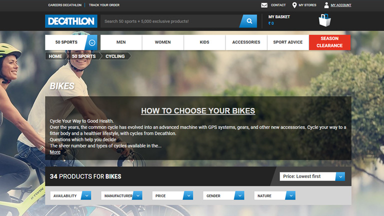
1. Placement Of Call To Action Buttons

Your website must have an end goal and as soon as the user lands on your website, he must be able to identify it. Thus, the Call To Action buttons must be placed at the most focused spots on your webpage. These buttons must be large enough for users to clearly cite them and should also be placed in various positions to ensure that users click on them.

Placement Of Call To Action Buttons

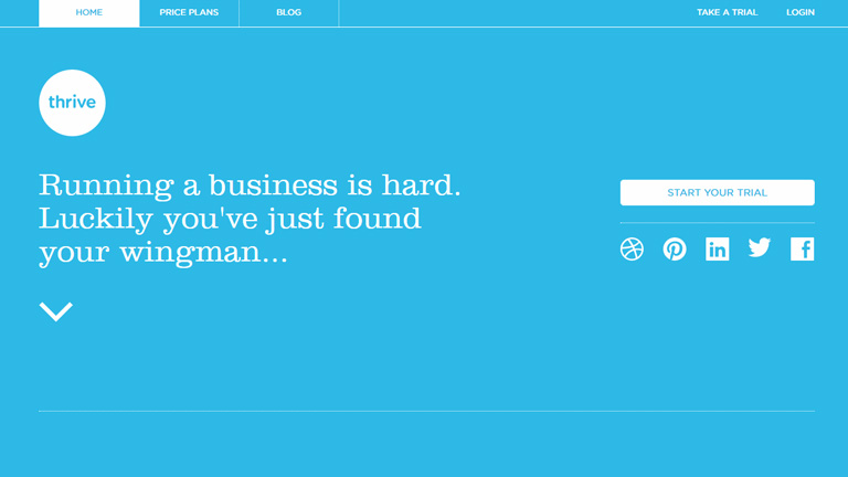
2. Less Color Is More Color

In an effort to make a visually stunning website, designers often try and experiment with a lot of colors. This may look charming but as per user experience, fewer colors have a greater impact. Stick to a color palette with only 2 or 3 colors. A monotone color palette is even better. You can use different tones and tints of the same color. A large number of colors cause mental stress for users and must be avoided. A website looks neat and well organized under a monotone for fewer colors.

3. Consolidate Your Content Into Manageable Portions

If your website has a lot of content to offer, it is quintessential to streamline it into manageable parts. Don’t offer the entire content in one go to the users. Arrange all the related content under one section to enhance readability.

stripe

4. Use The UI Elements With A Purpose

A designer will have a lot of UI elements like icons, elements, images etc. in his bag. But, that doesn’t mean that all of them must be used without any reason. Make sure that when a user clicks on any of the icons he reaches to a page that he is expecting to go to. Plan the UI elements in advance and use them only if they serve any purpose in the overall design.

5. The Visuals And The Copy Must Go Hand In Hand

While the font style, type, and size are some of the important elements of a web design, what actually is written is of greater importance. Your copy must compliment the visuals on your website so that there is a synergy between all the design elements. Keep editing the copy and try to eliminate the unwanted text. Your aim is to connect to the users through the copy in a clear and concise manner. Also, create a proper tone with the design elements and use of connected words.

6. Never Forget The 80-20 Rule

It is one of the most important rules to follow while designing a website. There are 2 important factors under this rule.

I. Always remember that 20 percent of the elements on your website will result in 80 percent of the desired user actions. Which means, a few calls to actions, buttons, and other user interface elements will generate the majority of user interaction.

II. Focus on the top 20 percent of your content to make 80 percent of changes when changing a design. This 20 percent includes elements that generate the most clicks – CTAs, traffic funnels, and images.

It’s not necessary that we implement complex design elements in a website to make it more appealing or user-friendly. Often a simplistic web design strikes perfectly and enhances User Experience. Follow these tips in order to simplify your web design and achieve great results. You can also reach out to our design experts to discuss your website designing requirements.
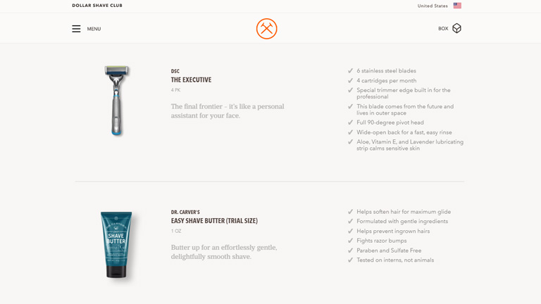
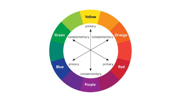
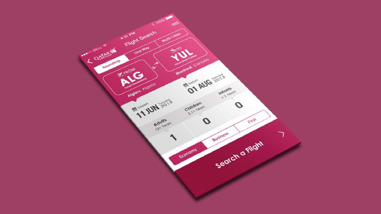
Categories
Technology Web Design

These 5 Tips To Design Ecommerce Product Pages Are Absolutely Gold

The whole and sole purpose of any eCommerce website is to achieve higher conversion rate and thus generate a bigger revenue. Therefore, they focus extensively on the checkout process for users. Right from the time they add a product to the cart, to the time they complete the purchase. However, it’s not only the checkout process that is important. The product pages also hold equal importance. The product pages must be designed in a manner that customers get all the information that they seek in the most convenient way. Here are a few tips to enhance user experience on Ecommerce product pages.

1. Clear Mention Of Price And Features

The first thing that customers look on a product page is the price. Display the price as early as possible. Display it at the very top of the page and to the side of the product title as well. It’s better that you display the overall price of the product including all the applicable taxes and also mention the shipping charges if any. The prominent features like different colors or sizes should also be clearly mentioned. If the price of the product changes with any color, pattern or size, the change should reflect right when the variant is selected. The aim is to be as transparent as possible while dealing with the price.

Price And Features

Image Credit: levis.com

2. Display Sellable Images

Images play a huge role in increasing the sale of any product. It’s a proven fact that products with great images sell faster and more than other products. The number of images to display is however arguable. 10 images or just 1 great image. Both can create the desired impact. The idea is to give customers a digital taste of what the product actually looks like. Features like ‘Click To Zoom’ and ‘Thumbnail Galleries’ provide added advantage.

Display Sellable Images

Image Credit: amazon.com

3. Product Description At A Glance

People over the web don’t really read everything written on the web pages and simply browse through them. That’s why it’s not a good idea to stack up long features list in different sections. Rather, you should present prominent features of the product in a skimmable format right beneath or beside the main product. Keep the list short, segmented in pointers, with a crisp one-line description. Make the heading ‘features’ eye-catching by enlarging its font and tweaking the font style. Trust us, you will grab more eyeballs.

Product Description

Image Credit: dollarshaveclub.com

4. Always Display Customer Reviews

Customer reviews are a great way of building trust among your ‘to be’ customers through testimonies of your existing customers. These reviews help potential buyers in making a wise choice and a lot of their doubts are cleared through them. It’s not necessary to display the full reviews right at the top. They can be displayed under a separate section preferably at the bottom of the page. However, overall average rating through star system must be displayed at the top of the page.

Display Customer Reviews

Image Credit: amazon.com

5. A Clear And Easily Accessible ‘Add To Cart’ Button

Once the customer has finally decided to buy a product, then begins the ultimate process of checkout. This process is generally guided by a CTA button (Add To Cart in this case). The CTA button must be very clear, easily accessible, and available at any given point in time. The button must be designed to be distinct by use of strong colors, different font style, and button text. It’s advisable to place it at the top of the product page.

Accessible Add To Cart Button

Image Credit: Hayneedle.com

Conclusion

The Ecommerce space is huge and is filled with tons of products. Every product is different and may demand a different design concept. Nonetheless, these basic UX concepts can fit for almost every product page on a broader level. Apply the aforementioned tips along with little tweaks of your own and you will get the results. Have a little chat with our design experts and tell them your design requirements.

Categories
Web Design

Avoid These 5 Things In Your Website Design To Stay Up To Date

If your website was designed a few years ago, there’s a bright possibility that there are a few elements which are unpleasant guests. They are outdated and need to be removed immediately from the website so that the website doesn’t look outdated. The world of web keeps changing every day and it’s essential that your website also keeps itself abreast with the new developments and advancements. This calls for a removal of certain outdated trends and practices. Here’s a list of 5 Don’ts that you should keep in mind while finalizing your website design.

1. Never Keep Social Media Icons In The Header

The header of your website is one of the most important areas of your website. This area gets the utmost attention and must be filled with the critical elements to which you want users to focus the most. Keeping flashy social media icons right at the top of your website layout is only inviting trouble in a quiet way. It takes a lot of efforts to get users on to the website, and by placing social media icons you’re guiding them to bounce off from your website to your social media handles. That will result in a high bounce rate.

Instead, you should use social media widgets which allow users to like your page etc. all within the environment of your website. That’s just a smarter way of letting people interact with you through social media.

2. Avoid Stock Photos

Pictures play a huge role when it comes to convincing users. Studies have shown that pictures have an excellent positive impact in terms of conversion as well. However, if they are not authentic and are simply obvious stock photos, users are not going to buy them. By obvious stock photos, we mean a smiling pretty girl’s face, the corporate handshake, the light bulb and much more. People have started undermining these stock photos and more than often make fun of the websites that use them.

When people will come across these stock photos on your website, they will not only find it cliched, they will also lose faith in your company. Instead, you can use custom photography and use real photos of your office, staff, and leaders. These are impossible to fake and are bound to create a solid impression

3. Get Rid Of The Email Links

If you have anything like staff Bio Pages, a very common practice is to use a little link to send email to that particular person. This is not the best of the practices. Firstly, it attracts email spamming. Spam marketers are always on a lookout for this kind of things. Secondly, it’s a real disaster when it comes to User Experience. Think about when you click on one of those. It opens up some kind of native email program on your computer like Microsoft Outlook or Apple email program. That’s just annoying.

Instead, you should use email sending forms. They are trackable, you can route them to different folders and subfolders using email programs, and can easily bifurcate client requests, internal queries etc.

4. Disable YouTube Suggested Videos

With the ongoing trends in website designing, videos have become a crucial part of any website design and YouTube is undoubtedly the biggest source of it. If you use videos anywhere on your website, you must disable the YouTube suggested videos option. What happens is that when a Youtube video plays, it makes some interesting suggestions about other videos that might be related to the video that you just watched. But, at best these videos might be simply unrelated and at worst they might be videos about your competitors.

Either way, it acts as a distraction for your users and has no connection whatsoever with what you want the users to do when they are on your website. This option can be disabled by going to the Share option, then to the embed option, then Show More and unchecking the Show suggested videos when the video finishes option.

5. Bye Bye PDFs

PDFs were used to be a workaround for the non-content managed websites for long. For example, if you need to add a new document or add a new menu on to your website you make a new PDF, upload it and replace the other one so that people can download and get the newest information.

But, these days almost every website is content managed using tools like WordPress where you can quickly log in and change information without actually touching the code. So basically, these PDFs are completely irrelevant today. Still, there are a lot of websites, especially restaurant websites which frequently change their menu by changing PDFs rather than actually changing on the website which is a complete NO NO.

Conclusion

If you’re playing the game of web, you cannot be stagnant. Trends which are super cool today may find a need to be thrown away tomorrow. The key is to understand what is working today, what needs to be forgotten, and predicting what future holds for us. Get in touch with our design experts to get more insight regarding the same.

Categories
Design UX

Human Faces Can Be A Great Tool To Increase User Experience

In a quest to increase and better the User Experience, designers try to use plenty of techniques and new ideas. However, they often neglect the fact that human faces can be a compelling tool in a designer’s toolbox. Human faces are bound to get more attention as compared to any other visual graphics. Moreover, they evoke human emotions which can lead to an emotional interaction and increased engagement. The reactions and behaviors of users can be easily influenced by the use of human faces. Here are a few factors that highlight how faces can be very effective in enhancing UX of any website.

1. Creates A Stunning First Impression

No matter what kind of content you have on your web page, images of faces will draw immediate attention as compared to other content. Many eye tracking studies have confirmed this fact and has also stated that the users keep moving their attention back and forth between these face images and other content. A face will create a solid first impression of your website on users. It doesn’t take a long for users to form an opinion about a website during their first interaction. 50 milliseconds approximately. That’s really quick and therefore a face can act as a powerful tool to create a significant impact.

wix

Pic Courtesy: Wix.com

2. Effectively Guides a Visitor’s Line Of Sight

Once a user’s attention is grabbed you can also guide his line of sight with proper placement and use of face images. As humans, we have a tendency to follow the line of sight of other people. It simply means that if a face image is looking in a particular direction or towards a particular section, users will also shift their focus in that direction. Designers can use a strategically placed face image to direct users’ attention to important content and call-to-action buttons.

audi

Pic Courtesy: Audi.com

3. Facial Expressions Evoke Emotional Responses

We all have come across the saying “A picture is worth a thousand words ” and this could not be truer in case of a face image. The human face is capable of expressing and showcasing a large number of emotions. A designer can convey emotions through facial expressions on human faces. The expression on the faces of images used can evoke similar emotions in users. If users view a genuinely happy face, they will most likely develop the same emotion which will influence their feelings for your website or the brand as a whole. Studies confirm that emotions in designs directly impact the conversion ratio.

spotify

Pic Courtesy: Spotify.com

4. Builds Trust

Building trust among users is very critical to the success of any business. Human faces can help a lot in establishing a sense of trust. Trust is the foundation of any successful and loyal customer base. The digital world is full of products, services, and brands. Users are always skeptical and don’t trust anyone easily. Showcasing real faces on the website portrays your openness and trustworthiness. A lot of companies have followed this and have opted a new kind of personalized ‘About Us’ section. They depict faces of CEOs, teams, and other members of the company to boost up trust. It is very useful for industries like medicine, childcare etc. where trust is a big factor.

founder

Pic Courtesy: foundr.com

5. Generates Visual Appeal

To a great extent, a product’s success is related to its visual appeal. A poorly packaged product might not get the sales it deserves. Same is the case with websites. No one wants to see an ugly design. Everyone prefers an attractive design. Human faces are a great way to enhance the aesthetic aspects of your design. Human faces provide a personal touch to users and they feel more connected. A website with human faces makes the users believe that there are real people behind this design. A lot of websites lack this personal touch which cost them deeply in terms of conversion ratio.

dove

Pic Courtesy: Dove.com

To Sum It Up

The effective use of human faces in UX design can create a huge impact on user experience. They are a great source to catch eyeballs immediately, evoke emotions, build trust and influence the behavior of users. Designers must use human faces more often while designing a website to shape up the overall experience of users. We have a team of experts who constantly infuse similar design tricks to scale up the user experience. Have a word with them and get a stunning website design.

Categories
UX

5 Pro Tips To Better Your UX Design Practice

Designing for years and years often gives you a feeling that you have mastered this particular art. You start considering yourself to be a perfectionist and believe that there is no scope for improvement. Well, the saying ‘Practice makes a man perfect’ is absolutely true in all terms. However, people tend to stop their learning once they feel PRO. One should never forget that even the best in the business might need some learning. The skills of designers who are in the industry might start deteriorating as they haven’t spend any time in improving their skills. So, it’s best that the designers pull up their socks and start practicing best ux design practices to shine their skills. Here are 5 tips to get you started.

1. Trim Down The Jargons

Being a UX designer, terms like Heuristic review, agile, iterative design etc. would be quite common for you. But, ask any commoner and it will all be Latin & Greek to him. To be honest, they really don’t care as well. It’s OK if you use these terms during your UX team meetings, but you must avoid them during conversations with rest of the employees, investors, clients, partners etc. The clients and the stakeholders must always be on the same page as you are and this could only be achieved when you use simple terms which they can comprehend easily. If you are not doing the same, you are simply separating them which is not a good sign.

2. Use Your Past Creations

If you have been in the industry for quite a few years now, you will surely have several projects under your belt. But, do you ever review your past projects while developing a mindset for your upcoming project. Most of the designers don’t really do so. However, these projects could act as a great inspiration for your next project. By reviewing your old projects you would understand what you use to follow at that time, what you are using now, and you can draw a comparison between the two. An analysis of these projects could become a great whitepaper which you can be used to promote your business. Results from the past could be used to demonstrate your expertise to prospective clients.

3. Take A Break

This might sound a completely out of the box suggestion, but it has its own benefits. Monotony is a serial killer of innovations, ideas, and dreams. Taking a break is a great option for experienced designers to get away completely from designing and refresh their skills. You can involve yourself with different verticals like software development or product development. See the other side of the grass and judge if it is really that greener. It will allow you to appreciate what others do in the organization and will increase the level of understanding between everyone. More the understanding, more the efficiency.

4. Conduct A UX Team Review or Audit

Sadly, there is a very monotonous pattern of daily work that we have been following since ages and tend to follow it on a loop. We get a project, we work on it, we deliver, and we start again. By following this without any gaps or rest, we carry on the flaws and loopholes from one project to the next one as we don’t have time to even identify them. Take a break and utilize it by conducting an audit amongst the UX team. Review how you are working, what is the methodology that you follow, and ask questions about the effectiveness of every step that is being taken in the entire tenure of the project. This whole exercise will allow you to identify workflow flaws, loopholes, and areas of improvement. It will work wonders for your overall work efficiency and quality.

5. Play Around With New Tools

It’s a great practice to get your hands around the newbies. While working on their favorite softwares for years and years, designers hesitate to try out on new softwares. This only limits their knowledge and skills as every new tool adds a new skillset to the designer’s portfolio. Also, there are a lot of career benefits attached to it. Knowledge of a few comprehensive tools may become a game changer in your next interview. Choose a new wireframe package to play with it and adopt a new process of designing wireframes. This can help you in examining the way you build wireframes.

The crux of the matter is that no one is too old to learn something. Learning never gets wasted. Following these design practices allows you to brush up your existing skills, add new skills, follow the industry standards, and most importantly open up your mind for new groundbreaking innovations and ideas. Our UX experts are available to assist you round the clock to cater to your design needs. Speak to them NOW!

Categories
Web Design

5 Indications Shouting “You Must Redesign Your Website”

Things change with a drop of a hat and the only thing that remains constant is change itself. Tune back your mind 10 years ago and try to compare today’s digital world and the Digi world back then. You would probably be smiling, noticing the changes and developments in the world of technology over the last decade. The world of technology changes at a much swift pace as compared to any other thing across the planet. With every morning marking the dawn of a new technological advancement, it becomes essential for businesses to mold their business strategies. This process might require a change in the marketing techniques, brand makeover or even a website revamp. Now, the question arises, how would you now that it’s time to redesign your website? Here are a few common indications that you should look for and decide whether your website needs a revamp or not.

1. Your Website Takes Ages To Load

Every user on the web is super impatient; to a level as if he is sitting on a hot pan. If your web page takes ages to load, you are calling for trouble. The user is not going to wait for ages and within a few seconds will look for other available options. The margin of error in this situation is extremely low. Also, Google doesn’t particularly like web pages who take an eternity to load. Page loading time is an important criterion while deciding a page’s ranking.

So, if your web page takes a lot of time to load, you are bound to lose potential clients and also will slide down the Google ranking list. It’s best you revamp your website by analyzing the factors squeezing the time and eliminating them.

2. Your Website Still Has a 90’s Structure

Believe me, there are tons of websites that still look like they are time stuck in 90’s. Back in the 90’s, web pages were a lot more static and they just displayed information about services and contact details. There was no option to administer the web site to change text and images. Those days are well gone by. The world today is so dynamic that the content on your web pages may require a constant change. Inability to change the content is a serious threat to your website today and thus you must revamp your website by implementing latest tools and techniques.

3. You Don’t Have A Responsive Web Design

A responsive web design enables the web page to be displayed with consistency across all screen sizes on various devices. Websites were designed originally with a vision that they will be viewed only on desktops or laptops. However, times have changed and the majority of people access your website through other devices like tablets, mobiles etc. Therefore, it is pivotal that your web design must be responsive so the user doesn’t face any problem while viewing it on any kind of a device.

4. Your Website Has A Low Conversion Ratio

What is the ultimate goal of a website? To attract users and convert them. A conversion is the ultimate goal of the business. A conversion can be shopping, downloading a file, watching a video, sharing content, leaving a comment, contacting the company etc. If there is no conversion or a very low conversion rate for a website, it’s no good to the business.

If you notice that the conversion ratio of your website is very low, it’s certainly the right time for you to redesign your website. Analyse the causes for the low conversion ratio through web page analytics and work on the new design.

5. Your Website Has A Negative User Experience

User Experience (UX) is the key factor in deciding the success of your business and high conversion ratio. If a user doesn’t find your website user-friendly and gets bugged while using your website, it seriously creates a bad impression. You’re bound to get a blow on your brand’s reputation as well as sales. No matter how catchy the content of your website may be, it’s important for a user to find a proper way to follow and complete the ultimate task (the goal of your business). At no point in time, he should feel lost and must be clearly guided by the web design and structure at all places.

Analyse the flow and structure of your web site. Identify the flow challenges, ambiguous directions, roadblocks etc. and revise your web design overcoming these challenges to create a smooth and delightful user experience.

To conclude, every business owner must understand the ultimate fact that change is constant and they must swim with the tide. Sticking to an old web design can seriously hamper your business and brand in the long run. So keep yourself abreast with the latest trends in the web design world and be proactive to ride on the changes. Talk to our experts and analyze whether your website needs a revamp or not?

Categories
Blog

Role Of Color Psychology In An App Design

It’s tough for even great psychologists to really understand the human brain. It never fails to amuse and pops unanswered questions every now and then. Sometimes there is simply no reason or logic for a particular human behavior triggered through the brain. Talk about the color psychology. Interestingly, the human brain is more capable of noticing and remembering not so pleasant sights as compared to beautiful things. Let’s connect this attribute with visuals (basically app visuals). It basically means that the human brain will surely notice an ugly design or color scheme over a decent one and will most probably remember it. Colors used in an app form the basis of its visual appeal. If you get your color scheme correct, well and good. However, if you screw it up, then it can ruin even the most functional app.

Why Are Colors So Important?

Believe it or not, colors play a vital role in driving your emotions while using an app. Whenever we use any application there is a motive behind using it. It may be for financial transactions, entertainment, making reservations, checking scores etc. All these motives have a string of emotions attached to them. The color scheme of your app can either fuse with these emotions or may cause a negative impact towards these emotions.

Picking up an ideal color palette can be the game changer for your app. The color scheme, if picked up correctly can soothe down human anxiety, help them to relax, evoke happiness, calm down senses and can result in many other positives. On the other hand, if you mess up with the color scheme it can even provoke your user to bang the phone on the wall.

Here are a few colors and the emotions attached to each one of them:

White – Pure and simple, clean.
Black – Blunt and powerful, minimalist.
Red – Intense and important, focused.
Yellow – Energetic and positive, optimistic.
Blue – Calm and relaxed, trusted.
Green – Profitable and natural, earthy.
Purple – Luxurious and regal, trendy.
Orange – Bright and cheerful, childish.
Pink – Romantic and loving, feminine.

The Theory of Colors

The subject of colors does not top the charts of complexity but still demands a basic understanding. The basics of color scheme can be best understood through a color wheel. There are 3 primary colors – Red, Yellow, and Blue which can be mixed to bring out secondary colors – Green, Purple, and orange. White (in various proportions) is used to create tints and Black is used in various proportions to create shades.

theory of color

There are certain pre-defined standard color schemes which are most commonly used.

1. Monochromatic

As the name suggests, monochromatic color scheme refers to the use of a single base color. Monochromatic colors work well in creating a soothing and calming effect. It also portrays a neat, simple and clean design.

qatarairwaysImage:Qatar Airways

2. Analogous

Analogous color schemes are created from related colors that are not completely opposite to each other. One of the colors is used as a dominant color while others are used to enhance the scheme. This scheme is quite easy to pull off as compared to other schemes. The only trick is in deciding which vibrancy of color to use, as it will be exaggerated.

analogou

3. Complimentary

This color scheme uses opposite colors to complement each other in a design. The opposite colors contrast each other very strongly and that grabs eyeballs instantly. When using a complementary scheme, it is important to choose a dominant color and use its complementary color for accents. For example, when the human eye sees an object full of different hues of greens, a bit of red stands out very well.

4. Custom Color Scheme

It’s not really mandatory to stick to one of the aforementioned color schemes. There is every possibility that the nature of your app and the persona of your brand may demand a different color scheme altogether. Customizing your own color scheme is not rocket science and can easily be adapted. Adding a bright accent color to an otherwise neutral palette is one of the easiest color schemes to create. Having said that, it’s also one of the most visually impressive.

Adobe Color CC, previously known as Kuler is your savior while deciding color schemes. It makes color selection extremely easy. Each and every color on the palette can be individually modified or selected as the base color with a few clicks only.

Your Color Scheme Must Reflect Your Brand’s Image

The standard color schemes act only as a guide while choosing the color scheme for your application. The most important thing to remember during this process is that the colors should speak the language of your brand. Your brand name, goal, objective, and persona must all be reflected through the colors. Every academic study conducted on this topic supports the argument that it’s very important for the brand’s color to support and co-relate to the brand’s personality. The focus must be purely on the brand image and the selection of colors must run primarily around it.

Colors have a decisive impact on user behavior and their emotions. If your design philosophy isn’t taking this into account, you are making a big mistake. You may not need to be strictly abiding by the common color scheme standards, but you cannot neglect the importance of colors in the overall user experience process. Be brave, play around with different shades, tints, and color combos. Never stick with one combination and try different combinations. You can perform an A-B testing using different combinations. Talk to our team and get enlightened about how you can improve the user experience by implementing the perfect color scheme in your app design.

Categories
UX

5 Golden Rules To Create An Excellent User Interface

Over the last few years, the world has digitized so rapidly and drastically that it becomes a little hard to believe. Digital interaction and experience have become a part of our daily routine. This raises the importance of user experience to a whole new level. User Interface is associated with us practically everywhere. Be it on our mobiles, websites, car displays, thermostat control in our offices/homes and the list goes on and on. But what differentiates a quality UI from an ordinary UI ? Let’s find out the answer by discovering 5 key elements of an excellent UI.

1. The Design Must Be Simple:

As simple as it sounds. Simplicity has its own charm and it never fails to impress. Don’t clutter a page with unnecessary elements and options. Furthermore, the target is to provide only essential elements and options which are required by the user to complete their task. Rest of the elements can take a step back. A lot of designers push in a bunch of “can be neglected” elements in the page design which defeats the purpose of providing best user experience.

This Toader Photography website is a brilliant example of simple user interface.

Toader Photography
Pic Courtesy: toaderphotography.com

2. Users Must Sense Familiarity:

When a user lands on a web page, at no point in time he should think “What to do now?” Neither he should be greeted with something unexpected. The interface must be intuitive in nature so that users easily understand it. This will create a sense of familiarity in a user’s mind. A great example – A lot of restaurants and food joints are using a food article icon (like a burger or a pizza slice) on their app and websites. This instantly tells the user where the menu is?

In another example, see how Zappos has placed all the familiar tabs at familiar positions.

zappos

Pic Courtesy: zappos.com

3. The Messaging Must Be Clear:

The first point emphasized on being simple and ditching the complexity. But, it’s equally important to be clear and concise. Save your users from the trouble of reading lengthy messages, labels, and descriptions. It will really annoy a user and would only lead him towards the “X” button. Cut to the chase and be point blank. Users like it. Moreover, it’s all about providing a delightful user experience and stretched messaging is a roadblock in this process.

4. Be consistent:

Never loose on consistency throughout the user experience journey. People like consistent interfaces as it smoothens the entire experience. They develop usage patterns and later rely on these patterns which further improves their experience. The process is simple. They learn about your design pattern and want to use the learning in their future interactions. An inconsistent interface will make it hard for users to understand how things really work on your website or app.

5. Create A Visual Hierarchy:

This is a very critical element in terms of user interfaces. However, most of the designers overlook it. It is quintessential to focus on the important elements. Never try to make every element look important. It clutters everything and the user gets confused in taking any action. A proper distinction between colors, shapes, and placement of elements must be maintained to guide the user towards the action. If the visual hierarchy is properly implemented in a design, it kills complexity and helps users in performing their tasks more efficiently and swiftly.

Look how Decathlon has highlighted the “Season Clearance” tab by coloring it bright red. This instantly grabs attention and leads the user towards the action.

decathlon

Pic Courtesy: decathlon.com

Times have changed and so have the users. They demand a satisfying user experience more than just a transaction. Therefore, designers should dig in deep and try to understand each and every aspect related to user experience to create a user-friendly interface. Talk to our experts and fulfill your design requirements.

Categories
UX

Have You Heard Of UX Writing?

Content writing is not a new term in the industry. Companies have identified content writing as a vital force to boost their brand presence, increase customer interaction, and eventually push their business. There is a new term which is creating quite a buzz these days. We are talking about UX writing. It wouldn’t be incorrect to label it as an extension to digital content writing. But what really is UX writing? Let’s explore it:

What is UX writing?

UX writing is basically writing a copy for user-facing touchpoints. This copy must not only speak about the organization but should also be user-centric and useful for users.
Here’s a very good example – One smart UX writer once thought that when a user sends a newsletter through MailChimp, they’re a bit anxious. To make them feel better about what they’ve just sent, he designed a success message “High Five! Your campaign is in the send queue and will go out shortly”. This simple message gave assurance to the user and also congratulated him. It certainly makes a user relaxed and happy.

Today, organizations have realized that copywriting is not something that only the marketing team takes care of. User experience must be infused in copywriting to make it more connecting and effective. With this, a new role has emerged in the market known as UX Writer. Be it Amazon, Google, Dropbox, PayPal or MailChimp. There’s requirement of a UX writer everywhere. Here are the common job responsibilities of a UX writer:

Research

UX writers are full-fledged members of the UX team. As a member of the UX team, they are expected to actively conduct or participate in audience and user related research. One thing is for sure that a UX writer is not just a writer. He is more of a user experience expert who will use his expertise to understand what the user feels at different stages on the website and design a copy to touch on those emotions.

Writing

Well, this goes without saying that the ultimate responsibility of a UX writer is to write an impressive copy. And, it’s not about mere good writing. It’s about great writing. An UX writer should be able to explain his every single choice of word and must be able to justify it. He should be a wordsmith at the peak of his art.

Collaboration

Cross-team collaboration is one of the most critical responsibilities attached to this job role. Anyone who has written something professionally will agree to the fact that everyone has their own choices and viewpoint when it comes to words. The marketing team might stick to something which the UX team totally dislike and vice-versa. So it’s essential to strike the balance by justifying your choice of words.

These are the core job responsibilities of a UX writer. Other responsibilities include executing editorial strategy, building content strategy, writing marketing copy, and writing user-friendly training material.

An efficient UX writer can really do wonders for your brand. It can provide an edge to your business and solidify your connection with users. But, it’s not that easy or pocket-friendly for companies to get one. That’s where NYX ditech comes to your rescue. Our team has some of the best UX writers who can work along with our development and marketing team to give you best digital solutions. Share your requirements with us today.