NYX Ditech

Categories
Blog

Top-Notch Tips for Creating a Time-Saving Design

Users over the Internet have a very short attention span. They don’t really read everything and stick on every page, but scan through quickly. This makes it important to use design techniques that help users scan and get most of the information from your website in the shortest time possible.

It is critical to understand what users need to learn from the design at a glance and help them get that information so that they’ll stick around and explore your website. Here are a few tips to do so.

Minimal Thinking

A design without a lot of choices can be quick and easy for the user. While at first, “think minimally” might make you think about a minimal design style, it’s more about streamlining elements and effects. Overall, the goal is to limit information overload and the number of decisions a user has to make to meet the goal of the design. Keep simple navigation with a handful of choices, using simple typefaces that are easy to read at a glance.
Amp up the contrast between elements so that calls to action are easy to find. For every page, or scroll, in the design, stick to a single thought or action.

Use Visual Content to Encourage Actions

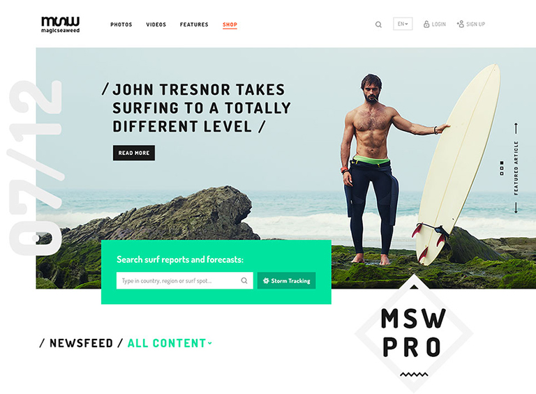
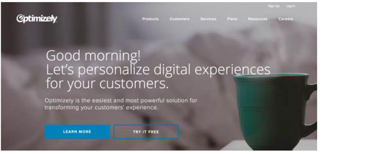
Strong visuals, including photography and videos, are an easy way to grab user attention and when paired with an actionable element, it can help generate an immediate click. It should be quick to move from one point to another within the design. Think about it in terms of e-commerce. A user sees a bag on social media, clicks to get to the website, where they must be able to see the item to keep interacting with the website.

A time-saving design would show the bag with a ‘Buy Now’ button. The user should easily understand how to get it or what is the next action, without having to fumble through multiple pages or clicks. Also, it’s a good practice to use the same image for off-site and on-site promotions. A different picture might not register as quickly with the user as the same image. This works because most people can process an image more quickly than reading words.

Divide Complicated Elements into Parts

Create a story so that you can break a complicated design into smaller, more digestible pieces. Smaller blocks and pieces of content are easier to understand quickly, thereby facilitating a users’ movement from one element to element. Try user interface elements such as “read more” links, card-style blocks and parallax scrolling animation to create engagement and break down complicated designs.
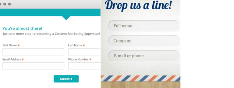
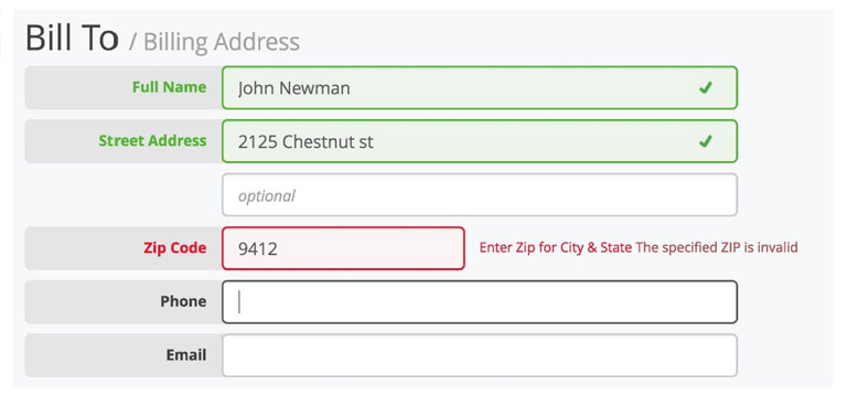
Cut Down Forms

One of the easiest ways to make the design quicker for users is to cut down on asking for not so important information. Forms must be simple and should only collect the essential information such as name and email address, and follow up later for forms designed to generate leads.

Use forms that validate data so users know if they’ve entered something wrong, so corrections are quick and easy. Minimize typing and use buttons or checkboxes in forms where applicable.

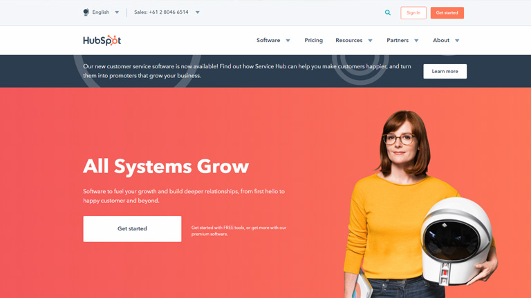
Use Bold and prominent CTAs

Make the design quick to use and easy to finish with a bold call to action design that users can’t miss. Bright colored, oversized elements can help users immediately see what they are supposed to do. Further, provide content within buttons that tells users exactly what to do and what will happen when they “click here.”

In order to be seen, a CTA should have plenty of contrast so that it doesn’t blend in with surrounding elements and draws attention to itself. (And don’t forget to make sure the CTA is easy to find on mobile screens as well.)

Review and Edit Multiple Times

Nothing saves users’ time, more than duly checking each and every element, multiple times before publication. Edit everything in the website design and then review it again. A time-Saving website design has written copy that’s easy to read and understand. This means that there are no spelling errors or typos, sentences use proper syntax, grammar, and sentence structure, with everything being organized in a logical manner.

Sometimes a good edit means bringing in a third party to read everything and ensure it makes sense to someone else. An extra set of fresh eyes can help you identify the hidden errors, or to analyse if the content is too complex, with too many jargons.

Consistency Is The Key

A consistent design includes repeated elements, actions, and interactions that work in the exact same way throughout the design. It simply means that a button should always look like a button, have the same color and font, same hover state and work in the exact same way no matter where the button leads the user. Repeat this idea for any element in the design that gets used multiple times, such as icons, the cart, forms, links and social media buttons. Be consistent with other elements also. Headlines, body text and images used should also follow a consistent style.

Conclusion

Whether you agree or don’t, users are looking to do things in a hurry on your website. They want to quickly finish tasks or meet their goals and move on to something else. The more your design saves users’ time, the more user-friendly your website will become. Talk to our experts to discuss how you can add to the UX of your website.

Categories
Web Design

Designing A Single Page Website? Here Are Some Tips

Some websites don’t need multiple pages but just work better with single page designs. Single page website are typically portfolio pages, product sites, landing pages, and sometimes company pages too. You always want a site with little content but strong branding and clean navigation. But that’s not it. There are other trends which go into a strong single page layout. Adding to the user experience is one of the critical elements and a lot of thought should go into how can you design a single page that’ll offer the best user experience? There is no absolute “best” way to craft a single page site, however, here are a few tips and good practices which really work.

Auto-Scrolling Nav Links

A very common feature you’ll find on single page designs is the automatic scrolling navbar. This is where you click a link and it’ll automatically scroll to that section of the page. It works just like a regular navigation menu except for the custom animation scroll effect which offers a really fancy user experience. But sometimes this animation might feel far too slow to some people and that’s one risk that you face when forcing a custom animation into the navigation. To combat that, you can use something that auto-loads different pages and scrolls down into new sections on the same page. The load times are faster with a much smoother transition. Designing a sleek, auto-scrolling nav effect ensures that page sections load into view very quickly and the navigation is also easy to read.

Side Navigation Labels

If you don’t want the navigation fixed to the top of the page you can always design vertical navigation. The links on either side follow the user along the page. They act similar to the typical nav bars, except they’re a bit out of the way and more accessible in that space. Side navigation is not the best fit if you have a lot of text or need to support smaller screens with the same vertical menu. Instead, you can try switching to a more mobile-friendly, accessible menu with responsive techniques. Many websites also use dot navigation links. These aren’t great because they don’t tell you which section of the page you’re currently viewing, but they do save a lot of space and look pretty sleek. Many companies use auto-animate through different sections which works well when you’re adding flashy graphics into custom-styled layouts. Vertical navs work well if you can fit them into your layout.

Portfolio Layout Ideas

If you’re designing a portfolio site then you need to consider a lot of things. Well, a portfolio site is mostly all about showcasing your work, but a great portfolio also reflects ‘you’ into the content. This can all be easier to consume if it’s on one page. It’s not necessary that every portfolio is always just a single page. However, a portfolio website design works well in a minimalist design sense. It’s important to keep the page design clean and simple, yet very fun to look at.

Add CTAs For Sales Pages

If you’re selling a product or digital course then it’s always smart to include a CTA somewhere on your page. This is especially true if you’re designing a landing page where it’s the only page someone might see. Like in single page designs. Try to keep the text as clean as possible, with simple icons and a really smooth design. You really don’t want to distract users, rather you want them to take the desired action. If you’re meeting your goals, then you know you’re on the right track. With great CTAs you’ll notice that font choice, size, position, and color all play a huge role. Those are bound to get people to click at first glance.

On-Scroll Page Animations

Based on the title of “on-scroll animations” you might think this is the same as nav animations. But it’s really its own category and it’s definitely a nice effect. You can easily add page elements that animate themselves throughout the page while scrolling. notice the different page elements animate into view. They’re pretty easy to watch so they don’t move too fast or too slow, but there is clear movement. The idea is to grab people’s attention. It works best with graphics and different page sections, specifically alternating page sections. This effect does not radically alter the page’s behavior or intent. This is mostly an aesthetic trend that just makes everything easier to look at.

Our design team will be more than happy to discuss more on single page designs. Have a quick word with them.

Categories
Web Design

Designing Websites Applying User Behaviors

Every website is developed with an objective. The objective can be anything; connecting, selling, informing, transacting etc. Every website is designed and developed to complete these goals. Whether the goal is connecting with friends or searching something on the internet, it remains the core of developing a website. As a designer, it is very important to understand this concept of user behaviors to create better user experiences. The basic idea is to keep the usability first and everything else like visual elements second. Here are a few web design tips which are based on understanding user behavior and will help you to design profoundly usable websites.

1. Design Must Be Determined by User Goals

If you don’t know the question, how are you going to answer it? It’s as simple as that. Before even thinking about the design of a website it is important to know what is actually required. If you don’t know what the users want, you will never be able to prepare a useful design. Analyse the KPIs because these will define your goals. Do you want people to instantly take actions and transact on your website, or you want to increase direct sales, or you just want them to spend more time on your website? You can design sites intuitively based on assumed goals, however, the best way to design is merging your goals with the user’s goals into one cohesive final product.

2. Test It and Track It

Analyse and assess your ideas based on KPIs and implement your understandings. You should always be testing new ideas to see if you can optimize any parts of your website. One of the best methods to do so is through A/B testing. Think about what you want should happen and how will you be able to make it happen. Take an example of a content heavy website, say an e-newspaper. A lot of these kinds of websites face high bounce rate problems and the main reason for users bouncing off is not being able to navigate themselves to more content. A simple addition of infinite scroll is the answer to this problem which radically improves the user experience and helps people who are stuck around to read content.

When working to improve certain metrics, think about the user experience, because this is really how design should be done. Imagine what the user would think and feel while using your website and how can you improve their experience. Some factors can be very simple and direct. Like the color of links on your site. Just changing colors can have a surprising effect on CTR, signups, or actions taken by a user.

3. Be Open to Changes

The willingness to adjust and change at different time intervals is essential while designing. A few quick halftime adjustments come in very handy, as a lot of times you face design roadblocks and changing a few components is the only way around. If you’re testing something that clearly isn’t working then don’t waste more time on it. The same goes with any new feature as well, which the users are complaining about and clearly needs to be replaced or worked upon. You should know when to call quits and start on something new.

At the end of the day, it’s your users who really matter and if something is not working for them, it has to go down the drain, irrespective of how dear it may be to you as a designer. Your personal feelings should not interfere while taking a decision on what works and what doesn’t. Be open to changes, new strategies and ideas based on new evidence and analysis.

4. Take a Holistic Approach

Every design that you create must comprise of smaller usable pieces which together contribute to a larger composition. This is the best holistic approach to any and every design. You know what they always say, “look at the bigger picture” and focus on understanding how every visitor will perceive it. Question yourself -is your homepage user-friendly, will the user easily understand ‘what to do’ when he lands on the homepage, will he be able to easily navigate through the website? Both the composition and overall design quality play a big role in how people perceive a website.

People need to rely on authoritative designs that work well and serve a purpose. Unfortunately, many designers do look at the big picture, but still, fail to use it and implement the ideology. This leads to a visually pleasing design, which is a useless interface. Design is not just about aesthetics and appearance. It’s about ease of use, practicality of the design, user experience, responsiveness of the website, page load time and a lot more. A holistic approach to design considers more than what you can see. It’s also about what you experience by using the website.

5. Provide Visual Feedback to Users

It’s very important to inform users when are they correctly interacting with your interface and also when they are not doing so. Visual cues and messaging show users whether their interaction is producing the desired results. One of the simplest examples of this can be changing the visual styling of a button when the user hovers over it or even when they click on it. This will give them a sense of confidence that they are heading in the right direction, and on the other hand, will give them a sense of caution if they feel they are not going in the correct direction. Visual cues may not be a direct way of giving feedback, but it certainly is a very effective medium of doing so.

If you consider the user experience at every stage of the design process, designing a user-friendly design will not be an uphill task. All it needs is to put yourself in users’ shoes and analyse every action that they can take and normally do. However, it’s very easy to lose focus and get into a self-centered mode and design something completely to satisfy your own needs and preferences.

Talk to our design experts and discuss your design needs.

Categories
UX

Usability Mistakes That You Should Avoid

Importance of usability is very well known to designers. Usable websites offer great user experiences, and great user experiences lead to happy customers. Designers must implement smart design decisions and aim at satisfying and delighting the visitors, rather than frustrate and annoy them. Here are a few usability problems and challenges that are very common across websites and some recommendations on how to cope with them.

1. Small Clickable Areas

Hyperlinks are designed to be clicked, so to make them usable, it makes sense to ensure that they’re easy to click. A lot of designers fail to make the hyperlinks clickable and thus reduce the usability. We need to make the clickable areas bigger because our hand movement with the mouse isn’t very precise. A large clickable area makes it easier to hover the mouse cursor over the link. To ensure we get a large clickable area, we could either make the whole link bigger or increase the padding around the link using the CSS.

2. Incorrect Use of Pagination

Pagination refers to splitting up content onto several pages. This is often found on websites that have long lists of items; for example, products in a store or pictures in a gallery. Using pagination for this purpose makes sense because displaying too many items on one page would make the page slower to upload and process. Alternatively, in particular cases of content pages, like blog articles, the content is sometimes split into several pages. It’s unlikely that the article is so long that it requires pagination, however, this is done to increase page views as a lot of blogs and magazines get their revenue through advertising.

3. Duplicate Page Titles

The title of each Web page is very important. Page titles are the pieces of text we write between the <title> tags in the <head> section of our HTML code. Sometimes people create a generic title while working on their website’s template, which is usually their website’s name. This is a mistake and must be avoided because it robs each page of a couple of key benefits.

The first benefit is that a good title communicates to your visitors a lot of information about what the page is about. People can quickly figure out if they’re in the right place or not. Remember that this title doesn’t just show at the top of the browser window; it’s also shown on the search engine results pages.

The second reason has to do with SEO. Search engines need different information to rank the results of a particular query. A page title is one of the more important pieces of information they use to gauge how relevant your page is to a particular search term. This doesn’t mean you should load as many keywords as possible into the title, but you should ensure that each title describes the content of the page, including a couple of words you think people will search for.

4. Missing Contact Channels

User engagement is important if you want to build a successful community, and communities are important if you want to build successful websites and social web apps. User engagement is also important if you want to build loyal customers. Quickly answering people’s questions and fixing their problems doesn’t just mean that you have good customer service – it means you care, and your customers and visitors will appreciate it.

Your visitors must be provided with an easy channel for getting in touch with you, like an email address or contact form. You could also use contact forms to bypass the problem of showing your email address on a page.

5. Too Much Functionality That Needs Registration

Your website may have some content or features that require visitors to register before using; which is fair enough, but be careful how much content is put behind this registration shield. Very interactive web applications, such as emails, document editing and project management, restrict 100% of their functionality to registered users. Other websites, such as social news websites, do not. One can browse all the stories and enjoy the functionality without identifying themselves.

When you implement a log-in barrier, be careful that you don’t lock away features that don’t really need user identification. Some blogs require people to register before posting, which is a way to deal with spams, but it will also significantly decrease the number of comments you see.

User participation on your website is affected by how many barriers there are. Removing barriers such as registration will almost certainly increase user participation. Indeed, once users start using your website, they will more likely sign up, because they’re already involved.

Usability is of utmost importance and therefore must not be compromised at all. Speak to our design experts on how you can achieve a successful web design without actually compromising on the usability front.

Categories
UX

5 UX Element Which Shined Throughout 2018

There’s no denying that user experience was big in 2017, and continued with the same pace in 2018 as well. Anticipating user expectations in future is tough and that’s why it’s a bit tricky to live up to user expectations. However, for designers, it’s important to at least be proactive to anticipate user expectations. The following 5 UX element have created a buzz throughout the year and can act as a guide for designing a satisfying and successful user experience in future.

1. Simplified Journey

There’s always some intention in a user’s mind when they interact with a website or mobile app; they want to achieve the intention as quickly as possible. To create a user-friendly application or website it is essential to simplify a user’s journey with time-saving designs. In simple terms, reduce the number of steps users have to take in order to achieve their goal. All the applicable information must be presented in an easy-to-use format and with a smooth navigational flow. Displaying only the most relevant information specific to the user context is instrumental in creating an optimal user experience.

2. Personalized Experience

Personalization is a technique embedded within the strategy of time-saving designs. It is important to recognize the need and importance of shifting from creating generic experiences to individually targeted experiences. To achieve this, designers need to identify the wants and needs of users on a deeper level. With the help of individualized data and advances in machine learning, technology is becoming capable of adjusting automatically for specific users. One of the best examples is the incorporation of personalized recommendations based on user behaviors. These suggestions increase chances of a user taking an action on your website.

3. Human Factor

Due to technological advancements like touch and voice recognition on smartphones and other digital devices, user expectations have changed a lot. People now expect to interact with digital products just like they would typically interact with another human. Therefore designers need to put pay attention on providing a more human experience to users while they interact with your websites. The popularity of humanizing digital experience is correlated to connecting with user emotions. Users should feel connected to their devices in an emotional way.

4. Focus on Content

Well-organized, comprehensive and readily available content plays a big role in making websites and mobile applications appealing to users. Recent trends concentrate on removing all unnecessary elements which can distract a visitor and places the spotlight on content. Content-centered experiences can be created in two ways – either using a design that highlights content or allowing the content itself frame the design. The ultimate goal is to ensure there are no obstructions in a user’s exposure to your website or application’s content. Start by removing excessive visible clutter, so that the message you want to convey easily reaches the visitors.

5. Voice-Based Interaction

Hardware devices that we use to access the web have become more streamlined, which calls for a more streamlined UX. With every new update, more and more buttons are vanishing from smartphones, tablets and even laptops. As a result of this progression, voice user interface (VUI) has surfaced. VUIs have become integrated into most major technologies, such as products from Google, Amazon, Apple, and Microsoft. A fair amount of web searches are performed through voice inputs. With your users most likely using tech from one of these innovative VUI pioneers, it is a good idea to analyze how your website can benefit from adapting.

It’s always a good idea to take cues from currently trending UX trends to anticipate future user expectations and tailor future UX based on it. For more insights on latest web design trends, talk to our design experts NOW!!

Categories
Blog Web Design

Best Way Of Using Search Option In Your Web Design

Often visitors find themselves in a clueless situation while trying to find particular information on a website; especially on a website with a lot of content. A search option comes to their rescue in this situation. Moreover, it acts as a crucial navigation tool and guides users to the intended information. Most of the websites offer a clearly visible search button on the homepage. Search button acts as an assistant to the users and thus needs to be designed properly. Without a well designed and easy to navigate search button, viewers won’t stick to your website and will simply bounce off. If your content is growing at a rapid pace, you surely need a search box, and make sure you design it good. Here are a few tips to keep in mind while designing and putting a search box to effective use.

1. Use The Universal Magnifying Glass Icon

When you are designing your search box, keep the familiar magnifying glass icon. This helps visitors to easily locate the search box. When viewers are trying to find some information or a product which they don’t find easily, you really don’t want them to put more efforts in looking for a search box. While looking for a search bar, natural instincts force them to look for a magnifying glass, as it is a universal search icon. Continue with the same icon because a majority of visitors, if not all, are familiar with the icon.

Magnifying Glass Icon

2. Search Bar Must Be Prominent

While displaying the search bar, ensure that the design is prominent so that it can be easily found. When answers are hard to find, your search bar needs to be available as a quick and easy solution. Not just the icon, but the text field should also be easily visible so that your viewers know where to ask their question. Placement of the search bar has been a matter of discussion among designers since ages. The truth of the matter is that it should be placed where the user expects it to be; which is either at upper right-hand corner or upper center section of the page. Top corners of the page are often where people expect it to be, as a lot of popular websites place it over there.

mswpro

courtesy:mswpro

3. A Submit Button Is Must

The search button on your website is like Google. The difference is that Google searches the query across the web, whereas search box looks for answers from your website. As a result, it should be reasonable for viewers to expect that by typing in a question, they have to submit their query by clicking on the ‘enter’ button. However, it does help to have a large submit button which shows your viewers what to do. It helps to make this area large so that viewers don’t have to click and point the mouse or tap a narrow area on a phone or tablet. Many viewers will click on ‘enter’ instead of submit. When designing your website, you can test that the enter button will work in order to produce the correct results.

4. Search Box On Every Page

Placing a search box on every page increases the efficiency of your website. Visitors may get stuck on any of your web pages and at that time can easily navigate their way using the search option. They might reach to a web page from the home page using the search option, and they may even be happy with the content they find there, but they may wish to explore more. If there’s no search box on that web page, they will again get lost. Search bar should also be included on dead end links such as any 404 pages, so that your viewers will be able to find information they are looking for and return to your main site should they need to.

github

courtesy:github

5. Long Search Field

When your viewers type a query into your search field, you must have enough space there so that they can see what they are doing. This way, they will be able to review or edit their query. Ideally, your text box should allow 27 characters or more because most queries will be contained in this amount of space. Set your width using ems, or the size of one letter m. This will enable you to judge your space effectively. In order to save space, an expanding search field, which grows as the user types in a question, should be used.

courtesy:Cnet

6. Auto-Suggestions Enabled

Autosuggestion is a blessing for visitors who are typing their queries into the search box. It prompts them to quickly reach to what they are looking for. Framing queries is a tricky business and not everyone is good at it. If visitors don’t find any relevant answers to their query, it’s very hard for them to rephrase the question without being prompted. By using the auto-suggestion box, users are able to search for content effectively.

courtesy:Cnet

Conclusion

A search bar offers your viewers the opportunity to navigate your site quickly and efficiently in order to find the content they are searching for. This aids user experience and provide them with some sense of control. It should be bold and easy to find, so that the user is never confused about how to find information. User experience is a vital part of web designing and plays a pivotal role in the success of your website.  Our experts  are ready to guide you on how to design a UX rich website.

Categories
UX

5 UX Rules Every Startup Must Recognize

Anyone who’s familiar with best practices in design fields knows how important it is to commit time and resources to UX development. But tech startups tend to spring up almost from nowhere, boosted by programmers who may not have a great understanding of the importance of user experience. The result – UX designs that confuse, infuriate, and ultimately leads to tons of questions. Here are 5 UX rules that are the most important for tech startups to recognize as early as possible in the development process.

Rule 1: Let Go the Vanity Designs

Your back-end tech ideas may be wholly revolutionary, but it doesn’t mean that any design you come up with is automatically fit for purpose. The only opinions that really matter when it comes to UX are those of the users, and they don’t usually leave much room for vanity design. Every designer thinks he knows a lot. But don’t try to reinvent the wheel. Unless you have an incredibly compelling justification, adhere to existing UX standards, and give your users something recognizable instead of something revolutionary (familiarity beats novelty). Being creative is fun bit don’t try and over do it.

Rule 2: User Psychology is Key

Content is king is the common belief, but that isn’t really true. User psychology is king. Content is just one way of affecting it, and UX is another. In fact, top UX designers are masters of psychology, carefully studying how and why users take particular actions.

Startups can easily get stuck in an infinity loop when it comes to psychology, imagining one type of end user and getting trapped by their perspective. People are more complex than that. Users will vary in countless ways. You can’t account for them all, but you can do a good deal of research and come up with general personas that cover most of your target audience (try using a guide on how to create personas).

Rule 3: KISS (Keep It Simple, Stupid)

The best user experiences are streamlined, trimmed down for speed and efficiency. You might think this simply calls for compressing images, using clear language, and avoiding unnecessary data entry, but there’s almost always more to be done.

When prototyping a UX, you should cast an eye over every single element; every image, CTA, paragraph, button, or piece of styling and after careful review, ask “Is this really necessary?”. If you get rid of it, does the end user lose anything of significance? Will they find it harder to achieve their goal, or like the site any less? If an element doesn’t justify its presence, scrap it. Smooth out the friction. A simple design is easier to demonstrate, understand, run, and maintain.

Rule 4: Maintain Consistency

Some layouts can be extremely confusing, with variable design elements and unclear contextual clues. That’s why making your UX design consistent across every aspect of the project is essential. Think about basic visual elements like icons. We don’t really pay that much attention to them when they’re used correctly, but they glaringly stand out when they’re used poorly.

You can get a solid idea of what you can and can’t play within a layout by taking one look at the themes. Change the colors? No problem. Change the font? Also fine. Alter the icons or the basic navigation? Not the best idea. Get it slightly wrong and users will have no idea what’s happening. You don’t want to make your users think.

Rule 5: Get Rid Of Lorem Ipsum

At some point in UX design history, someone decided that creating layouts and populating them with fake text (usually Lorem Ipsum) was a good idea. It really isn’t, and the sooner you get out of the habit of using empty copy, the better off you’ll be. At the very least, this is because text is a core component of UX. It steers people away from certain areas and towards others, and has a knock-on effect on how the rest of the interface is perceived. Iterating upon copy is just as important as iterating upon any other UX element.

UX can seem like a distant concern for a tech startup focusing on functionality and scaling, but where there’s software of any kind, there’s a demand for great UX that cannot be overlooked talk to our UX experts and discuss your requirements.

Categories
Design

Evolution Of UX Design Principles Over The Years

Since the early 70s, designers and developers are working hand in hand to make screen-based user interfaces. At that time, actual user experience(UX Design) was least recognized and making everything work with a limited amount of processing power and a monochromatic screen was the sole goal. Slowly and gradually the hardware evolved which led to the growth of design possibilities.

Whether its a simple text on a screen or a fully-functional Graphical User Interface (GUI), its the UX designer who helps people to understand and draw sense from the technology. The early period of computing restricted the learning process to how to use windows, tabs and icons. While in the contemporary era, learning focuses more on making the most out of a tiny screen and touch gestures.

The iPhone Revolution

It all began with the iPhone which started a revolution and changed the principles of UX design. It was the iPhone which shifted our focus towards user experience and made it one of the most critical elements of any design. The use of button-free gesture control is iPhone’s best-known innovation and is the biggest contributor to its success.

iPhone Revolution

With the iPhone, users could control everything from the screen and there were no buttons like the other smartphones of that age. The iPhone looked clean, elegant and consistent. It completely transformed the use of smartphones. This design innovation made a smartphone more of a fully-functional computer. Although iPhone was not a leader in camera quality, memory, connection speed etc., it sure was a fully capable computer operating system.

Parallelly, UX design also evolved owing to faster processors and extended memory and in conjunction with that the iPhone suddenly opened up thousands of new possibilities for designers.

Responsive Design

Designing was much simpler when you knew that most of your users were accessing your interface on a desktop computer. That was changed with the growth of smaller screens like a laptop, a tablet or a smartphone. A UX designer had to make sure that the interface looks good across every platform. Responsive design has changed the way companies think about UX design. A Responsive Design enables the different elements to act according to the size and configuration of the device.

Responsive Design

A menu can widen out across the desktop screen, giving users more choice, then shrink to essential navigation elements on a smartphone. Moreover, it has driven us towards a unification of user experience across devices and modes. Companies take extra efforts to ensure that their browser-based UX has the exact same workflow and feel as their app does. With a change in how people access the web now, mobile-first has dominated both web design and software development.

Data-Based Design

The design revolution posed new challenges which weren’t on the surface previously. Designers required to make complex user interactions clear and intuitive on both smaller and bigger screens. A list of tasks which previously required a 17-inch screen, keyboard and mouse must now be accessible with a 4-inch screen and a thumb. User demands were increasing day by day and designer had to live up to the expectations. This pushed the companies towards data-based design which involved user testing to get everything right.

It became common for companies to implement user testing in order to address issues like flow, accessibility and user design preferences. User testing allows a trial of multiple versions simultaneously, get user feedback and suggestions, make changes and retest without actually programming and reprogramming the app.

Data-Based Design

Not every company implies UX design testing in the best ways and can draw false conclusions or data. For example, many companies don’t really watch users while interacting with the software, so all they get is self-reported data. Another good example – users may be testing the app prototype sitting down at a desk, but in real time they are likely to use the actual finished app while walking around. This can lead to developers thinking their UX design principles are sound when they actually are flawed. Moreover, untrained testers can draw wrong conclusions from user data.

For UX designers it’s important to learn how to effectively integrate testing and other data sources into design decisions. Usability testing has already driven a refinement in UX design principles. Companies like Apple or Google carry out lots of testing and use their findings to create their own style guides, both for in-house work and apps carried in their store.

The pace of design evolution has been on an increase since past few decades and it wouldn’t be a surprise if the design principles which are trending today completely fade out in a few decades. It’s important for a designer to understand the changes in user experience fundamentals and incorporate it in the design. Talk to our design gurus for more insight.

Categories
Web Design

5 Pro Tips To Master The Art of Web Designing

The web designing process is as vast as an ocean. There’s a plethora of design principles and trends that a designer needs to follow while pouring down his creativity in a web design. While it’s never harmful to experiment a bit here and there during the designing process, but it’s good to keep a few tried and tested tricks at the back of your mind. Here are 5 pro tips that will come in handy while designing a visually stunning and user-friendly website.

1. Always Left Align Your Logo

The logo of your brand holds great importance. Therefore, placing it in an appropriate spot on your website becomes a pivotal task. Designers think that centrally placing the logo will ensure that it gets maximum attention as it will become more visible, however, that’s not really the case. Studies have shown that a left aligned logo grabs a lot more attention than a right or center aligned one.

Users tend to start reading a webpage from the top left-hand corner, moving left to the right bottom corner, which means users will focus more on a left aligned logo. A right aligned logo portrays weeker brand image while a centrally aligned logo hinders navigation to the homepage. Moreover, a majority of languages across the world use left to right scripts.

Left Align Your Logo

2. Never Use Pure Black for Text or Backgrounds

Colors and Types are very important to enhance the visual appeal of any website and black is one of the most commonly used colors for texts and backgrounds. But, if you’re using pure black color for your text and backgrounds, you’re going down the wrong lane. A study has shown that pure black text and backgrounds with white can cause discomfort for the eye when users read the text over an extended period of time.

White has 100% color brightness and black has 0% color brightness, which leads to a huge disparity in the light levels users see. This is very discomforting for the eyes. Instead of black, use dark gray text on a white background so the change in brightness will not be as drastic.

Text Color

3. Use Single ‘Full Name’ Field In Your Forms

If your form has two separate fields for First Name and Last Name then you must change it. It’s not necessary that every user will be able to split the name into a first and last name. The cultural aspect comes into picture here. For example, Latin Americans generally have two last names, one from each of their parents, while Chinese people use their family name as their first name and their personal name as their last name.

Bifurcating the name field into two parts can cause confusion among users. Instead, use a single ‘Full Name’ field so that users can enter their name in the manner they pronounce and write it.

Full Name

4. Always Show Error Messages On The Right

While displaying any kind of error messages, always stick to the right side. The western reading system goes from left to right. When users move their sight from the input message to the error message towards the right, it’s a natural movement of their eyesight and thus takes minimum mental and visual effort.

On the other hand, when the error messages are placed on the left-hand side, it goes against the western reading flow and also breaks the natural reading flow of the user.

Error Message

5. Use A Ghost Button As A Secondary Button

A Ghost button is a button that has an outline but no solid fill. When used in the right context, they can clarify the priority of an action and increase task efficiency. When two buttons are used together, users think about which button to click. They depend on text labels to come to a decision, however, if visual cues are provided to them, they can decide faster.

A solid button for your main action and a ghost button for your secondary action will accelerate the user’s decision-making.

Button

For more such interesting design tips you can reach our design experts who would be more than happy to discuss your design requirements.

Categories
UX Web Design

How To Enhance The UX Design of A Hotel Website?

User experience is an essential element of any website. However, the hospitality industry is one such industry wherein the importance of user experience grows multiple folds right from the word GO! The heart of the entire hospitality industry goes in providing an amazing experience to its customers, especially when it comes to hotels. As a hotel owner, you wish to provide a memorable stay and experience to the guests and also offer them amazing user experience right from the first point of contact, which is your hotel website. So, here are 5 tips to enhance the UX design of your hotel website and create unforgettable experiences.

1. Optimization Of The Booking Flow To Boost Conversions

Conversion is the key. No matter how divine your website looks, or how delicious your food tastes, if the conversion ratio of your website is low, it all goes down the drain. To ensure that your conversion ratio is in place, you must streamline the booking process on your website.
Focus more on usability rather than the aesthetics of the booking window. Always place the booking window at a clutter-free and visible spot on the website.
Clearly highlight the room types and rate differences between the rooms. Also, support it through relevant high-quality images. This helps the user to quickly make an informed decision.
Gather only vital information upon checkout and refrain from asking unnecessary questions. Make sure that you provide a clear summary of the booking so that the customer can review and confirm the booking.

Source: Holiday Inn

2. Design For Mobile First

This needs no detailed explanation. Majority of the people these days access the internet through their smartphones and thus it’s pivotal that you design your hotel website for the mobile screens first. Moreover, the importance of mobile first design grows more as the users predominantly make bookings while on the go. There’s a sense of urgency in these cases, which means the design should be focused towards usability rather than functionality. In case you’re not able to provide the complete functionality of the website to mobile users, at least provide a link to your full website to them.

3. Make Your Website Visually Compelling

Users crave for high- resolution photographs of the hotel property. They want to take a virtual tour of the entire hotel through the images. So provide them high-quality photographs of every nook and corner including the rooms, bathrooms, lobby, view from the balcony, interiors, exteriors, swimming pool, banquet and all other facilities available in the hotel. That said, ensure that your images are optimized, else the loading time of your website will skyrocket, only to push up the bounce rate and drag down your business.

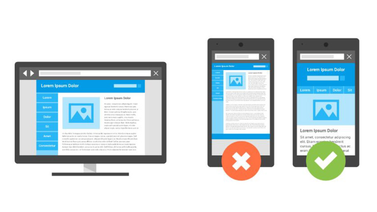
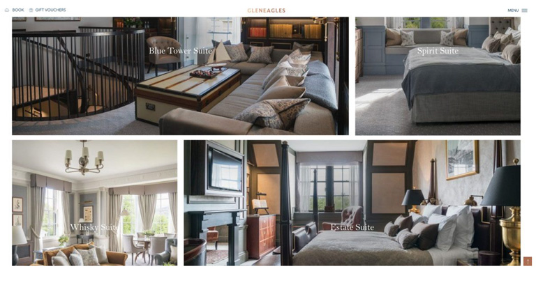
Source: Gleneagles.com

4. Offer Delightful Customer Experience Through The Website

User experience and customer experience are very closely connected and go hand in hand. Your website user experience can heavily influence the overall customer experience of your guests. So, it’s best to provide a delightful customer experience from the very first touchpoint which is your website. Online travel booking websites like Booking.com, Expedia etc. can never provide a personalized guest service, which is an advantage for you as a hotel owner.
Ensure that there are multiple ways for a customer to get in touch with your hotel administration, straight from your website. A landline phone number, skype, contact form for reservation related inquiries and special requests, as well as a live chat are must-haves on your website.
Offer special add-on services, which are not available on any other sales channel. It can be a complimentary welcome drink, a bottle of wine or perhaps a special discount. This will make the user feel the difference when booking with a hotel directly and will ensure repeat purchase directly from the hotel website.

Source:thelincolnhotel.com

5. Add Reviews From A Trusted Source

A study showed that almost 77% of travellers do reference review before booking an accommodation. Social proof is one of the most important factors to influence a buyer’s decision. In order to enhance your website’s credibility and provide social proof for your guests, showcase reviews from a trusted and well-known source like Tripadvisor. While adding a Tripadvisor review widget might not add an aesthetic appeal to your website, it surely is much more convincing than your own website testimonials.

Source: West Side Guest House

Developing a hotel website which is great in terms of both UX and marketing is a daunting task, and it might take more than one go to achieve the feat. But, these tips really come in handy during the design process and smoothens the path towards the ultimate goal. Talk to our UX experts, and learn more on how you can revamp your hotel website.