NYX Ditech

Categories
Web Design

Avoid These 5 Things In Your Website Design To Stay Up To Date

If your website was designed a few years ago, there’s a bright possibility that there are a few elements which are unpleasant guests. They are outdated and need to be removed immediately from the website so that the website doesn’t look outdated. The world of web keeps changing every day and it’s essential that your website also keeps itself abreast with the new developments and advancements. This calls for a removal of certain outdated trends and practices. Here’s a list of 5 Don’ts that you should keep in mind while finalizing your website design.

1. Never Keep Social Media Icons In The Header

The header of your website is one of the most important areas of your website. This area gets the utmost attention and must be filled with the critical elements to which you want users to focus the most. Keeping flashy social media icons right at the top of your website layout is only inviting trouble in a quiet way. It takes a lot of efforts to get users on to the website, and by placing social media icons you’re guiding them to bounce off from your website to your social media handles. That will result in a high bounce rate.

Instead, you should use social media widgets which allow users to like your page etc. all within the environment of your website. That’s just a smarter way of letting people interact with you through social media.

2. Avoid Stock Photos

Pictures play a huge role when it comes to convincing users. Studies have shown that pictures have an excellent positive impact in terms of conversion as well. However, if they are not authentic and are simply obvious stock photos, users are not going to buy them. By obvious stock photos, we mean a smiling pretty girl’s face, the corporate handshake, the light bulb and much more. People have started undermining these stock photos and more than often make fun of the websites that use them.

When people will come across these stock photos on your website, they will not only find it cliched, they will also lose faith in your company. Instead, you can use custom photography and use real photos of your office, staff, and leaders. These are impossible to fake and are bound to create a solid impression

3. Get Rid Of The Email Links

If you have anything like staff Bio Pages, a very common practice is to use a little link to send email to that particular person. This is not the best of the practices. Firstly, it attracts email spamming. Spam marketers are always on a lookout for this kind of things. Secondly, it’s a real disaster when it comes to User Experience. Think about when you click on one of those. It opens up some kind of native email program on your computer like Microsoft Outlook or Apple email program. That’s just annoying.

Instead, you should use email sending forms. They are trackable, you can route them to different folders and subfolders using email programs, and can easily bifurcate client requests, internal queries etc.

4. Disable YouTube Suggested Videos

With the ongoing trends in website designing, videos have become a crucial part of any website design and YouTube is undoubtedly the biggest source of it. If you use videos anywhere on your website, you must disable the YouTube suggested videos option. What happens is that when a Youtube video plays, it makes some interesting suggestions about other videos that might be related to the video that you just watched. But, at best these videos might be simply unrelated and at worst they might be videos about your competitors.

Either way, it acts as a distraction for your users and has no connection whatsoever with what you want the users to do when they are on your website. This option can be disabled by going to the Share option, then to the embed option, then Show More and unchecking the Show suggested videos when the video finishes option.

5. Bye Bye PDFs

PDFs were used to be a workaround for the non-content managed websites for long. For example, if you need to add a new document or add a new menu on to your website you make a new PDF, upload it and replace the other one so that people can download and get the newest information.

But, these days almost every website is content managed using tools like WordPress where you can quickly log in and change information without actually touching the code. So basically, these PDFs are completely irrelevant today. Still, there are a lot of websites, especially restaurant websites which frequently change their menu by changing PDFs rather than actually changing on the website which is a complete NO NO.

Conclusion

If you’re playing the game of web, you cannot be stagnant. Trends which are super cool today may find a need to be thrown away tomorrow. The key is to understand what is working today, what needs to be forgotten, and predicting what future holds for us. Get in touch with our design experts to get more insight regarding the same.

Categories
Design UX

Human Faces Can Be A Great Tool To Increase User Experience

In a quest to increase and better the User Experience, designers try to use plenty of techniques and new ideas. However, they often neglect the fact that human faces can be a compelling tool in a designer’s toolbox. Human faces are bound to get more attention as compared to any other visual graphics. Moreover, they evoke human emotions which can lead to an emotional interaction and increased engagement. The reactions and behaviors of users can be easily influenced by the use of human faces. Here are a few factors that highlight how faces can be very effective in enhancing UX of any website.

1. Creates A Stunning First Impression

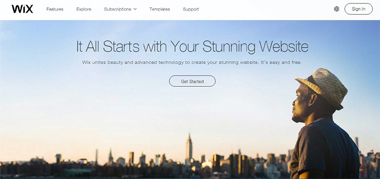
No matter what kind of content you have on your web page, images of faces will draw immediate attention as compared to other content. Many eye tracking studies have confirmed this fact and has also stated that the users keep moving their attention back and forth between these face images and other content. A face will create a solid first impression of your website on users. It doesn’t take a long for users to form an opinion about a website during their first interaction. 50 milliseconds approximately. That’s really quick and therefore a face can act as a powerful tool to create a significant impact.

wix

Pic Courtesy: Wix.com

2. Effectively Guides a Visitor’s Line Of Sight

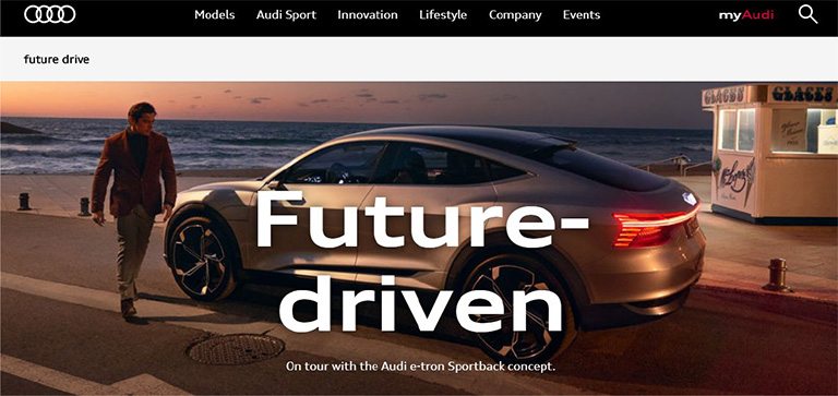
Once a user’s attention is grabbed you can also guide his line of sight with proper placement and use of face images. As humans, we have a tendency to follow the line of sight of other people. It simply means that if a face image is looking in a particular direction or towards a particular section, users will also shift their focus in that direction. Designers can use a strategically placed face image to direct users’ attention to important content and call-to-action buttons.

audi

Pic Courtesy: Audi.com

3. Facial Expressions Evoke Emotional Responses

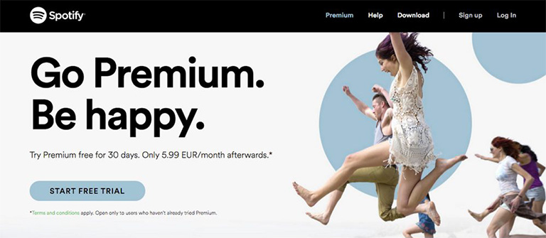
We all have come across the saying “A picture is worth a thousand words ” and this could not be truer in case of a face image. The human face is capable of expressing and showcasing a large number of emotions. A designer can convey emotions through facial expressions on human faces. The expression on the faces of images used can evoke similar emotions in users. If users view a genuinely happy face, they will most likely develop the same emotion which will influence their feelings for your website or the brand as a whole. Studies confirm that emotions in designs directly impact the conversion ratio.

spotify

Pic Courtesy: Spotify.com

4. Builds Trust

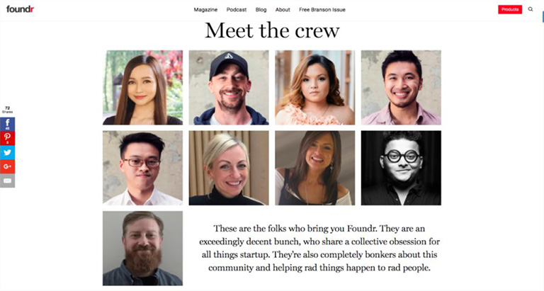
Building trust among users is very critical to the success of any business. Human faces can help a lot in establishing a sense of trust. Trust is the foundation of any successful and loyal customer base. The digital world is full of products, services, and brands. Users are always skeptical and don’t trust anyone easily. Showcasing real faces on the website portrays your openness and trustworthiness. A lot of companies have followed this and have opted a new kind of personalized ‘About Us’ section. They depict faces of CEOs, teams, and other members of the company to boost up trust. It is very useful for industries like medicine, childcare etc. where trust is a big factor.

founder

Pic Courtesy: foundr.com

5. Generates Visual Appeal

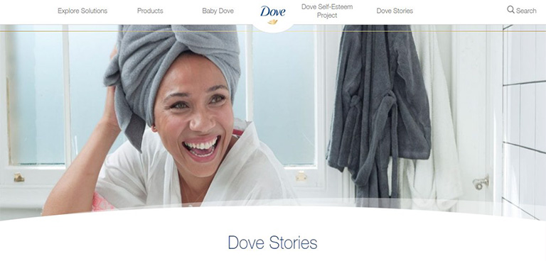
To a great extent, a product’s success is related to its visual appeal. A poorly packaged product might not get the sales it deserves. Same is the case with websites. No one wants to see an ugly design. Everyone prefers an attractive design. Human faces are a great way to enhance the aesthetic aspects of your design. Human faces provide a personal touch to users and they feel more connected. A website with human faces makes the users believe that there are real people behind this design. A lot of websites lack this personal touch which cost them deeply in terms of conversion ratio.

dove

Pic Courtesy: Dove.com

To Sum It Up

The effective use of human faces in UX design can create a huge impact on user experience. They are a great source to catch eyeballs immediately, evoke emotions, build trust and influence the behavior of users. Designers must use human faces more often while designing a website to shape up the overall experience of users. We have a team of experts who constantly infuse similar design tricks to scale up the user experience. Have a word with them and get a stunning website design.

Categories
Design UX

5 Pro Tips To Design Best CTA Buttons

The technology world has grown leaps & bounds and so has the access to the web. We access the internet to perform a variety of actions ranging from the simplest ones to the most complex actions. There is always a purpose or I must quote “An intention” behind visiting any website. Every visitor has a goal in his mind when he is browsing through a website. However, in a majority of the cases, the visitor is not able to guide himself through the process and complete the action. CTA buttons help a visitor in completing the process. But creating a great CTA button is not everyone’s cup of tea. So, here are 5 amazing tips that will help you create effective CTA buttons

1. Create A Hard-Hitting Crisp Copy

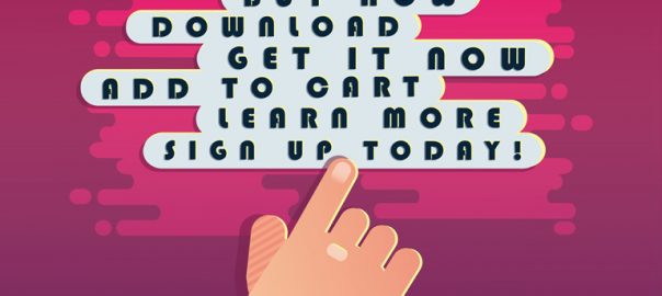
It doesn’t matter how well you design your CTA buttons, or how attractive they look in those flamboyant colors. If the language of your copy is not up to the mark, your CTA buttons will lose their effectiveness. The idea is to keep the message short, sweet, and bang on target. There’s no need to tell a story in this message. It’s recommended that the CTA message must not be longer than 10-15 words. Simple words like ‘Get it’, ‘Do it’, ‘Sign up’, ‘Download’, ‘Purchase now’, etc. are the good old classic examples of an action-oriented and straightforward CTA message.

2. Make Your CTA Button Stand Out From The Crowd

What’s the use of a CTA button if it is not even properly visible on the website? Visitors don’t know the location of your CTA button and they are not going to sweat it out in an effort to find it. Thus, the CTA button must always stand out visually. Here are a few things to remember:

  • Your CTA button must not be a tiny dot on the web page. It should be large enough to be noticeable at any given point in time. Having said that, don’t over exaggerate the size factor otherwise it will lead to banner blindness and the purpose will be defeated. Also, make sure that you choose the size based on how it will display on smaller screens especially mobile devices as maximum traffic these days comes from mobile devices only.
  • Always use contrasting colors to amplify the effectiveness. Simply pick up the most commonly used colors across your website and design the CTA buttons with opposite or contrasting colors. You can use Red or Orange, in particular, considering they are the highest converting buttons.
  • If you are using any images or a custom design in your CTA, make sure that you use only a high-quality image. Moreover, the image must complement the offer you make.

3. CTA Buttons Must Be Placed Sensibly

It’s critical where you position your CTA buttons. You need to make sure that the user comes across them while browsing through the website. Ideally, they must always be placed in the path of the user. As a designer, you must be able to anticipate and predict a user’s behavior and his next move. A lot of marketers use this tried and tested method on their landing pages:
Headline > > > Marketing Copy > > > Capture Form & CTA
The CTA button at the end.

4. Use The Negative Space Effectively

Your web page will have a lot of content and there’s a big chance that your CTA button may lose its visibility by becoming a part of it. The CTA button must always stand out from the other content of the website. To do so, it’s important to manage the negative space around the CTA button effectively.

  • Incorporate blank space between your content and your call to action button.
  • It’s critical to balance the amount of negative space around the buttons with the size of the buttons themselves.
  • The button, the space around it, and the surrounding content must all go hand in hand despite the fact that they are of different sizes.

5. Create A Sense Of Urgency

Whenever someone visits your website he must feel a sense of urgency. The visitor must feel that he must act right away without any delay. Encourage your visitors to act immediately. Don’t give your visitors any reason to pause. Creating a sense of urgency is important, however, don’t mislead your visitors in any way. Also, this technique will work well with the low-cost items and not always for high ticket items.

Converting visitors into customers is the ultimate goal of any business and CTA plays the key role in this process. If you are not able to handhold the visitor in order to complete the desired action, there is a high possibility that he will lose track and bounce off. Also, there’s a lot more to a CTA button than just the button itself. The color, contrast, surrounding, content etc. all play a vital role in deciding the effectiveness of a CTA button. Talk to our experts and understand how you can create better CTA buttons.

Categories
Web Design

10 Biggest Main Menu Mistakes You Must Avoid

It takes a lot of efforts to get your users on your website and takes more efforts to make them stay on that page. The common saying “First impression is the last impression” still holds good in any scenario. The moment your user gets on the landing page he starts forming impressions about your website. Your main menu speaks a lot about your website. It’s kind of a marketing tool for your website. But a lot of websites make naive mistakes which can lead to a high bounce rate and less time spent on the webpage. In short, it can cause some serious damage to your business. Here are 10 common main menu mistakes that should be avoided in order to create a good impression on users.

Mistake #1: Overcrowding The Main Menu

According to a study, the human brain can distinguish up to 7 different elements at a single point in time. Once the number goes beyond 7, the distinguishing power decreases which can confuse the visitor and eventually lead him to bounce off the page. Display only the important options in the main menu and place the other options at other convenient places.

Mistake #2: The Main Menu Drags Too Much Attention

Once the user lands on your page, his attention should go towards the most important aspects of your website. The content is the king here and should get all the user attention. A highly attractive main menu will lead the eyeballs towards the top of your web page and away from the real content. So it is highly advised to keep the main menu as simple as possible.

Mistake #3: An Unresponsive Main Menu

A major chunk of the Internet is accessed through mobile devices and tablets these days. Not having a responsive design in today’s scenario is just like living in a stone age. It is really frustrating to access an unresponsive main menu on a mobile device. You need to constantly zoom in and zoom out to access the menu options while avoiding a click on other options which you don’t wish to access. Responsive has set itself as an industry standard and must be maintained at all levels.

Mistake #4: Options In Main Menu Are Wrongly Placed

According to another Psychological study, items placed at the first and last of a list are most effective. They get the highest rate of attention and retention. It’s called the serial position effect. Hence, this should be kept in mind while designing your main menu items as well. Keep the most important items at the first and the last position.

Mistake #5: Keeping Buttons Rather Than Links In The Main Menu

This is another common mistake done by so many websites. Links are far more effective than buttons and thus should always be valued higher. Buttons are not at all search friendly and are completely invisible to search engines. They require a lot of effort and time to be updated and are particularly bad for mobiles due to their slow speed. They are even less accessible to the visually impaired.

Mistake #6: You Are Using ‘Get In Touch’ Instead Of ‘Contact Us’

In an attempt to get fancy, we sometimes forget that there are many things which are most effective when used in their good old classic version. Get in touch, Reach out to us, Let’s talk, Join hands with us etc. are all fancy modifications of ‘Contact Us’. However, they end up confusing the user. So stick to ‘Contact Us’.

Mistake #7: Your Main Menu Has Your Blog Link

We often fail to understand the basic intention and role of a blog. Your blog is like a searchlight which helps the users to find your website. Hence there is no need to place it in the main menu. Unless the blog is a supercritical part of your services or the website itself is a blog, the link to your blog must rest somewhere in the footer section.

Mistake #8: Using Generic Menu Labels

Who We Are, What We Do, Where We Work, Who We Hire have been the most common main menu labels for ages. But, things have changed a lot over the years and using these labels in your main menu will not do any good for your business. Instead, make your navigation and website more communicative about your services and products. This will help reduce the bounce rate and the users will feel more connected.

Mistake #9: You Have A Home Button In Your Main Menu

This is something very insensible. Your main menu must not have a Home button. The logo of your company must act as a ‘Back to Home’ button. A home button unnecessarily eats extra space in the main menu and diverts attention from the more important content. Although this has been followed by a majority of companies, we still encounter a few websites which still features a Home button in the main menu.

Mistake #10: Not Properly Highlighting The Current Page

At all times you must remind the visitors of where they are by highlighting or shadowing the pages that the visitor is currently on. This can surely be done by using breadcrumbs, but it’s also important to make sure your main menu uses active states.

Creating an impressive and technically sound main menu helps you to create an excellent first impression on your users. In addition to that, it helps in decreasing the bounce rate and the users will definitely spend more time on your website. Talk to our experts for more details.

Categories
Web Design

5 Indications Shouting “You Must Redesign Your Website”

Things change with a drop of a hat and the only thing that remains constant is change itself. Tune back your mind 10 years ago and try to compare today’s digital world and the Digi world back then. You would probably be smiling, noticing the changes and developments in the world of technology over the last decade. The world of technology changes at a much swift pace as compared to any other thing across the planet. With every morning marking the dawn of a new technological advancement, it becomes essential for businesses to mold their business strategies. This process might require a change in the marketing techniques, brand makeover or even a website revamp. Now, the question arises, how would you now that it’s time to redesign your website? Here are a few common indications that you should look for and decide whether your website needs a revamp or not.

1. Your Website Takes Ages To Load

Every user on the web is super impatient; to a level as if he is sitting on a hot pan. If your web page takes ages to load, you are calling for trouble. The user is not going to wait for ages and within a few seconds will look for other available options. The margin of error in this situation is extremely low. Also, Google doesn’t particularly like web pages who take an eternity to load. Page loading time is an important criterion while deciding a page’s ranking.

So, if your web page takes a lot of time to load, you are bound to lose potential clients and also will slide down the Google ranking list. It’s best you revamp your website by analyzing the factors squeezing the time and eliminating them.

2. Your Website Still Has a 90’s Structure

Believe me, there are tons of websites that still look like they are time stuck in 90’s. Back in the 90’s, web pages were a lot more static and they just displayed information about services and contact details. There was no option to administer the web site to change text and images. Those days are well gone by. The world today is so dynamic that the content on your web pages may require a constant change. Inability to change the content is a serious threat to your website today and thus you must revamp your website by implementing latest tools and techniques.

3. You Don’t Have A Responsive Web Design

A responsive web design enables the web page to be displayed with consistency across all screen sizes on various devices. Websites were designed originally with a vision that they will be viewed only on desktops or laptops. However, times have changed and the majority of people access your website through other devices like tablets, mobiles etc. Therefore, it is pivotal that your web design must be responsive so the user doesn’t face any problem while viewing it on any kind of a device.

4. Your Website Has A Low Conversion Ratio

What is the ultimate goal of a website? To attract users and convert them. A conversion is the ultimate goal of the business. A conversion can be shopping, downloading a file, watching a video, sharing content, leaving a comment, contacting the company etc. If there is no conversion or a very low conversion rate for a website, it’s no good to the business.

If you notice that the conversion ratio of your website is very low, it’s certainly the right time for you to redesign your website. Analyse the causes for the low conversion ratio through web page analytics and work on the new design.

5. Your Website Has A Negative User Experience

User Experience (UX) is the key factor in deciding the success of your business and high conversion ratio. If a user doesn’t find your website user-friendly and gets bugged while using your website, it seriously creates a bad impression. You’re bound to get a blow on your brand’s reputation as well as sales. No matter how catchy the content of your website may be, it’s important for a user to find a proper way to follow and complete the ultimate task (the goal of your business). At no point in time, he should feel lost and must be clearly guided by the web design and structure at all places.

Analyse the flow and structure of your web site. Identify the flow challenges, ambiguous directions, roadblocks etc. and revise your web design overcoming these challenges to create a smooth and delightful user experience.

To conclude, every business owner must understand the ultimate fact that change is constant and they must swim with the tide. Sticking to an old web design can seriously hamper your business and brand in the long run. So keep yourself abreast with the latest trends in the web design world and be proactive to ride on the changes. Talk to our experts and analyze whether your website needs a revamp or not?

Categories
Web Design

How To Effectively Implement Long Scrolling While Designing Lengthy Web Pages?

A lengthy web page or infinite scrolling was considered bad from a design perspective and even from a user experience perspective. However, lengthy web pages have gained a good amount of popularity over the years. The exponential increase in the use of mobiles is the key propeller of long scrolling design. Smaller screens support long scrolling and thus an infinite scrolling design best suits for users on these devices.

Long scrolling helps in creating more engagement amongst users. The content appears more engaging when the user needn’t focus on navigation options on the page. Here are a few important rules which should be followed to effectively implement long scrolling while designing lengthy web pages:

1. Introductory Content Must Be Strong And Compelling

The common saying “First impression is the last impression” holds full value in case of a web page as well. The natural tendency of users makes them scroll down the page right when they land on a page. However, it’s very important that the most engaging and compelling content is always placed at the top of the page. If the content at the top is good, it increases chances of a user to scroll down the page. Use attractive images along with strong content to create interest among users.

2. Use A Sticky Menu

Even when you are creating a long scrolling web page it is important to provide the location and directions to the users. With no proper directions or lead to navigate around the page, they will most likely bounce off the page. Long scrolling becomes troublesome when the top navigation menu disappears on scrolling down the page. The user shouldn’t be scrolling all the way up to find navigation options. Use a Sticky Menu which will show the current location and will sit at a convenient location all the time.

3. URL Must Change Based On Scroll Position

One of the biggest challenges of long scrolling is the constant URL. The user’s scroll position is not reflected in the URL which makes it impossible for them to switch between devices and continue browsing from the same spot.
However, starting from HTML 5 it’s possible to change the URL without reloading the page. The history.pushState() function allows the change in the URL which enhances the user experience in terms of scrolling.

4. Provide Jump -To Options

It’s common for a user to get disoriented in a long scrolling design pattern. The amount of content is huge and is often broken down into chunks. It creates a problem when all the chunks contain equally important content. It’s possible that a user might have seen something important previously on the page and wants to go back to that content. However, he might not get a proper direction to reach back there. A “Jump To Option” is the solution to this problem. A Jump Down and a Jump Up option would solve the navigation problems for users.

5. Optimize The Page Loading Time

Another challenge with long scrolling pages is slow loading time. It’s very critical for any website to manage a decent or rather quick page load time else it can be fatal for their website. According to a research, 57% of the users exit from a web page if it doesn’t load in 3 seconds. Page-loading time should be optimized for long scrolling web pages using certain effective sequential loading techniques. Lazy loading is one such technique that enables users to access the most basic content swiftly. It loads only the basic content at the first go and while a user browses through the basic content, rest of the content on the web page is loaded.

In short, if the user’s browsing experience is delightful, then they won’t really mind scrolling down a long web page. Start thinking from a user’s perspective and design for their utter comfort. Talk to our design experts today and get the best advice on design aspects.

Categories
Web Design

5 Things You Can’t Ignore When Recasting a Website into a Mobile App

It was the time when owning a website became the need of the hour and going online was the next profitable move for businesses to reach new heights. The advancement of technology has once again asked business houses to take a step forward in adopting new methodologies and matching the market’s demand. And that’s where recasting a website into a mobile app comes into picture.
The demand here we are talking about is a mobile app for your business. It is certainly one important thing, which cannot be ignored in this consumer-focused market. It’s a requisite to have in this modern era and it is probably time to recast your website into a mobile app but only after you go through the following aspects carefully.

1. Answer The Whys And Hows

Following the trend is no bad but realizing the value it adds to your business and to your audience is what makes you successful. Just because everyone is moving to mobile doesn’t mean you also should. To make this clear you need to answer several whys, one being why your business requires a mobile app? How it’ll add value to your users’ lives? Proceed, once you have answers to all the popping questions in your head.

2. Layout

Experience a user gets while on the website is completely different from a mobile app. A mobile app is more of scrolling to the end with all necessary facets covered along the way while in the case of a website you have sections to display content. Also, space is more in the case of a website and content can be displayed elegantly to the users. While an app has limited screen space, different controls and gestures to make users understand the purpose of your business. It’s important that you plan well in advance about what to be shown and what not to so that a clean, understandable interface is at the users’ disposal.

3. Features

A mobile app is all about intuitiveness and simplicity. Build an app keeping these facets in mind and users won’t regret downloading it. Don’t overload your app with features that can be easily avoided and try to think from the user’s perspective before you come to a conclusion. Incorporate features that add value to the end users, which eventually entice them to come to your app more often. Present the things in the right way and build an interactive piece for improved user engagement and business growth.

4. User Permissions For Data Access

The basic idea behind mobile apps is to make everything available and accessible while the user is on the move. Mobile apps need to access user data for improving the experience and also for devising better-personalized marketing plans. Data like location, contacts, camera, microphone and more need to be accessed, which demand permission. Make sure you ask for it in the politest manner possible and also provide them with the reason for the same.

5. Design

It is one of the most important aspects of a mobile application. Make sure to get a skillful team to work on this aspect because a neat and sort out design impresses your users, which is certainly more important than the feature list. A poor and clustered design can have a reverse impact on the end users making them abandon your app at once. So ensure you design that leaves a lasting impression on the users- making them come back to your app.

Closure

Moving from a website to a mobile application isn’t a cakewalk. It requires a thoughtful ploy to make things work as intended. For which you got to research well and equip yourself with necessary resources, skills and manpower. So reach out to our experts today and get the best directions.

Categories
Blog Technology

5 Tricks To Use Your Error 404 Page Effectively

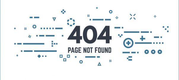
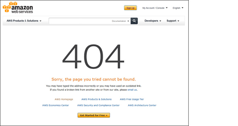
It would amuse you that people do spend a part of their browsing time on an error page and especially Error 404 page. It is one of the most common errors that people encounter while browsing the Internet. What is Error 404 exactly? It simply means that the page you are trying to access doesn’t exist. This error page is very scary for website owners and developers. However, if you follow these simple tricks, you can use this error page to your own advantage.

1. Engage Users By Providing Them Your Best Content

An Error 404 page shouldn’t act as a dead end for your users. Yes, they couldn’t find what they were looking for but you can use this opportunity to redirect them to some of your best content. Provide them options and links to the best of your content. The possibility of spending more time on your website increases many folds if you give them options. It’s very much possible that the query entered by some user is not exactly what he was looking for and he might find the information on any other page of your website. This is something which must be followed on any website.

Amazon 404 Page

2. A Search Box Is A Must

Many times the content that the user is looking for is referred in the older web pages of the website and has been removed. It’s best that you provide them with a search box so that the user can explore the entire website and fetch information related to his keywords. It works as a guide for the users and directs them towards the correct or at least most related information on the website.

Twitter Error

3. Add A Direct Contact Form

When your business model is highly dependent on generating new leads, a contact form becomes essential for your website. Placing a contact form on an Error 404 page is a bit unconventional but is very effective. It serves multiple purposes and provides a platform for users to directly contact the management. It also allows them to report any issues on the websites, errors or even bugs in some cases. In this manner, you can keep improving your website and be future ready.

4. Stay Away From Humor

There are a lot of designers who practice and preach a humorous approach when it comes to designing an Error 404 page. However, it is advisable not to use humor as a weapon. Let’s get one thing straight, if someone is looking for some information it will be obviously be something important. And, instead of getting the desired information he lands on an error page. Not really funny. Even broken pages are not in the funny list of a majority of users. It also shows the attitude and tone of your company and creates a bump in that.

404 Page

5. Offer Freebies To Your Users

Well, who doesn’t like freebies? Use certain freebies in order to lure your customers in sharing their details with you. This is another way of creating leads. He might not find what he was looking for but may find some valuable information which can help him in future. You can offer some beneficial information or a digital download as a freebie for providing their email address. For many professionals like lawyers, dentists, doctors etc., one customer can yield them a hefty revenue. Thus, it’s quite sensible to take every effort in order to hold on to every website visitor and try to turn them into a customer.

The aforementioned tips are very handy and can really help your website. The soul purpose here is to convert a negative into positive and ensuring that the visitors never reach a dead end. But it’s important to understand that all of these tricks cannot be implemented on the same Error 404 page. You need to understand which one of the above suits you the best. That will depend upon the nature of your business, your brand image, and your business objectives. Reach out to our experts and discuss with them how you can get an exceptional website designed.

Categories
Design

5 Great Ways Of Storytelling Through Design

A website is not a dumping ground to dump all your product info, services, portfolio, company information etc. It’s much more than that. A truly effective website must tell a story to create user engagement. This is one of the most important element which will compel users to stick around and that’s exactly what every website aims at. A great story might start with a mere thought but it’s the design which infuses life in a story. Here are 5 effective ways of great storytelling through design:

1. Create The Engagement Through Imagery

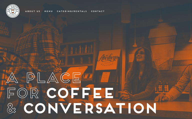
The most hard hitting method of engagement creation is through visuals. Use neat and clean visuals, appealing images, compelling videos, and interesting illustrations to create an everlasting first impression. Your story must be full of imagery with a mix of design techniques and words. Develop a color palette which mirrors the essence of the story that you are telling. A good story will always lead the user towards completion of a task or goal.

Engagement Through Imagery
Image Courtesy: candccoffee.com

2. Invite Participation

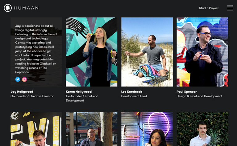
Create value to your design with interactive elements along with common actions. Add a bit of animation to buttons that users need to notice or help drive the eye to certain elements with directional cues such as arrows or images. Parallax scrolling is an engaging way to encourage motion on the screen.

Consider this example of Humaan. They use simple yet effective hover animations along with team photos. The staff poses quirky expressions that flaunt each member’s character.

Invite Participation
Image Courtesy: humaan.com

3. Construct A Game

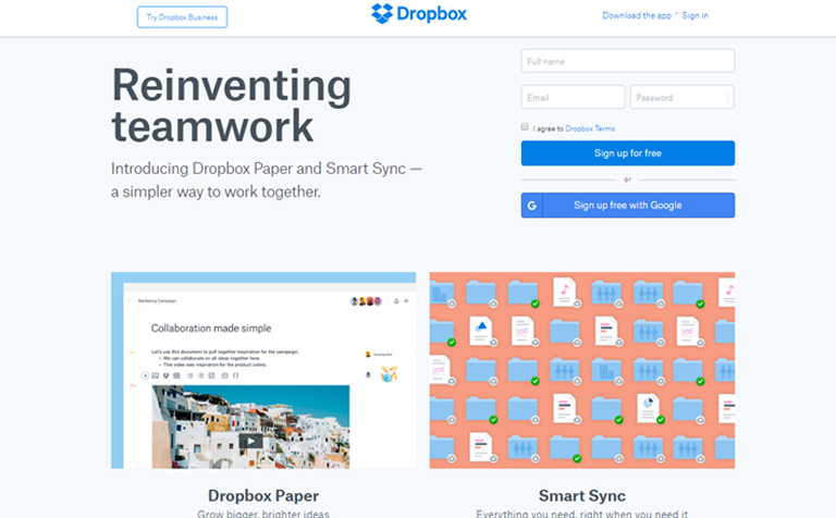
The most difficult part of building a story is to know where to begin from. If you are clueless, start off with a simple game. A game can add the fun factor for users. The game needn’t be very complex but has to be rewarding. Take an example of Dropbox. It uses options like inviting others to use Dropbox, logging in from multiple devices, and connecting various email accounts as tools of gamification. It rewards people with extra space on dropbox. This helps it create a brigade of loyal repeat users.

Construct A Game
Image Courtesy: dropbox.com

4. Emphasize On Narration

Every story needs to have a proper flow. A story must have a beginning, a middle, and an end. It’s similar in the case of a website as well.

Beginning: The Logo and headline are your beginnings. Tell your users who you are and why they are on your website.
Middle: The middle comprises of a supporting narrative that makes you different from others. What can you offer your users who are on your site? What should they expect?
End: The end must have a call to action such as a form or ability to make a purchase or link to something else.

5. Establish A Character

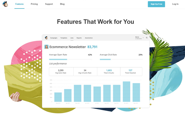
User persona plays a very crucial role in the case of a website design. Elevate the user persona by introducing a character for your website. A wonderful example for the same would be the email platform MailChimp. The company’s cartoon mascot and logo pops up throughout the entire design of the website. The character clarifies the company name, portrays the fun element of the company, and helps to keep the company’s story fresh.

Establish A Character
Image Courtesy: mailchimp.com

When you’re designing your story try to be your own self. Portray what you really are. Users love authenticity and connect more to authentic stories. Talk to our team of experts and start your own story today.

Categories
Blog Technology

Why a Digital Agency Rocks over your in-house team

Every second day there are new rules and policies introduced and new algorithms made known which adds to the dynamic nature of digital universe. That’s why it becomes super critical to constantly maintain your website amidst all these changes and developments as that’s your bread and butter at the end of the day. Thus, selecting a digital agency or relying on the in-house team for being at pace with these changes and developments becomes a critical question.

The digital world has evolved rapidly over the last decade and a whole new set of changes have turned the entire look and feel of the digital world.

It’s a common notion to hire an in-house expert to manage your website, however there are formidable reasons to outsource the job to a digital agency. Check out why it’s better to partner with a digital agency rather than recruiting an in-house team:

1. The experts do it for you –
A digital agency will always have an upper hand when it comes to the overall expertise. They have an entire team of experts for planning, web designing, SEO, content management etc. Everything can be done under one roof. You don’t need to look for individual experts yourself, they HAVE IT ALL!!

2. Keeps you abreast with the Industry trends –
An agency handles multiple projects with several clients and thus they sharply keep an eye on each and every development in the industry. They know everything from Google’s latest SEO guidelines to latest plug-in requirements and security updates which help you to be a step ahead of the rest.

3. Meets deadline every time –
Every business works on deadlines and it becomes difficult for an in-house team to always meet the deadline. A digital agency is highly professional and breaching the deadline of a project is a complete NO NO for them. This helps you to focus and plan your business efforts effectively with a specific time frame for each step in mind.

4. Has a giant pool of information –
A reputed digital agency has rich experience gained over the years working with different clients and in various environments. This hones their skills to a peak and they accumulate a large pool of vital information which can be utilized for the enhancement of your website.

5. Super focused and pro-active –
In a quench to provide the best services to their clients, experts in a digital agency are always on their toes. The experts work closely with each other to produce jaw dropping designs and a soothing user experience that helps you in achieving your business goals. You will never have to push them for a task, they are on the front foot right from the word GO.

The list is long and the horizon of advantages is as big as one can imagine. Digital marketing continues to grow multiple folds year on year adding to the complexity of corporate website requirements. It is of utmost importance that you join hands with a reputed digital agency known to provide top-notch services and a satisfying overall experience throughout the process.
If you are looking to revamp your existing website or planning to start a new one, you have come to the perfect place.