Designers across the globe have unanimously accepted the fact that pictures speak way louder than words. Today, images play a vital role in every web design and when paired with the right text, they create a magical effect. Text on and around images is a growing trend, however, it’s not the easiest of the concepts to pull off. You need the perfect image, hard-hitting message and a complimenting typography. Moreover, you must be clear about your intentions and what you really want to achieve with that type on the image. Here are a few tips that will help you to master the art of designing with type on an image.
Insert Text Into The Image
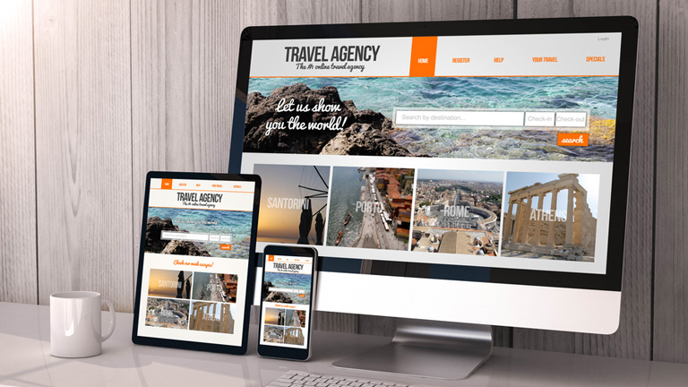
One of the best ways to perfectly play while designing type on pictures is to make the text a part of the image itself. This doesn’t necessarily works all the time but is very fruitful in some cases. You can either use a simple image and introduce the text into it or use an image with text already in it. But, make sure that the message conveyed is exactly the one that you wish to.
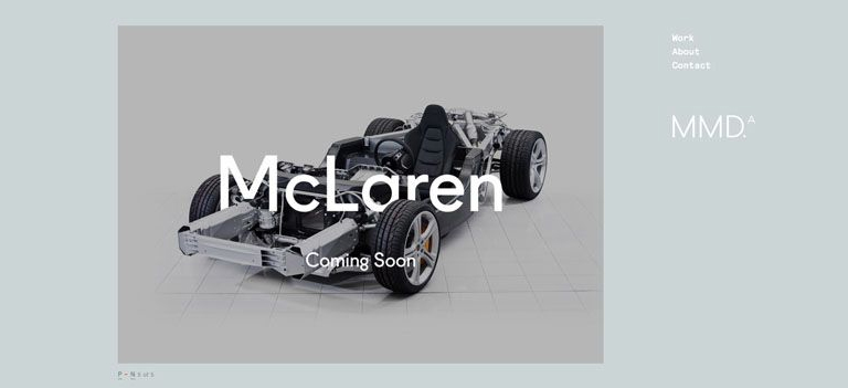 source:Mclaren
Use Contrast
No matter how powerful your message or text is, it needs to be readable to be successful. Make sure that the text varies in color, just enough to be seen in combination with the photo. If you have a photo with a dark background, opt for white or light colored text or vice-versa. Contrast can also refer to the size of the text in relation to what is happening in the image. Lettering should work with (not against) the image.
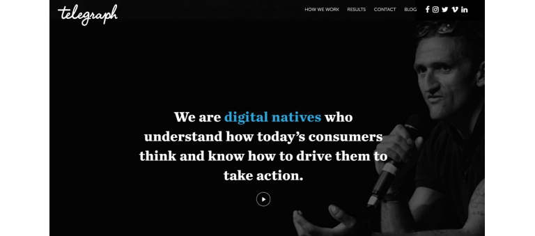 source:Telegraph
Follow The Visual Flow
Working with the visual flow of an image is one of the most important tips when it comes to working with text and photos. The words must fit into logical parts of an image and there shouldn’t be any text over important parts of an image, such as the main action, faces or the showcased product. In terms of visual flow, look for spaces where the subjects of the image would look. The text placed in the visual line of image is likely to be more impactful.
Blurred Background Image
One of the simplest tools that you can use is the ability to blur a part of an image or the entire image at times. Adding a little blur to the background of an image with a software can help your text stand out and create a stunning visual impact. Blur can also add focus to your overall concept and can bring the actual product and text into sharper focus for website visitors.
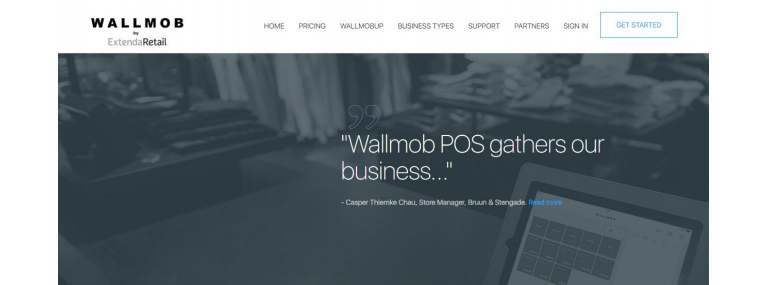 source:Wallmob
Text In A Shape
When the images that you choose to use has lots of color or differences between light and dark sections, putting text inside a shape can really make it stand out. Select a color for the box which provides enough contrast for the lettering to show. You can also use a frame with some transparency to give it a softer feel, a show through kind of image.
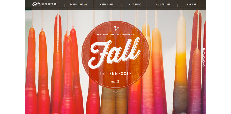
Source: fall
Text In Background
Another handy and impactful trick out there is to put the text in the background of the image rather than the foreground. Typically, backgrounds are less busy and easier to work with when placing text. Most of the backgrounds are single colored, making the text stand out easily and increases its readability. The end result is a natural-looking placement that does not require a lot of tricks or alterations to the main image. Subtle shading effects can also be used to get the desired output.
 source: square
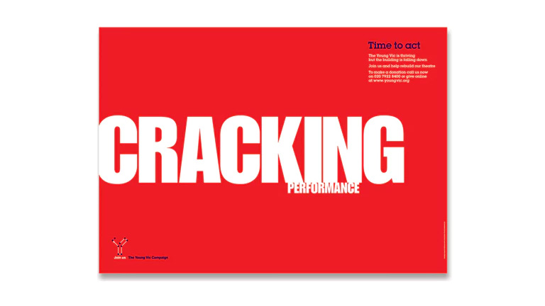
Use Huge Fonts
When you’re really confused with what to do, place the safest bet by using large size fonts. This applies to both the image or the type itself. The size element instantly grabs users’ attention and with one element being large, it’s easier to create scale with the text and image. Using big images can help with shading and contrast differences while using big text can add enough weight to lettering where it will appear readable against almost any image.
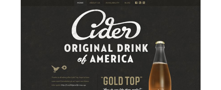
Source: Cider
In addition to these tips, always remember to use simple typography and a straightforward image for the best results. Discuss more on your web designing needs. Talk to our experts right away.


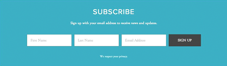


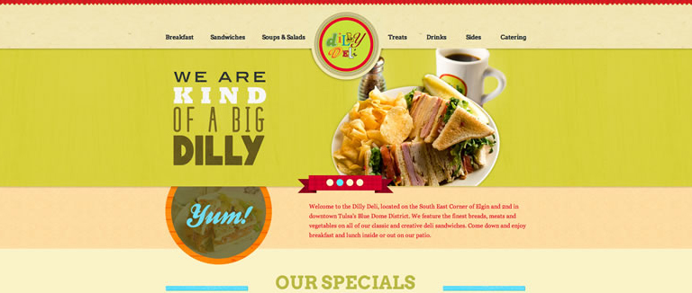
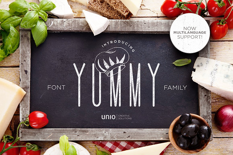
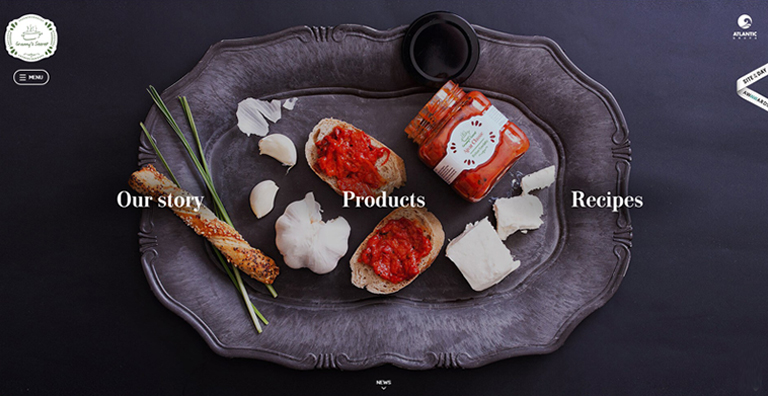


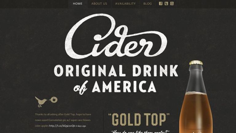


 Image Source: SEO Rave