NYX Ditech

Categories
Web Design

5 Valuable Tips On Effective And Persuasive Web Design

The ultimate goal of any website is to draw user’s attention and to influence his behavior on the website through web design. While this is a well-known fact, most of the website designers end up focusing more on the visually appealing factors and sideline the critical aspects of website designing. We have collected a few important tips which will help you focus on designing influential and effective websites. Take a look!

1. Keep A Check On The Text Length

The optimal length is 100 characters per line. However, for a likable reading experience make it between 45 and 72 characters. This is because people prefer reading shorter lines. To be more precise, people don’t really read on the web but they only browse through the text. Keeping an optimal length of text will ensure that the users don’t hurry through the text but actually read it.

2. Avoid Providing Unnecessary Distractions To Users

You may think that humans can multitask by keeping the same level of concentration on each task, you are probably not correct. Users don’t really do multitasking, they do switch-tasking. When a user is switch tasking he cannot properly remember or pay attention to everything.

Make sure that you don’t let your customers focus on 3 different things at a time. Arrange your sequence of information, the layout of your images, and copy carefully without unnecessary distractions. This is especially important for your vital pages like the sign-up page and the main product page.

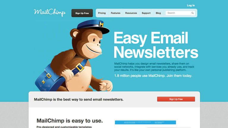
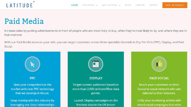
3. Pair Your Colors Well

Never try to be too flashy and experimenting with colors. When it comes to selecting the color scheme of a website, the classic color schemes are the best. I have seen designer pairing Red & Green, or Red and Blue. These pairings are too hard on eyes.

They create an optical illusion of colors jumping out, making it very tiring for the user’s eyes to look at. Go with pastel backgrounds while choosing colors for your website. Don’t go too strong on the colors. A dark font on a light background is highly recommendable.

4. Break Down The Content For Easy Reading

Despite all the new technology available in the world, reading text online is still a tedious job and can cause fatigue. For the simple fact that our eyes are not meant to read text online. So for an easy reading experience break down your copy into bullet points, shorter paragraphs, and categories.

Use of images is also a great way to ensure better user experience. Also, it’s not advisable to be too experimental with the shapes and fonts of the text. Use clear and readable fonts. Shy away from skinny fonts and use big and round ones. The best size is 14 or 16.

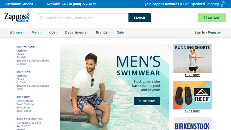
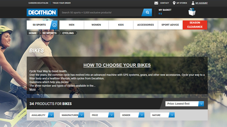
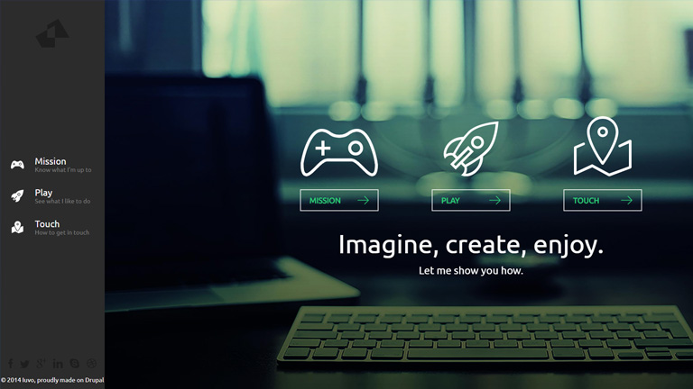
5. Always Remember The 3 To 4 Rule

3 is an important number. Humans can remember 3-4 things at a time and that too for about 20 seconds before they disappear into an unexplored world. But, this doesn’t mean that you can only give 3-4 options to your customers. Simply stack your information into groups of 3s and 4s.

This is especially important for your navigation bar. By giving more than 3 to 4 options to your users, you will make it difficult for them to choose or even take any action. Also, avoid keeping too many tabs and categorize all the information under 3-4 tabs.

Conclusion

These simple, effective and useful considerations will make a huge difference in how your customers will experience your website. These tips will also boost your chances of selling being a content, product or idea. Talk to our design experts and learn more such tricks on designing.
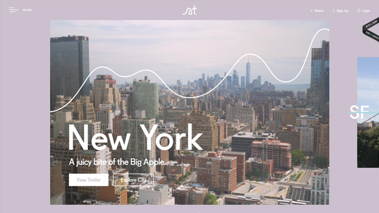
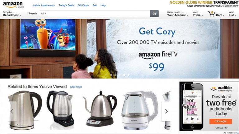
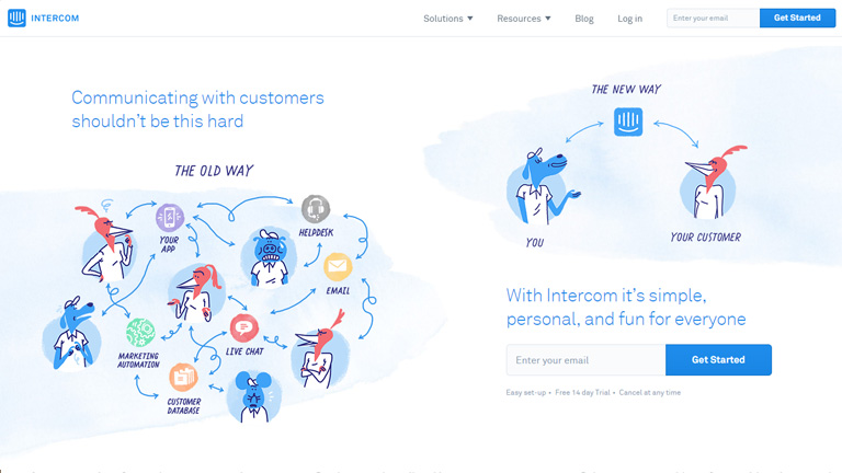
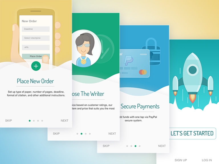
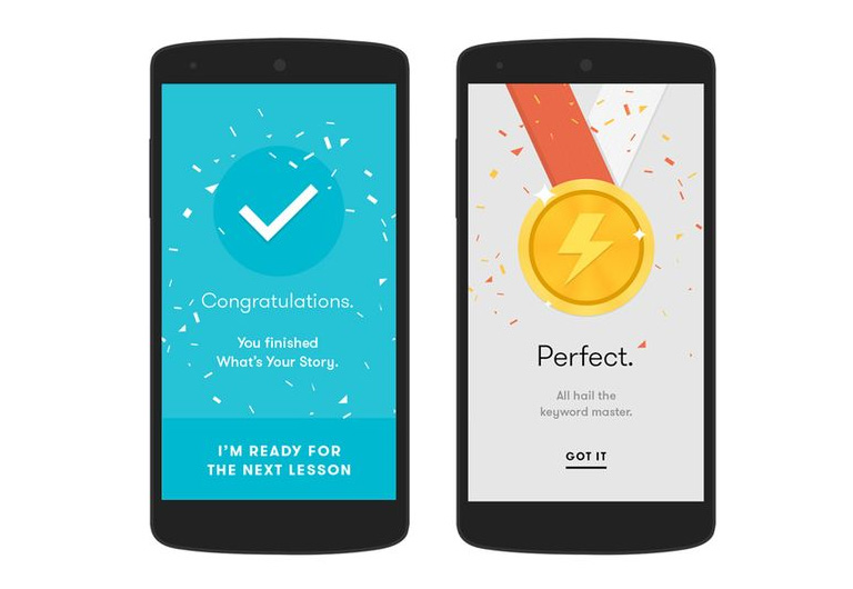
Categories
Web Design

How Can You Effectively Simplify Your Website Design?

We all want that our website must create a stunning impression on every user right from the word GO. We try all the tricks in our bag to create a website that’s unique and stands out from the crowd. However, often while doing so we forget the fact that simplicity has its own appeal. The design interface must be simple to understand and use. Unwanted elements overpopulate the design and act as a roadblock in a user’s journey towards the desired action. Here are a few essential tips on how you can simplify your existing website design or build your new simple website based on these tips.

1. Placement Of Call To Action Buttons

Your website must have an end goal and as soon as the user lands on your website, he must be able to identify it. Thus, the Call To Action buttons must be placed at the most focused spots on your webpage. These buttons must be large enough for users to clearly cite them and should also be placed in various positions to ensure that users click on them.

Placement Of Call To Action Buttons

2. Less Color Is More Color

In an effort to make a visually stunning website, designers often try and experiment with a lot of colors. This may look charming but as per user experience, fewer colors have a greater impact. Stick to a color palette with only 2 or 3 colors. A monotone color palette is even better. You can use different tones and tints of the same color. A large number of colors cause mental stress for users and must be avoided. A website looks neat and well organized under a monotone for fewer colors.

3. Consolidate Your Content Into Manageable Portions

If your website has a lot of content to offer, it is quintessential to streamline it into manageable parts. Don’t offer the entire content in one go to the users. Arrange all the related content under one section to enhance readability.

stripe

4. Use The UI Elements With A Purpose

A designer will have a lot of UI elements like icons, elements, images etc. in his bag. But, that doesn’t mean that all of them must be used without any reason. Make sure that when a user clicks on any of the icons he reaches to a page that he is expecting to go to. Plan the UI elements in advance and use them only if they serve any purpose in the overall design.

5. The Visuals And The Copy Must Go Hand In Hand

While the font style, type, and size are some of the important elements of a web design, what actually is written is of greater importance. Your copy must compliment the visuals on your website so that there is a synergy between all the design elements. Keep editing the copy and try to eliminate the unwanted text. Your aim is to connect to the users through the copy in a clear and concise manner. Also, create a proper tone with the design elements and use of connected words.

6. Never Forget The 80-20 Rule

It is one of the most important rules to follow while designing a website. There are 2 important factors under this rule.

I. Always remember that 20 percent of the elements on your website will result in 80 percent of the desired user actions. Which means, a few calls to actions, buttons, and other user interface elements will generate the majority of user interaction.

II. Focus on the top 20 percent of your content to make 80 percent of changes when changing a design. This 20 percent includes elements that generate the most clicks – CTAs, traffic funnels, and images.

It’s not necessary that we implement complex design elements in a website to make it more appealing or user-friendly. Often a simplistic web design strikes perfectly and enhances User Experience. Follow these tips in order to simplify your web design and achieve great results. You can also reach out to our design experts to discuss your website designing requirements.

Categories
Web Design

7 Essential Elements Every Homepage Must Have

They say ‘First impression is the last impression’. Well, maybe not the last impression but it surely is the most crucial one. A solid first impression helps people to build faith in you and form positive notions about you. Same is the case with your website. The moment users land on your homepage, they start judging your business and brand. Users only take a few seconds to form an opinion about you and this opinion highly influence their behavior. Thus, it’s very crucial to have an appealing and intuitive homepage to impress the users and make them stay on your website.

There are a few very important elements which are the foundation of a successful homepage and designers must always include them while designing any homepage.

1. Value Proposition

Tell your visitors who you are? What do you do? And Whom do you cater to? right at the very beginning. Until and unless users clearly get answers to these questions, they are not likely to stick around. Besides telling them what you do, also mention how you do it differently. This will help users to distinguish you from your competitors. Be clear and concise. Avoid twisted language or use of phrases which are difficult to understand.

value-proposition

Pic Courtesy: Slack.com

2. Instinctive Navigation

The majority of users on your website will be new and will not know what is where. Therefore the navigation on the homepage must be so simple that even a newbie can get information that he seeks. At no point in time, users should get stuck or get confused while looking for information. You should also anticipate typical user behavior and place the content and sections based on that. Like if your blog page gets most of the traffic then no point in hiding it somewhere in the footer section. Place it where it gets maximum visibility.

instinctive-navigation

Pic Courtesy: Storytrail.com

3. Use Of Videos

The visual appeal of images and videos is far more than words or any other content. While it’s not really mandatory to include videos on your homepage, but it’s a great way to increase user engagement. A video showcasing what you do, your distinctive features, your office, staff etc. can be a huge hit. This interactive way of increasing user engagement can never go wrong especially with the new users.

useofvideos

Pic Courtesy: Koozai.com

4. Social Media Links

Your objective is to grab as many eyeballs as you can and social media is the biggest platform to do so. Well, almost all the websites include social media links on their homepage, but the placement of these links is crucial. Place these links at the most convenient locations and at places where people expect to find them. Connecting to users through social media ensures increased engagement and reach which will surely pump up the business.

social-media-links

Pic Courtesy: Latitudegroup.com

5. Contact Us Section

Ever been in a situation where you try to contact the tech support or customer service executive for something important and not able to find the contact details? Most of us do face this situation some or the other time. Don’t let your customers face a similar situation. Visitors must easily find contact information on the homepage. Most commonly this information is placed at the bottom of the homepage and thus visitors do expect this information right there. The Contact Us section must include an email Id, Phone No., and address at least.

contact us section

Pic Courtesy: Achieve3000.com

6. Real High-Resolution Images

Get one thing straight – Stock images will never be able to achieve credibility no matter how beautiful and attractive they may be. It’s best to avoid stock images and instead use high-quality real images to increase credibility and user engagement. Use photos of your staff, office setup, and your leaders to create a realistic impression on users. Real human faces can be a great tool to increase user experience.

real high-res images

Pic Courtesy: Foundr.com

7. Services/Features Section

The video and value proposition may give only a highlight about your services and products. However, it is must that detailed information about the services/features/products is provided to users on the homepage itself. This not only help users who are looking for full information right at the start, it also boosts your page ranking.

services-features-section

Pic Courtesy: Latitudegroup.com

When you go out on your first date you ensure that you put your best foot forward. Properly groomed, neat clothes, and etiquettes right in place. You leave no stone unturned to create that perfect first impression. The situation is similar when a new user lands on your homepage. Talk to our design experts and leave nothing behind to create a stunning first impression.

Categories
Design

Looking To Personalize Your Website Design? Here Are The Pros & Cons

Web designers are always on a lookout for options that can enhance the user experience and the visual appeal of a website. A lot of new philosophies have surfaced over the years related to website design. Personalizing the design of a website is one of the examples. Designers across the world have mixed feelings about the whole personalization process of a website. Some look at it as a success mantra, while others feel that all the research and hassles are not worth it.

Before we move further into details, let’s first understand what exactly is website personalization? Website personalization is another way of offering personalized marketing. In this strategy, the company or brand serves personalized content and recommendations to users. The personalization is based on different techniques like data collection and analysis, user behavior studies, automation and even algorithms in some cases.

Personalization has done wonders for many big guns like Amazon and Netflix. But, that doesn’t guarantee its success when it comes to your own website. In this article, we will discuss the Pros and Cons of personalization in your website design so that you can take an informed decision.

Look who has done it successfully.

netflixNetflix.com


Amazon.com

Let’s start with the positives.

PRO #1

A Personalised Experience For Every User
What could be better than a personalized experience in the world of the web that is brimming with so many websites that provide a generic experience. People feel more connected to your brand and website when they receive a personal experience and are most likely get addicted to it. It can be the game-changing differentiator for your website.

User’s name, specific recommendations based on behavior pattern & past selections, promotional offers matching customer requirements, authority to tweak the look and feel of the website (color scheme, background images, font size etc.) are some of the key elements of a personalized experience.

PRO #2

Inflates Conversion Ratio & Customer Loyalty
Studies have suggested that the brands that offer a personalised experience to its customers enjoy increased revenues. Customers that receive customized experience are less likely to look for other options which means low customer attrition rate and high customer loyalty. Even the conversion ratio is increased substantially as the customers are offered exactly what they need and precisely in the manner they personally prefer.

PRO #3

Offers Consistency Across Devices
A personalized website experience builds consistency even when the customers access the website through different devices. This comforts his experience and pushes the user experience to a new level altogether. Take the example of Kindle, you start reading something on your mobile, you can pick it up from the same place on your tab or laptop later on. Even the look and feel of the app is absolutely same across all devices and therefore the user doesn’t need to adjust for even a bit. This is a prime example of providing personalized website design experience.

Now Let’s dig into the disadvantages.

CON#1

Cost Is Increased Heavily
When you are eyeing to provide a different and personal experience to every user be sure that there would be a lot of efforts and technological implementations involved. That’s why it will be expensive. You will need tools to collect & analyze data, algorithmic technology, automation and a full team to keep generating personalizations. All this will be heavy on your pocket and therefore it isn’t everyone’s cup of tea.

CON #2

Can Raise Privacy Concerns
Collection of personal information is the base of personalization. A lot of personal information is collected at different levels from the users which is then processed and used to provide customized offerings. This can raise privacy concerns among users. Not everyone will be comfortable with the fact that you know so many things about them. Moreover, they will also be concerned about how you use all the personal information that is collected. It’s best to be upfront and disclose what all information you collect, how you store it, and for what all purposes you use it.

CON #3

It’s A Very Tedious Process
A lot of time needs to be invested in order to create a personalized experience on your website. An immense amount of research and analysis is required to prepare a single wireframe and the process doesn’t stop there. It continues even after the website is launched. Keeping up with user wants and preferences is a time consuming full-time effort. In order to maintain a set of working personalizations, a lot of regular revisions, constant updates and plenty of data storage is required. Personalization looks very attractive but demands a lot of time and intensity.

Conclusion

So we have learned that personalization of website design is really a boon and improves revenue, sales, customer retention, and conversion ratio. However, it’s costly and time-consuming too. So, it’s best to take a midway while creating your website. With the help of a good email or referral program, you can route customers to a semi-personalized page which offers them tailor-made content. While this isn’t a fully-individual experience, the method can still provide desired results without digging a big hole in your pocket.

No need to scratch your head while thinking about the details of designing a website. We are here to help you. You can talk to our design experts and discuss your design requirements in detail. We would be glad to assist you.

Categories
Technology

What Are The Key Components Of A Flawless Chatbots?

Any business that wishes to reach new heights of success relies heavily on its customer service. No matter how good your product or service is, a poor or average customer service can cause a serious dent in its success. For long, humans proved to be the best option when it comes to customer service representatives. However, customer-centric chatbots are quickly taking their place. Communication is the key to any successful business and that’s the reason why several marketing top heads are integrating AI-enabled chatbots into their system.

Today, when a visitor lands on a webpage, a chatbot welcomes him with a message. This creates a positive impact on the customers and engages them in a conversation with the company. The leading developers across the world have developed amazingly intelligent Chatbots that can quickly process all kind of information like text, photos, videos etc. So what should you keep in mind while making a chatbot for your website? Here are a few key ingredients to make a perfect chatbot.

1. Contextual Understanding

The biggest challenge while automating human communication is to understand the contextual meaning of a statement. For this, the chatbots need a much higher level of intelligence which will enable it to extract the real context from a customer’s statement. It must analyze a number of variables like conversation history, date, day, tone etc. present in a customer’s statement. These variables vary from customer to customer. Intelligent chatbots can effectively streamline the internal communication process to strengthen the customer support.

2. Comprehendible Responses

No matter how intelligent these chatbots become, the key to their success will always be how human-like they are. When visitors land on a webpage and start interacting with these bots they must feel as if they are really interacting with a human being. To ensure this, it’s essential to maintain a particular tone and dialect while talking. The focus should predominantly be on creating a natural communication process with responses that are clearly understood by the visitors.

3. Predefined General Responses

Chatbots must be designed to not only give custom replies, but they can provide general responses based on a predefined mechanism. These flows are designed in order to take the users from introduction stage to conversation. An AI-enabled chatbot must be used to enhance this marketing mechanism and save time for the customer support desk. Predefined responses will help in gathering the initially required information hence shortening the customer support process. Chatbots are most used in the banking and healthcare sectors where it has helped a lot in saving time. An analysis showed that chatbots helped in saving almost 4 mins per customer in comparison to a phone call. This can help these sectors save billions of dollars every year.

4. Data Gathering Tool

Chatbot is an amazing data gathering tool. Brainstorm and zero down on the key data metrics that you would like to collect from your customers and design your chatbot in a way that it captures this information. For example – Ask the zipcode from your customers to know their location. You can collect information about their shopping preferences to push relevant information to them. Information about their eating habits, shopping preferences, exercise habits etc. will help you to push relevant offers and promotions to them.

5. Constant Evaluation and Updation

This is the most important component to consider while developing a chatbot or for that matter any new application or feature. Chatbots are pretty new, which means there is a huge scope for improvement and enhancement. Keep a close eye on your competitors. Figure out what they are doing well and implement it in your chatbot strategy. Pick out the innovative features and see if you can use it in your chatbots. Also, learn from their mistakes and shortcomings. Monitor your app on a regular basis and evaluate it thoroughly. Determine the scope of optimization based on your overall goals.

Concluding Remarks

A chatbot is a brilliant digital marketing tool which can boost the conversion ratio of any business. It also is a cost-effective alternative to human customer service representatives and has a very bright future ahead. The only tricky part is to maintain a balance between the automation and human aspect. No matter how much the technology grows, human touch will never lose its value. The upcoming few years will be very exciting and it would be real fun watching these chatbots evolve. Talk to our experts to know more about chatbots and discuss your digital media requirements.

Categories
Web Design

Ever Wondered How Your Website Development Cost Is Calculated?

Trade and business have been an integral part of our society right from the early days of civilization. The earliest of the trades go back to the days when even the monetary instruments were absent. People relied on the barter system to trade according to their needs. Obviously, there has been a drastic change in the business world over the years. With an exponential increase in the magnitude of internet access, every business today relies heavily on online trade. Be it a local grocer or an FMCG heavyweight, everyone needs their presence over the web. The most critical question to be answered here is to take a call on the expense related to website development.

The cost of designing a website is variable, and thus it becomes difficult as a business owner to take a call on what should be the right amount to invest in creating and developing the website. Moreover, it’s more important to understand the base of cost estimation. There are a few key factors that affect the cost of developing a website and it’s important to know them beforehand.

1. Domain Registration

The very first step in web development process is to choose a domain name and get it registered. A domain name is the web address or the URL of your website. Like ‘itsmybusiness.com’. Availability of a particular domain and the type of domain are 2 critical elements deciding the cost. Common terms, names, and one-word domains often carry a high price tag. There are different types of domains as well like .com, .in, .au, .og etc. The cost also depends on the type of a domain. There are a few domains which are even available for free. However, it’s not advisable to go with them if you are really serious about your business.

2. Hosting

In order to occupy space over the web, you need to pay a monthly or yearly fee. That’s called the web hosting fees. There are tons of local as well as global service providers who can provide you hosting services. Again, there are free hosting services available, but you will not get good quality of services from them. Moreover, it will expose your website to security threats across the web.

3. Design

The above-mentioned factors are pretty basic and the change in cost can be only a few dollars here and there. The real game starts with the design part of a website. The cost of designing a website depends on a lot of factors. Web firms who have access to premier softwares and have skilled professionals will charge you a premium price. But, this price will often be justified by the superior quality of their work.

Again, the amount of time consumed also determines the cost as most of the payments are calculated on an hourly basis. An efficient workforce will ensure that the tasks are completed without any errors or need of redoing the work again and again. This will help in keeping a tap over the total working hours and thereby saving on the overall cost. It’s better that you check the portfolio of their projects to determine the quality of their services before handing over the project.

4. Copywriting

This is the tricky part while deciding to create a website. Most of the businesses prefer to write their own website content as they feel they are the best people to decide the tone and words to communicate with their end users. However, this is where they get it wrong. Producing effective web content is not everyone’s cup of tea. Content is the ultimate King and professional web content writers are a must to produce effective content. Don’t try saving a few bucks here as it could prove drastic for your business.

5. SEO

What’s the use of a creating a great website if it’s not visible to the world? The world of web is a dense forest full of innumerable websites and links. It’s very difficult to catch a visitor’s eye without onsite optimization. SEO refers to the process of optimizing a website in a way that search engines find it appealing and thereby increasing its visibility. This is again a specialized skill and requires professional assistance. Avoid the future loss by planning and implementing SEO during the initial stage itself.

So when you start planning to create your website, keep these vital factors in mind. If you want to do it, do it the right way. Consider and discuss all of these above-mentioned factors with your web design firm to zero down on the web development cost. Even better! get started right away. Share your requirements with our experts and they will provide you the best quotes.

Categories
Design Web Design

5 UI Trends That Topped The Charts In 2017

These 9 months of 2017 have been quite exciting in terms of technology and the web. The world of web is moving at a fast pace with new advancements emerging every now and then. In line with these technological advancements, the design world has also allowed itself to evolve by accepting new trends and ideas. Designers have welcomed fresh design trends and methodologies with both hands especially while designing the User Interface. With a majority of the year gone by, let’s have a quick look at the UI trends which ruled in 2017.

1. Use Of Deeply Engaging Videos

We have repeatedly highlighted the importance of videos in terms of web design and User Interface. It’s the best way of voicing out the brand’s message in an appropriately associated tone. ‘A picture speaks thousands of words’, and is much more engaging as compared to mere words. Use of pictures has been a trend for quite some time now and videos are its natural successor. Images are static whereas videos are dynamic, thereby creating an amplified effect. 2017 has seen a shift in momentum from the use of static images to engaging videos. Having said that, images are not going to disappear from the scene overnight. However, videos are the next big thing in designing an impressive interface.

2. Long Scrolling

Scrolling is not really a so-called trend and is more of a fundamental functionality. It has been prevalent from a long time both in websites and desktops. But, long scrolling has emerged as a design trend in the last few years. A huge number of websites are using long scroll & longform content for desktops and other larger devices in order to display their content. Due to an increase in access to the internet through smaller devices like mobiles etc., users have become extremely comfortable with scrolling. This has pushed designers to implement long scroll and longform of content in bigger screens. With help of long scroll, users can access a huge amount of content in a single and smooth motion. It works well with all forms of content like longform journalism, news articles, stories, landing page etc.

3. Flamboyant Colors & Gradients

The year 2013 saw the uprise of a design methodology which changed the look and feel of the web back then. It was the introduction of flat design. The concept was to keep the design as simple as possible while eliminating all the fancy and jazzy elements from the design. Functionality wise it was very strong and therefore soon spread like wildfire among the designers. However, it had its own drawbacks. Soon everyone was using a flat design and therefore every website looked more or less similar.

Designers realized the need of creativity and individuality once again and they broke the shackles in 2016. Designers started focusing more and more on personality, experimenting with bold colors, vivid colors etc. instead of dull and simple color shades to provide a sense of uniqueness to their websites. 2017 has seen a great increase in vivid colored and stylized websites. This trend has shown positivity and is bound to gain momentum in the upcoming year as well.

4. Bold & Beautiful Typography

In an extension to use of vivid colors and bold designs, designers have fearlessly experimented with loud Typography as well in 2017. Today, there are a lot of free or cost-effective web font services (like Google fonts, Typekits etc.) available to designers, which provides them creative freedom and more experimenting power. 2017 has seen a huge rise in the use of unconventional, bold, and out of the league web fonts in comparison to conventional fonts. This trend is here to stay for quite some time and the upcoming year will see more and more bold & beautiful typefaces against the traditional typefaces.

5. Illustrations

Illustrations provide an immense sense of personality, individuality, and character which can barely be achieved with traditional photography. Illustrations designed in line with a brand’s identity develops a sense of authenticity and builds trust in users and customers. Illustrations have their own versatility. Some brands may prefer sophisticated illustrations to achieve that posh and classy look, whereas others may rely on more rough and edgy styles to position themselves as fun and playful. Illustrations have performed well in 2017 and they seem to be buzzing in the coming years as well.

The only thing constant is ‘change’ itself. New trends and ideas keep on emerging at the scene and designers should always try to keep themselves abreast these trends. The aforementioned trends are the most popular trends that created a buzz in 2017. However, there is a huge list of other trends as well which were successful in modifying the design world. Share your design requirements with our experts and see how you can ride on these trends to create an impressive User Interface.

Categories
Design UX

4 Brainy Ways To Use Illustrations In UI Design

It’s an accepted fact that as human beings we are more attracted towards visuals. Any visual information grabs our eyeballs faster than any other means of communication. Almost 90 percent of all the information that our brain interprets is in form of visuals. Due to this fact, it’s easier to convey information through visuals as compared to a complex and lengthy block of text. Pictures have always been part of a good interface. However, use of illustrations has interestingly increased recently. Illustrations provide a lot of freedom to designers to produce creative effects. Moreover, they have added control on content and technical aspects as well. Here are 3 smart ways to implement illustrations in UI design effectively.

1. Illustrations On Homepage

No matter how brilliant your product may be, it is bound to be a failure if it is poorly packaged. Similarly, people judge your company and the quality of your product by the look and feel of your website. Thus it’s imperative that your website must look stunning and provide an unforgettable experience. That’s why designers take a lot of efforts in order to provide a visual delight to the customers.

This is where homepage illustrations come into the picture. It provides an aesthetic and imaginative touch to the entire website. You can customize your illustrations to strike a personal connect with your customers. This works wonder in terms of creating a strong brand recall.

intercom

Pic Courtesy: Intercom.com

2. Onboarding And Tutorial Illustrations

Illustrations provide help using visuals. They provide clarity in messaging by drilling down concepts into very basic visuals. Pictures create a far better impact and accelerate the overall experience. This is what makes illustrations so prominent for on-boarding and tutorials.

Onboarding screens propose the key features and benefits of the app to users. Illustrations help in providing context and add clarity in information for the user. This smoothly leads him towards the next step. Illustrations can really help in conveying the core message with the minimum use of copy.

An engaging and interactive onboarding instantly creates interest in user’s mind. It generates eagerness among the users and also creates a sense of happiness. A tutorial is usually a boring manual which can often kill interest among users. Using illustrations is a much better way to engage users during this initial process.

pinterest

Pic Courtesy: Pinterest.com

3. Illustrations On Reward Screens

We all have played video games at some point in time of our life. Be it mobile games, TV video games or any other type of games. Almost every game has a feature of rewarding the player on an achievement of certain criteria. Terms like level unlocked, stage unlocked, power unlocked etc. go hand in hand with these games. But why is rewarding so important? It’s because rewarding provides a human touch to the interface experience. The user feels as if he is interacting with a real human rather than a machine.

It stimulates a positive emotion among the users and they feel more connected. It helps in creating a positive engagement between the users and the app. Users tend to overlook the flaws of your app when they receive a rewarding experience from your side.

pmbr

Pic Courtesy: pmbr.tn

4. Character Illustration

Character Illustrations in simple terms means using a person, animal or cartoon character to illustrate your brand and website. The character can act as a mascot for your brand as well. The best example of character illustration can be cited at Mailchimp. The company uses an appealing chimp as their brand mascot who is present in almost every part of the website. Characters can be used in designing the logos of your brand as well.

mailchimp

Pic Courtesy: Mailchimp.com

However, Character illustration requires more efforts in order to seize and display the real personality of the character. But we believe it’s worth it as it ensures that your brand stands out distinctively from the crowd.

Illustrations act as a very impressive and imperative way to enhance user experience and create positive engagement. These are some of the best ways to use them. However, it’s not limited to only these 4 ways neither there is any set of rules on how to use them. The soul purpose is to display the desired information in the most basic visual manner so that users can easily interpret it. Talk to our design experts and understand more about the use of illustrations and other design requirements for your business.

Categories
Blog UX

5 Tips To Design A Great Dashboard?

The digital world is revolutionizing every day. Every new day we come across new gadgets, technology, and innovation. Look around and you will see tons of websites offering you umpteen services and products. With the technological revolution, the importance of design has also increased multiple folds. A lot of time and creativity is invested to ensure that a user gets a delightful experience. However, only the front end design gets all the limelight while an unsung hero quietly sits in the background and works vigorously without any buzz. It’s the Dashboard.

The amount of data that we touch base is increasing day by day which makes the Dashboard design a very vital aspect. A great design provides solidity to the Dashboard and makes it more efficient. It helps users to maneuver around data, interpret it, and use it to understand the real picture. So how to design a great Dashboard? Here are top 5 tips that will help you in designing a great Dashboard.

1. Design For Users

If you emphasize purely on data and try to design a great dashboard, you will never succeed. At the end of the day, data is just some numbers. Always keep users at the top while designing a Dashboard. The soul objective of a Dashboard is to provide information to users which they seek and which can help them to understand the position at any given point in time. Analyze what questions will users be asking, which information will be required on a daily basis, and which is the best way of presenting the desired information. You should actually interact with the end users in order to understand them and their requirements.

2. Provide A Concise Overview

It’s very important that a user gets the most important information right on the front page. So the Dashboard design should display a front page should have different parts containing the most valuable information through which a user can drill deep down in any particular section. This ensures that the user is not bombarded with everything in the first go itself. It helps them to not get lost while looking out for information.

admin-tool

3. Use Visuals To Help Users

It’s a proven fact that visuals have a greater impact on users as compared to any other element. Data visualization is a wonderful way to provide information to users. Use graphs, charts, plots etc. to help them analyze the data. Graphs are better than a pie chart but there isn’t any thumb rule. Also, avoid using over the top graphics like an exploding pie or a stacked graph. The objective is to provide neat and clean visuals rather than complicating things for the user.

chart

4. Maintain An Uncluttered Dashboard

The primary sign of a great Dashboard is that it’s very neat and uncluttered. It should not contain any unnecessary image, graphics, text or other elements. Good design practices like white space, grouping, and alignment must be followed religiously. It will help the user to visually connect to the related information eliminating all the noise and clutter.

5. Provide Guidance Where Necessary

Ideally, a Dashboard should be quite self-explanatory and the user must not require additional help. However, there will be some instances where he might need a little explanation. There is a possibility that the Dashboard is rarely used or at least for once there would be a new user. Provide contextual help where required. Like, provide info that describes a particular data visualization, or to explain data values shown. It’s best to show the help text in context upon clicking or hovering over a help icon or link.

Following these tips will definitely help you in designing a great dashboard. However, the bottom line is “it starts with users and ends at users only”. Keep taking feedback from the end users and use them to improve the design. Talk to our designers and discuss your digital requirements. Our team of experts will strive to provide you the best solutions.

Categories
UX

5 Golden Rules To Create An Excellent User Interface

Over the last few years, the world has digitized so rapidly and drastically that it becomes a little hard to believe. Digital interaction and experience have become a part of our daily routine. This raises the importance of user experience to a whole new level. User Interface is associated with us practically everywhere. Be it on our mobiles, websites, car displays, thermostat control in our offices/homes and the list goes on and on. But what differentiates a quality UI from an ordinary UI ? Let’s find out the answer by discovering 5 key elements of an excellent UI.

1. The Design Must Be Simple:

As simple as it sounds. Simplicity has its own charm and it never fails to impress. Don’t clutter a page with unnecessary elements and options. Furthermore, the target is to provide only essential elements and options which are required by the user to complete their task. Rest of the elements can take a step back. A lot of designers push in a bunch of “can be neglected” elements in the page design which defeats the purpose of providing best user experience.

This Toader Photography website is a brilliant example of simple user interface.

Toader Photography
Pic Courtesy: toaderphotography.com

2. Users Must Sense Familiarity:

When a user lands on a web page, at no point in time he should think “What to do now?” Neither he should be greeted with something unexpected. The interface must be intuitive in nature so that users easily understand it. This will create a sense of familiarity in a user’s mind. A great example – A lot of restaurants and food joints are using a food article icon (like a burger or a pizza slice) on their app and websites. This instantly tells the user where the menu is?

In another example, see how Zappos has placed all the familiar tabs at familiar positions.

zappos

Pic Courtesy: zappos.com

3. The Messaging Must Be Clear:

The first point emphasized on being simple and ditching the complexity. But, it’s equally important to be clear and concise. Save your users from the trouble of reading lengthy messages, labels, and descriptions. It will really annoy a user and would only lead him towards the “X” button. Cut to the chase and be point blank. Users like it. Moreover, it’s all about providing a delightful user experience and stretched messaging is a roadblock in this process.

4. Be consistent:

Never loose on consistency throughout the user experience journey. People like consistent interfaces as it smoothens the entire experience. They develop usage patterns and later rely on these patterns which further improves their experience. The process is simple. They learn about your design pattern and want to use the learning in their future interactions. An inconsistent interface will make it hard for users to understand how things really work on your website or app.

5. Create A Visual Hierarchy:

This is a very critical element in terms of user interfaces. However, most of the designers overlook it. It is quintessential to focus on the important elements. Never try to make every element look important. It clutters everything and the user gets confused in taking any action. A proper distinction between colors, shapes, and placement of elements must be maintained to guide the user towards the action. If the visual hierarchy is properly implemented in a design, it kills complexity and helps users in performing their tasks more efficiently and swiftly.

Look how Decathlon has highlighted the “Season Clearance” tab by coloring it bright red. This instantly grabs attention and leads the user towards the action.

decathlon

Pic Courtesy: decathlon.com

Times have changed and so have the users. They demand a satisfying user experience more than just a transaction. Therefore, designers should dig in deep and try to understand each and every aspect related to user experience to create a user-friendly interface. Talk to our experts and fulfill your design requirements.