NYX Ditech

Categories
UX

5 UX Element Which Shined Throughout 2018

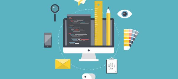
There’s no denying that user experience was big in 2017, and continued with the same pace in 2018 as well. Anticipating user expectations in future is tough and that’s why it’s a bit tricky to live up to user expectations. However, for designers, it’s important to at least be proactive to anticipate user expectations. The following 5 UX element have created a buzz throughout the year and can act as a guide for designing a satisfying and successful user experience in future.

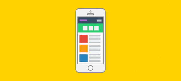
1. Simplified Journey

There’s always some intention in a user’s mind when they interact with a website or mobile app; they want to achieve the intention as quickly as possible. To create a user-friendly application or website it is essential to simplify a user’s journey with time-saving designs. In simple terms, reduce the number of steps users have to take in order to achieve their goal. All the applicable information must be presented in an easy-to-use format and with a smooth navigational flow. Displaying only the most relevant information specific to the user context is instrumental in creating an optimal user experience.

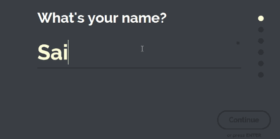
2. Personalized Experience

Personalization is a technique embedded within the strategy of time-saving designs. It is important to recognize the need and importance of shifting from creating generic experiences to individually targeted experiences. To achieve this, designers need to identify the wants and needs of users on a deeper level. With the help of individualized data and advances in machine learning, technology is becoming capable of adjusting automatically for specific users. One of the best examples is the incorporation of personalized recommendations based on user behaviors. These suggestions increase chances of a user taking an action on your website.

3. Human Factor

Due to technological advancements like touch and voice recognition on smartphones and other digital devices, user expectations have changed a lot. People now expect to interact with digital products just like they would typically interact with another human. Therefore designers need to put pay attention on providing a more human experience to users while they interact with your websites. The popularity of humanizing digital experience is correlated to connecting with user emotions. Users should feel connected to their devices in an emotional way.
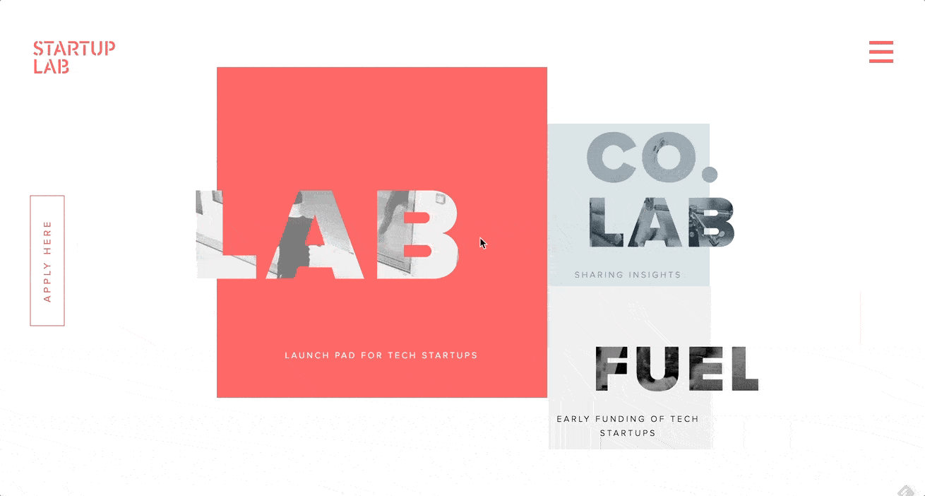
4. Focus on Content

Well-organized, comprehensive and readily available content plays a big role in making websites and mobile applications appealing to users. Recent trends concentrate on removing all unnecessary elements which can distract a visitor and places the spotlight on content. Content-centered experiences can be created in two ways – either using a design that highlights content or allowing the content itself frame the design. The ultimate goal is to ensure there are no obstructions in a user’s exposure to your website or application’s content. Start by removing excessive visible clutter, so that the message you want to convey easily reaches the visitors.

5. Voice-Based Interaction

Hardware devices that we use to access the web have become more streamlined, which calls for a more streamlined UX. With every new update, more and more buttons are vanishing from smartphones, tablets and even laptops. As a result of this progression, voice user interface (VUI) has surfaced. VUIs have become integrated into most major technologies, such as products from Google, Amazon, Apple, and Microsoft. A fair amount of web searches are performed through voice inputs. With your users most likely using tech from one of these innovative VUI pioneers, it is a good idea to analyze how your website can benefit from adapting.

It’s always a good idea to take cues from currently trending UX trends to anticipate future user expectations and tailor future UX based on it. For more insights on latest web design trends, talk to our design experts NOW!!

Categories
Technology Web Design

Web Development Evolution Over the Years

Change is the only constant. With other things, web development has also witnessed an evolution comprising many changes over the years. New ideas and technologies have raised the industry standard of web development to a whole new level. In this article, we will highlight how web development has changed over the years and what’s the contrast between yesterday and today.

Many Visually Appealing Fonts Available

Rollback the clock, or ask designers from yesteryears, they will go on and on talking about how standard the fonts were those days. You only had a handful font style, patterns to play around with. Every second website looked more or less similar. There weren’t any multi-font graphics that are available today. Today, you can not only find almost any font you think of, but can even create your own font.

User experience is critical and therefore a lot of emphasis is given on customization of elements, including the fonts. Fonts customization has become fairly easy, owing to the readily available tools (both paid and free). You may think what’s the need of so many fonts to convey the message through the website? Well, it’s not just about the text or what the text is trying to communicate; it’s more about the overall user experience and how well the fonts settle with other design elements of the website to enhance the experience, look, feel of the website.

Many Visually Appealing Fonts Available

GIFs Have Replaced PNG and EPS

Low page loading time is a vital element for any website’s success. In the past, designers and developers were very reluctant to use high-quality images as their large size hampered the page loading time. Therefore they used low-quality, stock images. However, the time has changed and users now expect HD images. Best WordPress page builders understand the importance of images and offer many options for integrating them into your site seamlessly.

PNG offers a wide range of images, but you may still notice a low pixel resolution of images, especially while viewing in different resolution. This is where EPS images have come in to minimize the distortion. Being based on vector imaging, they eliminate distortion or bad resolution. Moreover, they quickly upload, since they are compressed. The GIF is seeing a comeback, and they are no longer restricted to funny cat memes, they hold more visual importance now and is one of the most effective formats for animation.

GIFs Have Replaced PNG and EPS

Social Media is Everywhere

We don’t really need to push on how drastically social media has grown during the past ten years and is now a crucial part of our lives. Facebooking is now an action, messaging someone is a typical part of a conversation and our websites understand the language because we have to be social on our websites. Plenty of viral and news content floating throughout sites and social media is a normal occurrence. The number of people accessing news on Twitter or Facebook before one of the popular news shows is almost double.

It’s imperative for every business to have a solid social media strategy in order to survive in today’s world. Integrating social media into a website is a regular step in today’s web development process. Developers work hard to help users navigate their way over to “like” and “follow.” Developers nowadays don’t even ask “Do you need to integrate social media channels into your website?” It’s given, an unwritten rule given the current scenario.

Social Media is Everywhere

Development Simplified, Good Content Gained Importance

You no longer need to be a coding ninja to develop a website. HTML is not as necessary these days as it was a decade ago. If you want to build a website, you can use a drag and drop page builder and have a website up and running quickly. It looks great and most of the time functions in line with visitors expectations.

Meta tags are still here, but the importance is less than what it used to be a decade ago. Search engines will still pay attention to your metadata, but if you look at how important it was ten years ago and how important it is now, you will notice a major difference. That said, high-quality organic content is much more important in the search engines than any data you type in.

Good Content Gained Importance

As the times continue to change, we have to change and adapt to make sure that we are not left behind with a website from yesteryears. There is no reason to not set yourself up for success with a stunning website with great functionality and the ability to give its users an experience they will want to repeat. Talk to Our experts and know how you can do that?

Categories
Blog Web Design

Best Way Of Using Search Option In Your Web Design

Often visitors find themselves in a clueless situation while trying to find particular information on a website; especially on a website with a lot of content. A search option comes to their rescue in this situation. Moreover, it acts as a crucial navigation tool and guides users to the intended information. Most of the websites offer a clearly visible search button on the homepage. Search button acts as an assistant to the users and thus needs to be designed properly. Without a well designed and easy to navigate search button, viewers won’t stick to your website and will simply bounce off. If your content is growing at a rapid pace, you surely need a search box, and make sure you design it good. Here are a few tips to keep in mind while designing and putting a search box to effective use.

1. Use The Universal Magnifying Glass Icon

When you are designing your search box, keep the familiar magnifying glass icon. This helps visitors to easily locate the search box. When viewers are trying to find some information or a product which they don’t find easily, you really don’t want them to put more efforts in looking for a search box. While looking for a search bar, natural instincts force them to look for a magnifying glass, as it is a universal search icon. Continue with the same icon because a majority of visitors, if not all, are familiar with the icon.

Magnifying Glass Icon

2. Search Bar Must Be Prominent

While displaying the search bar, ensure that the design is prominent so that it can be easily found. When answers are hard to find, your search bar needs to be available as a quick and easy solution. Not just the icon, but the text field should also be easily visible so that your viewers know where to ask their question. Placement of the search bar has been a matter of discussion among designers since ages. The truth of the matter is that it should be placed where the user expects it to be; which is either at upper right-hand corner or upper center section of the page. Top corners of the page are often where people expect it to be, as a lot of popular websites place it over there.

mswpro

courtesy:mswpro

3. A Submit Button Is Must

The search button on your website is like Google. The difference is that Google searches the query across the web, whereas search box looks for answers from your website. As a result, it should be reasonable for viewers to expect that by typing in a question, they have to submit their query by clicking on the ‘enter’ button. However, it does help to have a large submit button which shows your viewers what to do. It helps to make this area large so that viewers don’t have to click and point the mouse or tap a narrow area on a phone or tablet. Many viewers will click on ‘enter’ instead of submit. When designing your website, you can test that the enter button will work in order to produce the correct results.

4. Search Box On Every Page

Placing a search box on every page increases the efficiency of your website. Visitors may get stuck on any of your web pages and at that time can easily navigate their way using the search option. They might reach to a web page from the home page using the search option, and they may even be happy with the content they find there, but they may wish to explore more. If there’s no search box on that web page, they will again get lost. Search bar should also be included on dead end links such as any 404 pages, so that your viewers will be able to find information they are looking for and return to your main site should they need to.

github

courtesy:github

5. Long Search Field

When your viewers type a query into your search field, you must have enough space there so that they can see what they are doing. This way, they will be able to review or edit their query. Ideally, your text box should allow 27 characters or more because most queries will be contained in this amount of space. Set your width using ems, or the size of one letter m. This will enable you to judge your space effectively. In order to save space, an expanding search field, which grows as the user types in a question, should be used.

courtesy:Cnet

6. Auto-Suggestions Enabled

Autosuggestion is a blessing for visitors who are typing their queries into the search box. It prompts them to quickly reach to what they are looking for. Framing queries is a tricky business and not everyone is good at it. If visitors don’t find any relevant answers to their query, it’s very hard for them to rephrase the question without being prompted. By using the auto-suggestion box, users are able to search for content effectively.

courtesy:Cnet

Conclusion

A search bar offers your viewers the opportunity to navigate your site quickly and efficiently in order to find the content they are searching for. This aids user experience and provide them with some sense of control. It should be bold and easy to find, so that the user is never confused about how to find information. User experience is a vital part of web designing and plays a pivotal role in the success of your website.  Our experts  are ready to guide you on how to design a UX rich website.

Categories
Web Design

Why Is Whitespace So Important In Web Designing?

The term whitespace is often perceived as white empty sidebars between which the content is squeezed. But that’s not the case. whitespace, also known as negative space is also the empty area around images or other elements on the web page in addition to the spacing between letters in your titles and text. Irrespective of the design style you follow, it is very important to include and use whitespace wisely to create a visual appeal. It may not eat a lot of your screen real estate, but surely makes your website look refined. Here are a few benefits of using whitespace in your design.

1. It Grabs Attention

We may get into a never-ending debate zeroing down on the best strategy to attract user attention online. However, one thing we all may agree on is to what doesn’t grab attention- emptiness, blank space, nothing. This simple fact helps in putting blank space to best use. whitespace can be used to draw and funnel attention to the important elements which you want to highlight.

Grabs-Attention

You may clutter a page with images and texts, and highlight the important page elements; you can choose to leave more space around vital images or even go for larger fonts to make them stand out. You can do this on your homepage, landing pages, portfolio pages, conversion funnels etc. Empty space around the key object eliminates distracting elements or clutter around it, thereby extracting all of user’s attention towards the object itself.

2. Demonstrates Visual Hierarchy

It’s very important to distinguish important elements from the ‘not so important’ ones. Mostly, this is done by playing around with the size of elements. In addition to the size of the elements, size of whitespace is also critical, especially from a design point of view. Vital elements have more whitespace around them and the size of whitespace keeps on decreasing with the importance level of elements. This establishes a visual order or visual hierarchy.

Demonstrates-Visual-Hierarchy

By implementing this hierarchy of visual priorities and effectively using whitespace, your design will exhibit a smooth visual flow that eliminates ambiguity. The viewer knows what’s important and where to go next. Landing pages are usually the best examples of this. There’s a large title with more whitespace than the text that will follow, and that test runs up till a large ‘Subscribe Now’, or ‘Buy Now’ button that has the most amount of whitespace around it.

3. Sets Groups Apart

A lot of minds think whitespace is really waste of space, but when used appropriately and wisely, it actually saves space. If you find yourself running out of screen real estate and still have a huge list of products, services, or anything else that you want your viewer’s attention towards, then you may end up placing items too close together. This will make items in that section appear to be similar and will not get the desired attention as they’ll blend in with the noise.

Sets-Groups-Apart

To rectify this, instead of highlighting your products, you just alter the size of them, change their layout and orientation, or combination of the two. This will create some whitespace between the objects, set them apart from each other, and make it easier for viewers to pick up on that.

4. Improves Readability

Whitespace is the backbone of text readability. You wouldn’t be able to read through this text if it was all crammed together with minimal spacing. Text looks all packed up and hard to read if you leave very little whitespace. That said, leave too much space and you end up wasting it. This is the reason why the world’s top designers emphasis so much on fonts and typography.

Different fonts employ different amounts of whitespace, depending on the font style. However, font size holds equal importance. Headings are larger and use more space in order to draw viewers’ attention. Some other areas that use whitespace to improve and enhance the reading experience include line spacing and paragraph margins.

If one has to describe whitespace in a poetic way, it could well be “a perfect amalgamation of art and science.” A scientific application of this art is required for the design to be effective. One can achieve beautification through simplification by effectively utilizing whitespace. Intrigued by learning this?  Talk to our experts to know more.

Categories
UX

5 UX Rules Every Startup Must Recognize

Anyone who’s familiar with best practices in design fields knows how important it is to commit time and resources to UX development. But tech startups tend to spring up almost from nowhere, boosted by programmers who may not have a great understanding of the importance of user experience. The result – UX designs that confuse, infuriate, and ultimately leads to tons of questions. Here are 5 UX rules that are the most important for tech startups to recognize as early as possible in the development process.

Rule 1: Let Go the Vanity Designs

Your back-end tech ideas may be wholly revolutionary, but it doesn’t mean that any design you come up with is automatically fit for purpose. The only opinions that really matter when it comes to UX are those of the users, and they don’t usually leave much room for vanity design. Every designer thinks he knows a lot. But don’t try to reinvent the wheel. Unless you have an incredibly compelling justification, adhere to existing UX standards, and give your users something recognizable instead of something revolutionary (familiarity beats novelty). Being creative is fun bit don’t try and over do it.

Rule 2: User Psychology is Key

Content is king is the common belief, but that isn’t really true. User psychology is king. Content is just one way of affecting it, and UX is another. In fact, top UX designers are masters of psychology, carefully studying how and why users take particular actions.

Startups can easily get stuck in an infinity loop when it comes to psychology, imagining one type of end user and getting trapped by their perspective. People are more complex than that. Users will vary in countless ways. You can’t account for them all, but you can do a good deal of research and come up with general personas that cover most of your target audience (try using a guide on how to create personas).

Rule 3: KISS (Keep It Simple, Stupid)

The best user experiences are streamlined, trimmed down for speed and efficiency. You might think this simply calls for compressing images, using clear language, and avoiding unnecessary data entry, but there’s almost always more to be done.

When prototyping a UX, you should cast an eye over every single element; every image, CTA, paragraph, button, or piece of styling and after careful review, ask “Is this really necessary?”. If you get rid of it, does the end user lose anything of significance? Will they find it harder to achieve their goal, or like the site any less? If an element doesn’t justify its presence, scrap it. Smooth out the friction. A simple design is easier to demonstrate, understand, run, and maintain.

Rule 4: Maintain Consistency

Some layouts can be extremely confusing, with variable design elements and unclear contextual clues. That’s why making your UX design consistent across every aspect of the project is essential. Think about basic visual elements like icons. We don’t really pay that much attention to them when they’re used correctly, but they glaringly stand out when they’re used poorly.

You can get a solid idea of what you can and can’t play within a layout by taking one look at the themes. Change the colors? No problem. Change the font? Also fine. Alter the icons or the basic navigation? Not the best idea. Get it slightly wrong and users will have no idea what’s happening. You don’t want to make your users think.

Rule 5: Get Rid Of Lorem Ipsum

At some point in UX design history, someone decided that creating layouts and populating them with fake text (usually Lorem Ipsum) was a good idea. It really isn’t, and the sooner you get out of the habit of using empty copy, the better off you’ll be. At the very least, this is because text is a core component of UX. It steers people away from certain areas and towards others, and has a knock-on effect on how the rest of the interface is perceived. Iterating upon copy is just as important as iterating upon any other UX element.

UX can seem like a distant concern for a tech startup focusing on functionality and scaling, but where there’s software of any kind, there’s a demand for great UX that cannot be overlooked talk to our UX experts and discuss your requirements.

Categories
Web Design

Should It Be Content Or Design First?

Designing a website is an entire process and needs proper planning. The key element during planning is to decide the course of events and order of events. Amongst these decisions, the most critical and tricky one is to decide whether the content should be written first and the design should follow it or vice versa.

With advancements in technology and evolution of new design trends, a lot of new design elements have surfaced. Swirly animations, smooth java, embedded flash plug-ins, parallax scrolling, white space usage, customized fonts and shades, there’s a lot on the plate of a designer to beautify a website. That said, even the most alluring websites will not succeed if an equally enticing content doesn’t compliment it. There are quite a few challenges in creating content based on a ready design. The question ‘whether design should be decided first or the content?’ is a tricky one. Although, we feel that deciding content first and framing a design based on that is a better practice because of the following reasons:

Content Will Go Heywire With A Pre-Decided Design

A lot of designers start browsing through umpteen web design templates right from the word go and select a template which looks the most attractive. However, this poses a big challenge for content developers as they need to frame and twist the content according to the template and its categories. This is a bad practice and will result in negative business consequences.

Content First Speeds Up Production

Deciding a copy for a website is a tedious process and takes substantial time. Moreover, there’s hardly a chance that the initial copy will turn into a final copy. The designer will have his own inputs about the type and amount of content in certain sections plus the use of specific words, which means a lot of revisions. The production and launch will be delayed if the design is finalized before the content due to the revisions until the best copy is created. Now imagine, what if the content is worked on before the design? The launch process will speed up as finalizing a design based on the approved content will comparatively take lesser time.

SpinningThe Design Based On The Content Is Much Easier

It really becomes difficult for designers to visualize and implement a design with no content available. If the designers have a copy available, they can start developing design templates to fit to the tone of the content. Furthermore, there’s every reason for the content team to take a headstart. Moulding the design based on content will be easier and appealing as compared to go the other way round.

Design Is Expensive

It’s not a great idea to start designing without content in your hand. It can cost you a fortune. The initial design might look all fancy and attractive. But, if you analyse the costing for it, it won’t come out frugal. It’s possible that your’s is a content-heavy website and there might not be room for already implemented fancy filters or distractions. Alternatively, your content might be very simple and was depending on the design to uplift it. But, the final design may be as minimalistic as the content, making it very ordinary.

Content Hooks a Visitor

Surely the design may be important to attract viewers during the initial phase but it’s the content that hooks them. The design will elevate the overall user experience if it’s framed on the basis of the content. That’s because both will be speaking the same language and tone. This will result in more on-page time and a lower bounce rate.

These points highlight the importance of a content-first approach and how it’s beneficial to the success of a website. However, there are a lot of theories which favour the opposite approach. You can contact and discuss this at length with our design experts for a better understanding.

Categories
Design

Evolution Of UX Design Principles Over The Years

Since the early 70s, designers and developers are working hand in hand to make screen-based user interfaces. At that time, actual user experience(UX Design) was least recognized and making everything work with a limited amount of processing power and a monochromatic screen was the sole goal. Slowly and gradually the hardware evolved which led to the growth of design possibilities.

Whether its a simple text on a screen or a fully-functional Graphical User Interface (GUI), its the UX designer who helps people to understand and draw sense from the technology. The early period of computing restricted the learning process to how to use windows, tabs and icons. While in the contemporary era, learning focuses more on making the most out of a tiny screen and touch gestures.

The iPhone Revolution

It all began with the iPhone which started a revolution and changed the principles of UX design. It was the iPhone which shifted our focus towards user experience and made it one of the most critical elements of any design. The use of button-free gesture control is iPhone’s best-known innovation and is the biggest contributor to its success.

iPhone Revolution

With the iPhone, users could control everything from the screen and there were no buttons like the other smartphones of that age. The iPhone looked clean, elegant and consistent. It completely transformed the use of smartphones. This design innovation made a smartphone more of a fully-functional computer. Although iPhone was not a leader in camera quality, memory, connection speed etc., it sure was a fully capable computer operating system.

Parallelly, UX design also evolved owing to faster processors and extended memory and in conjunction with that the iPhone suddenly opened up thousands of new possibilities for designers.

Responsive Design

Designing was much simpler when you knew that most of your users were accessing your interface on a desktop computer. That was changed with the growth of smaller screens like a laptop, a tablet or a smartphone. A UX designer had to make sure that the interface looks good across every platform. Responsive design has changed the way companies think about UX design. A Responsive Design enables the different elements to act according to the size and configuration of the device.

Responsive Design

A menu can widen out across the desktop screen, giving users more choice, then shrink to essential navigation elements on a smartphone. Moreover, it has driven us towards a unification of user experience across devices and modes. Companies take extra efforts to ensure that their browser-based UX has the exact same workflow and feel as their app does. With a change in how people access the web now, mobile-first has dominated both web design and software development.

Data-Based Design

The design revolution posed new challenges which weren’t on the surface previously. Designers required to make complex user interactions clear and intuitive on both smaller and bigger screens. A list of tasks which previously required a 17-inch screen, keyboard and mouse must now be accessible with a 4-inch screen and a thumb. User demands were increasing day by day and designer had to live up to the expectations. This pushed the companies towards data-based design which involved user testing to get everything right.

It became common for companies to implement user testing in order to address issues like flow, accessibility and user design preferences. User testing allows a trial of multiple versions simultaneously, get user feedback and suggestions, make changes and retest without actually programming and reprogramming the app.

Data-Based Design

Not every company implies UX design testing in the best ways and can draw false conclusions or data. For example, many companies don’t really watch users while interacting with the software, so all they get is self-reported data. Another good example – users may be testing the app prototype sitting down at a desk, but in real time they are likely to use the actual finished app while walking around. This can lead to developers thinking their UX design principles are sound when they actually are flawed. Moreover, untrained testers can draw wrong conclusions from user data.

For UX designers it’s important to learn how to effectively integrate testing and other data sources into design decisions. Usability testing has already driven a refinement in UX design principles. Companies like Apple or Google carry out lots of testing and use their findings to create their own style guides, both for in-house work and apps carried in their store.

The pace of design evolution has been on an increase since past few decades and it wouldn’t be a surprise if the design principles which are trending today completely fade out in a few decades. It’s important for a designer to understand the changes in user experience fundamentals and incorporate it in the design. Talk to our design gurus for more insight.

Categories
Web Design

Elevate Your Web Design With These Popular Forms of Animations

There were times when a webpage was just about text, a few hyperlinks, some images and perhaps a form. But over the course of time websites have evolved drastically. That’s primarily because the users’ expectation from web pages has evolved a lot. They have become overly demanding and want to have an interactive experience every single time they visit a webpage. The process of web designing has kept pace with this increasing demand by taking the visual storytelling process to a whole new level and in the process, animations have become an integral part of the whole design philosophy. Today’s animations are smoother, sophisticated, and more mobile-friendly than ever owing to the advanced ways of CSS3, HTML5, SVG elements and lightweight JavaScript.

Benefits Of Using Animations In A Web Design

Of all the visual elements present on a webpage, animations particularly stand out and helps in drawing attention onto a particular webpage element. It guides visitors from one step to another during the journey through the website. Also, animations are very effective in storytelling and in keeping the visitors engaged on a webpage. It adds to the overall user experience of visitors on a webpage or website.

Types Of Animations

There are different kinds of animations ranging from simple hover states to large ones which are almost like a video. Simple animations are more catchy and attract the user’s attention to important web page elements. That said, larger animations, when used sparingly and on the right project, can offer an incredibly interactive experience to the users.

type of animation

There are many types of animations like hover effects, notifications, progression loads, form validation, parallax scrolling, typography animations, content fading, screen transitions, walk-throughs, hidden navigation menus, scrolling galleries etc. In this article, we have listed four most popular types of animations that can add a visual appeal to your website.

1. Hover Effects & Tool Tips

One of the traits of a good website interaction is that it must provide feedback to users. Simple CSS animations, like the ones that are found on animate.css, provide a subtle feedback on any type of hover action, including image or button hovers. Moreover, hover actions and tool tips add to the user experience with navigation and additional information. One point that the designers must remember is that these animations won’t work on mobile or touchscreen devices, therefore all the valuable information must be exhibited in other ways.

Check out this 3D hover effect:

3Dhover

2. SVG Animations

Scalable Vector Graphics (SVGs), are dynamic vector elements that are scalable, artwork-based and responsive. These are smaller in size compared to images and rasterized graphics. A lot of animated SVGs can be produced using only the CSS3 and no JavaScript. Be it a simple vector icon or an advanced illustration, everything can be animated and scaled using SVGs.

SVG-Animation

3. Parallax

Parallax animations is a great way of visual storytelling and is a very effective tool to engage users. They create depth, add layers to the design, and provide a more dynamic and interactive web experience. Take a look at the page and navigation transitions of startuplab.no.

Parallax-Animation
Instead of loading a typical static new page it uses a subtle page transition effect to reveal the new page. A few of the elements are collapsed and a few are expanded, unlike typical pages that clear the screen to reload.

4. Interactive Forms

The goal of a web form is not just to encourage visitors to fill it but further engage with your brand. Interactive forms increase the possibility that users will start engaging with your brand and continue the relationship. One of the trending form designs is a single-field form interface. Instead of showing all the fields that a user has to interact with, this minimal form interface only shows one text input at a time.

Interactive Forms
It’s neat and there’s no clutter or distractions. Moreover, a few subtle visual cues like the tiny progress bar and a number that indicates the number of input fields to be completed add to the user experience.

It’s very important to keep users engaged with the brand and provide them a delightful user experience. Animations are a good resource and if used properly can elevate any web design to a next level. Talk to our design experts and discuss how you can use animations in your web design.

Categories
UX Web Design

How To Enhance The UX Design of A Hotel Website?

User experience is an essential element of any website. However, the hospitality industry is one such industry wherein the importance of user experience grows multiple folds right from the word GO! The heart of the entire hospitality industry goes in providing an amazing experience to its customers, especially when it comes to hotels. As a hotel owner, you wish to provide a memorable stay and experience to the guests and also offer them amazing user experience right from the first point of contact, which is your hotel website. So, here are 5 tips to enhance the UX design of your hotel website and create unforgettable experiences.

1. Optimization Of The Booking Flow To Boost Conversions

Conversion is the key. No matter how divine your website looks, or how delicious your food tastes, if the conversion ratio of your website is low, it all goes down the drain. To ensure that your conversion ratio is in place, you must streamline the booking process on your website.
Focus more on usability rather than the aesthetics of the booking window. Always place the booking window at a clutter-free and visible spot on the website.
Clearly highlight the room types and rate differences between the rooms. Also, support it through relevant high-quality images. This helps the user to quickly make an informed decision.
Gather only vital information upon checkout and refrain from asking unnecessary questions. Make sure that you provide a clear summary of the booking so that the customer can review and confirm the booking.

Source: Holiday Inn

2. Design For Mobile First

This needs no detailed explanation. Majority of the people these days access the internet through their smartphones and thus it’s pivotal that you design your hotel website for the mobile screens first. Moreover, the importance of mobile first design grows more as the users predominantly make bookings while on the go. There’s a sense of urgency in these cases, which means the design should be focused towards usability rather than functionality. In case you’re not able to provide the complete functionality of the website to mobile users, at least provide a link to your full website to them.

3. Make Your Website Visually Compelling

Users crave for high- resolution photographs of the hotel property. They want to take a virtual tour of the entire hotel through the images. So provide them high-quality photographs of every nook and corner including the rooms, bathrooms, lobby, view from the balcony, interiors, exteriors, swimming pool, banquet and all other facilities available in the hotel. That said, ensure that your images are optimized, else the loading time of your website will skyrocket, only to push up the bounce rate and drag down your business.

Source: Gleneagles.com

4. Offer Delightful Customer Experience Through The Website

User experience and customer experience are very closely connected and go hand in hand. Your website user experience can heavily influence the overall customer experience of your guests. So, it’s best to provide a delightful customer experience from the very first touchpoint which is your website. Online travel booking websites like Booking.com, Expedia etc. can never provide a personalized guest service, which is an advantage for you as a hotel owner.
Ensure that there are multiple ways for a customer to get in touch with your hotel administration, straight from your website. A landline phone number, skype, contact form for reservation related inquiries and special requests, as well as a live chat are must-haves on your website.
Offer special add-on services, which are not available on any other sales channel. It can be a complimentary welcome drink, a bottle of wine or perhaps a special discount. This will make the user feel the difference when booking with a hotel directly and will ensure repeat purchase directly from the hotel website.

Source:thelincolnhotel.com

5. Add Reviews From A Trusted Source

A study showed that almost 77% of travellers do reference review before booking an accommodation. Social proof is one of the most important factors to influence a buyer’s decision. In order to enhance your website’s credibility and provide social proof for your guests, showcase reviews from a trusted and well-known source like Tripadvisor. While adding a Tripadvisor review widget might not add an aesthetic appeal to your website, it surely is much more convincing than your own website testimonials.

Source: West Side Guest House

Developing a hotel website which is great in terms of both UX and marketing is a daunting task, and it might take more than one go to achieve the feat. But, these tips really come in handy during the design process and smoothens the path towards the ultimate goal. Talk to our UX experts, and learn more on how you can revamp your hotel website.

Categories
Web Design

7 Website Layouts To Highlight Your Content

It’s rightly said that ‘Content Is The King’ and therefore it becomes crucial to display content on a website in the most useful and intuitive way. Selecting a website layout is one of the very first steps taken by designers when they start any new project. They work hard to ensure that the layout of each and every website they work on, comes out to be unique in its own way. However, that’s not really necessary. Most of the popular websites on the internet use similar layouts, and that’s not a coincidence. These tried and tested layouts are familiar, usable and save a lot of money. Let’s take a look at the 7 most commonly used website layouts that highlight content in a great way.

1. Split Screen

ocean
Image source: Ocean

A split screen layout is perfect for a page that has two prime pieces of content both carrying equal importance and need to be displayed simultaneously. Split screen layouts are also perfect to portray two different variations of the user journey. A lot of designers use it to show a contrast between two items against each other. However, designers must not use a lot of content in split sections. If the design demands to display a lot of textual or visual information then don’t opt for a split screen. Use of animations helps in making a split screen layout more appealing.

2. Asymmetrical Layout

xplodemarketing
Image source: Xplode

An Asymmetrical layout features inequality between two sides of the layout. Do note that Asymmetry doesn’t mean imbalance. It is used to provide balance to a layout where it’s either impossible or impractical to use equal sections in a design layout. Designers can keep the visitors visually engaged by changing the width, scale, and color of each asymmetrical piece of content. This type of layout works best when designers really want to create something unexpected, while still guiding the eye from one element to another, even across emptiness.

3. Boxes

mporter

Image source: mporter

Another widely used website design layout is the Box layout. It features a large header-width box and a few smaller boxes placed below the header box taking a little portion of the large box’s on-screen area. The number of smaller boxes can range between two to five. Each box can contain a link to a separate page that contains detailed information. This layout works well with both individual portfolio-like sites and for corporate or e-commerce websites. It can be used for storytelling with the large box showcasing products while the smaller boxes offering further information on the product.

4. Grid of Cards

youtube

Image source: Youtube

Cards are the best way to present clickable information, especially when you need to present a lot of information in a consumable manner. The boxes usually contain an image along with a short description which helps visitors to get familiar with the type of content available in each of the box. Based on that they can choose the content they like and dive straight into the details by clicking or tapping on the card. Grids of cards work fantastically with responsive designs as the size, spacing, the number of columns, and the style of cards can vary based on screen size. A grid of cards layout is good for content-heavy sites.

5. Featured Image

featured image
Image source: Apple

It’s a fact that visuals are the most engaging and attracting type of content. This layout relies heavily on images to create an emotional connection with visitors. A big, bold photograph or illustration of an object makes a strong statement and creates a stunning first impression. Moreover, this layout is best in use when you need to demonstrate a single product/service and want your visitors to focus only on that. Designers must ensure that the image or the illustration used must be of high-quality and relevant to the message you wish to convey to your audience.

6. F-Shape Layout

wixcom

Image source: Wix.com

This type of layout is based on the way users read content on the web. According to studies, while browsing through the web, users typically move their sight in a particular pattern starting at the top-right corner of the page, moving horizontally, and then drop down to the next line. This is repeated until the user finds something interesting. This scanning pattern is relevant not only for desktop users but also for mobile users. The F-Shape layout is good for pages that need to present a lot of different options and allow users to scan them fast. It is perfect for a news site homepage or page that contains search results.

7. Z-Shape Layout

wixcom

Image source: UX Planet

The Z-shape layout is also based on the scanning habits of visitors. Unlike the F-Shape pattern, some site visitors start from the top-left corner, moving to the top right, forming a horizontal line, but instead of dropping down directly, as in the F-shaped pattern, their sight moves down to the left side of the page, creating a diagonal line and then they glance back across to the right again, forming a second horizontal line. The Z-shape layout is better suited for sites with a singular goal and less content. This pattern is effective at directing user attention to specific points by using well-placed visuals, text, and CTAs.

Content is the main ingredient of any website. Designers should ensure that the prime objective of any website design is to display the content in an easily consumable manner. They must select the appropriate website layout which makes their content shine outright. Speak to our design experts and know more about design layouts.