NYX Ditech

Categories
Blog Technology

It’s Android Oreo VS iOS 11: Who Is The Winner?

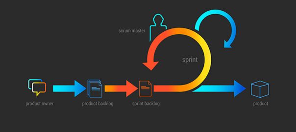
The world is a tough place to survive. There’s competition everywhere and you really need to be on your toes to sustain. Talk about competition in the world of technology and you can easily site some of the fiercest competition. The most popular rivalry in terms of mobile operating systems is between Android and iOS. The history of this rivalry goes way back and has reached a cut-throat level today. Both the giants have recently launched their latest versions. Google launched Android Oreo in August and Apple launched iOS 11 in September which has fueled the discussion ‘Android Oreo VS iOS 11’. Which one is better?

We will have a best of 7 rounds competition between Android Oreo and iOS 11. In every round we will compare the two on the basis of some important features and will try to get a winner at the end of the exercise. So let’s do this!

Round 1
Siri vs Google Assistant

The battle starts with a comparison between the two stars. Siri was introduced by Apple in iPhones way back in 2011 with iPhone 4s. Since then they have improved it with the launch of every new version. With iOS 11, they have improved the voice quality and provided translation between two languages.

However, Google Assistant has scaled new heights in terms of accuracy and efficiency in identifying the objects ever since Google translator was connected to Google Assistant. You can type or speak to search for things and give instructions. Google Assistant picks your words very effectively surpassing the tone, accent and clarity barriers.

Siri vs Google Assistant

Android Oreo is the outright winner here.

Round 2
Battery Life And Mobile App Limitations

There are around 3 million Android apps sitting in the Play Store. Google did not impose any kind of limitations regarding the release of apps till the launch of Android Nougat. That’s why the number is gigantic which has resulted in below par battery performance. With the introduction of limitations regarding release and installation of apps, Android users can expect better battery performance.

On the other hand, Apple has always maintained high standards in terms of app release. They follow very strict rules to manage what type of apps are released on iOS. This often gives a terrible headache to iOS app developers but ensures efficient functioning of the operating system along with super battery life.

Battery Life And Mobile App Limitations

Android Oreo has made significant efforts here, but iOS 11 clearly wins this round.

Round 3
PIP (Picture In Picture) Feature

At Google I/O 2017, Google opened support for Picture-in-Picture to any app which previously was limited only to YouTube app. This enhanced the video viewing experience for users as the video continues to play at the bottom of the screen even when you leave the app.

Apple introduced PIP when they launched iOS 9. However, it was introduced only for iPads. The feature is still missing from mobile devices and works only with the newer iPads.

PIP (Picture In Picture) Feature

Another win for Android Oreo.

Round 4
Messaging

iOS 11 offers all in one messaging app facility to its users, but Android still doesn’t have this feature. Android Oreo still banks on messaging apps like Allo, Hangouts, or Google Duo which are very specific in terms of their features. Moreover, Apple Pay is far better than Google Wallet as the latter requires a separate setup for itself.

Messaging

iOS 11 offers you a stable Wi-Fi, text effects and SMS texting which makes it the clear winner of this round.

Round 5
Autofill Facility

With Oreo, Android has focused on improving the overall user experience by resolving even smaller issues like the auto fill facility. The autofill feature makes it easier to log on to the apps without typing in the full password. Android users no longer need to download separate apps like LastPass for managing their passwords.

On the other hand, iOS 11 considers security as their most important factor. iOS 11 is very strict when it comes to the substitution of its default apps.

Autofill Facility

Android Oreo has an edge over iOS 11 considering the flexibility available to its user when using a password manager.

Round 6
Design Improvements

Android Oreo has not really reinvented itself when we talk about its design. Yes, there are a few tweaks here and there but nothing revolutionary.

While Android Oreo is on the backfoot in terms of design, iOS has done some major improvements. They have redesigned the control center, Siri interface, lock screen, and app store in their latest iOS 11.

Android Oreo VS iOS 11

Scores level. 3 All

Round 7
Notifications

Apple has always been a forerunner in this department with its robust notification display. However, with Android Oreo, Google has managed to catch up with iOS on this front. Just like Apple, stock Android too will have a dot on top of the app. It was already available on third-party launchers but native android got this update with the Oreo edition.

The biggest differentiator is the method of interacting with the notification. You can view the notification without even opening the app, you can categorize it into various categories, and it even has Smart Text Selection.

Notifications

Android Oreo stands out against iOS 11 here by a narrow margin.

Verdict

As expected, the competition was really tough with Android Oreo emerging as the winner with a very thin margin. Both these players are very strong and leave no chance of attacking each other with the introduction of amazing features and improving their operating systems every now and then. The comparison based on some of the important aspects may have pointed Android Oreo as a slightly better choice but it doesn’t underestimate iOS 11 by any means. At the end of the day, it all comes down to personal preferences.

Categories
Technology

Mobile App Maintenance: Why Is It So Essential?

The idea of developing a mobile app might pop up anytime, anywhere and within a jiffy. However, developing and releasing the desired app takes a good amount of time, energy, thought process, technology and a bunch of other factors. Most of people think that the job of a developer and owner ends with the release of the app. However, this is a big myth. The real challenge is to ensure that the users come back and engage more on your platform. That’s what demands proper mobile app maintenance after the release.

Let’s say the 2 giants of mobile operating systems, Android and iOS release an update. Would you not update your app in lines with the latest version of these operating systems? Of course, you have to update your application. Moreover, mobile app maintenance is imperative in order to provide convenient service and ever-improving user experience to all the users. Here are a few important reasons to keep a proper mobile app maintenance process?

1. Helps In Keeping Pace With Popular Operating Systems

Both Android and iOS keep updating their OS to introduce new technological advancements. Android has recently launched Android Oreo 8.0 and iOS upgraded their OS to iOS 11 version. A lot of apps that work on the older version of these operating systems don’t run on the latest versions due to compatibility issues. It’s important to maintain your app on the basis of latest OS versions so that the users don’t discard your app due to compatibility issues.

2. Improved Software Libraries

A software library contains codes, configurations, and routines. It is the backbone of any app development process and developers rely heavily on it. A lot of mobile apps these days use third-party libraries that change very quickly and very often. Thus, updating the libraries becomes supercritical. Mobile app maintenance ensures timely updating of these libraries for the smooth functioning of apps. Else your app will be broken.

3. Provides Better UI & UX

The UI of any app should always be up to date and advanced. An impressive interface from yesterday might not get similar attention today. So, we need to continuously update the interface of our app through systematic mobile app maintenance. Similarly, if you want to get more and more audience and top the app ratings, you must provide a smooth user experience. A proper mobile app maintenance process ensures that users get amazing experience thereby resulting in increased traffic and higher ratings.

4. Helps In Overcoming Hardware Issues

The mobile companies are at war with each other and there is cut-throat competition. In a quest to clinch the top slot, mobile companies launch new and updated models every now and then. Your app might not fit in with the latest mobile devices and may become obsolete in absence of a proper mobile app maintenance process.

5. Provides A Monetary Edge

No matter how efficient a developer is or how clear the owner’s vision is, it’s impossible to develop a perfect app. At a certain stage, flaws will come up and will require attention. If you implement mobile app maintenance process and update your app regularly it gives you a financial edge. You can release the app with essential features rather than implementing all the features. This will help you save on the overall initial cost. With a mobile app maintenance process in place, you can keep updating the app and infuse new features periodically.

To conclude, the only thing constant in this world is change itself. The technology world keeps changing and you will constantly bump into the need for updating your app. Moreover, you need to provide the latest and updated version of your app to the users so that they don’t uninstall your app. This is only possible if you maintain your app on a regular basis. Talk to our experts and know how we at NYX Ditech help our clients in not only developing great apps but also match their maintenance requirements.

Categories
Technology

Here’s Why Switching To A Hybrid App Is A Great Idea

It’s been nearly a decade since mobile applications surfaced over the technology world and their growth has been phenomenal. The access to the internet through mobile devices has surpassed all other means by a healthy margin. With an ever-increasing dependence on mobile applications, it becomes critical for mobile app developers to keep providing an amazing user experience. In a quest to do so, he needs to first choose the correct app development approach. Here’s where the developer takes a call between a Native app and a Hybrid app.

The choice between a Native app and a Hybrid app is one of the hottest topic of debates across the world these days. A majority of tech gurus pointed out the need of switching to hybrid apps foreseeing it as the future of mobile app development.

Let’s first understand the basic difference between a Native app and a Hybrid app

A Native app is developed purely around a particular OS. The UX and technical guidelines of that particular OS are followed religiously during the entire development process. Standard native development tools and kits like Android Studio, Eclipse, Objective C, Swift, Visual Studio etc. are used to develop a native app. The look and feel of all the native apps are similar as they are developed using the same guidelines.

A Hybrid app is essentially an app developed on the footprints of a company’s website. A single Hybrid app can be released across multiple operating systems and thus they are easier to develop. The developer’s need to manage only one version of the source code against multiple versions when developing a Native app. Web technologies like HTML, CSS, and Javascript are used while developing a Hybrid app.

There’s no thumb rule or written verdict that one should only develop a Hybrid app. However, there are a lot of reasons which suggest that Hybrid apps are better than Native apps.

1. No More App Store Limitations

Ask, any Native app developer and he will testify that releasing a Native app is a troublesome and time-consuming process. The entire code needs to be packed and sent to the store for approval which can take anywhere between a couple of days to a week as well. Adding more to the trouble, sometimes there’s a need to update the app multiple times in a day, which is not possible with app store limitations. It’s a very irritating scenario for the developers. Here’s where the Hybrid app comes to your rescue.

2. Smooth & Standard User Experience

Providing a standard user experience across all platforms is a must for any business. Lack of consistency in the look and feel across different devices and platforms hampers the brand image. A Hybrid app allows you to provide a smooth and consistent UX across all platforms. Moreover, a single update is enough to renew the app on all platforms.

3. Cost Effective

A Hybrid app will instantly become your favorite when you will realize how cost effective it is. A Native app requires a lot of engagement from the developer’s end, thereby increasing the time devoted by the developer. More time means more money spent. However, a Hybrid app utilizes a different set of libraries which are then linked with tools which drastically reduces the development time, which means less money spent.

4. Single Code, Multiple Uses

Most of the Native apps have an Android version and an iOS version which are developed using platform specific languages like Objective-C or Swift for iOS and Java in case of Android. On the other hand, a Hybrid app allows you to develop an app using the same language. Simply write the code once and deploy it across all your mobile platforms. Similarly, mobile app testing is also simplified because you don’t need to write unique test scripts for each app type. The entire QA process is benefited as it reduces the amount of QA infrastructure requirement.

5. Extensive Reach

The reach of any business is not always collective or gathered. It’s always scattered around. Since a Hybrid app can be downloaded from any store, it has a better reach to the scattered audience of the business. Hybrid apps have an upper hand over the native apps when it comes to reaching out to the audience quickly and effectively.

Looking at the recent advancements in technology and future projections, one can bet that Hybrid apps will pin down Native apps very quickly. The sublime benefits of a Hybrid app make the development process much easier and efficient. Having said that, Native still holds good for a few specific apps like gaming apps, intensive graphics apps, immersive 3D experience apps, etc. But taking a call on a holistic level, our bet is on Hybrid apps. Talk to our Mobile app development experts and know more on how you can get an exceptional mobile app of your own.

Categories
Web Design

Ever Wondered How Your Website Development Cost Is Calculated?

Trade and business have been an integral part of our society right from the early days of civilization. The earliest of the trades go back to the days when even the monetary instruments were absent. People relied on the barter system to trade according to their needs. Obviously, there has been a drastic change in the business world over the years. With an exponential increase in the magnitude of internet access, every business today relies heavily on online trade. Be it a local grocer or an FMCG heavyweight, everyone needs their presence over the web. The most critical question to be answered here is to take a call on the expense related to website development.

The cost of designing a website is variable, and thus it becomes difficult as a business owner to take a call on what should be the right amount to invest in creating and developing the website. Moreover, it’s more important to understand the base of cost estimation. There are a few key factors that affect the cost of developing a website and it’s important to know them beforehand.

1. Domain Registration

The very first step in web development process is to choose a domain name and get it registered. A domain name is the web address or the URL of your website. Like ‘itsmybusiness.com’. Availability of a particular domain and the type of domain are 2 critical elements deciding the cost. Common terms, names, and one-word domains often carry a high price tag. There are different types of domains as well like .com, .in, .au, .og etc. The cost also depends on the type of a domain. There are a few domains which are even available for free. However, it’s not advisable to go with them if you are really serious about your business.

2. Hosting

In order to occupy space over the web, you need to pay a monthly or yearly fee. That’s called the web hosting fees. There are tons of local as well as global service providers who can provide you hosting services. Again, there are free hosting services available, but you will not get good quality of services from them. Moreover, it will expose your website to security threats across the web.

3. Design

The above-mentioned factors are pretty basic and the change in cost can be only a few dollars here and there. The real game starts with the design part of a website. The cost of designing a website depends on a lot of factors. Web firms who have access to premier softwares and have skilled professionals will charge you a premium price. But, this price will often be justified by the superior quality of their work.

Again, the amount of time consumed also determines the cost as most of the payments are calculated on an hourly basis. An efficient workforce will ensure that the tasks are completed without any errors or need of redoing the work again and again. This will help in keeping a tap over the total working hours and thereby saving on the overall cost. It’s better that you check the portfolio of their projects to determine the quality of their services before handing over the project.

4. Copywriting

This is the tricky part while deciding to create a website. Most of the businesses prefer to write their own website content as they feel they are the best people to decide the tone and words to communicate with their end users. However, this is where they get it wrong. Producing effective web content is not everyone’s cup of tea. Content is the ultimate King and professional web content writers are a must to produce effective content. Don’t try saving a few bucks here as it could prove drastic for your business.

5. SEO

What’s the use of a creating a great website if it’s not visible to the world? The world of web is a dense forest full of innumerable websites and links. It’s very difficult to catch a visitor’s eye without onsite optimization. SEO refers to the process of optimizing a website in a way that search engines find it appealing and thereby increasing its visibility. This is again a specialized skill and requires professional assistance. Avoid the future loss by planning and implementing SEO during the initial stage itself.

So when you start planning to create your website, keep these vital factors in mind. If you want to do it, do it the right way. Consider and discuss all of these above-mentioned factors with your web design firm to zero down on the web development cost. Even better! get started right away. Share your requirements with our experts and they will provide you the best quotes.

Categories
Design UX

5 Pro Tips To Design Best CTA Buttons

The technology world has grown leaps & bounds and so has the access to the web. We access the internet to perform a variety of actions ranging from the simplest ones to the most complex actions. There is always a purpose or I must quote “An intention” behind visiting any website. Every visitor has a goal in his mind when he is browsing through a website. However, in a majority of the cases, the visitor is not able to guide himself through the process and complete the action. CTA buttons help a visitor in completing the process. But creating a great CTA button is not everyone’s cup of tea. So, here are 5 amazing tips that will help you create effective CTA buttons

1. Create A Hard-Hitting Crisp Copy

It doesn’t matter how well you design your CTA buttons, or how attractive they look in those flamboyant colors. If the language of your copy is not up to the mark, your CTA buttons will lose their effectiveness. The idea is to keep the message short, sweet, and bang on target. There’s no need to tell a story in this message. It’s recommended that the CTA message must not be longer than 10-15 words. Simple words like ‘Get it’, ‘Do it’, ‘Sign up’, ‘Download’, ‘Purchase now’, etc. are the good old classic examples of an action-oriented and straightforward CTA message.

2. Make Your CTA Button Stand Out From The Crowd

What’s the use of a CTA button if it is not even properly visible on the website? Visitors don’t know the location of your CTA button and they are not going to sweat it out in an effort to find it. Thus, the CTA button must always stand out visually. Here are a few things to remember:

  • Your CTA button must not be a tiny dot on the web page. It should be large enough to be noticeable at any given point in time. Having said that, don’t over exaggerate the size factor otherwise it will lead to banner blindness and the purpose will be defeated. Also, make sure that you choose the size based on how it will display on smaller screens especially mobile devices as maximum traffic these days comes from mobile devices only.
  • Always use contrasting colors to amplify the effectiveness. Simply pick up the most commonly used colors across your website and design the CTA buttons with opposite or contrasting colors. You can use Red or Orange, in particular, considering they are the highest converting buttons.
  • If you are using any images or a custom design in your CTA, make sure that you use only a high-quality image. Moreover, the image must complement the offer you make.

3. CTA Buttons Must Be Placed Sensibly

It’s critical where you position your CTA buttons. You need to make sure that the user comes across them while browsing through the website. Ideally, they must always be placed in the path of the user. As a designer, you must be able to anticipate and predict a user’s behavior and his next move. A lot of marketers use this tried and tested method on their landing pages:
Headline > > > Marketing Copy > > > Capture Form & CTA
The CTA button at the end.

4. Use The Negative Space Effectively

Your web page will have a lot of content and there’s a big chance that your CTA button may lose its visibility by becoming a part of it. The CTA button must always stand out from the other content of the website. To do so, it’s important to manage the negative space around the CTA button effectively.

  • Incorporate blank space between your content and your call to action button.
  • It’s critical to balance the amount of negative space around the buttons with the size of the buttons themselves.
  • The button, the space around it, and the surrounding content must all go hand in hand despite the fact that they are of different sizes.

5. Create A Sense Of Urgency

Whenever someone visits your website he must feel a sense of urgency. The visitor must feel that he must act right away without any delay. Encourage your visitors to act immediately. Don’t give your visitors any reason to pause. Creating a sense of urgency is important, however, don’t mislead your visitors in any way. Also, this technique will work well with the low-cost items and not always for high ticket items.

Converting visitors into customers is the ultimate goal of any business and CTA plays the key role in this process. If you are not able to handhold the visitor in order to complete the desired action, there is a high possibility that he will lose track and bounce off. Also, there’s a lot more to a CTA button than just the button itself. The color, contrast, surrounding, content etc. all play a vital role in deciding the effectiveness of a CTA button. Talk to our experts and understand how you can create better CTA buttons.

Categories
Design Web Design

5 UI Trends That Topped The Charts In 2017

These 9 months of 2017 have been quite exciting in terms of technology and the web. The world of web is moving at a fast pace with new advancements emerging every now and then. In line with these technological advancements, the design world has also allowed itself to evolve by accepting new trends and ideas. Designers have welcomed fresh design trends and methodologies with both hands especially while designing the User Interface. With a majority of the year gone by, let’s have a quick look at the UI trends which ruled in 2017.

1. Use Of Deeply Engaging Videos

We have repeatedly highlighted the importance of videos in terms of web design and User Interface. It’s the best way of voicing out the brand’s message in an appropriately associated tone. ‘A picture speaks thousands of words’, and is much more engaging as compared to mere words. Use of pictures has been a trend for quite some time now and videos are its natural successor. Images are static whereas videos are dynamic, thereby creating an amplified effect. 2017 has seen a shift in momentum from the use of static images to engaging videos. Having said that, images are not going to disappear from the scene overnight. However, videos are the next big thing in designing an impressive interface.

2. Long Scrolling

Scrolling is not really a so-called trend and is more of a fundamental functionality. It has been prevalent from a long time both in websites and desktops. But, long scrolling has emerged as a design trend in the last few years. A huge number of websites are using long scroll & longform content for desktops and other larger devices in order to display their content. Due to an increase in access to the internet through smaller devices like mobiles etc., users have become extremely comfortable with scrolling. This has pushed designers to implement long scroll and longform of content in bigger screens. With help of long scroll, users can access a huge amount of content in a single and smooth motion. It works well with all forms of content like longform journalism, news articles, stories, landing page etc.

3. Flamboyant Colors & Gradients

The year 2013 saw the uprise of a design methodology which changed the look and feel of the web back then. It was the introduction of flat design. The concept was to keep the design as simple as possible while eliminating all the fancy and jazzy elements from the design. Functionality wise it was very strong and therefore soon spread like wildfire among the designers. However, it had its own drawbacks. Soon everyone was using a flat design and therefore every website looked more or less similar.

Designers realized the need of creativity and individuality once again and they broke the shackles in 2016. Designers started focusing more and more on personality, experimenting with bold colors, vivid colors etc. instead of dull and simple color shades to provide a sense of uniqueness to their websites. 2017 has seen a great increase in vivid colored and stylized websites. This trend has shown positivity and is bound to gain momentum in the upcoming year as well.

4. Bold & Beautiful Typography

In an extension to use of vivid colors and bold designs, designers have fearlessly experimented with loud Typography as well in 2017. Today, there are a lot of free or cost-effective web font services (like Google fonts, Typekits etc.) available to designers, which provides them creative freedom and more experimenting power. 2017 has seen a huge rise in the use of unconventional, bold, and out of the league web fonts in comparison to conventional fonts. This trend is here to stay for quite some time and the upcoming year will see more and more bold & beautiful typefaces against the traditional typefaces.

5. Illustrations

Illustrations provide an immense sense of personality, individuality, and character which can barely be achieved with traditional photography. Illustrations designed in line with a brand’s identity develops a sense of authenticity and builds trust in users and customers. Illustrations have their own versatility. Some brands may prefer sophisticated illustrations to achieve that posh and classy look, whereas others may rely on more rough and edgy styles to position themselves as fun and playful. Illustrations have performed well in 2017 and they seem to be buzzing in the coming years as well.

The only thing constant is ‘change’ itself. New trends and ideas keep on emerging at the scene and designers should always try to keep themselves abreast these trends. The aforementioned trends are the most popular trends that created a buzz in 2017. However, there is a huge list of other trends as well which were successful in modifying the design world. Share your design requirements with our experts and see how you can ride on these trends to create an impressive User Interface.

Categories
UX

5 Pro Tips To Better Your UX Design Practice

Designing for years and years often gives you a feeling that you have mastered this particular art. You start considering yourself to be a perfectionist and believe that there is no scope for improvement. Well, the saying ‘Practice makes a man perfect’ is absolutely true in all terms. However, people tend to stop their learning once they feel PRO. One should never forget that even the best in the business might need some learning. The skills of designers who are in the industry might start deteriorating as they haven’t spend any time in improving their skills. So, it’s best that the designers pull up their socks and start practicing best ux design practices to shine their skills. Here are 5 tips to get you started.

1. Trim Down The Jargons

Being a UX designer, terms like Heuristic review, agile, iterative design etc. would be quite common for you. But, ask any commoner and it will all be Latin & Greek to him. To be honest, they really don’t care as well. It’s OK if you use these terms during your UX team meetings, but you must avoid them during conversations with rest of the employees, investors, clients, partners etc. The clients and the stakeholders must always be on the same page as you are and this could only be achieved when you use simple terms which they can comprehend easily. If you are not doing the same, you are simply separating them which is not a good sign.

2. Use Your Past Creations

If you have been in the industry for quite a few years now, you will surely have several projects under your belt. But, do you ever review your past projects while developing a mindset for your upcoming project. Most of the designers don’t really do so. However, these projects could act as a great inspiration for your next project. By reviewing your old projects you would understand what you use to follow at that time, what you are using now, and you can draw a comparison between the two. An analysis of these projects could become a great whitepaper which you can be used to promote your business. Results from the past could be used to demonstrate your expertise to prospective clients.

3. Take A Break

This might sound a completely out of the box suggestion, but it has its own benefits. Monotony is a serial killer of innovations, ideas, and dreams. Taking a break is a great option for experienced designers to get away completely from designing and refresh their skills. You can involve yourself with different verticals like software development or product development. See the other side of the grass and judge if it is really that greener. It will allow you to appreciate what others do in the organization and will increase the level of understanding between everyone. More the understanding, more the efficiency.

4. Conduct A UX Team Review or Audit

Sadly, there is a very monotonous pattern of daily work that we have been following since ages and tend to follow it on a loop. We get a project, we work on it, we deliver, and we start again. By following this without any gaps or rest, we carry on the flaws and loopholes from one project to the next one as we don’t have time to even identify them. Take a break and utilize it by conducting an audit amongst the UX team. Review how you are working, what is the methodology that you follow, and ask questions about the effectiveness of every step that is being taken in the entire tenure of the project. This whole exercise will allow you to identify workflow flaws, loopholes, and areas of improvement. It will work wonders for your overall work efficiency and quality.

5. Play Around With New Tools

It’s a great practice to get your hands around the newbies. While working on their favorite softwares for years and years, designers hesitate to try out on new softwares. This only limits their knowledge and skills as every new tool adds a new skillset to the designer’s portfolio. Also, there are a lot of career benefits attached to it. Knowledge of a few comprehensive tools may become a game changer in your next interview. Choose a new wireframe package to play with it and adopt a new process of designing wireframes. This can help you in examining the way you build wireframes.

The crux of the matter is that no one is too old to learn something. Learning never gets wasted. Following these design practices allows you to brush up your existing skills, add new skills, follow the industry standards, and most importantly open up your mind for new groundbreaking innovations and ideas. Our UX experts are available to assist you round the clock to cater to your design needs. Speak to them NOW!

Categories
Web Design

10 Biggest Main Menu Mistakes You Must Avoid

It takes a lot of efforts to get your users on your website and takes more efforts to make them stay on that page. The common saying “First impression is the last impression” still holds good in any scenario. The moment your user gets on the landing page he starts forming impressions about your website. Your main menu speaks a lot about your website. It’s kind of a marketing tool for your website. But a lot of websites make naive mistakes which can lead to a high bounce rate and less time spent on the webpage. In short, it can cause some serious damage to your business. Here are 10 common main menu mistakes that should be avoided in order to create a good impression on users.

Mistake #1: Overcrowding The Main Menu

According to a study, the human brain can distinguish up to 7 different elements at a single point in time. Once the number goes beyond 7, the distinguishing power decreases which can confuse the visitor and eventually lead him to bounce off the page. Display only the important options in the main menu and place the other options at other convenient places.

Mistake #2: The Main Menu Drags Too Much Attention

Once the user lands on your page, his attention should go towards the most important aspects of your website. The content is the king here and should get all the user attention. A highly attractive main menu will lead the eyeballs towards the top of your web page and away from the real content. So it is highly advised to keep the main menu as simple as possible.

Mistake #3: An Unresponsive Main Menu

A major chunk of the Internet is accessed through mobile devices and tablets these days. Not having a responsive design in today’s scenario is just like living in a stone age. It is really frustrating to access an unresponsive main menu on a mobile device. You need to constantly zoom in and zoom out to access the menu options while avoiding a click on other options which you don’t wish to access. Responsive has set itself as an industry standard and must be maintained at all levels.

Mistake #4: Options In Main Menu Are Wrongly Placed

According to another Psychological study, items placed at the first and last of a list are most effective. They get the highest rate of attention and retention. It’s called the serial position effect. Hence, this should be kept in mind while designing your main menu items as well. Keep the most important items at the first and the last position.

Mistake #5: Keeping Buttons Rather Than Links In The Main Menu

This is another common mistake done by so many websites. Links are far more effective than buttons and thus should always be valued higher. Buttons are not at all search friendly and are completely invisible to search engines. They require a lot of effort and time to be updated and are particularly bad for mobiles due to their slow speed. They are even less accessible to the visually impaired.

Mistake #6: You Are Using ‘Get In Touch’ Instead Of ‘Contact Us’

In an attempt to get fancy, we sometimes forget that there are many things which are most effective when used in their good old classic version. Get in touch, Reach out to us, Let’s talk, Join hands with us etc. are all fancy modifications of ‘Contact Us’. However, they end up confusing the user. So stick to ‘Contact Us’.

Mistake #7: Your Main Menu Has Your Blog Link

We often fail to understand the basic intention and role of a blog. Your blog is like a searchlight which helps the users to find your website. Hence there is no need to place it in the main menu. Unless the blog is a supercritical part of your services or the website itself is a blog, the link to your blog must rest somewhere in the footer section.

Mistake #8: Using Generic Menu Labels

Who We Are, What We Do, Where We Work, Who We Hire have been the most common main menu labels for ages. But, things have changed a lot over the years and using these labels in your main menu will not do any good for your business. Instead, make your navigation and website more communicative about your services and products. This will help reduce the bounce rate and the users will feel more connected.

Mistake #9: You Have A Home Button In Your Main Menu

This is something very insensible. Your main menu must not have a Home button. The logo of your company must act as a ‘Back to Home’ button. A home button unnecessarily eats extra space in the main menu and diverts attention from the more important content. Although this has been followed by a majority of companies, we still encounter a few websites which still features a Home button in the main menu.

Mistake #10: Not Properly Highlighting The Current Page

At all times you must remind the visitors of where they are by highlighting or shadowing the pages that the visitor is currently on. This can surely be done by using breadcrumbs, but it’s also important to make sure your main menu uses active states.

Creating an impressive and technically sound main menu helps you to create an excellent first impression on your users. In addition to that, it helps in decreasing the bounce rate and the users will definitely spend more time on your website. Talk to our experts for more details.

Categories
Technology

8 Most Commonly Used Agile Development Terms Decrypted

Have you ever worked with a digital agency? If yes, then you will certainly connect to the following. The members of the digital agency have a peculiar habit of throwing fancy development related terms at you. Most of these terms are Greek and Latin to you and often manage to get a blank expression on your faces. You may feel like a tailender batsman ducking bouncers like Sprint, MVP, User Story etc. Most of the companies today have adopted the Agile methodology for development and they use terms related to it. We thought it would be a good idea to introduce and explain the most commonly used Agile development terms to you. Your next interaction with a digital agency will be much more meaningful once you understand these terms.

1. User Story

A user story in simple words is a description of a software feature taking into account an end user’s perspective. A user story analyzes a particular user requirement and provides a simplified description to it. It reads the type of user, what is their requirement, and why do they have this particular requirement.

Format: As a <role>, I want <feature> so that <reason>.

Examples: As a user, I want to upload videos so that I can share videos with others.
As a moderator, I want to approve comments once they are posted so that I
can make sure they are fitting.

2. Persona

Another widely used term in Agile development is Persona. It refers to a precise type of user who is going to use your software for fulfilling his requirements. Every set of users have a different persona based on their needs, habits, wants, demographics, traits, habits, and lot of other factors.

3. User Acceptance Testing (UAT)

User Acceptance Testing or End User Testing is the last level of software testing. It is conducted just before the software is rolled out in the market. Under UAT, the software is tested by a set of intended users who will eventually use the software. The software is tested to make sure it can handle required tasks in real-world scenarios with the desired specifications. It is mostly tested on a staging server outside the development environment.

4. Done

During the development process, you will quite often come across the term Done and that too on three different levels.
Level 1: Done > The software runs fine in the developer’s box according to the developer.
Level 2: Done-Done > QA has positively verified that it runs in a test environment while meeting all acceptance criteria.
Level 3: Done-Done-Done > The User Acceptance Test has been conducted and the clients or business owners have approved it.

5. Sprint

The name may sound like an athletic event but it has no connection whatsoever to running. A sprint in terms of Agile development refers to a particular period of time during which the team completes a specific work and gets it ready for review. Normally this period ranges from 1 week to 1 month. It all starts with a planning meeting between the development team and the product owners. Both decide on what exact work must be accomplished during that sprint. The developers set benchmarks on the amount of work which is realistically possible during that particular sprint. However, the criteria for the work to be approved is decided by the owners.

6. Kanban

Kanban is a very popular framework used to implement agile software development. It is a visual representation of various tasks performed during the project cycle. A Kanban board is used for this purpose. The board has different states as columns, for every work item. The work items are pulled along through the ‘in progress, testing, ready for release, and released columns. There are horizontal “pipelines” for different types of work. The one and only management criteria introduced by Kanban is “Work In Progress (WIP)”. By managing WIP you can prioritize and manage overlapping work items.

7. Technical Debt

During the entire process of development, there are umpteen challenges which may slow down the process of development. These challenges can be technical or even emotional challenges on a personal level. To top it up, there are various deadlines that are to be served. Amidst all these challenges the development team takes several shortcuts. These shortcuts may help in overcoming challenges in the short run but can create issues in the long run. These issues could be related to the development, code base, environment, platform, design, libraries, test automation etc. Technical debt is the term which defines the aggregate consequence of taking shortcuts while the entire design and development process. These consequences can be anything from poor code maintenance, reduced velocity, low productivity etc.

8. MVP

NO! it doesn’t mean the Most Valuable player by any sense. MVP stands for Minimum Viable Product. MVP is that version of a product under development which helps a team to collect the maximum amount of learning about users with least efforts. A product (not necessarily the final version) is developed and served to the customers to note their actual behavior with the product. It’s far better to gather information while people actually using it as compared to merely asking people how they will behave or what will they do with the product.

Well, it’s not mandatory to understand these terms in depth being product owners. But, a basic understanding of these common terms will help you to extract more sense during conversations with the development team. There are many other terms which are associated with Agile development methodology, but you are good to go with these most commonly used terms.

Categories
Blog Technology

The New Apple iPhone 8 And iPhone 8 Plus Launched

The biggest wait of the year is finally over with Apple announcing the new Apple iPhone 8 and iPhone 8 Plus at their annual event on 12th September. The hype about the latest iPhone was more than ever, and everyone was eagerly waiting to get their hands on the new Apple babies. The event also witnessed the launch many other Apple products. Let’s quickly check out what’s new in the latest phones from Apple.

Design & Aesthetics

If you are an apple enthusiast and were expecting ground breaking changes in the latest iPhone, then you would be a bit disappointed. The looks of the new iPhone 8 and iPhone 8 Plus are pretty much similar to their predecessors. Although, they have a new glass coated back cover which gives them a considerably fresh look. The design is not all about the shine, gloss, and shimmer. It has a bit of subtle touch adding to its class. The backglass blends into the sides of the phone incredibly well which was missing in the previous versions of the phone. The glass back supports wireless charging which is of the biggest new features. Apple boasts that it has the hardest glass back ever put on a phone. Overall, the back of the iPhone 8 and iPhone 8 Plus looks slightly better than its predecessors.

Talking about the front, it picks up the fingerprints quite smoothly and swiftly. The glass has an excellent cloudy finish which is a couple of notches higher than the iPhone 7. Everything else is pretty much like the iPhone 7. It still has the touch Id and still uses the force touch thing, unlike a physical button.

Sound

I think the inclusion of actual stereo headphones in the latest iPhone would bring a smile on quite a few faces. The earpiece up top can get super loud to provide proper stereo separation while you’re watching a video.

Display

The iPhone 8 has a 4.7-inch (diagonal) widescreen LCD Multi-Touch display with IPS technology, 1334-by-750-pixel resolution at 326 ppi, and 1400:1 contrast ratio (typical). The iPhone 8 Plus has a 5.5-inch (diagonal) widescreen LCD Multi-Touch display with IPS technology, 1920-by-1080-pixel resolution at 401 ppi, and 1300:1 contrast ratio (typical). True Tone Display, 3D touch, Dual -domain pixels for wide viewing angles, etc. are some of the other features of the two phones. To be honest, you will not be able to make out the difference between the display of iPhone 8 and iPhone 8 Plus in comparison to its predecessors while looking at the screen in appropriate lighting conditions.

Camera

The camera is the biggest highlight of the new iPhones. The new camera features stand out as compared to its older versions especially the portrait lighting feature on iPhone 8 Plus. Although the artificial lighting effects are still a step away from being 100 percent real, they are far ahead of any other mobile phone camera gimmick. They are more natural, subtle and close to reality. You’ll have a lot of fun playing with it.

The Apple newbies will ride on an A11 Bionic chip with 64-bit architecture, Neural Engine, and Embedded M11 motion coprocessor. The company has offered only two compositions this year. Both the phones are available in an entry level of 64GB and an upgraded model of 256GB. One would have to shell out $699 for the base model of iPhone 8 and $799 for the base model of iPhone 8 Plus. Both the phones will be available from 22 September.

To conclude, these new iPhones are no more than an improvised update of the existing iPhones. However, the updates have been not been restricted to just a few upgrades here and there like we have noticed previously in the ‘S’ versions. The phone has a new processor, the A11 Bionic, which is very fast and even the camera has some amazing features including the new 12-Megapixel sensors and an image processor in built by Apple. We can only say that there are a plenty of new features to play around with, only if you’re a diehard Apple fan.