NYX Ditech

Categories
Brand & Identity Design Web Design

5 Web Design Tips To Boost Your Business

It’s a difficult task to start and business; more difficult is to grow it and ensure that it keeps growing. There are thousands of aspects that you need to consider if you really want to boost your business. Marketing strategies, product creation, growth plans, promotion campaigns and the list goes on and on. With so many ongoing tasks, it can be far too easy to let a little thing like digital presence fall by the wayside. However, that can really prove to be fatal. According to a study conducted on the subject ‘what exactly makes people want to complete a purchase from a particular website’, the results came out to be resounding “trustworthiness.” By making consumers feel safe, comfortable and at ease when they visit your online destination, you stand a much higher chance of not just encouraging them to complete a purchase, but convincing them to become longtime users.

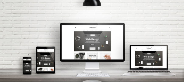
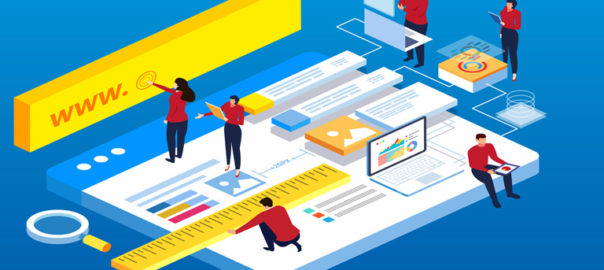
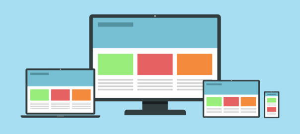
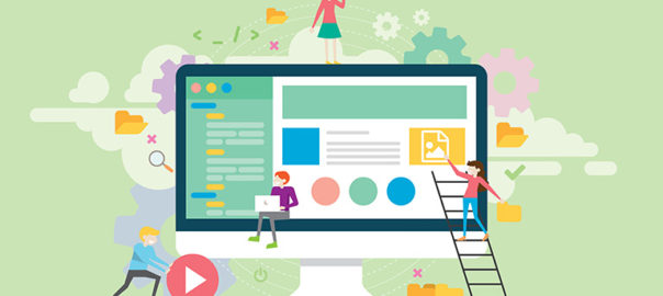
A strong website design is paramount in creating this trustworthiness. By presenting an online destination that is straightforward and easy to navigate, users will have a more positive experience throughout your website, making them more likely to complete a purchase. Other things like company transparency, great testimonials, and a solid product are obviously important to potential customers, but website design clearly sits on top of these aspects to ensure that customers feel that the website is trustworthy. In order to stand out from the crowd, there are a few tried-and-true design elements that will transform your website visitors into loyal customers. Let’s check out some web design and UX trends that will help you to grow your business.

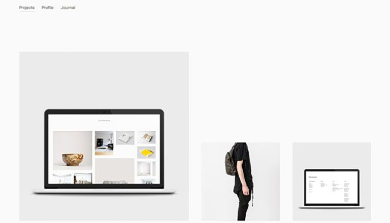
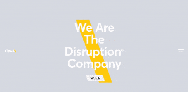
1. Video landing page

Including a video into your website design is a no-brainer. 78 percent of internet users watch videos online every week. That said, don’t just embed any random video taken from YouTube. Instead, take your website design to the next level by creating a video landing page. This video can act to be a strong tool for your website. You could target this video to a direct call to action on a particular web page. Else you could create an immersive video that auto-plays on your homepage.
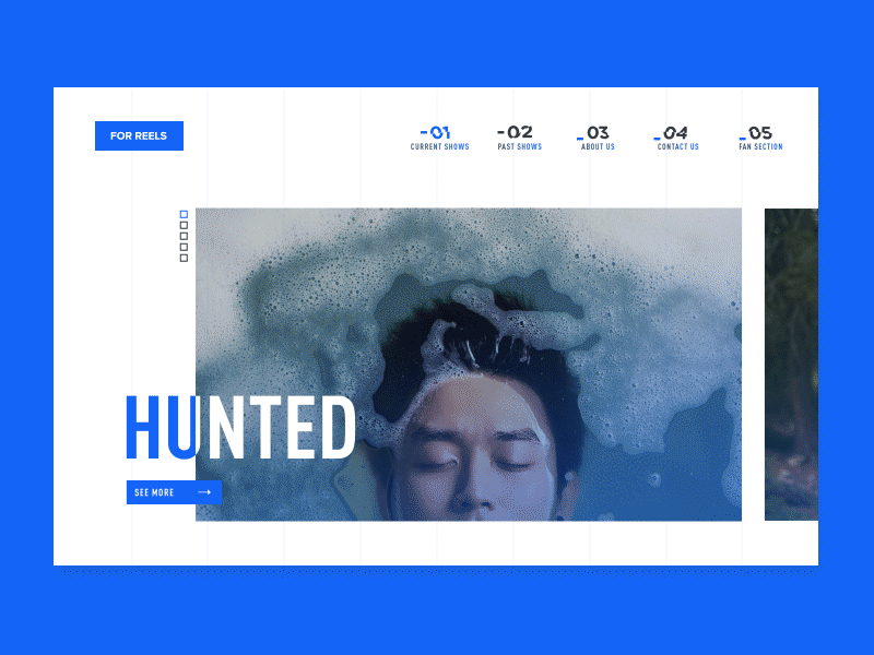
Source: Hunted

Either of these approaches can provide information or elevate the brand’s identity. Moreover, both will improve UX and users’ impression of your company as a whole. A survey in which 159 professionals and entrepreneurs participated revealed that 69 percent of website traffic will be video, while 70 percent of professional participants reported that video converts better than other forms of information and content.

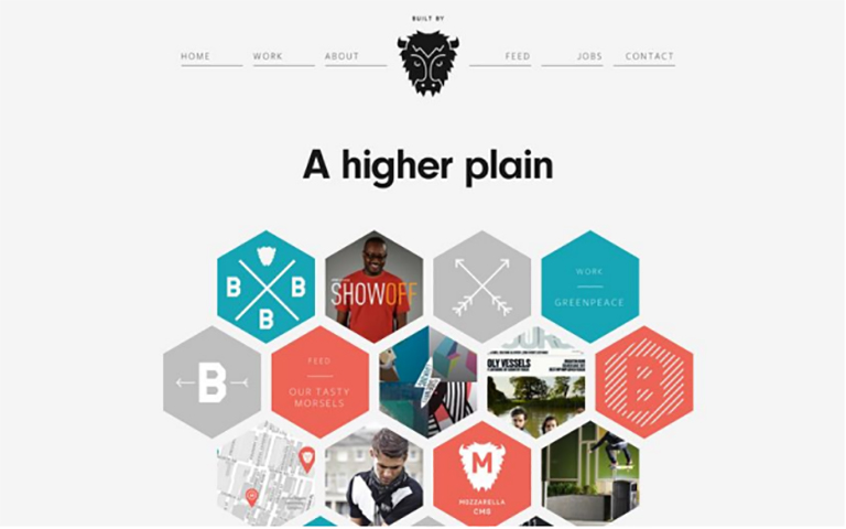
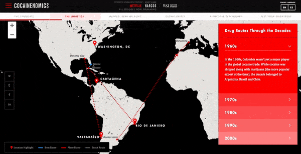
2. Parallax scrolling

There’s no doubt about the fact that digital experiences have improved many aspects of our daily lives. It has simplified our lives to a great extent, however, it has made people very lazy. So lazy, in fact, that clicking a button is often too far out of the realm of possibility. That’s where parallax scrolling comes in. This uneven-like scrolling effect has combated consumers’ general laziness while remaining engaging and visually appealing. With a simple swipe, users can easily consume your information while making their way down the page.

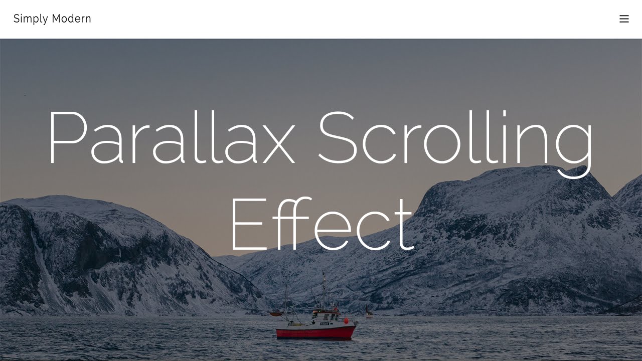
source: simply modern

The popularity of parallax scrolling has increased the use of deep-scrolling and single-page website designs. Parallax scrolling helps users to easily access the important information, while letting them see what’s below, as well. You can prioritize your content and place the content that is more likely to be appreciated by users at the top, followed by the less related content. Parallax scrolling can include effects like an illustrated timeline that goes both horizontally and vertically, ensuring it captivates users.

3. Animated Calls to Action

It’s normal for a user to get lost while navigating on a website. A lot of times it is not clear to them as to what action is required. Therefore, a website needs a clear and precise call to action tabs that constantly remind them of what needs to be done. However, simply telling your consumers what to do is just not enough anymore. When they access the web, they get instructions from all around, therefore you need to something extra to stand out of the crowd.

Adding a little animation to your important action items is a good way to differentiate. Whether it’s a micro-mini interaction or a simple effect to catch users’ eyes, consumers are more likely to execute the action you’re pushing when the call to action grabs their attention and provides confirmation of completion.

4. Custom Typography

Context and text are the pillars of any good website. It’s no longer the times of boring Times New Roman, Arial or any other basic stock font. Instead, take your message to the next level with unique typography that encompasses your brand identity while simultaneously communicating to users. Unique typography and distinct typefaces can take many shapes and can be found in different areas of your design.

Some brands may choose to utilize this in their logo design, while other businesses will use custom font throughout the entire design to draw attention to important content, The choice is yours; utilize this trend whichever way you want.

5. Artificial intelligence

No matter how much technology has evolved and advanced over the years, there are still some human elements which cannot be ignored. Yes, it’s true that the wave of ecommerce sales over brick and mortar storefronts, people still crave connections. This is likely one of the reasons that artificial intelligence in all its forms is so popular.

AI in website design can take many shapes, but some popular examples include machine learning, personalization and chatbots. Machine learning and personalization are cut from the same cloth to a degree and ingratiate a feeling of “being special” with users that, in turn, fosters brand loyalty.

Designing a website that differentiates itself from the crowd and boosts your business require attention. Attention to details and an experienced brain. Why don’t you discuss your website design needs with our experienced designers?

Categories
Blog Design Web Design

Efficiently Using White Backgrounds in Website Design

There were days when dark-colored themes and flashy colors were all over the internet. However, over the last few years, designers have identified the importance of blank spaces, white spaces and have been increasingly using the white color. White backgrounds have gained huge popularity these days. Gone are the dark backgrounds and patterns that have been a big part of the design process for a while. Using a white background may seem like the easiest and the safest path to a clean website design, but that’s not the case. White backgrounds need to work with both your text and image choices. They need to sync in with the overall Website Design and should not look like an afterthought. So what should designers do to best use white backgrounds? Let’s check it out.

Why Use a White Background?

Using a white background is fairly an easy way to go about designing as it is the default setting when working in HTML and CSS, however, colors did gain popularity over a period of time. White as a background color for blogs and e-commerce sites is a staple, but nowadays more and more designers are using white backgrounds for different projects which are more on the creative side. A couple of years ago, the trend was to use a black or dark-colored background, but that trend has surely flipped, and there’s not one particular reason for that.

White backgrounds have a strong correlation with Responsive designs and Flat & Minimal styling. White background regained popularity because it is easy and always looks natural. In some responsive layouts, sites lock to certain pixel-width grid stops and everything outside of those shows a background edge. With a completely white background, this edge becomes invisible without any extra design thought. Simple is still a major trend and a white background is the epitome of simple. White also makes it easy to pair and use many of the bright, bold colors that are symbolic of flat design styles.

Website Design

More About ‘White’

White is a simple color, or we can say it is the absence of color. While it has some meanings of its own, it can take on the context of its surroundings. White is the color of purity, faith, light, cleanliness, possibility, softness and generally denotes positivity. As a background color though, white is more of in a supporting role. White maintains some of its own color associations, but the hue also absorbs what is around it, allowing the full meaning of the design around it to come through. For example, when a white background is paired with pink and script typefaces, it takes on feminine attributes. White as a background color emphasizes clarity and removes visual obstacles and clutter. The hue is used to add visual emphasis to other important parts of the design like color, text or images. It is frequently a part of the overall visual aesthetic that is simply designed and minimalistic.

Other Shades of White

Other colors or words that represent hues that are white or almost white include snow, milk, ivory, pearl, paper, corn silk, seashell, linen, cream and alabaster. These include a pinch of another color, typically black, to soften white with an undertone for reading on screens. Some users and designers argue that pure white is harsh on the eye. However, in print projects, pure white is often standard.

Website Design

Tips to Use White Background

Keep it simple: The essence of white is simplicity. To create a powerful, beautiful impact, choose a simple or minimally-styled design scheme.

Create contrast: Choose dark or bright colors against the white background to create a meaningful visual impact which will entice the users. Black is the most common and preferred choice for type on a white background; even dark gray creates an almost equal impact. Black and dark gray over a white background enhances the readability and is easy on viewers’ eyes. The same goes for images as well. Select images that aren’t overly white in focus or consider using a black border around images to set them apart from the whitish background.

Use simple images: Photos, graphics and illustrations should blend smoothly within the overall design. Refrain from using complex, loud, confusing images. Use simple images which are easy to comprehend and do not stress out viewers.

Wisely choose the types: Beautiful type is of the utmost importance in a design outline where everything is simple. A visually appealing font will accentuate the simplicity of the overall design. It will help in creating a visually stunning white-based website.

Plenty of space: Remember, white backgrounds are part of an overall look and trend. Wisely use them and give plenty of room to everything that is displayed on the screen. Add extra space around objects if required, leave wider margins between text and menu items and focus on the space as much as the objects within it.

Focus on an accent color: Pick an accent color and use it against white backgrounds with black type to create a visually appealing website. The splash of colors brings focus to certain parts of the design in a more subtle way. Moreover, this works with any hue.

Conclusion

White backgrounds aren’t new, they have been around for years now. Only the way of using them has changed and opened new doors to visually enhance web designs working on white backgrounds. This can bring a modern, sleek and clean feel to almost any type of web design project. So go for it! We’d love to see what you are working on. Share your thoughts with us and discuss your design needs with our experts.

Categories
Blog Design Web Design

Use Video And Movement To Exemplify User Experience

The ever-changing world of UX web design has witnessed a plethora of changing trends over the last decade. With a new year, we expect a lot more changes, and new design trends will come to the surface. If you look back to your user experience with websites over the last year, you would probably be able to think of a few websites which really stood out and few which were absolutely shady, in terms of user experience. A bad user experience leads to a negative brand image. Therefore, it’s very important to move along with the changing trends, in order to keep up the user experience level, or even enhance it.

You might have noticed that a lot of designers these days are taking help of video, visuals and movement in order to enhance the UX of a website. It not only enhances the user experience, but it also makes the website more appealing. Here are some of the ways in which you can use video and movement opportunities to grab the users’ attention and keep visitors on the page for longer periods of time.

Non-Traditional Scrolling

More and more websites are now experimenting with different scrolling techniques to create a unique user experience. Instead of using the conventional vertical scroll designers can try out other non-conventional scrolling patterns like long scrolling, fixed long scrolling, infinite Scrolling, or tasteful parallax scrolling. Creative scrolling patterns let you adjust the pace, delivery, and interactivity of the content. Considering that our attention span on the web is less than 10 seconds, a delightful scrolling experience certainly prolongs user interest. Take a look at the imgur website. It uses infinite scrolling pattern, which loads the content as needed to provide a more paced experience. Infinite scrolling proves useful for single-page sites with more than a few screens worth of content, especially with multimedia galleries.

User Experience Video

Rotating Animations

The best web design strategy that will keep users coming back to your website is the Switching Strategy. The more you keep switching your content, more the people will be intrigued. See the Disruption company website. It leaves users curious for more because every time you refresh the homepage you’ll see a new and innovative brand video they’ve created for the homepage. We’ve seen some brands rotate the titles of articles or call-outs as well. These options could leave users with a unique experience on your website every time they visit.

User Experience Example 1

Interactive Web Designs

The inclusion of user interactivity has become more popular and will only continue to grow. Users are spending more time on pages of responsive websites that utilize features with user interactivity. The hindrance with this UX design trend is that the clients hesitate to pay for the advanced interactivity. Even if their own team wants to include features like these, they still shy away. Our team predicts more automated development processes will appear and will hopefully cut the cost for clients who want unparalleled, interactive features on their sites. A great example of user interactivity can be explored on Cocainenomics from the Wall Street Journal. This type of web design not only showcases a visual design talent, but it increases the website’s time on page and brand awareness.

User Experience Example 2

UX-Driven Diagonal Lines

Over the years, it has been a common trend to use straight, horizontal lines to distribute sections on a website’s page. A lot of UX research was done on the topic by various design experts and their teams which discovered that using diagonal line design is not only visually intriguing, but it facilitates the visual flow of users. it guides them to follow down the page or to points to a call-to-action. Using diagonals in your designs will increase the number of users that scroll through the entire length of the site. TaxiNet has beautifully implemented this trend on their website to enhance the user experience.

User Experience Example 3

Large, Eye-catching Titles

Today, we live in a hustling and bustling society, which is always on a move. Users seem to have less and less time to spend on websites due to their busy lives. Therefore, designers have identified the need of creating a design which instantly grabs attention and conveys the message right at the start of user interaction. They are adapting and including large, bolded titles and shortened messaging to capture their audiences and expedite their time to convert. The increased size of these heading tags is usually matched with much smaller sub-text copy if more information is desired. Austin Eastciders demonstrates this alliance of font sizes throughout their homepage design and uses a video in the background to showcase different occasions to enjoy their tasty ciders.

User Experience Example 4

A lot is changing in the world of design. Rich user experience is no longer a luxury; it’s more of basic and elementary. Speak to our design experts and learn how you can infuse visually appealing design elements which elevate the user experience.

Categories
Web Design

5 Tips to Infuse International Flavors In Your Website

Globalisation and internationalism have been boosted with the advent and growth of the Internet. The reach of traditional marketing mediums is often restricted to a particular geography. However, websites, on the other hand, have an extended reach and cater to a much broader audience across different geographies. Therefore, it becomes pivotal to design and develop a website which works well across the globe.

Going Global is the ‘Need of the Hour’

Growing globalism has pushed businesses to constantly look for new markets around the world. What could be a better and effective way to globally market a business than the Internet. It’s the best medium for a business to advertise and promote its products or services. This fact has become obvious for most of the businesses. They understand that a website designed with an international flavour will only boost their global brand presence. However, still there are a lot of companies which are hesitant to embrace this change. Well, web designers can help these businesses extend their reach beyond a localized clientele.

In order to tap global markets, it’s important for your website to be internationally understood. Apart from in-depth research of target markets, there are a bunch of other things which play a crucial role in helping a website reach its full potential. Most important ones amongst them are a proper navigation strategy, website design, the right tools, suitable images and localised web content. Here are a few tips to infuse internationalism in your web designs.

1. A Globalized Visual Style

The visual design of your website plays an important role in determining its success. It’s really necessary to give deep thought to the visual style of your designs and the impact that they make on international audiences. In order to make your website internationally acceptable, thoroughly review the entire website design. People from different geographies, nationalities and cultural backgrounds will have different ways of perceiving visual information, and the same goes for a website’s design.

One of the ways to handle this is to develop one single corporate theme and adapt it to different countries/regions. Keep the branding uniform in the design, but slightly tweak the layout, language, and content from one site to another. This is a time-saving method because you just have to design one encompassing “brand” for the site. But, be careful of not going out too loud. You should try to keep the colors and design of the website subtle and basic. A basic and less complicated design is easier to be consumed by almost everyone around the world.

The second way is to design completely different websites for different regions or cultures. This is quite a time-consuming process. Although, it will enable you to put your message across to different people of the world in a much more targeted way. If you go ahead with this approach, you will need to divide the world into different segments – cultural division, country-wise division, regional division or continental division. Irrespective of the kind of division you choose, there should be a fair bit of research behind it.

2. A Global Design, But With Local Content

Regardless of whether you opt for a common design for all the regions of the world or make a different design for specific area’s target audience, the written text or the content of the website should always be localized for better comprehension. The tone and style of marketing material change considerably between cultures. Even if a design stays the same from one country to the next, the content will ideally shift in terms of language and tone.

Writing effective website content for a particular demographic requires in-depth knowledge of different cultures of the target audience. Therefore, if you want to create a localised version of your website, it’s best that you hire a local professional copywriter and translator to develop effective content.

3. Strategic Navigation

Navigation is another important element that influences the effectiveness and overall user experience of your website. Navigation will play a critical role in ensuring that your website is understood properly across geographies. Give special attention to reading preferences of different cultures. Ensure that your site is navigable for languages that read both left-to-right and right-to-left. Requesting users to specify their language at the very first interaction, via a simple navigation system, is a good start. You can install a horizontal navigation bar, rather than a vertical one, to eliminate the need of moving your navigation bar from one side to the other. Also, you can go with symmetrical web design, so that if the script on your page is flipped, it won’t knock down everything else. Better navigation means a better understanding of your website.

4. Relevant Images

Images and other visual elements play a vital role in attracting the viewer to your website. It is important to make sure that the images on your website are relevant to your target audience. While bringing internationalism in your business website, keep a few things under consideration when choosing images for it. Avoid images that are considered offensive by conservative cultures. Also, when using images with the human element in it, make sure that the people displayed should belong to the same race, country or region you are targeting at. Jewish people posing on a Chinese website makes no sense at all. Localization practices are followed by several multi-national companies in the world. If you want to go for a universally accessible website, it is advisable to use general images, not specific to any culture. But don’t blatantly bombard visitors with stock photos; it will kill the connect and authenticity.

5. Country Specific Keywords

No matter how hard you try and how good you implement these tips, it will all go down the drain if your website does not rank well in search results. Keywords are the most important words on the Internet. They not only enable users to find exactly what they want, but they also allow website managers to provide the users exactly what they have to offer. When adapting your website for a foreign country or region, give special attention to the keywords.

In order to manage keywords for different demographics of the world, create a list of the keywords you use on your English language website. Get them translated by a professional linguist belonging to the target country. They can even suggest alternative keywords or variations of keywords that are more likely to work in that particular region. Make sure that you compare your keywords with what Internet traffic stats say by using a tool like Google Analytics.

Spread your business across the globe by implementing these tips on your website. There are many other techniques which can help you in the process. Talk to our experts and know more about it.

Categories
Blog

Top-Notch Tips for Creating a Time-Saving Design

Users over the Internet have a very short attention span. They don’t really read everything and stick on every page, but scan through quickly. This makes it important to use design techniques that help users scan and get most of the information from your website in the shortest time possible.

It is critical to understand what users need to learn from the design at a glance and help them get that information so that they’ll stick around and explore your website. Here are a few tips to do so.

Minimal Thinking

A design without a lot of choices can be quick and easy for the user. While at first, “think minimally” might make you think about a minimal design style, it’s more about streamlining elements and effects. Overall, the goal is to limit information overload and the number of decisions a user has to make to meet the goal of the design. Keep simple navigation with a handful of choices, using simple typefaces that are easy to read at a glance.
Amp up the contrast between elements so that calls to action are easy to find. For every page, or scroll, in the design, stick to a single thought or action.

Use Visual Content to Encourage Actions

Strong visuals, including photography and videos, are an easy way to grab user attention and when paired with an actionable element, it can help generate an immediate click. It should be quick to move from one point to another within the design. Think about it in terms of e-commerce. A user sees a bag on social media, clicks to get to the website, where they must be able to see the item to keep interacting with the website.

A time-saving design would show the bag with a ‘Buy Now’ button. The user should easily understand how to get it or what is the next action, without having to fumble through multiple pages or clicks. Also, it’s a good practice to use the same image for off-site and on-site promotions. A different picture might not register as quickly with the user as the same image. This works because most people can process an image more quickly than reading words.

Divide Complicated Elements into Parts

Create a story so that you can break a complicated design into smaller, more digestible pieces. Smaller blocks and pieces of content are easier to understand quickly, thereby facilitating a users’ movement from one element to element. Try user interface elements such as “read more” links, card-style blocks and parallax scrolling animation to create engagement and break down complicated designs.

Cut Down Forms

One of the easiest ways to make the design quicker for users is to cut down on asking for not so important information. Forms must be simple and should only collect the essential information such as name and email address, and follow up later for forms designed to generate leads.

Use forms that validate data so users know if they’ve entered something wrong, so corrections are quick and easy. Minimize typing and use buttons or checkboxes in forms where applicable.

Use Bold and prominent CTAs

Make the design quick to use and easy to finish with a bold call to action design that users can’t miss. Bright colored, oversized elements can help users immediately see what they are supposed to do. Further, provide content within buttons that tells users exactly what to do and what will happen when they “click here.”

In order to be seen, a CTA should have plenty of contrast so that it doesn’t blend in with surrounding elements and draws attention to itself. (And don’t forget to make sure the CTA is easy to find on mobile screens as well.)

Review and Edit Multiple Times

Nothing saves users’ time, more than duly checking each and every element, multiple times before publication. Edit everything in the website design and then review it again. A time-Saving website design has written copy that’s easy to read and understand. This means that there are no spelling errors or typos, sentences use proper syntax, grammar, and sentence structure, with everything being organized in a logical manner.

Sometimes a good edit means bringing in a third party to read everything and ensure it makes sense to someone else. An extra set of fresh eyes can help you identify the hidden errors, or to analyse if the content is too complex, with too many jargons.

Consistency Is The Key

A consistent design includes repeated elements, actions, and interactions that work in the exact same way throughout the design. It simply means that a button should always look like a button, have the same color and font, same hover state and work in the exact same way no matter where the button leads the user. Repeat this idea for any element in the design that gets used multiple times, such as icons, the cart, forms, links and social media buttons. Be consistent with other elements also. Headlines, body text and images used should also follow a consistent style.

Conclusion

Whether you agree or don’t, users are looking to do things in a hurry on your website. They want to quickly finish tasks or meet their goals and move on to something else. The more your design saves users’ time, the more user-friendly your website will become. Talk to our experts to discuss how you can add to the UX of your website.

Categories
Web Design

Designing A Single Page Website? Here Are Some Tips

Some websites don’t need multiple pages but just work better with single page designs. Single page website are typically portfolio pages, product sites, landing pages, and sometimes company pages too. You always want a site with little content but strong branding and clean navigation. But that’s not it. There are other trends which go into a strong single page layout. Adding to the user experience is one of the critical elements and a lot of thought should go into how can you design a single page that’ll offer the best user experience? There is no absolute “best” way to craft a single page site, however, here are a few tips and good practices which really work.

Auto-Scrolling Nav Links

A very common feature you’ll find on single page designs is the automatic scrolling navbar. This is where you click a link and it’ll automatically scroll to that section of the page. It works just like a regular navigation menu except for the custom animation scroll effect which offers a really fancy user experience. But sometimes this animation might feel far too slow to some people and that’s one risk that you face when forcing a custom animation into the navigation. To combat that, you can use something that auto-loads different pages and scrolls down into new sections on the same page. The load times are faster with a much smoother transition. Designing a sleek, auto-scrolling nav effect ensures that page sections load into view very quickly and the navigation is also easy to read.

Side Navigation Labels

If you don’t want the navigation fixed to the top of the page you can always design vertical navigation. The links on either side follow the user along the page. They act similar to the typical nav bars, except they’re a bit out of the way and more accessible in that space. Side navigation is not the best fit if you have a lot of text or need to support smaller screens with the same vertical menu. Instead, you can try switching to a more mobile-friendly, accessible menu with responsive techniques. Many websites also use dot navigation links. These aren’t great because they don’t tell you which section of the page you’re currently viewing, but they do save a lot of space and look pretty sleek. Many companies use auto-animate through different sections which works well when you’re adding flashy graphics into custom-styled layouts. Vertical navs work well if you can fit them into your layout.

Portfolio Layout Ideas

If you’re designing a portfolio site then you need to consider a lot of things. Well, a portfolio site is mostly all about showcasing your work, but a great portfolio also reflects ‘you’ into the content. This can all be easier to consume if it’s on one page. It’s not necessary that every portfolio is always just a single page. However, a portfolio website design works well in a minimalist design sense. It’s important to keep the page design clean and simple, yet very fun to look at.

Add CTAs For Sales Pages

If you’re selling a product or digital course then it’s always smart to include a CTA somewhere on your page. This is especially true if you’re designing a landing page where it’s the only page someone might see. Like in single page designs. Try to keep the text as clean as possible, with simple icons and a really smooth design. You really don’t want to distract users, rather you want them to take the desired action. If you’re meeting your goals, then you know you’re on the right track. With great CTAs you’ll notice that font choice, size, position, and color all play a huge role. Those are bound to get people to click at first glance.

On-Scroll Page Animations

Based on the title of “on-scroll animations” you might think this is the same as nav animations. But it’s really its own category and it’s definitely a nice effect. You can easily add page elements that animate themselves throughout the page while scrolling. notice the different page elements animate into view. They’re pretty easy to watch so they don’t move too fast or too slow, but there is clear movement. The idea is to grab people’s attention. It works best with graphics and different page sections, specifically alternating page sections. This effect does not radically alter the page’s behavior or intent. This is mostly an aesthetic trend that just makes everything easier to look at.

Our design team will be more than happy to discuss more on single page designs. Have a quick word with them.

Categories
Technology

Tips To Design An Amazing Ecommerce Product Page

The most important element of any ecommerce website is its usability. The user journey, from product display to check out, is a long process and there are so many elements involved in it. Therefore, it becomes crucial to address the usability of every web page of your website. Product pages are very tricky to design. More often than not, designers lose out at the usability front while ensuring that the products are displayed as best as they can be. Here are a few tips to design a successful and appealing product page for your Ecommerce website.

1. Add an Alluring, Strong CTA Button

This is probably the most important part of any ecommerce product page. A page’s call-to-action button is the crucial element that draws interest and entices a user to take an action. On a product page, this should be your “add to cart” button. It’s the one thing that’ll get people moving through your funnel to actually convert, which is the primary goal of any ecommerce website.

Take a look at the product page of Cross Rope. They feature a pretty simple design and the clear CTA button is colored bright green which immediately grabs attention and stands out against the background. That’s exactly the job of a “add to cart” button. For all CTAs, you ideally want to select a color that grabs attention and differentiates itself from everything else on that page. That said, its essential to blend the colour into your layout and make it feel natural.

crossrope

2. Price Must Be Easily Visible

One of the biggest roadblocks to entry for most customers is the price of a product. No matter how much they like what you’re selling, but if it’s too pricey then it’s just not an option. Some designers think it makes sense to hide the price so users won’t notice. Well, that’s an awful idea. It is very obvious that at some point in time you will need to show the price to the customer and chances are more that he will not buy it. On the contrary, you want your price to be clearly visible and accessible at a glance. Give visitors the info right away so that they waste time looking at a product they can’t afford or just wouldn’t buy.

Take a look at the below image. You really don’t need big red text for your product pricing but it should be clearly visible at a glance. The best color and positioning for your site will depend on how your layout is structured.

3. KISS – Keep Information Short & Skimmable

We often come across so many ecommerce websites with heavily detailed product pages because of which it becomes very stressful for users to read through the information. As a web designer, you should know that people don’t really read the entire content but they actually skim content and quickly look for what they need. Therefore it’s best to provide them with required information upfront, in the style they prefer. Crucial information on a webpage must be organized into page sections. It should be easily visible, easy to read, with clear language and very few obstructive page elements. Check out the Haier’s design. It has a list of features in bold text for the key points. These work like mini-headlines where the content is dark, bold and super easy to read. A great design choice that places attention on the consumer’s needs.

haier

4. User Reviews & Ratings

A product is easy to sell if it comes with a social approval stamp. Product reviews are incredibly valuable and most ecommerce platforms use this feature. You should highly encourage user reviews and push these towards the front of the product page whenever you can. Most ecommerce sites rely on a star-based rating system which works well. This gives a visual indicator of what most buyer’s think of the product. Visitors can quickly go through the star ratings and then see how many people have left used and reviewed a particular product. If you only see 2 or 3 reviews then you know the star rating isn’t really reliable. However, 30+ reviews mean that this is a good basis to gauge the product’s value. We can find this on plenty of ecommerce sites including Amazon, the king of modern Internet retail.

5. Clear Breadcrumb Trail

Another popular feature that many Ecommerce product pages have is breadcrumbs. You can add breadcrumbs to any page with ease and they don’t require a lot of space. In fact, they often take up empty space you never use. The benefit of a breadcrumb is the increased user engagement with relevant links to top-level parent categories for each product. Your goal should be to design similar breadcrumb-style navigation bars. But again, usability is key to everything and therefore your links should be easy to read and the breadcrumb categories should make sense.

wayfair


Categories
Web Design

Designing Websites Applying User Behaviors

Every website is developed with an objective. The objective can be anything; connecting, selling, informing, transacting etc. Every website is designed and developed to complete these goals. Whether the goal is connecting with friends or searching something on the internet, it remains the core of developing a website. As a designer, it is very important to understand this concept of user behaviors to create better user experiences. The basic idea is to keep the usability first and everything else like visual elements second. Here are a few web design tips which are based on understanding user behavior and will help you to design profoundly usable websites.

1. Design Must Be Determined by User Goals

If you don’t know the question, how are you going to answer it? It’s as simple as that. Before even thinking about the design of a website it is important to know what is actually required. If you don’t know what the users want, you will never be able to prepare a useful design. Analyse the KPIs because these will define your goals. Do you want people to instantly take actions and transact on your website, or you want to increase direct sales, or you just want them to spend more time on your website? You can design sites intuitively based on assumed goals, however, the best way to design is merging your goals with the user’s goals into one cohesive final product.

2. Test It and Track It

Analyse and assess your ideas based on KPIs and implement your understandings. You should always be testing new ideas to see if you can optimize any parts of your website. One of the best methods to do so is through A/B testing. Think about what you want should happen and how will you be able to make it happen. Take an example of a content heavy website, say an e-newspaper. A lot of these kinds of websites face high bounce rate problems and the main reason for users bouncing off is not being able to navigate themselves to more content. A simple addition of infinite scroll is the answer to this problem which radically improves the user experience and helps people who are stuck around to read content.

When working to improve certain metrics, think about the user experience, because this is really how design should be done. Imagine what the user would think and feel while using your website and how can you improve their experience. Some factors can be very simple and direct. Like the color of links on your site. Just changing colors can have a surprising effect on CTR, signups, or actions taken by a user.

3. Be Open to Changes

The willingness to adjust and change at different time intervals is essential while designing. A few quick halftime adjustments come in very handy, as a lot of times you face design roadblocks and changing a few components is the only way around. If you’re testing something that clearly isn’t working then don’t waste more time on it. The same goes with any new feature as well, which the users are complaining about and clearly needs to be replaced or worked upon. You should know when to call quits and start on something new.

At the end of the day, it’s your users who really matter and if something is not working for them, it has to go down the drain, irrespective of how dear it may be to you as a designer. Your personal feelings should not interfere while taking a decision on what works and what doesn’t. Be open to changes, new strategies and ideas based on new evidence and analysis.

4. Take a Holistic Approach

Every design that you create must comprise of smaller usable pieces which together contribute to a larger composition. This is the best holistic approach to any and every design. You know what they always say, “look at the bigger picture” and focus on understanding how every visitor will perceive it. Question yourself -is your homepage user-friendly, will the user easily understand ‘what to do’ when he lands on the homepage, will he be able to easily navigate through the website? Both the composition and overall design quality play a big role in how people perceive a website.

People need to rely on authoritative designs that work well and serve a purpose. Unfortunately, many designers do look at the big picture, but still, fail to use it and implement the ideology. This leads to a visually pleasing design, which is a useless interface. Design is not just about aesthetics and appearance. It’s about ease of use, practicality of the design, user experience, responsiveness of the website, page load time and a lot more. A holistic approach to design considers more than what you can see. It’s also about what you experience by using the website.

5. Provide Visual Feedback to Users

It’s very important to inform users when are they correctly interacting with your interface and also when they are not doing so. Visual cues and messaging show users whether their interaction is producing the desired results. One of the simplest examples of this can be changing the visual styling of a button when the user hovers over it or even when they click on it. This will give them a sense of confidence that they are heading in the right direction, and on the other hand, will give them a sense of caution if they feel they are not going in the correct direction. Visual cues may not be a direct way of giving feedback, but it certainly is a very effective medium of doing so.

If you consider the user experience at every stage of the design process, designing a user-friendly design will not be an uphill task. All it needs is to put yourself in users’ shoes and analyse every action that they can take and normally do. However, it’s very easy to lose focus and get into a self-centered mode and design something completely to satisfy your own needs and preferences.

Talk to our design experts and discuss your design needs.

Categories
Design

Infuse Innovation In Design Patterns: Why and How?

A lot of researches have proved that human behavior happens in patterns and humans largely use the default, familiar patterns to interact with technology, without seeking a new way to do so. Having identified the substantial influence of patterns over human behavior, it is a wise step to use established design patterns in your work. That said, repetition can also kill innovation. It’s nearly impossible to design something new for your audience if you only concentrate on what’s been already done.

In this article, you will learn how you can use innovative ideas with established design patterns to meet the need of your end-users.

What are Design Patterns?

Design patterns are established solutions to recurring problems. Established design patterns are extremely useful for interface designers. One of the best examples of UI design trends can be positioning the login call to action at the upper right-hand corner of the navigation. People are familiar with this type of positioning because they’ve used the same behavior to log in or check their profile for years. They expect the login button to be there.

Tax Zar
Image source:Taxjar

People enjoy the familiar and are reluctant to anything that they don’t know, or is unexpected. When an interface matches the user’s expectations, it reduces cognitive load, saves users’ time, and makes the software more intuitive.

While we are discussing how to bring out originality and infuse innovation in design works, patterns do have a number of advantages for your design process.

Utilizing a pattern saves time as you don’t have to design an interface from scratch, everytime you start a project. You would be building on a solution that has been successful and has worked well in the past. However, relying heavily on design patterns can easily drive you towards an under-researched design.

Before you start customizing patterns, make sure you select the right pattern for the job. Yes, design patterns are usually reliable solutions to recurring problems, but if you don’t choose the right one, your design could actually reduce clarity for your audience. There are various repositories that offer examples of important design patterns. You can choose the most suitable one for you from there. Once you have your patterns in place, it’s time to get into the innovation mode. Here, innovation means specific changes in a few parts of the interface, not spinning the entire thing on its head. The fundamental design still fits a pattern, but new ideas are added to better help your users understand the interface, satisfy their needs, and accomplish their goals.

Cresent Heights
Image source: crescent heights

Ways to Innovate

There are two most commonly used, tried and tested techniques which can be used to infuse innovation in existing design patterns.

Mental Models

A mental model refers to an established belief someone has about how a system should look or function. This principle states that people find something challenging to use if the interface doesn’t function as they have already decided it should. How designers perceive a product or website and how users perceive the same is often poles apart. This discrepancy is the biggest pathway to poor design.

A couple of research methods like Usability testing and card sorting can be used to uncover what’s on your users’ minds. In Usability testing, people verbalize what they’re thinking as they interact with your site, while in card sorting, users group types of data based on categories, which can help you understand where in the interface people expect to find content.

Empathy Maps

An empathy map is a qualitative research method that visualizes specific needs and actions of your users. Using data collected from user interviews, surveys, and field studies, empathy maps typically categorize user needs in four sections: Says, Thinks, Does, and Feels. This kind of research helps in identifying what users feel versus what they do. These conflicts will help you identify what elements to highlight or hide in your UI design.

Innovation has always led to great things, however, it’s not really wise to only depend on innovation and everytime crafting something completely new, without the essence of tried and tested solutions. It should always be a combination of new ideas and established design patterns. Know more about the same by speaking to our design experts.

Categories
UX

Usability Mistakes That You Should Avoid

Importance of usability is very well known to designers. Usable websites offer great user experiences, and great user experiences lead to happy customers. Designers must implement smart design decisions and aim at satisfying and delighting the visitors, rather than frustrate and annoy them. Here are a few usability problems and challenges that are very common across websites and some recommendations on how to cope with them.

1. Small Clickable Areas

Hyperlinks are designed to be clicked, so to make them usable, it makes sense to ensure that they’re easy to click. A lot of designers fail to make the hyperlinks clickable and thus reduce the usability. We need to make the clickable areas bigger because our hand movement with the mouse isn’t very precise. A large clickable area makes it easier to hover the mouse cursor over the link. To ensure we get a large clickable area, we could either make the whole link bigger or increase the padding around the link using the CSS.

2. Incorrect Use of Pagination

Pagination refers to splitting up content onto several pages. This is often found on websites that have long lists of items; for example, products in a store or pictures in a gallery. Using pagination for this purpose makes sense because displaying too many items on one page would make the page slower to upload and process. Alternatively, in particular cases of content pages, like blog articles, the content is sometimes split into several pages. It’s unlikely that the article is so long that it requires pagination, however, this is done to increase page views as a lot of blogs and magazines get their revenue through advertising.

3. Duplicate Page Titles

The title of each Web page is very important. Page titles are the pieces of text we write between the <title> tags in the <head> section of our HTML code. Sometimes people create a generic title while working on their website’s template, which is usually their website’s name. This is a mistake and must be avoided because it robs each page of a couple of key benefits.

The first benefit is that a good title communicates to your visitors a lot of information about what the page is about. People can quickly figure out if they’re in the right place or not. Remember that this title doesn’t just show at the top of the browser window; it’s also shown on the search engine results pages.

The second reason has to do with SEO. Search engines need different information to rank the results of a particular query. A page title is one of the more important pieces of information they use to gauge how relevant your page is to a particular search term. This doesn’t mean you should load as many keywords as possible into the title, but you should ensure that each title describes the content of the page, including a couple of words you think people will search for.

4. Missing Contact Channels

User engagement is important if you want to build a successful community, and communities are important if you want to build successful websites and social web apps. User engagement is also important if you want to build loyal customers. Quickly answering people’s questions and fixing their problems doesn’t just mean that you have good customer service – it means you care, and your customers and visitors will appreciate it.

Your visitors must be provided with an easy channel for getting in touch with you, like an email address or contact form. You could also use contact forms to bypass the problem of showing your email address on a page.

5. Too Much Functionality That Needs Registration

Your website may have some content or features that require visitors to register before using; which is fair enough, but be careful how much content is put behind this registration shield. Very interactive web applications, such as emails, document editing and project management, restrict 100% of their functionality to registered users. Other websites, such as social news websites, do not. One can browse all the stories and enjoy the functionality without identifying themselves.

When you implement a log-in barrier, be careful that you don’t lock away features that don’t really need user identification. Some blogs require people to register before posting, which is a way to deal with spams, but it will also significantly decrease the number of comments you see.

User participation on your website is affected by how many barriers there are. Removing barriers such as registration will almost certainly increase user participation. Indeed, once users start using your website, they will more likely sign up, because they’re already involved.

Usability is of utmost importance and therefore must not be compromised at all. Speak to our design experts on how you can achieve a successful web design without actually compromising on the usability front.