NYX Ditech

Categories
Brand & Identity Design UX Web Design

Web Designing While Accounting Human Errors

We often hear the phrase ‘To err is human’, and it can’t be truer in every aspect of our lives. We all make mistakes. Users on your websites are no different. Sure, you can’t stop them from making mistakes, but, can you follow some aspects of web designing while designing your website in a way that it leaves a scope of making mistakes?

Even the most careful and diligent users are bound to make mistakes at some point in time; others will make more mistakes. Therefore, it is critical to consider this fact while designing your website. The errors in web designing can be as simple as mistyping a URL, providing incorrect information in a sign-up form, adding info in wrong fields, etc. The mistakes could even be as disastrous as accidentally sending thousands of dollars to the wrong person via PayPal. So, here are a few tips that you can follow to account for human error while designing your websites. 

1. Provide Straightforward Instructions

A lot of times, we assume that the users are by default aware of the most basic instructions. Thus, we don’t feel it necessary to provide these basic instructions to them. Moreover, people often see basic directions as a bit snooty. It’s human to assume you know everything you need to know for a simple-seeming task. This causes errors.

Don’t assume they know what you mean. An imperative when delivering clear instructions is not to assume the recipient knows what you mean. This can be for anything from commonly used acronyms to simple navigation instructions.  Mixed messages, assumptions and multiple options mean that the message received might differ from what we actually meant.

2. Give Clear Warnings During

Just like the instructions, users must get a clear understanding of the consequences of actions taken on the website. And, sometimes they need to be informed and explained the implications, that too in detail. Still, there would be users who would keep ignoring your warnings, but there’s not much you can do for them in any case.

There’s also a second web designing approach which you can proceed with. A majority of people will leave your site when they face a warning message which they don’t fully understand. Else, they may look for help to understand the warning, which again may lead them to bounce off. You’ll have to decide whether you would rather deal with potential inaction from some customers, or more errors. Both approaches have their pros and cons.

3. Always Confirm Actions While

You may think that all users are completely sure of what they are doing on the website, or they may get annoyed with questions asking them to confirm their actions. A confirmation dialog may seem like an irritating and useless extra step; however, the truth of the matter is a quick “Are you sure you want to do that?” message can be invaluable. The user may be taking action for the first time, or the tenth time, it’s irrespective. A confirmation will only increase chances that the user takes the correct, intended action.

4. Validate Forms

Form validation may not be a full-proof solution, but a potent tool, and a great way to gently guide the user in the right direction. While proper form design can help keep users from simply putting the wrong text in the wrong form, form validation is excellent for double-checking information and catching typos and forgotten fields.

Improper validation of form data is one of the leading causes of security vulnerabilities. It exposes your website to attacks such as header injections, cross-site scripting, and SQL injections. It is important to note that client-side validation is beneficial, but it is not enough. If you’re going to implement client-side validation, it would be good to have some of the server-side too, just to be safe.

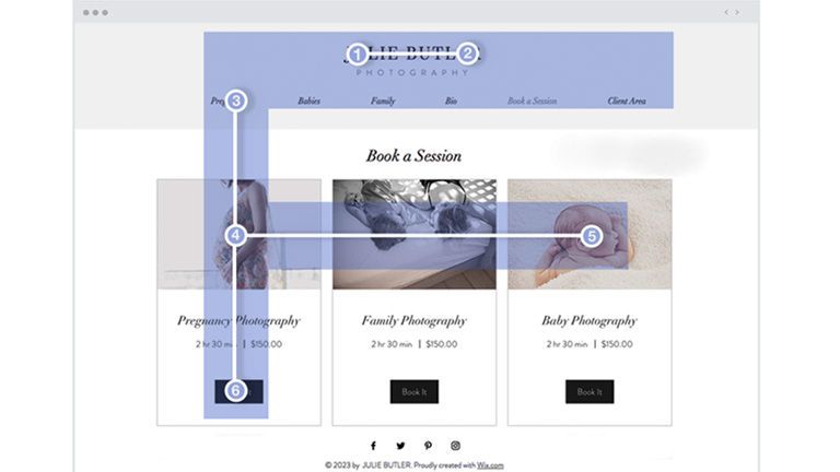
5. Use Appropriate Form Labels

In our last article, we listed out some essential tips for selecting the right button labels. The labels on the forms are equally important and can lead users to commit an error, if not used properly. There are tonnes of websites on the Internet with so many vaguely-labeled forms. Worse are the forms that use industry jargons on a client-facing website. In some of the sites, the labels and input fields are even misaligned. That’s just a strict NO-NO!

6. Improve Usability Through Color and Contrast

The colors and contrast are often used on a website most simplistically. People only go as far as using red and its shades to portray bad, and green and its shades to show good. But that’s not enough. It doesn’t necessarily help differently-abled users. A website should be usable by everyone, so various disabilities should be kept in mind. Disabilities can include but are not limited to, the inability to use a mouse or see the screen.

When someone has low visual acuity, specific color palettes on websites may make it difficult for that person to see and understand the website content fully. You must find a way to add contrast to your elements, in such a way, that they’re clearly and easily distinguished from each other. Pay special attention to this if two options use similar text, but do radically different things.

7. Provide ‘Undo’ Option Where Possible

We all know how handy the ‘Ctrl+Z’ option comes in every day while performing various tasks. The ability to undo an action is such a boon to everyone. We wish we had an undo button for our lives. Coming back to reality though, if you’re building a web app, you might seriously consider implementing some sort of “Undo” function for just about every action with permanent consequences.

You cannot ensure error-free browsing on your website; neither can you take a generic call on the abilities of your users. But, considering human errors while web designing, will increase the chances of good user experience and fewer errors. Speak to our experts to discuss more on it.

Categories
Design Technology Web Design

5 Best Practices To Design Single-Page Websites

Single-page websites were once not a real favorite of web designers. However, things have changed over the past decade, and single-page sites have gained popularity owing to its ease of creation, simplicity and potential to deliver a rich user experience. That said, which one is better – multi-page or single-page website, is a never-ending debate. A single-page website is faster and easier to develop, but it still requires a lot of creative thinking and thorough planning.

Single-page website

No prizes for guessing, a single-page website is a website that contains a single HTML page. The entire content of the site is placed on one page. When users click on a navigation link, they are directed to an HTML anchor on the very page.

Single-page websites are responsive and provide better mobile UX. It offers a lot of freedom to web designers in terms of layouts and visual effects. They do have a few drawbacks as well, like it is not SEO friendly. You cannot index several web pages with various keywords and meta descriptions, which will negatively affect organic traffic performance. The key is to understand the target audience, their expectations, and the company’s long-term goals.

A single-page website is best suited for personal websites, portfolios, landing pages, brochure websites, single-product websites, resume pages, one-time events etc.

Single-page websites: Best practices

Break Down The Content

A single-page website is a right choice for you if you don’t have much text to display. Though less text doesn’t mean less information. Therefore, you need a clear and easy-to-follow visual structure. Create a story and break the content into small chunks and sections using different header styles, background colors, overlays etc. Well-written content along with appealing visual effects will ensure that users don’t stop scrolling on your website.

As you only have one page, try not to feed too much information to users. Use multiple sections and keep the messaging clear and concise. More importantly, ensure that you maintain a continuous and sequential flow of content. Another way to keep users following your point is to tell a story using both visual and textual content. Storytelling is a powerful way of delivering content.

Create A Visual Hierarchy

Visual hierarchy tools used for web design include size, color, contrast, proximity, and repetition. A common belief states that people read in the F-pattern when they are served a large amount of textual content, while the Z-pattern suits pages that have less text. But, it is suggested to use both of these patterns for different sections, as a single-page website contains numerous sections, and it’s essential to diversify the site structure.

The single-page visual hierarchy should be concise yet encouraging. Before selecting a particular page structure, identify your needs and keep in mind that you only have one page to scroll.

Add Alternative Navigation

Single-page websites are all about scrolling and sometimes about endless scrolling. At times, this can leave the users clueless and stranded, with no idea where to go. If your site has a complex structure and with a lot of blocks, you should think of alternative navigation.

Use a sticky navigation bar that stays on top of the page, no matter how deep you scroll. This will allow users to move to the section they are looking for quickly. Also, use anchor links and a back-to-top button to keep the UX pleasant and intuitive. Always keep the users on track. Try to combine scrolling with a traditional navigation system. Don’t forget to put a “back to the top” button if you have a long single-page website.

Add A Compelling Call-to-Action Button

A call to action button is the most influential factor in a conversion. A well-designed CTA influences users to take the desired actions; be it a mobile app download, order placement, demo request, email signup or as simple as a contact form submission. The exceptional quality of a call to action increases the chances of conversion.

Single-page websites are perfect for a CTA. Because of their structure, single-page sites are more focused as compared to multiple-page sites. The design and placement of the CTA must be around the specific purpose of your website.

Keep It As Simple As You Can

Take a look at any of the traditional, multiple-page websites and you will notice that they are created based on a particular design theme. A few templates of inner pages are added to this basic design theme to complete the overall design. However, it is much more challenging to design a single-page website.

With the recent developments in CSS3, HTML5 and Javascript, the opportunities to create a simple and engaging website are as vast as you can stretch your imagination. Adding little details, like animations and smooth transitions, also contribute to enhancing the user experience.

Don’t make It Heavy

A lot of times the goods about a single-page website are washed out by its slow load speed.
Since there is only one page to deliver the content, all information is stuffed onto one page, making it really heavy and takes ages to load. Be selective, don’t stuff the website with unnecessary information and heavy animations. Saving a user’s time should be paramount. Slow loading will also hurt your website’s SEO.

Analyse the pros and cons of a single-page website, and then make an informed choice. In case you would like to know more about it, talk to our experts now.

Categories
Blog Brand & Identity SEO Web Design

5 Annoying Things To Avoid In A Web Design

Competition over the Web Design internet is fierce. Today, there are a large number of individuals and businesses who spend money and time on digital marketing and SEO to rank higher on Google searches. It has become tough to differentiate from rivals and get users to visit a particular website over others.

Since acquiring new visitors is very difficult, providing a delightful user experience gains importance and is pivotal to retain each hard-earned customer. If a website offers an unpleasant experience to its users, forget about winning repeat visits, they might never come back on the website. Here are some of the most common things in a web design which leaves users in frustration and thus must always be avoided.

Slow Website Speed

With the boom in technology, everything has become super quick. Everyone has a smartphone these days, and access to the internet is just a tap away. Even half-baked questions or half-remembered trivia get instant answers from Google. People can contact each other, sitting halfway across the globe in a matter of seconds. Today, the speed and responsiveness of our hyper-connected world have spoiled us all. Therefore, when we click on a search result, and the page keeps loading even for only three to four seconds, it is equivalent to eternity for users.

Remember, you’re not the only one providing an answer to a query or serving what a user is looking for. If your page doesn’t load within a blink of an eye, they will click on other best available options. Get rid of all the unwanted elements which are dragging down the speed of your website. Ensuring a good page load speed is critical to create new visitors and retain them.

Too Many Popups

It’s a shared experience, wherein we click on a link in our Google search results, and we are directed to a webpage which is full of popups. So much as so that we are not even able to read the actual content available on the page. Moreover, they keep popping up, even after you close them.

Combined with a browser alert that “this website would like to send you notifications”, the overall effect is one of being barraged with irrelevant information. It ultimately kills the actual content you were trying to reach.

Some advocate the fact that popups significantly improve conversion rate, while others get put-off by their potential of pestering the users. No matter which side we stand, one thing is for sure that popups are badly planned, throwing information and content which is not relevant for users. Therefore it is better to stay away from them.

Not Mobile-friendly

According to Statistic, 52.2 percent of internet traffic was generated through mobile phones in 2018. That’s a considerable ratio, and thus it’s pivotal that the website is responsive and mobile friendly. We are in 2019, yet we come across many mobile sites where items aren’t aligned properly, overlapping, strangely formatted or subject to some additional oversight from the designer. It creates a negative impression on users. They might feel that your company doesn’t take the time to go over little details.

Coupled with the recent change in Google’s algorithm to prioritize mobile-first indexing, there is now no reason at all to ignore the mobile experience of your website. A low-quality mobile site can negatively affect your SEO performance as well as the experience of your users, so it’s essential to get it right.

Animation Overdose

We like animations. Yes, they do look good and enhance the aesthetic value of a website. A few smooth transitions, transforms, appearances, and well-deployed animation can infuse vital life into an otherwise static and dry layout.

However, animation should be used sparingly, as and when required. Overdoing it can distract the audience. The key role of animations is to draw user attention to key content and call-to-action buttons. Users should not feel confused to read the actual text.

Animated introductory screens, too, are great attention-grabbers when users first reach on to your website, but avoid making them sit through the same animation every time they want to return to the homepage. Their beautiful presentation shouldn’t dictate the function of website elements.

Users shouldn’t be waiting for an element to appear or to become interactive. Using a lot of moving parts or content that flashes can pose problems for users. Some users may have an attention deficit disorder, making it very difficult for them to concentrate on the content.

Video Autoplay

Videos are an essential aspect of your online marketing efforts. They are a good source of explaining your products, brand message and other aspects, better than text can. Designers are often tempted to put the video on autoplay when they place them on the website. There are ways to do it tastefully, but it’s so often misused and creates a negative user experience.

Many sites place a video next to the body text. Usually this is entirely irrelevant to the content of the page. Even if you close it before navigating to another page, it quickly reappears. That’s really annoying.

Even worse, many sites preface these videos with automated advertisements which, given that the videos themselves are generally advertisements in one form or another. Some web users also hate auto-play as it can ruin their user experience and would rather prefer reading the information on the page without a distraction. It is more polite and effective to let the video be turned off until the audience chooses to play it.

To wrap up

Everything which we have mentioned above is basically issues of a bad UX design. It is important to consider every element and its effect on the overall user experience. If something hinders the user in finding what they’re looking for or detract them from the actual content of the page, it should be avoided. Speak to our design experts to know more about it.

Categories
Blog Design Technology Web Design

Tips To Choose A Website Builder for Your Next Project

Every business needs a compelling website these days. We come across loads of websites on the internet, some of which we find very attractive, some not so much. A lot of these websites are developed using website builders, which are great assets and expedite the process of designing and developing a website. A website builder is an effective tool to design a corporate website, blog, landing page, an eCommerce portal and a lot more.

A good website builder is easy to understand for even novice web designers. It typically provides templates and features that are based on web design best practices. But, what should you look for in a website builder to zero down on the best one for you? In this article, we will discuss exactly on that. Irrespective of the size of your business, this article will help you choose the best website builder platform for your website.

Set Your Budget

First and foremost, examine and ascertain your affordability. There is a website builder for every pocket. Start by considering the other costs involved in building your professional website. While deciding on the budget, consider the other costs involved as well, like domain registration and hosting. The images and copy for your website will also require some investment.

A lot of website builders offer a free plan, but that has its own limitations. Mostly the services cost somewhere between $5 to $40 a month, for plans that offer features required by businesses. If your budget is limited, you can save money by looking for plans that bundle different website services you need.

Prioritize Your Needs

Every business and website will have different needs. Based on these needs, a suitable website builder can be selected. Before you can decide on the best website builder platform, you need some idea of what you want your website to do and be like. Consider the level of experience you have in designing. Most websites builders are made for people that don’t have much experience with design or website coding. Still, some of them are easier to understand and get used to.

If you’re a newbie and would be starting from scratch, then look for a builder that offers website theme templates and drag-and-drop design options. If you want a lot of options and flexibility in designing your website, then go for a website builder which offers plenty of templates and further flexible editing options.

For instance, if you’re developing an eCommerce website, think if your website will include videos? A photo gallery? A blog? A map that shows where your store is located? Make sure your website builder supports the types of content formats you plan to include.

Also, Make sure the website builder you pick provides responsive website templates or other options to make your website mobile friendly.

Look For Ease Of Use

You don’t want to scratch your head figuring out how to use your website builder. Make sure the builder you select is one which can be easily interpreted. The key thing is ease of use for your comfort and at your skill level.

If you have a background in coding and want customization, you may use slightly advanced tools like the most popular builder – WordPress; you can also buy customizable templates. The templates also vary in ease of use, so choose wisely.

To be fair, almost all independent website builder platforms are easy enough to use. However, the features provided by the builder creates a huge difference. Always go for a feature-rich website builder as it adds to the ease of use.

Consider After Sales Service And Support

A quality website builder will have a solid support and troubleshooting team in place. The team would promptly answer your queries and troubleshoot if anything goes wrong.

Generally, customer service levels vary, based on the pricing plan you choose, but is an important consideration before choosing a website builder.

The support is offered at various levels, email support, priority support via email, chat support, or phone.

Check Out The SEO Features

No matter how good your website is, it’s of no use if people are not able to find you on the web. Once you’re done building your website, you want people to easily find you. Your website should not get lost in the deep sea of countless websites over the web.

For that, you need to implement SEO best practices along with the design of your website. A good website builder should include SEO features that simplify on-site optimization. You must be able to update all the SEO meta elements, on each page, without any hassles, so as to provide your sitemap to the search engines.

On-site optimization is just one part of SEO, but surely a significant one. An SEO feature-rich website builder will help you in successfully implementing your SEO strategy into the design right from the very start.

In nutshell, the best website builder for you is the one which is easy to use, offers plenty of features, meets your specific needs, has a strong support team, and is easy on your pocket. Sounds too much of information? Don’t worry, leave your design requirements to us. Discuss with our design gurus and get your dream website designed cost-effectively.

Categories
Web Design

Should It Be Content Or Design First?

Designing a website is an entire process and needs proper planning. The key element during planning is to decide the course of events and order of events. Amongst these decisions, the most critical and tricky one is to decide whether the content should be written first and the design should follow it or vice versa.

With advancements in technology and evolution of new design trends, a lot of new design elements have surfaced. Swirly animations, smooth java, embedded flash plug-ins, parallax scrolling, white space usage, customized fonts and shades, there’s a lot on the plate of a designer to beautify a website. That said, even the most alluring websites will not succeed if an equally enticing content doesn’t compliment it. There are quite a few challenges in creating content based on a ready design. The question ‘whether design should be decided first or the content?’ is a tricky one. Although, we feel that deciding content first and framing a design based on that is a better practice because of the following reasons:

Content Will Go Heywire With A Pre-Decided Design

A lot of designers start browsing through umpteen web design templates right from the word go and select a template which looks the most attractive. However, this poses a big challenge for content developers as they need to frame and twist the content according to the template and its categories. This is a bad practice and will result in negative business consequences.

Content First Speeds Up Production

Deciding a copy for a website is a tedious process and takes substantial time. Moreover, there’s hardly a chance that the initial copy will turn into a final copy. The designer will have his own inputs about the type and amount of content in certain sections plus the use of specific words, which means a lot of revisions. The production and launch will be delayed if the design is finalized before the content due to the revisions until the best copy is created. Now imagine, what if the content is worked on before the design? The launch process will speed up as finalizing a design based on the approved content will comparatively take lesser time.

SpinningThe Design Based On The Content Is Much Easier

It really becomes difficult for designers to visualize and implement a design with no content available. If the designers have a copy available, they can start developing design templates to fit to the tone of the content. Furthermore, there’s every reason for the content team to take a headstart. Moulding the design based on content will be easier and appealing as compared to go the other way round.

Design Is Expensive

It’s not a great idea to start designing without content in your hand. It can cost you a fortune. The initial design might look all fancy and attractive. But, if you analyse the costing for it, it won’t come out frugal. It’s possible that your’s is a content-heavy website and there might not be room for already implemented fancy filters or distractions. Alternatively, your content might be very simple and was depending on the design to uplift it. But, the final design may be as minimalistic as the content, making it very ordinary.

Content Hooks a Visitor

Surely the design may be important to attract viewers during the initial phase but it’s the content that hooks them. The design will elevate the overall user experience if it’s framed on the basis of the content. That’s because both will be speaking the same language and tone. This will result in more on-page time and a lower bounce rate.

These points highlight the importance of a content-first approach and how it’s beneficial to the success of a website. However, there are a lot of theories which favour the opposite approach. You can contact and discuss this at length with our design experts for a better understanding.

Categories
Web Design

Elevate Your Web Design With These Popular Forms of Animations

There were times when a webpage was just about text, a few hyperlinks, some images and perhaps a form. But over the course of time websites have evolved drastically. That’s primarily because the users’ expectation from web pages has evolved a lot. They have become overly demanding and want to have an interactive experience every single time they visit a webpage. The process of web designing has kept pace with this increasing demand by taking the visual storytelling process to a whole new level and in the process, animations have become an integral part of the whole design philosophy. Today’s animations are smoother, sophisticated, and more mobile-friendly than ever owing to the advanced ways of CSS3, HTML5, SVG elements and lightweight JavaScript.

Benefits Of Using Animations In A Web Design

Of all the visual elements present on a webpage, animations particularly stand out and helps in drawing attention onto a particular webpage element. It guides visitors from one step to another during the journey through the website. Also, animations are very effective in storytelling and in keeping the visitors engaged on a webpage. It adds to the overall user experience of visitors on a webpage or website.

Types Of Animations

There are different kinds of animations ranging from simple hover states to large ones which are almost like a video. Simple animations are more catchy and attract the user’s attention to important web page elements. That said, larger animations, when used sparingly and on the right project, can offer an incredibly interactive experience to the users.

type of animation

There are many types of animations like hover effects, notifications, progression loads, form validation, parallax scrolling, typography animations, content fading, screen transitions, walk-throughs, hidden navigation menus, scrolling galleries etc. In this article, we have listed four most popular types of animations that can add a visual appeal to your website.

1. Hover Effects & Tool Tips

One of the traits of a good website interaction is that it must provide feedback to users. Simple CSS animations, like the ones that are found on animate.css, provide a subtle feedback on any type of hover action, including image or button hovers. Moreover, hover actions and tool tips add to the user experience with navigation and additional information. One point that the designers must remember is that these animations won’t work on mobile or touchscreen devices, therefore all the valuable information must be exhibited in other ways.

Check out this 3D hover effect:

3Dhover

2. SVG Animations

Scalable Vector Graphics (SVGs), are dynamic vector elements that are scalable, artwork-based and responsive. These are smaller in size compared to images and rasterized graphics. A lot of animated SVGs can be produced using only the CSS3 and no JavaScript. Be it a simple vector icon or an advanced illustration, everything can be animated and scaled using SVGs.

SVG-Animation

3. Parallax

Parallax animations is a great way of visual storytelling and is a very effective tool to engage users. They create depth, add layers to the design, and provide a more dynamic and interactive web experience. Take a look at the page and navigation transitions of startuplab.no.

Parallax-Animation
Instead of loading a typical static new page it uses a subtle page transition effect to reveal the new page. A few of the elements are collapsed and a few are expanded, unlike typical pages that clear the screen to reload.

4. Interactive Forms

The goal of a web form is not just to encourage visitors to fill it but further engage with your brand. Interactive forms increase the possibility that users will start engaging with your brand and continue the relationship. One of the trending form designs is a single-field form interface. Instead of showing all the fields that a user has to interact with, this minimal form interface only shows one text input at a time.

Interactive Forms
It’s neat and there’s no clutter or distractions. Moreover, a few subtle visual cues like the tiny progress bar and a number that indicates the number of input fields to be completed add to the user experience.

It’s very important to keep users engaged with the brand and provide them a delightful user experience. Animations are a good resource and if used properly can elevate any web design to a next level. Talk to our design experts and discuss how you can use animations in your web design.

Categories
Web Design

Can’t Decide A Color Scheme For Your Website Design? Read This

A lot of planning goes behind developing a business strategy for launching any product/service and involves so many crucial decisions. One of these decisions is to choose a perfect color scheme for your website. One might think that this is not very important, but believe me, it’s as critical as any other element of your overall business plan. Your product/service must be presentable and people must recognize it, differentiate it, and most importantly recall it. Let’s understand the significance of different colors which will help you in choosing right color scheme for your website design.

Colors And Their Meanings

Every color has certain attributes attached to it and signifies something. Though, the significance differs from culture to culture. Here’s a brief description of the meaning and associations of color, particularly in relevance to the western culture.

RED – Shows passion, love and desire. Also used to show danger, strength, fire, and energy. Red quickly grabs attention & stimulates emotional reactions. Perfect for cars, sports sites and often used in food industry as it stimulates appetite. Must be avoided by sites related to finances, money lending etc.

PINK – Closely connected to femininity (women and young girls). It expresses sweetness, tenderness and finesse. It’s often used to portray romance and intimacy. Perfect for sites offering products related to women, babies or couples.

ORANGE – Orange is the color of joy, happiness and creativity. It’s very eye-catching and therefore often used as base color for call to action buttons as it attracts impulse buyers. Avoid using orange in excess as it shows desperateness to sell and that’s quite cheap.

YELLOW – In western culture, it’s often connected with happiness, warm feelings, optimism and cheerfulness. Again, a very eye-catching color, but must be used with caution as it can be a little harsh on eyes if used in excess or in a super bright shade.

GREEN – Color of nature, wealth, balance and harmony. It’s very pleasing to the eyes and often signifies prosperity. Green is suggested for sites related to money and finances.

BLUE – Both men and women equally love and prefer the color blue. It creates a feeling of stability and trust. Often used by banks, real estates and health institutions.

PURPLE – It symbolizes luxury, ambition and power. Since this color is very rare in nature it is also associated with mystery, magic and extravagance. It’s mostly used to advertise products for women and children. Also, purple is a good choice for businesses related to beauty & fashion, technology and education. However, it’s not advisable to be used in the food industry.

WHITE – White brings a feeling of safety, purity and cleanliness. It is a perfect base color especially for eCommerce sites since it help products to stand out. An information-friendly environment can be created by effective use of white space. It’s often used for medical websites.

BLACK – Black stands for class, royalty, luxury, wealth and sophistication. It is considered to be very elegant but also mysterious. Black is the safest bet for background color and is often used across businesses.

Ask these questions :

– What kind of age groups are you aiming at?
– Do you wish to sell your product to a specific gender?
– Which of their feelings do you want to engage?
– Do you want to trigger a specific emotional response?

It’s important to know your target audience, and then devote time to choose the best-related colors.

Colors By Gender

Joe Hallock did a study back in the year 2003 which compared color preferences among various demographics, here are a few results based on the observation:

  • Blue was the favorite color for both men and women
  • 23 percent of women chose purple as their favorite color while no men chose purple as their favorite color
  • Brown was the least favorite color for men while orange was the least favorite for women
  • 26 percent of the total participants considered orange as a cheap color

Another experiment conducted by Doctors Anya Hulbert and Yazhu Ling observed the following differences in how men and women perceive colors:

  • Women prefer soft colors while men like bright colors
  • Men are more tolerant towards achromatic colors as compared to women

Color Naming

Men like to keep it simple. What simply may be pink to men, could be Baby, Salmon or Magenta to a woman.

Choosing Colors For Your Website

Now that you have a basic understanding of colors, let’s dive into the details of how and what colors you can use on your website. There’s a rule of thumb when it comes to selecting colors for your website – You should not pick more than three colors for your website : Dominant, Accent, and Background.

Dominant Color

Dominant color is used at places where you want users to focus their attention. Remember, the purpose of Dominant colors is to differentiate certain section of your website so that users get attracted to those parts. Don’t overuse it as it will kill the purpose.

gimme

Image source: Gimme Delivery

Accent Colors

Accent colors are used to emphasize on certain elements like badges, sales banners & call to action buttons. Yes, they will hold importance but not as much as Dominant color. Avoid cluttering your website with too many accent colors. Less number of accent colors will help users to smoothly navigate throughout the entire web page. The eyes will naturally follow the path you want them to follow.

car repair workshop

Image source: Car Workshop

Background Color

The color of the background also depends on the purpose of your website. Like you shouldn’t pick orange as a base of wellness & spa websites, blue or green would be much better. Background colors can be used for storytelling. For example, suppose you want to create a strong and memorable impression on users, you should use darker shades and lighter tints of the dominant color across the website.

iceland
Image source:loveforiceland.com

Of course, color psychology is not engraved on stone. Color is something that people will classify through their own experiences and feelings. Don’t pick your colors at random. Think about your strategy and purpose more than once and determine what colors fit in the context appropriately. If you’re not very confident with your color coordination talk to our design experts, and they will be more than happy to assist you.

Categories
Web Design

7 Website Layouts To Highlight Your Content

It’s rightly said that ‘Content Is The King’ and therefore it becomes crucial to display content on a website in the most useful and intuitive way. Selecting a website layout is one of the very first steps taken by designers when they start any new project. They work hard to ensure that the layout of each and every website they work on, comes out to be unique in its own way. However, that’s not really necessary. Most of the popular websites on the internet use similar layouts, and that’s not a coincidence. These tried and tested layouts are familiar, usable and save a lot of money. Let’s take a look at the 7 most commonly used website layouts that highlight content in a great way.

1. Split Screen

ocean
Image source: Ocean

A split screen layout is perfect for a page that has two prime pieces of content both carrying equal importance and need to be displayed simultaneously. Split screen layouts are also perfect to portray two different variations of the user journey. A lot of designers use it to show a contrast between two items against each other. However, designers must not use a lot of content in split sections. If the design demands to display a lot of textual or visual information then don’t opt for a split screen. Use of animations helps in making a split screen layout more appealing.

2. Asymmetrical Layout

xplodemarketing
Image source: Xplode

An Asymmetrical layout features inequality between two sides of the layout. Do note that Asymmetry doesn’t mean imbalance. It is used to provide balance to a layout where it’s either impossible or impractical to use equal sections in a design layout. Designers can keep the visitors visually engaged by changing the width, scale, and color of each asymmetrical piece of content. This type of layout works best when designers really want to create something unexpected, while still guiding the eye from one element to another, even across emptiness.

3. Boxes

mporter

Image source: mporter

Another widely used website design layout is the Box layout. It features a large header-width box and a few smaller boxes placed below the header box taking a little portion of the large box’s on-screen area. The number of smaller boxes can range between two to five. Each box can contain a link to a separate page that contains detailed information. This layout works well with both individual portfolio-like sites and for corporate or e-commerce websites. It can be used for storytelling with the large box showcasing products while the smaller boxes offering further information on the product.

4. Grid of Cards

youtube

Image source: Youtube

Cards are the best way to present clickable information, especially when you need to present a lot of information in a consumable manner. The boxes usually contain an image along with a short description which helps visitors to get familiar with the type of content available in each of the box. Based on that they can choose the content they like and dive straight into the details by clicking or tapping on the card. Grids of cards work fantastically with responsive designs as the size, spacing, the number of columns, and the style of cards can vary based on screen size. A grid of cards layout is good for content-heavy sites.

5. Featured Image

featured image
Image source: Apple

It’s a fact that visuals are the most engaging and attracting type of content. This layout relies heavily on images to create an emotional connection with visitors. A big, bold photograph or illustration of an object makes a strong statement and creates a stunning first impression. Moreover, this layout is best in use when you need to demonstrate a single product/service and want your visitors to focus only on that. Designers must ensure that the image or the illustration used must be of high-quality and relevant to the message you wish to convey to your audience.

6. F-Shape Layout

wixcom

Image source: Wix.com

This type of layout is based on the way users read content on the web. According to studies, while browsing through the web, users typically move their sight in a particular pattern starting at the top-right corner of the page, moving horizontally, and then drop down to the next line. This is repeated until the user finds something interesting. This scanning pattern is relevant not only for desktop users but also for mobile users. The F-Shape layout is good for pages that need to present a lot of different options and allow users to scan them fast. It is perfect for a news site homepage or page that contains search results.

7. Z-Shape Layout

wixcom

Image source: UX Planet

The Z-shape layout is also based on the scanning habits of visitors. Unlike the F-Shape pattern, some site visitors start from the top-left corner, moving to the top right, forming a horizontal line, but instead of dropping down directly, as in the F-shaped pattern, their sight moves down to the left side of the page, creating a diagonal line and then they glance back across to the right again, forming a second horizontal line. The Z-shape layout is better suited for sites with a singular goal and less content. This pattern is effective at directing user attention to specific points by using well-placed visuals, text, and CTAs.

Content is the main ingredient of any website. Designers should ensure that the prime objective of any website design is to display the content in an easily consumable manner. They must select the appropriate website layout which makes their content shine outright. Speak to our design experts and know more about design layouts.

Categories
Web Design

5 Valuable Tips On Effective And Persuasive Web Design

The ultimate goal of any website is to draw user’s attention and to influence his behavior on the website through web design. While this is a well-known fact, most of the website designers end up focusing more on the visually appealing factors and sideline the critical aspects of website designing. We have collected a few important tips which will help you focus on designing influential and effective websites. Take a look!

1. Keep A Check On The Text Length

The optimal length is 100 characters per line. However, for a likable reading experience make it between 45 and 72 characters. This is because people prefer reading shorter lines. To be more precise, people don’t really read on the web but they only browse through the text. Keeping an optimal length of text will ensure that the users don’t hurry through the text but actually read it.

2. Avoid Providing Unnecessary Distractions To Users

You may think that humans can multitask by keeping the same level of concentration on each task, you are probably not correct. Users don’t really do multitasking, they do switch-tasking. When a user is switch tasking he cannot properly remember or pay attention to everything.

Make sure that you don’t let your customers focus on 3 different things at a time. Arrange your sequence of information, the layout of your images, and copy carefully without unnecessary distractions. This is especially important for your vital pages like the sign-up page and the main product page.

3. Pair Your Colors Well

Never try to be too flashy and experimenting with colors. When it comes to selecting the color scheme of a website, the classic color schemes are the best. I have seen designer pairing Red & Green, or Red and Blue. These pairings are too hard on eyes.

They create an optical illusion of colors jumping out, making it very tiring for the user’s eyes to look at. Go with pastel backgrounds while choosing colors for your website. Don’t go too strong on the colors. A dark font on a light background is highly recommendable.

4. Break Down The Content For Easy Reading

Despite all the new technology available in the world, reading text online is still a tedious job and can cause fatigue. For the simple fact that our eyes are not meant to read text online. So for an easy reading experience break down your copy into bullet points, shorter paragraphs, and categories.

Use of images is also a great way to ensure better user experience. Also, it’s not advisable to be too experimental with the shapes and fonts of the text. Use clear and readable fonts. Shy away from skinny fonts and use big and round ones. The best size is 14 or 16.

5. Always Remember The 3 To 4 Rule

3 is an important number. Humans can remember 3-4 things at a time and that too for about 20 seconds before they disappear into an unexplored world. But, this doesn’t mean that you can only give 3-4 options to your customers. Simply stack your information into groups of 3s and 4s.

This is especially important for your navigation bar. By giving more than 3 to 4 options to your users, you will make it difficult for them to choose or even take any action. Also, avoid keeping too many tabs and categorize all the information under 3-4 tabs.

Conclusion

These simple, effective and useful considerations will make a huge difference in how your customers will experience your website. These tips will also boost your chances of selling being a content, product or idea. Talk to our design experts and learn more such tricks on designing.

Categories
Design

Looking To Personalize Your Website Design? Here Are The Pros & Cons

Web designers are always on a lookout for options that can enhance the user experience and the visual appeal of a website. A lot of new philosophies have surfaced over the years related to website design. Personalizing the design of a website is one of the examples. Designers across the world have mixed feelings about the whole personalization process of a website. Some look at it as a success mantra, while others feel that all the research and hassles are not worth it.

Before we move further into details, let’s first understand what exactly is website personalization? Website personalization is another way of offering personalized marketing. In this strategy, the company or brand serves personalized content and recommendations to users. The personalization is based on different techniques like data collection and analysis, user behavior studies, automation and even algorithms in some cases.

Personalization has done wonders for many big guns like Amazon and Netflix. But, that doesn’t guarantee its success when it comes to your own website. In this article, we will discuss the Pros and Cons of personalization in your website design so that you can take an informed decision.

Look who has done it successfully.

netflixNetflix.com


Amazon.com

Let’s start with the positives.

PRO #1

A Personalised Experience For Every User
What could be better than a personalized experience in the world of the web that is brimming with so many websites that provide a generic experience. People feel more connected to your brand and website when they receive a personal experience and are most likely get addicted to it. It can be the game-changing differentiator for your website.

User’s name, specific recommendations based on behavior pattern & past selections, promotional offers matching customer requirements, authority to tweak the look and feel of the website (color scheme, background images, font size etc.) are some of the key elements of a personalized experience.

PRO #2

Inflates Conversion Ratio & Customer Loyalty
Studies have suggested that the brands that offer a personalised experience to its customers enjoy increased revenues. Customers that receive customized experience are less likely to look for other options which means low customer attrition rate and high customer loyalty. Even the conversion ratio is increased substantially as the customers are offered exactly what they need and precisely in the manner they personally prefer.

PRO #3

Offers Consistency Across Devices
A personalized website experience builds consistency even when the customers access the website through different devices. This comforts his experience and pushes the user experience to a new level altogether. Take the example of Kindle, you start reading something on your mobile, you can pick it up from the same place on your tab or laptop later on. Even the look and feel of the app is absolutely same across all devices and therefore the user doesn’t need to adjust for even a bit. This is a prime example of providing personalized website design experience.

Now Let’s dig into the disadvantages.

CON#1

Cost Is Increased Heavily
When you are eyeing to provide a different and personal experience to every user be sure that there would be a lot of efforts and technological implementations involved. That’s why it will be expensive. You will need tools to collect & analyze data, algorithmic technology, automation and a full team to keep generating personalizations. All this will be heavy on your pocket and therefore it isn’t everyone’s cup of tea.

CON #2

Can Raise Privacy Concerns
Collection of personal information is the base of personalization. A lot of personal information is collected at different levels from the users which is then processed and used to provide customized offerings. This can raise privacy concerns among users. Not everyone will be comfortable with the fact that you know so many things about them. Moreover, they will also be concerned about how you use all the personal information that is collected. It’s best to be upfront and disclose what all information you collect, how you store it, and for what all purposes you use it.

CON #3

It’s A Very Tedious Process
A lot of time needs to be invested in order to create a personalized experience on your website. An immense amount of research and analysis is required to prepare a single wireframe and the process doesn’t stop there. It continues even after the website is launched. Keeping up with user wants and preferences is a time consuming full-time effort. In order to maintain a set of working personalizations, a lot of regular revisions, constant updates and plenty of data storage is required. Personalization looks very attractive but demands a lot of time and intensity.

Conclusion

So we have learned that personalization of website design is really a boon and improves revenue, sales, customer retention, and conversion ratio. However, it’s costly and time-consuming too. So, it’s best to take a midway while creating your website. With the help of a good email or referral program, you can route customers to a semi-personalized page which offers them tailor-made content. While this isn’t a fully-individual experience, the method can still provide desired results without digging a big hole in your pocket.

No need to scratch your head while thinking about the details of designing a website. We are here to help you. You can talk to our design experts and discuss your design requirements in detail. We would be glad to assist you.