NYX Ditech

Categories
Brand & Identity UX Web Design

Boost Your Conversion Rate With These UX Basics

The expectations of users over the web and mobile apps has risen exponentially. A vast majority of users are unlikely to return to a website after one bad experience. There’s massive importance of user experience in website design – UX Basics, and the conversion rate of any website is directly proportional to how good is its user experience.

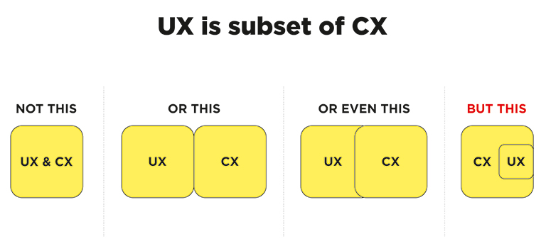
User experience (UX) is the wholesome experience a visitor has on a website or in a mobile app. It is a complete compilation of various small interactions knitted together, producing positive or negative feelings about the website and the brand. It’s not just a single design element or layout that defines the experience. The connection that visitors feel and the experience they receive on a website, as a result of the UX design, directly impacts consumer retention, brand identity, and the business as a whole.

A research conducted by Stanford University suggested that over 46 percent of consumers consider website design as an indicator of credibility. The fact is crucial for brands to secure existing users and captivate new consumers.

The following three UX design tips will help you improve your UX Basics, increase conversions and revenue, and will boost your business.

1. Branding must be consistent

There have been ample studies conducted to study the correlation between consistent branding and revenue. These studies suggest that consistent branding can boost revenue by a substantial amount. Moreover, a connected visual identity across all the platforms and devices, including the website, will help in creating a brand that consumers love to engage with. If users enjoy engaging with your brand, they will come back to you, again and again.

This cohesive visual identity(UX Basics) is pretty simple to reproduce. The top website designs use a recognizable color palette, consistent typography, imagery that provides value and information, and ingenious branding on every page of the website. The consistency in branding creates a balanced environment that allows your users to look for, and find, the products or information they seek; that too, without diverting their attention or confusing them. Users are aware of where they are, what to expect, and they can determine what they wish to do.

Amazon is an excellent example of consistent branding and a delightful user experience design. The modern yet simple logo design and an easy-to-use website add to the user-friendliness of the website and its mobile app. Users can quickly search, easily access their profile and cart, and quickly find their way back to the homepage, in case they go too deep into the thousands of pages on the website. 

Read More about tips to boost your brand

This simple, consumer-centric, clean design is branded in its messaging too. Every piece of Amazon’s marketing collateral, from commercials to social media posts to banner ads, speak the same language. 

UX Basics - Amazon - 1
UX Basics - Amazon - 2

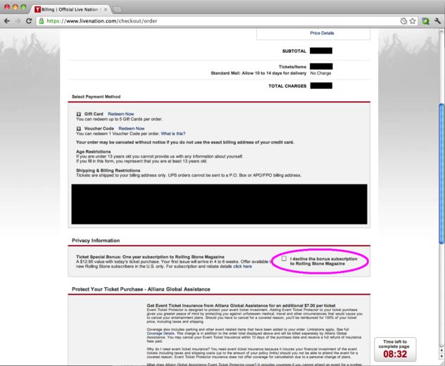
2. Use clear and precise calls to action

If you want something to happen, you need to take action and go for it. It is only one part of the user journey to get them on your website. Many users won’t have a clue of the action you want them to take until you make it crystal clear to them. You should use distinct, clear and precise calls to actions (CTAs) with direct language.

Follow these UX Basics to maximize the UX design and the effectiveness of a CTA button:

  • Use large and fully clickable buttons. Don’t just depend on the text within the button
  • Write clear, easy to understand copy. It can be witty and playful at times, but most importantly, users should immediately understand the action. 
  • Include a verb or an urgent adjective. 
  • Keep the whole CTA short and sweet.
  • The font itself should be readable and large.
  • Avoid playing with any trendy, swirling fonts. Stick to straightforward sans-serif typography.
  • Ensure the call to action stands out. Stick to your color palette and use a hue or unique shape so that the action stands out.
  • Include small complementary design elements, such as an arrow or a shopping cart if it is in line with.
  • Utilize white space to allow the messages to breathe.

Read More about designing your CTA Buttons

3. Be user-centric, not designers-centric

Remember that the consumers will be using your website and not the designers. Therefore, before adding any features or implementing any changes, designers should first walk through what that means for the user experience and customer journey.

After you conduct consumer research, you and your team will better understand the features. You can segregate the features into two categories. The ones that are most important for users and the ones that are less important. no matter how aesthetically appealing they may be.

Finally, once you design any UX design improvement, take the time to A/B test it. A/B testing of the new feature will ensure that it is functional and leads to better conversions. Studies show that most companies discover the best conversion rate optimization through A/B testing as opposed to total implementation.

Ultimately, investing in user experience design will provide a strong return on investment down the road. Want to increase the user experience of your website? Need help to improve conversion rate and revenue? Talk to our design experts.

Categories
Mobile Apps Technology

Top 5 Reasons Why Users Uninstall Mobile Apps

The number of mobile apps available for users today is staggering. Daily use, shopping, health monitoring, entertainment, sports, lifestyle, gaming, and whatnot? There’s an app out there for every possible thing that you can think of. The competition between similar mobile apps is cut-throat. Day-by-day it is becoming difficult for businesses to survive and ensure that the users not only use their app but at least not uninstall it. So what is that makes users uninstall any mobile app?

In this article we explore the top five reasons why users stop using a particular app and uninstall it:

1. They No Longer Use The App

This one is pretty straightforward. Once users build the impression that the mobile app is of no use, they will surely uninstall it. Not that they find a better replacement, but the simple fact that they don’t need it any longer. This indicates that your user engagement and retention efforts are not adequate. If your DAU (Daily Active Users) to MAU (Monthly Active Users) ratio is declining, it means that the frequency at which the daily active users are returning is very less. These are early signs of a possible increase in app uninstalls.

TIP: Track retention rate metrics and user engagement to make adjustments to the re-engagement campaigns, such as push notifications and in-app messaging. But don’t overdo push notifications as it could adversely affect the mobile app’s popularity and success.

2. The Mobile App Isn’t Helpful and Easy To Use

People install an app to find solutions to their problems and get what they need in the fastest way possible. If it takes too much time to get what they want, they are unlikely to return to your mobile apps and will look for a better and faster option. Mostly, this happens because developers spend a lot of time thinking ‘what the users want in an app?’, rather than thinking upon ‘how the users want to use the app?’. 

TIP: Spend time thinking about how do users want to search for products or solutions in your app. What is the level of urgency? Do they want to buy the product right away, or wish to save it for the future. Run usability tests to understand user behavior. Conduct a question and answer session with test users to understand their purpose and goals. These insights, in combination with the data collected from analytic tools, will guide you in developing an easy to use and helpful app.

3. Too Many Ads and Push Notifications

A vast majority of the apps available come with a free version. People expect the apps to be free and resist paying the price to download them unless it’s really essential. The primary method of earning revenue for a free app is through advertisements. People have come to terms with the truth that there will be ads popping up while using the free version of the app. However, they have become much more sensitive towards the ads. This sensitivity is a result of invasive and aggressive advertising tactics.

Similarly, too many push notifications also annoy users. Forget about using your app regularly, they start disliking you as a brand; so much that they eventually decide to get rid of your app. Nobody likes constant nagging. 

TIP: For ads, consider how they will interrupt the user experience and work around it. Track conversion rates and reactions triggered by advertisements and push notifications. Also, use platforms that allow intent-based segmentation. With a better understanding of user intent, you can effectively show relevant ads without spamming them.

As far as the push notifications are concerned, it is best to use common sense and to know how often you must communicate with your customers. The frequency of sending push notifications varies; it largely depends on the type of campaigns you run and the products or services you offer.

4. Bad User Experience in Mobile Apps

It’s not just a visually pleasing design that keeps users hooked on to an app. Creating a good user experience is equally important. If the app is not designed keeping users in mind, it baffles the user. They find it hard to navigate within the app, struggle to find what they need. Sloppy navigation, lack of search functionality, poor use of icons, illegibility of typography, unresponsive gestures, etc. are all ingredients of poor user experience.

TIP: Always keep the users in mind before starting to develop the app. The app must be intuitive and easy to navigate within. At no point in time, the user must get stuck in the whole buying (or conversion) process. Your users must be able to reach their destination with minimum clicks. It’s pivotal to provide a search option in the app. The search should be intuitive and must be leading users by using a predictive keyword algorithm. 

5. Security and Trust issues

The Facebook data scandal was one of the biggest data scandals of recent times. It made people think about how various apps store their personal information and how vulnerable they are. They have begun to believe that their data can easily get into the wrong hands at some point in time. If they don’t trust your app, they will uninstall it.

TIP: Ask and store only the required information. Be transparent with users and explain exactly why you want this information, where will you save it, and how will you use it. Your users must feel safe using your app. They should be assured that they can trust you with their credit card number and other vital, personal information.

Read more about Mobile Apps security here

The customer is the king. It’s a fierce battle out there in the world of mobile apps, and you need to ace your game to stay in the game. Keeping users engaged, respecting sensitivity to advertisements, and performing adequate software testing are some of the ways to avoid app uninstalls. Need to know more? Talk to our experts now!

Categories
Brand & Identity Design UX Web Design

Designing a Healthcare App? Here’s What You Need To Know

3G, 4G, 5G, unlimited access to the internet and a smartphone in every pocket. The world has undoubtedly come a long way on the path of technological advancements over the past two decades. With so many connected devices, no wonder mobile health has started to gain popularity. The most significant transformation in medicine since the early ages is happening right now and UX is at the forefront. The healthcare-tech sector is among the fastest-growing in the world today. 

According to a study conducted by the European Hospital and Healthcare Federation, the average number of general hospitals per 100,000 inhabitants, in Europe, was 2.9 in 2014 and the number of patients is increasing day-by-day. Therefore, the need for health apps has snowballed. 

Today, for the first time, patients are active decision-makers, and the healthcare industry needs to understand that patients are their partners. Creating a delightful user experience is essential for the success of health apps and the health industry as a whole.

Key UX Elements to Consider While Designing Healthcare Apps

1. Changes in Healthcare Accessibility

Times have changed. The Healthcare sector doesn’t operate the same way it uses to a few decades ago. It’s no longer a 9 to 6 affair, with emergencies being attended to as and when they occurred. It’s round the clock these days and patients expect full service 24/7. Be it an expecting mother or an ailing older adult, they all need access to health facilities at any given point in time.

2. The Emotional Quotient

In no other industry, businesses have to deal with such a broad spectrum of emotions. Sorrow, pain, anxiety, depression, joy, panic in cases of emergency, and what not? The interaction of patients with an automated mobile app can sometimes lack the emotional factor. Therefore, designers need to take the utmost care of factoring this element while designing the UX of the app. Although they are interacting with the app, it’s as good as the interaction between a patient and a doctor.

3. Patient Interaction Through Multiple Channels

Before the dawn of digital transformation, patient interaction limited to medical facilities or pharmacies. Fast forward to today, and the healthcare industry has to deal with various channels now, including traditional and mobile platforms. Moreover, today, our health-related decisions are influenced by social media too. UX designers need to address differences in trust levels among various channels. When in doubt, patients are more likely to trust the members of their close social circles rather than cold-hearted professionals. Social media also plays a significant role in the creation of support structures between patients. The user experience at these different levels is also essential to consider. 

Best practices to Improve Healthcare App UX

1. Understand The Users And Their Needs

From the outset of the project, developers and designers must be aware of the perception, needs and pain areas of users. A thorough understanding of the market is the base for developing a successful health app. Set focus on which type of app you plan to build?

For example – General health and fitness apps, chronic care management, medication management apps, professional medical applications, etc. The functionality and features of the app will depend on the type of app and its audience.

The involvement of practicing clinicians specialized in the area of your app is pivotal. With their insights and your research, you can zero down the fundamental problems that the app will address. Additional features that are not really necessary can be parked to be developed at a later stage. Understanding the existing user behavior and their needs are the key to a successful health app.

2. Make The Healthcare App Look Attractive

The styling themes and patterns that use to work a few years ago may not be best suited for today. Give due diligence to user psychology, current design trends, and your target audience. Studies have revealed that most of the health apps lack styling and visual appeal, which is the primary cause of users not using the app regularly after installation. Apps with clear and appealing data visualization have more chances to elevate user experience and retain users.

The layout of the app pages should be appealing and easy to use so that the users stick with your app. Give special consideration to the color schemes that you choose. Soothing colors are best suited for health apps. Navigation must be easy, the alignment and spacing should be appropriate, and most importantly, the headings must be clearly visible. A significant chunk of your target audience will be older adults. They need larger text and more prominent icons. Moreover, there will be users with specific health conditions, like epilepsy, diabetes, mental disorders, etc. Hence, the look and feel of the app must be apt for them too.

3. Make It Easy To Access, But Don’t Compromise On Security

A health app needs to be simple, intuitive and easily consumable. The registration or the sign-in process must be smooth and must not be time-consuming. The sign-in process must ideally be done on a single screen and with only a few clicks. Limit the information required to register (of course you need to capture vital info which is mandatory). The critical element is to offer quick access in the event of an emergency. Quick access to relevant information like doctor’s phone number and details about previous hospitalizations, allergies, etc. is quintessential. The data must be backed up over the cloud, to rescue in case of a lost or stolen phone.

Healthcare apps deal with a lot of personal and critical information about patients. These details must be strictly secured under personal data protection laws. Observe all laws and regulations that govern the personal data privacy when you set out to design the app.

4. Strike A Balance Between Functionality and Usability

There are two main participants of a health app – patients and health professionals. You need to understand that the app will either be professional-centric or patient-centric. If you go professional-centric, functionality will be the key. If you go patient-centric, usability will be the key. Which way you want to sit depends on the core objective of your app. But, you still need to strike a balance between the two. 

More on Usability Mistakes That Can be Avoided

Don’t lose sight of the main objective of the app and don’t try to fill the app with the maximum number of features. The app should be informative, but not overloaded with details. An app that deals with patient data, medication prescriptions and/or doctor appointments should have the proper messaging matrix providing different types of notifications and calendar integrations. Educational apps should contain different types of content, such as text, images, and video.

5. Test Your App Through The Life-cycle

Quality assurance and testing are a must. Field-test your app before the release. Proper testing, including testing the prototypes among the target audience ensures the readiness of the app. ideally, the UX design of the app must be regularly tested at the end of each iteration. Support your app continually and provide app users with undisrupted service. 

Are you looking to develop a health app? Do you wish to discuss the UX designing elements in-depth? Talk to our design experts now!

Categories
Brand & Identity Design UX Web Design

CX vs UX: What’s the Difference?

CX vs UX: User experience or UX is a well-known term. Designers, even non-designers, are well versed with the meaning of UX. But, have you heard of the term CX? It’s not as commonly used as its counterpart – UX, but is soon growing in popularity. CX or customer experience is often mistaken to be the same as UX. However, the truth of the matter is that both these terms are fundamentally different and need to be treated as two separate entities. 

It all starts with how we address and define our clientele. Our users are our customers and vice versa. That’s where we start believing that user experience is similar to customer experience. So let’s clear this confusion once and for all. Let’s understand CX vs UX.

User Experience

The concept of user experience is specifically connected to your product; be it the app, software, or website. The experience of users while interacting with that product is user experience.

The design, interface, usability, navigation, visual hierarchy, information architecture, etc. are all contributors to the user experience. It can either be positive or negative for the product’s users. 

Similarly, UX design is the process of designing products that are intuitive, easy, enjoyable to use, and solve problems. The aim is to develop something that solves user problems in the simplest and most user-friendly manner possible. Success rate, error rate, task time, click to completion and abandonment rate are some of the metrics used to measure UX.

Read about UX trends of 2019

Customer Experience

Customer experience, on the other hand, is a much broader concept. It encompasses all the interactions a user has with your brand and not just your product or service. CX interactions occur across multiple touchpoints, like your advertising, marketing materials, social media channels, pricing, sales process, customer service, and your actual product. 

Customer experience is concerned with customers’ perceptions of the organization and its services as a whole, not just the usability and functionality of its products. Overall satisfaction, Net Promoter Score (NPS) and loyalty are some of the metrics that define CX.

CX vs UX

CX vs UX: The above image clearly explains that UX is a subset of CX. User experience is the experience your customers have with your product, whereas customer experience is the experience those users have with your brand as a whole.

Importance of UX and CX

Both UX and CX are equally important in today’s world. Overall customer satisfaction is no longer dependent only on the quality of the product or service; it goes far beyond that. The experience and process of buying must be a satisfying one. Not just that, even the after-sales service and support plays a crucial role in setting the brand image.

Studies reveal that more than one-third of consumers walk away from a brand they love after one bad experience, and more than half of the consumers do the same after two bad experiences. Consumers are willing to pay more for a better experience, and this fact needs to get its due importance.

The good UX design is important because users will decide within just a few seconds whether your app, software or website is worth their time or not. On the other hand, good CX is important because it goes beyond the usability and functionality of your product, and serves as a key differentiator in a competitive market. 

Both CX and UX are independent, and therefore there can be scenarios where either one of them is good. For example – Good UX and bad CX, or, bad UX and good CX. Let’s understand this with two scenarios:

1. Good UX and bad CX

Tom wants to buy a music system. He goes onto an e-commerce portal. The online store has a fantastic UI and UX. The search engine is accurate and helps Tom to reach to his desired models within no time. He compares a few models and selects the best-suited one for him. The checkout process is also seamless. Within a few clicks, Tom selected a payment method and made the payment. Great!! His new music system is on its way.

But, when he received the package, he was unpleasantly surprised. The packaging was awful, and he received the wrong product. The model which he selected and the one that was delivered were completely different. He rang the customer support and was pushed from pillar to post before he could reach the correct department. The team was not able to track his order and told him that he would receive a call back within 12 hours. No phone call for two days. He got a call on the third day and was advised to send back the music system at his own expense, then only the replacement could be initiated. The entire process took three weeks.

Tom’s experience after placing his order was nothing short of disastrous. He poured out his grievances on the company’s social media handles, product page, and many other places. No matter how good the UX was, he has no reason to remember it now.

2. Bad UX and good CX

Now let’s see the flipside. Haunted by his previous experience, Tom decided to try some other e-stores to buy a professional camera. He browses a new portal that has a poor UX. The search engine wasn’t accurate; there was no option to compare products, and lacked details on the product pages. It took him a lot of time to buy the product, but he did it finally.

However, history repeats itself, and Tom again gets the wrong product. He called customer support and was delighted with their response. The team apologized for his inconvenience and quickly arranged a pickup of the product. In the meantime, they initiated the replacement process. Within two days, Tom received the camera that he ordered. Moreover, the company gave him a 30 percent discount voucher to make him feel valued. John is unlikely to remember the lacking user experience and is highly unlikely to leave negative feedback in the comments section of the site.

UX is one of the strongest influences on the whole CX, but both CX and UX play a crucial role in the ultimate success of a business. Lacking in any of the two areas can lead to a bad overall impression of the brand. Therefore, companies must optimize both of them to stay ahead in this competitive market. Have more questions? Talk to our experts.

Categories
Brand & Identity Design Technology UX Web Design

Investigating Various Types of Dark UX Patterns

There are two aspects to designing a website – a company’s marketing objective and users’ needs. One of the most challenging decisions a designer has to make is to strike a balance between the two. Boosting a company’s reach and profits is a common reason why brands use Dark UX Patterns.

What is Dark UX?

Dark UX Patterns are interfaces designed carefully to deliberately mislead users to choose a path they didn’t want to take. They are purposely designed to reach a company’s objectives without taking care of ethics and users’ needs. Dark UX came to light in 2010 after the boom of eCommerce industries on the web. To generate more sales, hit target numbers and get more subscriptions, etc., designers and business associates started creating misleading user interfaces to manipulate users.

Good user experience design is all about offering seamless and enjoyable interactions to users. User’s best interest should be of utmost priority, and there is no place for a deceptive or sneaky user experience design. 

Here are some of the most commonly used Dark UX patterns that designers should not be ideally designing, and of which the users must be careful.

Get in-depth information about innovation in UX patterns here

Bait and Switch

Bait and switch is a sales (especially retail) tactic, which is no short than a blatant fraud. Baiting and switching usually consist of offering customers an enticing item at an attractive, affordable price. This lures users to perceive it as a good deal (that’s part one of the trick – the bait), but later turning the offer into a less desirable deal (that’s the second part of the trick – the switch). Although the deal is not as appealing as it was previously, the users are likely to take it to minimize their perceived loss.

Bait and Switch - Dark UX

Confirmshaming

Confirmshaming is the act of creating a feeling of guilt and regret, forcing the users into doing something, which they may not like to do in the first place. The option to decline is written in such a way as to shame the user into an agreement. The most common use is to get a user to sign up for a mailing list. It is also often found in exit-intent modals and other popups. Confirmshaming has made its way into retail, shaming users who don’t want to be bothered with a pop-up by assuming they’d rather pay full. Take a look at the following example:

Confirmshaming - Dark UX

Friend Spam

A lot of mobile apps seek various permissions when installed. One of the most commonly asked permission is to get access to your contacts on the pretext that they will use it for a desirable outcome (like finding friends to join you). However, in reality, it spams all your contacts in a message that claims to be from you.

Friend Spam - Dark UX

Disguised Ads

As the name suggests, this pattern is adopted so that ads are disguised on the page, as if they were a part of the regular content or navigation. Considering the ads as regular content, users click them more often. Companies often run advertisements that look like a download button, tricking users into clicking on the ads rather than getting what they want.

Disguised Ads - Dark UX

Trick Questions

It’s a common situation in case of pop-ups with a confirmation. You read, and you don’t know whether to press OK or CANCEL. You respond to a question, which, when glanced upon quickly appears to ask one thing, but if read carefully, ask another matter entirely. They are cheap tricks that take advantage of the fact that people browse through web and app pages, instead of reading the content carefully. Users want to complete their tasks as quickly as possible, and that’s where they fall to these tricky questions.

Trick Questions - Dark UX

Hidden Costs

You get to the last step of the checkout process, only to discover some unexpected charges have appeared, e.g. delivery charges, tax, etc. That’s not a new situation. A lot of E-retailers are trying to be transparent about it. However, you can still site examples of E-retailers, now and then, who use it to boost their profits. The designers should stay away from such practices. We checked out GoDaddy, a leading domain and web service provider, and found out an example of hidden costs.

Hidden Costs - Dark UX

Forced Continuity

Read the small print; many free trials end with continuing charges. When your free trial with a service comes to an end, your credit card silently starts getting charged without any warning. You are then not given an easy way to cancel the automatic renewal. To avoid this dark pattern, don’t provide payment for anything that’s free.

Forced Continuity - Dark UX

Misdirection 

Misdirection occurs when the user’s attention is guided to a specific place. This is done so that they won’t notice something else that is happening. This dark pattern design forces you to focus on one thing just to distract you from another. Your reflex actions could send you far, far away from what you had in mind. So, take a good look and read the message before you click

Misdirection - Dark UX

Roach Motel

This type of dark pattern is pretty standard and reasonably relatable by all. The design makes it very easy for the user to get into a specific situation but then makes it hard for them to get out of. Once you have signed up, you are suddenly not given an easy way to cancel the automatic renewal, unsubscribe or opt-out of a service.

Roach Motel - Dark UX

You may be interested in a few golden rules for UX designs

The designers’ community must take the same guard altogether and should advocate honest designs. There shouldn’t be any frauds, misleading communication or any form of trickery. Want to hear more about Dark UX patterns? Have a quick chat with our designers.

Categories
Brand & Identity Design Web Design

Golden Rules for Designing Charts and Infographics

One of the most effective ways of communicating information in a clear, precise and straightforward manner is through charts and infographics. Charts can help viewers understand complex data. They can help reveal patterns, describe relationships within datasets and provide context. However, the effectiveness of these charts and infographics surface only when they are done right. This article will cover some golden rules for designing charts that communicate effectively.

1. Select The Best-suited Chart Type

Majority of people choose the type of chart based on how easy it is to create the said chart. However, it’s certainly not the best approach towards designing charts. Conventional tools, like Excel, give you easy access to the most basic charts types, like the pie chart, the bar chart, and the line chart. You can even design advanced charts like bubble clouds, treemaps, icon charts, pyramids, timelines, etc. using the chart generator tools available on the internet.

The important point is to consider the factors which help you in deciding which type of chart will best convey the information you want to. There are two essential questions to ask – what kind of data you have? And what do you want to say about your data? For example – Bar charts are best suited for showing comparisons of data broken into discrete categories; line charts, on the other hand, are better suited to track changes over time with continuous data.

2. Highlight The Most Important Details while designing charts

Each chart should be created with a specific goal in mind. It should have a clear focus and must support the argument that you are making. The visual focus of the chart should directly reinforce that goal. Most of the visual elements on the page should be pushing towards making that conclusion. 

Read Here About Designing Marketing Collaterals

Big bright bars and bold titles should be used to create a clear visual focus. Visual characteristics like color, size, or weight help in drawing attention to some details and suppressing others. Use bright, contrasting colors for the most important elements and use soft, muted colors to push less critical elements into the background. This technique works best if you don’t have too many colors in your graphic. Too many bright, saturated colors will compete with each other for user attention and will leave viewers confused.

3. Avoid Unnecessary Complexity

A minimal design is key for designing charts and infographics. The structural elements of your graphs should be as minimal as possible. A minimal design accentuates the effectiveness of your graphs and conveys the message most directly. Remove unnecessary chart elements like outlines, gridlines, backgrounds, and focus on the data. 

The essential elements like axes and tick marks must be clear, but unnoticeable. Give axes and tick marks a maximum line width of one and styles them in black or grey. Eliminate borders and background colors. Space out gridlines as much as possible and style them in light grey.

4. Propose Comparison In Your Chart Design

There’s a very thin line between minimal design and an over-simplified design. While you should simplify the structural chart elements, you don’t want to oversimplify your data. Charts and infographics that compare multiple data series can be much more persuasive than oversimplified charts or isolated numbers.

Allowing readers to make their own visual comparisons can add to the user experience. The typical approach to creating comparisons is to include multiple datasets in a single chart. Apply the same visual treatment to each chart and use the same axes and scaling. Line up and arrange charts in a meaningful order, so they’re easy to compare. Make each chart small, simple, and understandable at a glance.

5. Frame A Narrative Around Each Chart

The numbers and the data are the most important elements of any chart; however, that doesn’t strike out the importance of words in a chart. Words, in the form of titles, captions, and annotations, can be used to frame a narrative around each chart. These basic chart elements allow you to tell your story to the users, that’s in your data.

The simple way of using words in a chart title is to state the variables visualized in the chart. Like “Volume of liquids”. But that’s a missed opportunity. Chart titles should be striking; the ones which give out an interesting piece of information. Like“Population of India has doubled in the last 40 years”, if that’s the point we were trying to make. The title should say something meaningful about the chart. Use titles to convey the conclusions that you want your reader to take away from the graph. 

6. Show Right Amount of Data

An essential part of a proper chart design is choosing the right amount of data to display. You need to find that balance between complexity and clarity to create a chart that’s both clear and compelling. Ideally, in an infographic, you want to find the lowest common denominator. The smallest amount of data which can prove the point you’re trying to make. That said, there are factors like the audience, your message, and the data itself, which needs to be considered here. Audiences can be different, their intake of information and processing of information can be different. Some people will expect more context, more detail, and more data to take your word as a fact. Other audiences will be more concerned about the time it takes to read your graph, and will want to see lesser data, presented as simple as it can be. 

You will need the help of a personal graphics designer. Read more about how to get a dedicated graphics designer

Charts, when done right, are the perfect combination of visuals and information. Designers should leverage more on charts to create engaging content and draw user attention, which is crucial to convey the intended message. These golden rules will help you in designing the most compelling charts. If you have any questions, you can speak to our design experts.

Categories
Design Mobile Apps Technology UX

Designing Food Delivery Apps

It’s a hustling and bustling world we are living in, and in this fast-paced world, we need a fast solution from everything. So, that’s how food delivery apps came into existence. We all love delicious, lip-smacking food! Don’t we? Moreover, what can be a better combination than food with the ease of getting it whenever we want? The popularity of food delivery apps is increasing every day with more and more countries embracing the culture of packed, delivered food at their doorsteps. Be it a lazy Sunday afternoon or a last-minute house party, these food delivery apps are a savior. If you’re looking to invest your time and money in app development, this is the best segment to get in. On the other hand, if you’re a restaurant owner looking to expand your business, go for the app. Food delivery apps are the next big thing in the world of mobile apps.

The app store is full of food delivery apps; be it third-party apps or franchise-specific apps. Therefore, it needs some effort to distinguish your app from others, given they all fulfill the same purpose. In this article, we discuss how you can distinguish your food app by following some good UX design practices.

Importance Of UI/UX Design For A Food Delivery App

Food is a satisfying feeling, and so should be the process of ordering it. The experience of ordering food should be something fun, exciting, and not to forget – easy. For this, you need to design a good UX for your app. And why do we need a good UX design for food delivery apps? Let’s find out.

To Entice The Users

A great user experience design attracts the users and makes them stick with the app. Undoubtedly, the users continue using only those apps which are more comfortable for them to use and through which they can make the most. That’s why a good UX design is vital to attract more users.

To Create A Lasting Impression

Thanks to the unlimited internet, users are randomly downloading apps and checking them out. The app store is full of these apps, and the users are spoiled with choices. To make a good impression on these users and make them stick to your app, the importance of a good UX design goes a long way. These users are hard to please, so if you want them to keep using your app, you need to ace your UX game.

To Get Loyal, Repeat Customers

Giving users a great experience is the best way to ensure their loyalty. They have no reason to bounce off to a new app if they already love your app. 

Numerous factors contribute to the creation of a great food app design. Here are some important factors for designing an app that you need to consider to create a lovable food delivery app.

1. Focus On A Minimalistic Design

Design is the best way to capture the users’ attention as it’s the first thing we notice when we open an app. The visual elements like the fonts, icons, transition effects etc.all contribute to the UX of an app.

It is highly advisable to go with a minimalist approach for designing a food app. The UI must be as basic as it can be, and use clear lines with a generous amount of negative space. Minimalist design has a decluttered look to it, that decreases the cognitive load. It allows users to easily find the thing they are searching for. The minimalist app design makes the process of browsing and ordering food straightforward.

2. Color Theory Of Making People Hungry

Believe it or not, colors play a huge psychological role in the food selection and ordering process. So what color you use for your app design food becomes critical. The colors to be used on the food delivery app interface needs to excite the appetite of the user rather than suppress it.

Read more about color theories here

Use colors that make us think of food. Imagine red, or green, or yellow, these colors are closely associated with food because most food that we see, are of such colors. Consider some popular food apps, you will see that they make use of colors red and green very subtly. This way the app subtly excites our hunger while we are on the app, browsing for what to order.

3. Ease Of Movement – From Login To Payment

The ease of movement is another crucial factor to consider when you are designing the UX for your food app. Right from the moment a user logs in, places an order, and makes a payment, everything should be done seamlessly, without any glitches. Any hitches will only make the ordering process more complicated and annoying, meaning the users are going to leave your app and probably going to use another app to get their food.

As part of improving the user experience, some features are absolutely necessary and are real must-haves in a food delivery app.

Simple Onboarding Process

The signup and login process is the very first point where you can lose users, without actually getting them on-board. You need to keep the onboarding process as simple as possible, with minimum steps. The user should be able to create a profile and add the payment information as smoothly as possible. Remember that the key to success for a food delivery app is quick and easy ordering. People don’t want to follow a tiresome process to order their food.

Read more about app navigation practices here

Location Tracking

No! They don’t want to keep calling the restaurant or the customer care team to know the location of their food. Neither do they want to be bombarded with restaurants so far away from them that it’s senseless to order from them. They want to see restaurants that are near to them and must be able to track the precise location and status of their orders. Thus, location tracking is a UX necessity for your food delivery app design.

Easy Search And Find

They are hungry, and that’s why they are on your app. Hungry people are already short on patience, and a tedious search option will only make the matter worse. No one likes to go through endless searching and finding. Therefore, the apps with a better search and find functions are better than the ones where I had to go through a hundred filters. 

  • Use the location tracking to locate and present the nearest food joints first.
  • Use the rating system, show the restaurants with higher rating first.
  • Have easy access list, like cuisines, and make it easy for the user to find the desirable food.
  • Add a deep filtering system. Allergies, lactose intolerance makes it hard for people to order food online, and they need to know if the place they are ordering from caters to their special dietary needs.

Delivery Timing And Cost

Displaying accurate delivery timing and cost should be a top priority. Delayed delivery is one of the biggest reasons for people disliking a particular app. It reduces their trust in the app and gives them reasons to try out other apps. So make sure to display the precise delivery time at all times. Displaying the correct delivery time may not necessarily assure on-time delivery at all times, but surely reduces users’ anxiety as they can see the exact status.

Even the cost should be clearly displayed at all time. All items must be accompanied by its price (inclusive of all taxes and delivery charges). Hidden taxes and charges would only make the customer mistrust your app. The overall cart at the end of the order must also include the total cost, including the delivery charges if applicable, so that the users and check, be assured about the total order cost, and then only make the payment.

Convenient, Multiple Payment Options

In today’s world,  people have a lot of options to make payments. They can make payments using various e-wallets, credit or debit cards, net banking, payment apps, or by the good-old method of cash on delivery. As a food ordering app, you must give them every possible option of payment. This will ensure that they make payment using the method they want, rather than the method you want them to pay from.

Ease and utility are the key factors when it comes to food delivery apps today, and the UX of the app is what creates ease and increases utility. Giving more importance to the UX design is crucial for your food delivery app development. Talk to our design champs for more info.

Categories
Apple Blog Technology

iPhone 11 Ready To Release: What’s New?

Apple’s new iPhone series is here. Apple unveiled three new iPhones – the iPhone 11, iPhone 11 Pro and the iPhone 11 Pro Max – at a special event at the Steve Jobs Theatre at Apple Park in Cupertino, California earlier this week. The iPhone 11 is this year’s budget iPhone and the apparent successor to the iPhone XR. It isn’t going to be radically different than the iPhone X and iPhone XS, but there are still noticeable changes to set it apart from last year’s models.

Design

From the front, the iPhone 11 looks similar to the iPhone XR, with the thickness of the bezels too remaining roughly the same. However, it is at the back that Apple has included some new design features. The back panel now has a dual rear camera setup inside a square bump on the back. Apple has upgraded the quality of glass used on both the front and the back, which it claims is the toughest on any smartphone.

Battery

On the iPhone 11, Apple has promised even better battery life thanks to the slightly larger 3,110mAh battery. According to the company, it can offer an additional one hour of battery life when compared to the iPhone XR. It also provides reverse wireless charging and 15W fast-charging support, though the fast-charger is still not offered out of the box.

Camera

The most significant, noticeable difference is the square camera patch on the back of the two Pro models. The iPhone 11 features a primary 12-megapixel sensor and another 12-megapixel ultra-wide unit. Apple has added new features such as Portrait mode for animals, an ultra-wide mode, and a brand new night mode. You can also shoot video using the ultra-wide sensor at 4K 60fps. The new iPhone gets a 12-megapixel front camera compared to the 7-megapixel unit on the iPhone XR.

And while we’re excited to see what that new lens is capable of, the patch design has polarized Apple fans — at least in renders and mock-ups of the device. Apple could pull off a more refined look than the giant square we’ve seen from case makers and conceptual artists, but the effect will overall be much more noticeable than triple-lens cameras we’ve seen from other smartphone makers.

You may be interested in the iPhone 10’s specs to compare with the latest version. Read Here

Colors

Apple usually plays it safe when it comes to iPhone colors and finishes on its high-end models, saving the fun hues for lower-priced phones. The color options available for the iPhone 11 are Purple and Green, with the older ones Yellow, White, Black, and Red still around. 

Hardware

With the iPhone 11, Apple has upgraded the internals to make the affordable iPhone more powerful than ever. It gets a new A13 Bionic chipset, which is claimed by Apple to be the fastest CPU on a smartphone. The chipset is reportedly paired with 4GB RAM.

A Tougher iPhone

Apple boasts that this year’s phones are the toughest yet. Much of the advertising revolves around their resistance to falls and liquid immersion. The iPhone 11 has a dust- and water-resistance rating of IP68. That’s the highest rating commonly given to consumer products and an upgrade from the IP67 bestowed upon the iPhone XR.

The firm describes the 11 as “splash, water and dust-resistant”. It is said to be it was “tested under controlled laboratory conditions with a rating of IP68 under IEC standard 60529 (maximum depth of 2m up to 30 minutes)”. It’s also reportedly protected against accidental spills from coffee and other common liquids.

The release date is set for September 10, with pre-orders going live from Friday, September 13. It goes on sale on September 20. The new iPhone 11 has storage options starting at 64GB, going up to 128 GB. The Pro and Pro Max come in three storage sizes. The small 64GB option is joined by the default-best-for-most-people 256GB, and the power-user-maxed-out 512GB. There’s no 128GB size this year, for the Pro and Pro max models. With no expandable storage on offer, some might moan that there’s no 1TB option, as there is with the Note 10 and Note 10 Plus.

With the new iPhone 11 series, comes new challenges and opportunities for app designers and developers. How can you provide a better user experience to your users who will be using these new models? What are the tricks and tips? Speak to our design experts for more details.

Categories
Brand & Identity Design Mobile Apps Technology UX

Differentiating Between Wireframes, Mockups, And Prototypes

If you have ever worked with a developer, you would have heard the above-mentioned statements, or something similar to it. I have seen people scratching their heads and looking puzzled encountering these typically used project status terms, while an app is under development. A lot of engineers, marketers, and even senior managers use different design deliverables synonymously, as they don’t know when to use ‘wireframes’ or when to go with ‘prototype’? They assume that a wireframe, prototype, and mockup are exactly the same thing. It’s no more than a greyish, boxy sketch representative of an ingenious idea, which is definitely not the case.

“The wireframe is ready.”

“We are working on the mockup.”

All the design deliverables are different from each other as they are used to communicate different functions and aspects of the design. They do represent the final product, but the depictions are different.

Process of designing an app

Below-mentioned is a typical development journey. It is essential to follow these steps each time you create a new product.

Sketches > Wireframes > Mockups > Prototype

Start with a simple sketch on a blank piece of paper. Then, make a wireframe that organizes the content and features of your app. For mockup, add colors, icons, pictures, and logos to your wireframes. Add interactive elements into the mockups to inject life in it and come up with the prototype.

1. Sketch

It’s basically just a raw freehand drawing on a piece of paper, that gives you a low-fidelity representation of your app. It is the fastest way to represent your idea and getting ready for brainstorming. Believe me, even a simple sketch can describe your idea better than words. Go freestyle – work on different ideas, change details, visualize what you have on your mind; it’s all up to your imagination. This step is essential for getting to the wireframe stage. The best way to go about it is on a pen and paper.

2. Wireframes

A wireframe is equivalent to the skeleton or simple structure of your website/app. It should clearly show the main group of contents and the placement/structure of the information. It describes the functionality of a product, as in, what will happen when you click a certain button? The decisions on what and where on the website or app (in terms of content/features) are usually made during this stage. Remember, This step does not cover the product’s design.

Wireframes are not just meaningless sets of grey boxes, though they may look exactly like that. They are literally the backbone of your design. It’s a fact that you don’t need to deep dive into too many details, but you need to create a solid representation of the final design that won’t miss out any important piece of it. With a wireframe, you’re designing a roadmap for the whole project and all the stakeholders — developers, copywriters, project managers, etc. A well-created wireframe communicates the design in an easy, clear way and sets a path for the whole team.

Wireframes are typically used as the documentation of the project. Since they are static and simplistic, you could include short notes to explain the interaction, or maybe even technical documentation.

3. Mockup

A mockup is a middle to high fidelity, static, design representation. Very often a mockup is a visual design draft or even the actual visual design. It’s a good practice to never start development before mockups are completed. Add colors, fonts, dummy text, images, logos and anything else that will shape your wireframe. Your result is a static map of the app.

A well-crafted mockup helps you to finalize the product’s color schemes, visual style, typography, etc. A mockup is a playground where you can play with various visual aspects to see what looks best.

Mockups are particularly useful if you want to get early buy-in from stakeholders. Due to their visual nature, mockups don’t have the resistance of the low fidelity deliverables and can be created much quicker than prototypes. They are a good feedback-gatherer which smoothens the development journey.

4. Prototype

A prototype, often confused with a wireframe, is a middle to high fidelity representation of the final product, which simulates user interface interaction. It’s like a mockup enriched with UX pieces, interactions, animation and anything else you’d like to experience when clicking buttons. It should allow the user to experience content and interactions with the interface and test the main interactions in a way similar to the final product.

Prototypes are very useful when performing user testing. It allows you to check the usability of the interface before the development begins. This substantially reduces the development costs until the UI is approved. Once the prototype is tested, the team can start coding. The only thing missing in a prototype is functionality. It can give you a feeling of using a real app, but they are only images connected with each other.

You might find this article useful for creating a better UX Design

Why is it important to know the difference between Wireframes, Mockups and Prototypes?

These design deliverables help you define your expectations, save money on developers and describe clearly what you need to get built. You can confidently pitch to investors, first customers, and co-founders using the appropriate design deliverables. Before you choose a means of communication in the design process you need to consider your product and team; think about what works best for all of you. To know more, have a quick chat with our design experts.

Categories
Brand & Identity Design UX Web Design

Best Practices For Designing A Search Box

Site search is one of the most important yet most overlooked functions of a website. Search acts like a convertor between the user and the app or website. It is highly unlikely to predict and offer all the information, that users may look for, on the landing page itself. The user expresses their information need as a query, and the app or website communicates its response as a set of results. Users expect smooth experiences when searching. They are typically judgmental about the quality of a website, primarily based on the effectiveness of its search results. Hence, it’s essential to give thought to some things while designing the UI behind search and results. In this article, we will discuss some of the best practices for designing search, which will not only simplify your UI but will also enhance the user experience.

You may want to explore the roadmap of website design

Designing Search: First of all, let’s understand when do we need a search feature on the website?

The essential determiner is the amount of content on a website. Smaller websites, with a limited amount of content, are better off without the search option. Search becomes increasingly central as websites grow in size and complexity.

E-commerce sites are probably the most common use cases for utilizing search because users are searching for specific products. In large e-commerce websites, search bars move out of the header and take on a central role in the UI. According to research, about a third of total visitors use the site search tool. People who use the search tool are looking for something specific; they know exactly what they’re looking for and are generally more aware as compared to other visitors.

Read more about designing the E-Commerce Product Pages

Few Useful Tips:

1. Show Search Field Notably

The most important rule in designing search box is to make it easily noticeable. If the search is an essential function for your website, it should be displayed prominently. Search can be the fastest route to discovery if users can quickly locate it. Retain an open text-entry search field. Users want a place where they can quickly go to type in their search query.

Search hidden behind an icon has negative consequences. It makes the search feature less noticeable. When used without an open-entry text field, the icon takes up less space. Visually, it’s less prominent and, therefore, less noticeable. Users have to take extra action to access the search box, which creates a negative user experience.

2. Strengthen Your Predictive Text, Autocomplete and Error Correction

How often have you typed a word in the Google search box and got amused by the suggestive results it shows? It’s amusing at times, but there’s a super-strong algorithm behind it, based on the searching patterns of billions of users. Search options need to be intuitive and smart.

Don’t expect your users to know the product names, how to correctly spell everything or anything else for that matter. They might not even know what they are looking for. Your site search function should be intuitive and smart enough to anticipate where the search is headed. It must begin listing suggestions while the shopper is still typing. Artificial intelligence (AI) and onsite search are like perfect partners.

3. Always Pair The Search Box With A Magnifying Glass

Users are accustomed to a few things on the web, and they expect the same everywhere, like icons. There are a few icons that have mostly universal recognition from users. Icons are, by definition, a visual representation of an object, action, or idea. The magnifying-glass icon is one such icon which has a universal meaning attached to it. Users recognize a magnifying-glass icon as meaning ‘search’ even without a text label.

One of the things to remember while designing search magnifying glass is not to make it complicated. The simplest version of the magnifying glass is the most effective one because lesser graphic details speed up recognition.

4. Place The Search Box Where People Expect It

The best place for the search box on a website is a heated topic of discussion, with several theories floating around it. However, many of the popular websites such as YouTube, Amazon, IMDB, BEST BUY, etc. place the search boxes towards the top center or top right of the page. A study conducted by A. Dawn Shaikh and Keisi Lenz found that the most convenient spot for users would be the top right or top left of every page on your site, where users could easily find it using the common F-shaped scanning pattern.

Placing it somewhere unexpected means users need to put in extra effort to find the search box. That’s more like searching for the place to search, which is not the ideal thing you want your users to do. Search boxes at the expected places would reduce the search time as well and will create a positive UX.

5. Tell Users What Can They Search

It is highly recommended to include a sample search query in the input field to suggest to users what queries can be used. As discussed earlier, users are not every time sure of what they are looking for, or what all things they can search using the search box. Providing them suggestions and sample queries will smoothly guide them. If the user can search for multiple criteria, use the input hint to explain that. However, ensure to limit your hint to just a few words, else, you will increase the cognitive load.

Placeholder text gives users clues about what to look for. In some cases, placeholder text may create an accessibility issue. When placeholder text is designed to be lighter in color than regular text, it creates a contrast problem. In addition, placeholder text is not widely supported by assistive technologies, making it more difficult for these users to fill out forms accurately.

A lot of designers don’t spend the required thoughts and time while designing search box. A search box is a useful tool to elevate user experience and increase business. We hope that these tips will come in handy when you design your next website with a search box. In case you wish to discuss in more detail, feel free to talk to our design experts.