NYX Ditech

Categories
Brand & Identity Design UI Design Web Design

5 reasons To Not Use Stock Images On Your Websites

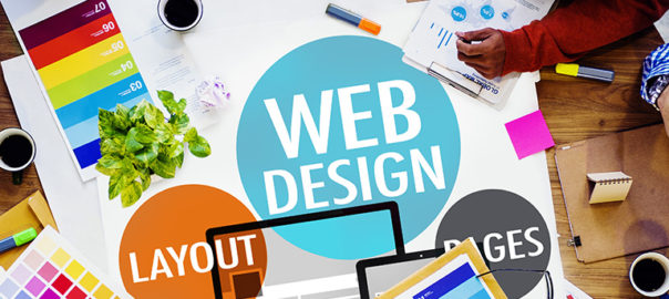
At the time of building a website, it is important to only select components that will positively impact your brand and support the objectives of the website. It especially holds true when it comes to choosing the right images for the website. It is important to understand and acknowledge the worth of custom photography and its positive impact on the brand. Some people might argue that custom photography is very costly as compared to stock images, but in reality, the initial higher cost is totally worth the investment in the long run. Here are some key reasons why custom photography is preferable over using stock images.

1. Clash of visions

No matter how professional the stock photo, it will always reflect someone else’s vision. The interpretation of the idea, concept, and emotion that you wish to convey will always differ from others. A picture is worth a 1000 words, but those words need to be yours. With custom photography, you have control over what thoughts and emotions your website conveys. 

From a marketing perspective,  that provides a great advantage. It is important to connect with prospective buyers on an emotional level. Whether it is a personal purchase decision or one for business, emotions and feelings always have an impact on decisions. Emotions drive people to take decisions, and that’s why you need to convey your emotions and vision through your pictures. If you use stock photos, your vision may be misinterpreted, and you may never strike where you wish to. 

2. It weakens your brand’s authenticity

An authentic brand is one that presents itself with honesty and transparency. When visitors interact with your brand, through your website, they must feel as if they are interacting with a human. Authentic brands are relatable, trustworthy, and thus successful. According to a study, 83 percent of consumers surveyed said that trust drives their loyalty to a brand.

Using stock photography is easy, but putting up actual photos of your business or employees will strengthen your connection with your visitors. Opting for meaningless stock photos showcase a very gloomy and dicy brand image. It runs you into a risk of losing out on customers. Instead of stock images, make choices for your visual content that will cultivate a deeper relationship with your clients and customers. Professional, well-lit photos of your real employees doing their real jobs will carry more value and build more trust than yet another stock photo.

3. Short-term cost vs long-term cost

It’s an obvious fact that hiring a professional photographer will incur larger initial costs than using stock photos. Plus, there are additional expenses involved like hiring professionals, arranging the equipment, or outsourcing the entire project to shoot. But, stock images also come with additional costs other than the licensing fee, which by the way are also very high. 

The recurring loyalty charges can be quite high depending on the quality of the image and how often you want to use it. Additionally, there’s also the time costs – it’s a tiresome job to look through hundreds and thousands of photos to find the “perfect photos” for your website. 

When you use custom photography, you create your personal library of images that you own. These images can be used in the future without any cost being involved. With stock photography, there are often limitations on how you can use the image and for how long.

4. Similar photos can create confusion

Imagine the same lady posing as a customer support executive on hundreds of websites, under the contact us or support section. Even if not on hundreds of websites, there’s always a possibility that your competitor and you like the same stock photo. Or you both choose the same stock art to create your logos. The customers may get confused and that’s not good for your customers. 

The confusion can make people refer to a competitor’s brand to their friends and families. This can blindly divert your business. Losing customers is bad news.  But, it’s especially painful to lose customers to such an easily avoided misstep. That’s not all, what if your competitor does something unethical and his or her reputation takes a hit, your reputation might be impacted as well.

That’s why it’s a good practice to use customized photos for artwork. A unique logo and authentic photos of your products, services, and employees help you stand out from the competition.

5. Copyright issues

We have saved the most dangerous con for the last. Lawsuits are tricky and can get you in some serious trouble. And, they are costly too. So, if your goal is to save money by using stock art, be aware of the possible legal dangers. Stock art can end up costing way more than real images, once you fall into a legal trap.

You can’t trademark most images that include stock art. Attempting to do so could get you in trouble. And, stock art licenses include more potential pitfalls than just trademark issues. You open yourself up to litigation if you violate the specific terms of use for the stock art you purchase. Worse than that, copyright law is no-fault.

Read More About Web Designing With Type On Image

Therefore, instead of stock art, hire a professional photographer to take original pictures for your business. And, hire professional graphic designers to create a logo and visual assets for your brand. If that sounds way too much for you, hire a professional company to do everything for you. Have a word with our experts and learn more.

Categories
Blog Technology Web Design

Benefits of Custom Web Development

Creating a website used to be a big, troublesome task only a decade ago, but now, things have changed; not to mention it has become much easier. With web development platforms such as WordPress, even those who don’t have a single clue about coding can take matters into their own hands and create websites single-handedly. However, there are certain instances when using such a platform just wouldn’t work for custom web development.

At times like these, entrepreneurs need to make a few tough decisions and dive deeper into the entire web development process. One of these tough decisions might be choosing between pre-made templates for websites or opting for custom web development. Both have their pros and cons, and the solution is mainly subjective. However, sometimes you need custom development as the specific benefits it has may prove to be just the thing that will provide you with a competitive edge in the digital world.

Custom web development

Web development is the process of building, creating and maintaining websites. It’s what keeps the site going, i.e. allows it to load correctly on every browser and system. It is also the engine that processes e-commerce transactions, collects leads and downloads digital documents. It’s the engine of your site and it‘s digital presence.

It’s important to know that web development can either break or make your site’s popularity and profitability. It’s not all about the looks of the site, but features, speed, compatibility are crucial factors that will play an important role in your website’s success. This is where trained, professional web developers come into play.

Custom web development enables you to create a unique website and gain that competitive edge over others in your industry. Going with pre-made templates can also do the trick, however, if you are looking for something that will stand out, custom might be the route you should take.

Benefits of custom web development

Visual effectiveness and user experince

Aesthetics play an important role in driving traffic and boosting sales. In custom web development, you have more options to make your website visually effective and appealing to users. This results in higher user engagement and ensures efficient communication with visitors.

Moreover, custom-built websites are user-friendly. The developers anticipate user expectations and tailor the development process accordingly. For a successful online presence, it is important that you develop the website around your business needs and target audience. This is why custom-built websites provide a better and enjoyable user experience.

Serves the long-term purpose 

People in the industry know that custom web platforms yield more ROI when compared to pre-made designs, even though they are more costly. Custom websites are built with the customer, their business objectives and audience in mind. This means that every move the developers make serves your business to increase conversion rates and generating more profit.

Personalization and localization

Nobody likes to interact with robots. Internet users today are far more demanding and want a website to understand their needs and offer them personalized solutions. This makes them feel special, and a personalized experience tends users to stay longer on your website and visit it on a regular basis.

In custom web development you have the advantage to customize the web pages and offer visitors a personalized experience based on his location and demographics. This is why a custom-built are more trusted and live longer as compared to premade templates.

SEO and visibility

One of the most important reasons why digital marketers prefer custom-built websites is that they help the website to achieve better search engine rankings. There is intense competition for visibility, and a fact that is often overlooked is that web development and SEO go hand in hand. Search engines prefer custom-built website because it is personalized and user-friendly. Another important factor for better ranking is mobile-friendliness. In custom web development you have more opportunities to make your website mobile optimized and provide a seamless user experience to visitors on the mobile phone.

Flexibility to make amendments

You know your business will change or grow with time, thus your site also needs to progress with time. When you use a free template, you will bring your website to a standstill. Your features and functionality are limited. However, if you go for custom website development, you get complete flexibility to customize your site as and when you want. You can update your website over time and ensure that your developer will keep it updated with the trends and advancements of the internet. This consistency will enhance your ranking and credibility.

Better performance due to optimization

When you get a standard website from an online site building platform, it usually has a set of features that you cannot get rid of. Unused and superfluous functionality creates an additional load on your website’s performance.

Custom web development solves this problem by giving you exactly what need, nothing less and nothing more. For example, one custom Drupal module can replace a few free ones, because it is created specifically for you. This boosts performance, prevents conflicts, eliminates complexity, and provides for the smooth functioning of the website. We should note that in custom web development there are also more opportunities for its improvement.

Complete support

So you developed a template-based website and the server just crashed or a plugin isn’t working as effectively; what do you do next? With custom web designs, this hassle is completely eliminated. You will have a go-to person, i.e. your developer to reach in case anything goes amiss with the website.

As these reasons make custom web design more reliable and efficient than DIY templates, you should definitely consider hiring a professional team for your business. At NYX Ditech, we are driven to provide our clients with turnkey web design and development solutions. Schedule an appointment with us for a detailed discussion about your website, business, and goals.

Read more about services we offer in Web Development here

Categories
Blog Design Technology UI Design Web Design

Hiring A Web Designer? Look Out For These Essential Skills

Being a Web Designer in today’s world is both fascinating and challenging. The world of web designing is growing every day; there’s plenty of scope for a Web Designer to learn and grow. The learning process should not stop at any point in time, and a Web Designer must pick up new skills while fine-tuning the basic skills. So, what are these essential skills that are required to become a Good Web Designer? Here’s a list of some essential skills that you must consider while hiring a web designer.

Technical Skills

The most important skills to possess are technical skills. Stronger the technical skillset, better the web designing output.

Visual Design Principles

One of the key skills for a web designer, that will help them do well is their visual designing skills. It might seem pretty obvious and straightforward that you need advanced design knowledge to be a successful web designer, but visual design targets digital products, so that’s a tad different. 

Visual design principles determine the look and feel of a website. Setting up visual design principles involves creating mood boards and type hierarchy, by playing around with web fonts and color palettes. Visual design principles have more to do with the kinesthetic elements; that said, it’s very closely linked to user experience.

Color Theory

As a web designer, it’s essential to be familiar with the color wheel. Basic understanding of how complementary, contrasting, and analogous colors work together, is a must. Knowledge of combining primary colors to create new colors will help you create a pleasing, appealing color palette.

One of the most common mistakes committed by web designers is the use of clashing colors. A little bit of visual disparity can lead to an exciting design. Still, conflicting hues can also lead to an ugly and unreadable layout. Everything including text, calls to action, and headers should use colors that go with the overall theme and has a strong sense of legibility. A web designer needs to know when to use lights and darks, how to use contrast and saturation so that they excel in their work.

UX

UX refers to User Experience; it is the experience that a person has when they interact with your website. It is how people feel when they use a website. A web designer must have UX knowledge to approach web design from a user-first perspective. The objective is to design a website that helps users to get what they need.

A lot of factors can be improved – the content, the navigation, the colors, the CTAs, and more. The better the web designer is at UX, the more useful the website gets designed.

UI

Very closely connected to UX is the user interface (UI); it is the series of screens, pages, and visual elements like buttons and icons, that enable a person to interact with a product or service. These elements guide and navigate the user through the design, overcoming any obstructions, offering a smooth experience. UX is more about the broad aspects of how design affects someone, while UI focuses on specificity. UI elements include navigational elements, intuitive interfaces, and calls to action that guide people to do what you want them to do in the shortest amount of time.

Graphic Designing

Website and graphic design are very similar in terms of creativity. Both are artistically crafting visual elements. However, web designing is a medium where ongoing changes and updates are a part of any project. On the other hand, graphic designing is about creating visuals with lastingness. Designing website elements fall under web designing while designing a logo falls under graphic design. Both are different design disciplines but are a part of branding. 

Graphic design skills will enhance the skill set of web designers. If they can hand-draw typography, custom illustrations, and other creatives, it will undoubtedly improve their web designing work.

Non-technical Skills

Apart from the technical skills, there are some other skills that elevate a web designer’s performance.

Communication

A web designer must have the capability to get their point across to the various stakeholders effectively. They’ll have to interact with product managers, marketing teams, clients, and even pitch ideas to potential clients. Therefore, good communication skills are a must for any Web Designer. Moreover, explaining your vision for a project in a way that non-designers or people with minimum technical knowledge understand is essential.

The role of a Web Designer has evolved over the last few years. Today, they do a lot more than just designing. They contribute to copywriting, editing for sites, developing presentations and more. Good communication skills will always be handy for them.

Time-management

Whether you work for a design agency or work on your own, managing various design projects require effective time management skills. A Web Designer needs to stay on top of their schedule to make their project stand out. They should be aware of various productivity apps like task lists or calendars, or project tracking tools like Trello or JIRA, to better manage a project. The world of web designing is hustling; mastering the art of prioritizing and tracking your work will be crucial to a Web Designer’s success. 

A Web Designer has to respect deadlines and provide regular progress reports to all the stakeholders. Their time-management and self-discipline skills often define their reputation as a true professional.

Proactivity and Creativity

Creativity is ‘The Game’. If a Web Designer doesn’t have a creative mind and can’t come up with new ideas to design, all the technical knowledge goes down the drain. Proactive and creative Web Designers take ownership of their projects and share responsibilities with the Project Manager. As a professional web designer, you should understand the project’s scope, purpose, and standards, acknowledge your client’s expectations, and continuously come up with constructive, out-of-the-box ideas.

Here are some tips to become a successful web designer

Like many modern-day job roles, a web designer’s role also demands a wide array of skills. Personal skills, along with sound technical knowledge, not only helps a Web designer to grow personally, but it also benefits the company. The next time you hire a Web designer, look for these skills. If you require our web designing services, talk to our team now!

Categories
Design UI Design UX Design Web Design

Top Web Design Trends For 2020

As we bid goodbye to another rocking year, we are all set to embrace new web design trends in 2020. The last few years have been quite fascinating in terms of the progress of the way websites are designed. With an increased focus on UX and UI, designers have moved their focus on improving the user experience from merely designing visually appealing designs. So what does 2020 hold for web designers? Let’s checkout the latest web design trends that will rule the charts in 2020.

1. Impressive animations

A lot of people believe that complex animation is heavily dependent on the hardware and that it is useless to produce it for the mass, using slow processors. However, there are many competent animation products that can work very well on slow hardware. Companies nowadays are producing plugins and dev tools for interactive animation, suitable for the mass systems. They optimize the process of implementing interactive projects to work on nearly any device – efficiently and as smooth as you can think. Motions are always better storytellers than words. It’s all about putting a substance into the animation.

2. Asymmetrical layouts and split screens

Looking at the present scenario, we predict that asymmetry is bound to make a strong comeback in 2020. This is one such web design trends that we feel is a safe bet. The block layout has been in the trend for ages but still holds its charm. It portrays an easily digestible flow of information, especially when the concepts have defined boundaries. It helps in adding to the completeness of the design making the design structure less complex. Blocks mean symmetry. However, there’s an asymmetrical trend that is always there but never makes it to the mainstream. Especially with today’s wide desktop screens.

Split-screen was originally used to display two different sets of information on one single screen. However, that has changed and now split screens are simply used to display any sort of information.

3. Low-key gradients

Technology is moving towards automation at a rapid pace. AI delegation, less is more and other things are slowly creeping in. The visual elements attributed to that kind of design is making its way into what is still a heavily-human job. Subtlety in colors, along with simplification, minimization and reduction is gaining popularity. The idea that something is smart and automated rings many bells. The blue and purple gradients were very popular in 2018, and even in 2019, the softer versions of blue and purple were amongst popular web design trends. We foresight the continuation of low-key gradients in 2020 and the years to come.

4. Writing for humans

The responsibilities of writers have increased over the last three to four years with an increased focus on writing for a better user experience UX writing is one such web design trends that have elevated the standard of so many designs in terms of delivering delightful user experience. Text is no longer merely an aid to the design, it is a vital part of the design. Human writing allows the reader to judge, choose, and relate to the product.

5. Designing – Developing

A lot of times designers are made to deliver projects within a very strict timeline. In such conditions designers do a lot of jobs which are beyond their usual scope, to deliver something which is almost impossible to implement within a specific timeline or budget, or team. In the process, some designers learn to code. They know what they are doing to an extent, but don’t have a mastery over it, or in simple words, they aren’t at par to the actual developers. This creates a difference of opinion.

This difference of opinions has to end in 2020. With tools like Webflow, the gap between designing and developing should narrow down. Basically, it’s a visual tool that allows you to design whatever you want as long as it can be done in HTML and CSS. Every pixel move is a code change, which makes this approach a perfect way for designers to start coding.

When everything is gearing towards interaction-based design, it gets harder to explain how the interaction should work and look. The importance and the need for a visual tool like that are hard to overstate.

6. Increasing use of white space

When the web pages are stuffed with elements, it becomes very difficult for any of them to grab attention. They all fight for attention, but none of them is successful in achieving it. On the other hand, when there is too much attention on one element, it gets all the attention and rest everything gets overshadowed. Depending on the message the UI is delivering, it’s important to provide some breathing space to elements to let that message sink.

There are micro and macro empty spaces, text and paragraph spaces, they can be active and passive, and all of them scale. It’s much more sensible if we process and consume condensed information for long and with less comprehension. Surrounding the core idea with an ample amount of empty space is a great way to make the idea stand out. That said, ensure that the idea which you are placing under the spotlight is worth it.

Read more about the importance of white spacings here

7. Varying user experience

Your users have different personas and online behaviors. Since ages, we identify and cater to a specific segment of the audience, which we consider to be our average users, in an average context, with an average engagement level. But we must understand that there is a big possibility of changing the experience for an infinite number of people based on their behavior on sight. Modern analytics allows us to determine who you are dealing with. It can be a casually browsing wanderer, a not-so-sure lead, or a potential buyer. Depending on the amount of time they spend on a screen or the scroll speed, a website behaves differently.

It will take an aggressive stance on user research and might not be an option for service design but brand designers will have the experiences tailored. That means understanding the scene, the mood, and the repercussions of the actions a user is taking.
Some trends are low-key and prevail for a small time. On the other hand, some trends are in for the very long term. Identifying future trends help in formulating a long term strategy. It also ensures that you remain up-to-date and don’t fade out. Want to discuss more about emerging web design trends? Talk to our experts now!

Categories
Blog Brand & Identity Design SEO Web Design

Top 10 Hacks To Create Effective Exit Popups

Most people don’t like popups. They feel popups are spammy and deplete the user experience. However, times have changed and exit popups are no longer the annoying spammy ads. Today, if you move the cursor to the top right or left corner of your screen, with an intent to leave the page, the website senses that you are moving away from the page and displays a last-minute popup using Javascript. These popup ads are called exit-intent popups.

These might belong to the not-so-popular popup ad family but are the most powerful and effective digital marketing tool in today’s time. And, we are not glorifying exit popups for no reason. Studies show that you can recover more than 50 percent of your abandoning visitors by implementing an exit-intent popup. It helps in reducing cart abandonment, increasing downloads, getting email signups, and a lot more.

Considering the importance and effectiveness of exit popups, here’s a list of exit popup hacks to boost engagement, sales, and subscribers.

1. Offer A Discount

Who doesn’t like discounts? The moment you offer a discount to your visitors, the majority of them will stop and at least consider your offer. The discount can be offered in many ways. A lot of websites offer a discount coupon in return of email id, signing up for newsletters, or subscribing to their email campaigns. Others may choose to simply offer a discount code that users can use upon purchasing from the website. The bottom line is that users love discounts, and thus it’s a great way to retain them

2. Personalize Your Message

Personalization creates a powerful impact. Be it email campaigns, or generic messages. It always works. Capture the name of your visitors even before you attempt to make a sale and when they are about to abandon your web page, grab their attention by exit popups with their name on it. Personal messaging will create a positive impact and users will feel more connected to your website.

3. Offer Content Upgrade

Another great way of reducing abandoning customers is by offering them an upgraded version of the content that they were reading. A more in-depth version of a particular blog post. So for instance, if your blog post is a ‘how-to’ tutorial, your visitors may want to read it in full but may leave as the content is too long to be read in one go. As they go to close the browser, present them with a free download of a PDF version of the post. Most likely they will download it for later use and will subscribe to your newsletters as well.

4. Provide Them Options

The real problem with unsuccessful popups is that they don’t really offer what the users want. This happens because the business a lot of businesses have many different buyer personas and each one of them will respond differently to a particular offering. The solution to this problem is to offer them multiple choices and allowing them to choose the one that they want. Once they select an option, an opt-in form can be used to capture the lead.

5. Add Pictures To The Offer

Images create a greater impact and make a big difference to any online campaign. A good quality offer image along with other essential information will entice the users and will increase the chances of acceptance. 

6. Optimize The Exit Popups

The user is ready to leave the page and a delay of even one second in displaying the exit popups can be the game-changer. Therefore, it’s essential to optimize the popup message and design, so that it pops up instantly. Remove heavy images and graphics, don’t use special effects, and cut down on the content.

7. Overcome Objections

One of the major roadblocks to a purchase is also one of the best exit popup hacks, especially for eCommerce products and checkout pages. A lot of times the customer is on the verge of purchasing your product but is stopped by one small objection. 

One of the biggest objections that shoppers have is the Buyer’s Remorse. Do they get doubts in their mind like what if this is not the right product for me? What if I have to return it back? Offer money-back offers, 30-day free trials, and easy returns to the customers, in exit popups, so that they can purchase with confidence.

8. Provide A Simple Reminder

Sometimes just a reminder can make a difference. When customers are abandoning your website, they must be reminded of the products left in their carts. The reminder creates a strong and irresistible desire to close the purchase. Use solid copy to create more impact. Wait! are you sure you don’t want to buy. Wait, you still have some items in your cart. Don’t leave without your items. These are some examples that you can use.

9. Offer Free Shipping

It is a fun fact that shipping cost is one of the primary reasons for customers abandoning their shopping carts. Therefore, using free shipping exit popups is a great way to retain customers. Discount coupons or direct discounts on shipping along with the link to the product they wanted to buy. 

10. Create A Sense Of Urgency

The scarcity of something makes it more desirable. If customers are informed that there are only a few units of their favorite products are left, they won’t want to miss it. Hurry up!! Only two left in stock, or Hurry up! you get it at this price only today, is something that you can use in your exit popups copy.

Few tips to Reduce the Bounce Rate of your site. Read Here

The above-mentioned hacks will surely help you in retaining your customers and increasing conversions. If you want to know more about how to create exit popup campaigns, you can talk to our team now.

Categories
Design UI Design Web Design

All You Need To Know About Website Header Designs

The landing page of your website is where the users first interact with you. It is your chance to create a solid first impression by creating impressive Website Header Designs. Undoubtedly, some areas of the webpage or mobile screen are particularly important and effective as compared to others; the header is one such area. 

In this article, we will discuss the functions of a header and different types of website header designs. 

What is a website header?

The header is the top part of the webpage. It is the area that users see for the first seconds of their introduction to the website before they scroll down or jump onto a particular section. The header should provide the core information about your business and offerings so that users could scan it in seconds. Headers are called “Site Menus” and are positioned as a key element of navigation in the website layout.

What can a website header design include?

Headers can include many layout elements  – 

  • Brand identity elements like logo, brand name, slogan, mascot, etc.
  • Search box
  • Core categories and sections of the website
  • Copy block around the theme of the product
  • Contact information
  • Language selector, in case of multi-lingual interface
  • links to the most important social networks

And many more.

That said, It’s not necessary to include all the above-mentioned elements in one web page header. You don’t want to stuff and overload your header with too much information. Too many elements and objects distract the user’s attention. Strategically pick the important elements, list them out, and choose the focused ones.

Why is the Website Header important?

There are several reasons why the header is a critical element of any website. Firstly, let’s consider the eye-scanning models which show how users interact with a webpage in the first few seconds of their interaction. When people visit the website, especially for the first time, they do not explore everything on the page. They scan it to look for attention-catching elements that convince them to spend some time on the website. 

The Nielsen Norman Group has researched extensively on determining the most common patterns in which users generally scan a webpage. Experiments on user eye-tracking showed that there are certain models along which visitors usually scan the website. Out of these, the most common patterns were the Z-Pattern, Zig-Zag pattern and F-Pattern. 

The similarity in all the three patterns is that users start the scanning process at the top horizontal area of the webpage. Displaying the core information and branding on the header helps readers quickly scan the key data. It also allows retaining users if the information is displayed properly.

Readability And Visual Hierarchy

The aspect of readability plays a huge role in the header. Therefore, a lot of thinking must go into deciding the typefaces for headers and the background color. The user must be able to scan and notice this basic information as fast as possible without any stress or distractions.

Also, remember that there are various ways for a header to transform while scrolling the page down. Some websites use a fixed header, which always stays and shows up at any point of interaction with the website; others hide the header during the process of scrolling. Some websites do not fully hide or fix the header but shrink it in size in the process of scrolling. All the secondary information is hidden and only the core elements of the layout are left active at all times.

Types of Website Headers

Hamburger Menu

Hamburger menus have gained a lot of popularity over the last few years. It is a great design solution that hides the basic links of data categories behind the hamburger button. The horizontal lines of the icon look like a typical hamburger, and that’s why the name.

This button is mostly placed in the header and is a typical element of user interaction. Today, most of the users are familiar with the Hamburger menu and expect the core categories of data under it. So, there’s no need for additional explanations and prompts. Hamburger menu leaves a lot of free space to place other important layout elements, and also provides a minimalistic design feel. This design technique benefits the responsive and adaptive design as it hides the navigation elements so that the interface looks the same on different devices.

Although hamburger menus are widely used as header elements, they are still a debatable issue of modern web and app design. A lot of design experts argue that a hamburger menu can be confusing for people who do not use websites regularly. So the decision of using a hamburger menu should be based on extensive research on users and target audience’s needs.

Fixed Header

Fixed headers is another header design trend that boosts usability if applied effectively. There are a lot of websites nowadays that use a fixed header. Take an example of Facebook. When you’ve logged into Facebook and scroll down you still see the header with the search bar and some other core functions at the top. 

The benefit of a fixed header is that if the user needs to use a function they can easily jump to the header without the need to scroll up, as would be required for a non-fixed header. However, if there is more content then users might lose some space because the header occupies some permanent screen real-estate. It enables to provide users with navigation area available at any point of interactions, which can be helpful in terms of content-heavy pages with long scrolling.

These tips might be helpful for you for designing headers

Double menu

The double menu in the header can present two layers of navigation. We have shown the example of such a trick in one of the recent case studies for a bakery website.

The bottom line is that the header is a vital zone of interaction for any website and needs careful design consideration. Each website header designs requires its own approach which fits for a specific target audience. User research is the key, based on which the decision can be made, whether to follow the traditional forms of header design or they need a new perspective. Want to know more? Ask our design experts.

Categories
Design UI Design UX Design

7 Golden Rules of Designing Dashboards

With the increasing importance of data and analytics, dashboards have gained much popularity. They are present in many of the web and mobile apps we use daily. A dashboard is a visual representation of information to present complex information in an easy to understand format for its users. A dashboard provides an overview, with access to essential data, functions, and controls. A useful dashboard should be clear, meaningful, consistent and straightforward. There are different types of dashboards for different kinds of businesses. However, there are some golden rules or best practices for designing dashboards. Let’s take a look at a few of them!

1. Know your audience

The first and the most important step in designing a dashboard is to know about the audience for whom you are creating the dashboard. Focusing on the audience’s requirements simplifies the process of producing an outcome that they desire. Once you’ve learned about the user personas, you should seek an answer to – what will my users expect from this dashboard? Your audience level may vary from one to the other. You should then segment your audience and segregate the information accordingly as basic and advanced content.

2. Consider your end goal

Along with knowing the audience, it’s equally important to consider your end goal, even before you start putting your design elements in place. To successfully do so, you need to put yourself in your audience’s shoes. 

The style in which the information should display depends directly on the context and device on which users will regularly access their dashboards. How will the dashboard be viewed, in an office or on the move? Will it be displayed as a presentation? All this will matter in deciding the design layout. If your dashboard is displayed as a presentation, make sure it contains all vital information within one page.

3. Choose relevant KPIs

Selecting the right Key Performance Indicators (KPIs) for your business needs is a must. Only by selecting the correct KPIs you will be able to create a genuinely useful dashboard design. It will help to shape the direction of designing dashboards as these metrics will display visual representations of relevant insights based on specific areas of the business. Once you’ve considered your target audience and determined your ultimate goals, you will be able to select the best KPIs for your dashboard.

4. Keep it responsive

It is essential to build responsive online dashboards that fit all types of screens, whether it’s a smartphone, a PC or a tablet. A responsive dashboard design allows the user to decide which data they want to focus on. An easily understood UI that enables the user to control which data needs to be front and center in the dashboard is the key to a responsive design. 

5. Maintain a Proper Hierarchy

One of the most common mistakes in designing the dashboard is showcasing all the information as if it is equally important. Information with high-importance should be separate from the low-importance information. Use the size and position of content widgets to show the hierarchy of data.

By defining information levels, you can make it easier for the viewer to identify the most important information. Display more significant data on the top left. Move towards the bottom right direction with the data from more to less important level. You can also categorize all the information and display them in different views.

6. Choose the Right Layout

Useful metrics and well-thought-out charts are not the only aspects of designing dashboards. You need to choose an appropriate layout to place the charts on the dashboard. A visually organized dashboard helps the user to find the information they need easily. A poor layout forces the user to think more, and nobody likes to wreck their brains looking for data in a heap of charts and numbers. 

The general rule is to display the key information first, on the top of the screen, upper left-hand corner. It is scientifically proven that most cultures read their written language from left to right and top to bottom. That means, people intuitively look at the upper-left part of a page first.

Another useful dashboard layout principle is to start with the big picture. The primary trend and the holistic view should be visible at a glance. After displaying the overview, you can go ahead with more detailed charts. Always group the charts based on a theme, with comparable metrics placed next to each other; it enhances the user experience. Jumping from sales data to marketing data, and then again to sales data is painstaking.

7. Keep It Simple While Designing Dashboards

The purpose of the dashboard is to display complex information understandable and straightforwardly. Don’t provide too much information upfront; it may be difficult to absorb for the user. Only include the most relevant information, at least on the initial screen. 

When you have datasets that are easier to understand when seen together, present them in a single card. But don’t overdo it, as it will only end up confusing the user. The number of columns used to display the information must be as less as possible. Reduce the clutter by removing irrelevant content. Also, pay attention to your labels, legends and the font size, and color. It shouldn’t be hiding your charts but should be legible at the same time.

These dashboard design principles are beneficial, however, you should never stop learning and evolving. The ability to tweak and develop your designs in response to the changes around you will ensure your analytical success. Want to discuss more on dashboard designs? Talk to our design experts.

Categories
Blog Technology Web Design

5 Handy Tips To Optimize Your WordPress Website

WordPress is the most popular Content Management System (CMS) across the web world. From one-page websites to complex e-commerce websites, WordPress caters to one and all. The internet is full of WordPress websites, and users have too many of them to choose from. They are impatient also. If the page they try to open doesn’t load within 2-3 seconds, they will most likely close it. Page loading speed is a critical element in deciding the success of any WordPress website. So how do we ensure a good page loading speed for websites developed on WordPress? Here are some handy tips:

1. Select a premium, high-quality hosting plan

Selecting the right hosting plan is one of the first and the most crucial choices you have to make for your website. The web host is like a home for your website. It plays a significant role in determining the performance of your website and its page loading speed. It also determines how your website will handle high-traffic situations.

When a user comes to your website, your host’s server determines how quickly the information is passed on to them. It is a fact that some servers are simply slow. However, the plan that you choose might cap your maximum speed. Therefore, your site will never go faster than the permissible limits. All your other speed-enhancement efforts will go down the drain if you opt for a poor-quality hosting plan. It’s quintessential that you pick a hosting provider and plan that suits your requirements. 

2. Keep your WordPress software, plugins and themes updated

Today, we all are flooded with update notifications on our devices and systems. Due to the high number of update requests, we usually turn a blind eye towards most of the notifications. However, in the case of WordPress, you should always ensure that you regularly update all the aspects of your site as soon as possible. Be it the core updates for your WordPress installation or new versions of your WordPress theme or plugins. Update all of them regularly. 

Not only the new updates will ensure that your site is safe against potential threats, but it will also ensure that the WordPress website remains as fast as possible. Developers at WordPress are constantly improving the core software to be faster and better optimized. Installing regular updates will ensure that every aspect of WordPress is running at its best.

For example, each core update features improvements to how your site handles code and delivers content. The same goes true when updating plugins and the theme. You should also ensure that your site uses the latest version of PHP. This will considerably enhance the speed of your website. 

3. Use image optimization

Images or media files consume the maximum resources available for your website. Pictures and videos are a great way to enhance the look and feel of your website, but they also require a lot of server space and bandwidth; especially if your site contains high-quality images.

Large file sizes increase the page loading time and bandwidth usage, which hampers the overall user experience. Image optimization is a process that compresses the size of an image file without noticeably affecting its quality. The process can be fully automated and is easy to implement. It is better to optimize your images before uploading them. There are many free plugins and online tools which can quickly optimize your images.

4. Implement Caching 

Implementing caching to reduce the number of requests that your site handles is a smart way to speed up your website. When a website is accessed for the first time, a copy of all the requested files is temporarily saved on the server. These cached files are then showed the next time the site is visited. This makes sure that your site’s files need not be requested and loaded directly from the server every time somebody visits your site. By considerably cutting down on the resources required to run your site, caching can speed up your site.

Caching may sound technical, but on a WordPress website, it’s easy. There are plenty of free plugins that can be used for caching. One of the most popular caching plugins for WordPress is WP Super Cache. It’s effortless to configure through WP Super Cache and is completely free.

Allgood said, there’s one thing that you need to carefully consider while implementing caching. Caching displays a saved version of your site to visitors; therefore, there’s a risk of showing outdated information. The risk is higher when your website contains dynamic elements, like Twitter feeds or a shopping cart, which can also be affected by caching.

5. Only Use High-Quality Themes and Plugins

The importance of regularly updating WordPress software, themes and plugins have already been highlighted. However, it’s equally important to choose the right tools to start with. People believe that having a lot of plugins installed can slow down their site. That’s a big misconception. The number of plugins may not always matter, but their quality does. Security, SEO, and e-commerce related plugins require more resources as they add more code and functionality to your site. Therefore, it’s essential to research to select the plugins you wish to use. The plugins should not drain more resources than they require.

WordPress themes can also affect your site’s speed. Many themes market themselves as “optimized” or “quick loading” without being either of them. With an excess of unwanted functionality or requiring more files than usual to function, a lot of these themes can cause your site’s performance to suffer.

Must read on what website builder you should use

You must carefully research while choosing well-coded themes and high-quality plugins. Check user reviews and ratings, look at the developer’s update history, and test the themes on the latest WordPress version.
We all know how important it is to have a good page loading speed, and with these tips, you can ensure that your WordPress website achieves the required page load time. Want to know more? Talk to our experts now!

Categories
UI Design UX UX Design Web Design

10 Great Examples of Creative Landing pages

The landing pages are the first and foremost introduction of your website and plays a vital role in marketing your brand on the web. it introduces the specific offers, your services, products and key elements of your business. Therefore it’s necessary to give a good thought behind designing a visually attractive, intuitive and user-friendly landing page. The goals behind the landing page design can be different. 

Landing pages are not just about selling and buying. They are also used to present and promote mobile applications, educational resources, communities, make special announcements, etc.

The design process for any landing page must start by setting a clear and concise target to be achieved. An ideal landing page must feature a clear visual hierarchy, bold and highly readable typography, a short scannable tagline, an instantly visible call-to-action element, and a readable and concise description.

Today, we have collated a list of 10 amazingly designed landing pages featuring a variety of products and offers. Take a look and draw inspiration from each one of them.

1. Photomate – A Photo Service

Landing Pages Example 1 - Photomate

Photomate is a digital product for photography lovers. It’s design is created for the direct purpose of web promotion. The app lets users keep their photos in an organized gallery and albums. They can find photos quickly and improve their looks with an AI-based editor. This landing page is a good example of using custom hero illustrations to boost storytelling, add originality and enhance the effectiveness of marketing efforts.

2. Cleanerz – An Innovative Car Wash Service

Landing Pages Example 2 - Cleanerz

The focus of digital products has shifted from selling, offering, informing, or educating to just connecting people who can help each other solve their problems. This design is a perfect example of connecting people. It is the landing page for a service that provides innovative car cleaning and let people join and earn money. This particular page is targeted at people who are looking to be hired as cleaners. The hero illustration is both cute and catchy. It creates a positive mood and informs about the nature of the service with readable and clear content placed on the light background.

3. Let’s Read Together – The Subscription Page

Landing Pages Example 3 - Let's Read Together

This is the subscription page of an online bookstore selling children’s books. Its conversion goal is to engage users and make them subscribe to the newsletters. The simple tagline and description that explains the benefits, with the hero illustration, instantly creates the proper aura and encourages users to subscribe. The dark background here doesn’t hurt readability in any way due to the thoughtful choice of fonts.

4. Checkbags – A Luggage Delivery Service

Checkbags

If you are a frequent traveler or you have to constantly move, you must be aware of the luggage challenge. This app aims to overcome this challenge and that’s the point behind the service presented in this design concept. The app picks up clients’ luggage from the desired location and delivers it to the chosen destination. The bright and catchy hero image along with a subtle color palette instantly sets the right mood. Color accents effectively unite the layout composition and the tagline fits great.

5. Flober – A Hair Accessories Store

Flober

One of the basic rules of e-commerce websites is to display the offered item at its best. This landing page demonstrates how to do it in the case of an e-commerce website. The page is designed for an online store selling exclusive hairclips and accessories. The illustration is very much prominent and artistic, which instantly sets the theme, gives aesthetic pleasure and creates a strong emotional appeal. The sophisticated typography nicely compliments the design.

6. Secure – A Security Service

Secure

This is another landing page that promotes a mobile app. The security application helps a user quickly contact the nearest police station and cares about the safety of the neighborhood. The visual contrast of a hero illustration, with irregular curves and thin lines makes the landing page stand out. Also, the bold solid Druk font creates an instant impact.

7. Carbonex – An Environment Protection Community

Landing Pages Example 7 - Carbonex

People are becoming more and more environmentally aware and concerned with every passing day. The seeking for solutions related to environmental problems is growing at a rapid pace. Carbonex is a web page designed for the website of the eco-aware community consulting businesses and manufacturers as well as launching projects devoted to environmental protection. The composition and color palette of the hero illustration supports the emotional appeal and creates an instant message about the theme. Visual hierarchy features easy scannability to make the major information. The infographics and CTA are also instantly visible.

8. Commo – A Social Network Management App

Commo

This catchy web page is designed to promote an application that allows users to manage all their social accounts in one place. The illustration has a dynamic composition that best reflects the fast-paced communication in social networks. The page has a split background with a light part for the graphics and the dark part for the text. The CTA button unites the general composition as white elements in dark. 

9. Smartmap – An Interactive Mapping App

Landing Pages Example 9 - Smartmap

Today, websites and apps are much more than just sources of information and communication. They are used for various purposes and often act as our virtual assistants. This landing page was designed to promote an app that allows users to build interactive maps for their smart homes, offices and even public spaces. The catchy and concise layout with an artistic hero image becomes reflects a strong brand image.

10. EasyShops – A Shopping Delivery Service

Landing Pages Example 10 - EasyShops

This is the landing page of a local delivery service, the one that helps shoppers who don’t have the time to shop. It uses catchy 3D graphics set in combination with a unique color palette which gives a trendy look to the page. It helps the brand to stand out. As the website is targeted at local clients, the CTA is designed for a quick call as a priority action.

Read more about UX tips on Landing Pages here

The web is full of such inspirations. It is just the trick to zero-down on the message that you want to convey, the way you want to convey and knowing exactly the brand perception that you want to build in your target audience’s mind. Wanna create a WOW landing page for your business? Talk to our experts.

Categories
Brand & Identity Design Technology Web Design

When And How To Redesign Your Website?

Design trends change at a fast pace, and you need to keep yourself abreast of the changing trends. A timely analysis of your website design will help you in taking the call if you need to redesign your website or not. If your design looks straight out of the ’90s, with functionality from the stone age, its time to redesign.

But the big question is – how to get started and from where? Therefore, we created a website redesign checklist to help you through the redesigning process.

First things first, put your website under a design microscope and analyze if it’s time for a change. When was the last time you changed your web design? With the internet evolving all the time, it’s challenging to keep your website modern without updating it regularly. If you can’t easily remember the last time your website had a makeover, it’s time to take a look at our website redesign checklist.

Is your website mobile-friendly?

Mobile-friendly websites mean offering a consistent experience for visitors across all devices and screen resolutions; whether they access your site via desktops, tablets, or mobile devices.

Everyone has a mobile these days, even the kids. Mobile searches are higher than ever. A study revealed that in 2018, 52 percent of website traffic came from mobile phones. It means that more visitors come to your website via a mobile device, rather than on a desktop. If your site isn’t mobile-friendly, you’re missing out on a substantial amount of leads and revenue.

Not to forget, in November 2016, Google rolled out its mobile-first index, which changed the Google ranking system altogether. Google now primarily looks at the mobile version of a website for indexing and ranking. 

Read More About Mobile Indexing Here

Is your website not driving revenue?

The core objective of a business is to generate revenue. Your website should be a lead-driving, and revenue-increasing machine. If that’s not happening, you likely need a website redesign. Well, one may argue that low revenue can be because of many reasons, but lack of website traffic and leads is a significant cause. And, even if your website design isn’t the main cause of your low leads and traffic, it won’t hurt upgrading the design.

Has Your business changed?

Your website should be an accurate representation of your business. If you have changed your business or modified some part of it, then redesigning is a good option. If you offer new products, or you’ve changed locations, or changed your branding, your website should reflect that.

Read More About Startup Business Branding Here

Now, if you decide to redesign your website, you need to follow the below-mentioned process:

1. List down what’s wrong with your site

It is the foundation of the redesigning process. You’ll want to make a list of everything that you feel is wrong with the current version of your website. The list should be comprehensive, covering everything from the design to the verbiage, and everything else. This step will not only help you in uncovering all the design shortcomings, but it can also help you discover other site performance issues. 

For example, you may find that your page upload speed is sluggish. This may not be a design issue, but it’s a problem nonetheless, which could repel visitors from your website.

2. Create a plan

Once you have made a list of all the aesthetic design issues, you need to come up with a game plan. Brainstorm some aesthetic elements that you’d like to implement instead of the present ones. Like, if you have listed that the color of your text doesn’t stand out against the background, write a suggestion against it of how you might want to fix it.

Or maybe you’ve decided that your navigation bar is overcrowded with too many components. You could make a note suggesting streamlining the navigation.

3. Take services of a web design agency

Not everyone is proficient in web designing, or has web designers on board. If you have experience with web designing, nothing like it; however, if you don’t have the resources and knowledge, it’s best to take the professional services of a reputable design agency. 

Not only will they create a stunning website for you, but they can elevate the user experience of your website to the next level. Not only they will do a great job, but they will also do it much more quickly than a fairly new and inexperienced team.

When you’re looking for a website agency to redesign your website, find one that has been in the business for a decent amount of time. Review their portfolio and list of clients to get an idea about their work. A couple of meetings can set the right expectations, and will help the design house to offer a custom quotation to you, based on the requirements.

4. Communicate your brand, goals, and taste to the design team

If you don’t communicate your brand, your thinking and what you wish to achieve, you will never reach your dream design. Sit down and talk to your website designer about the lists you’ve made and let them know how you’d like to go ahead with the changes to better fit your style.

Web designers have tons of ideas floating in their head; keep an open mind and explore all possible options, tailored for you. After all, they are experts. Ensure that you share your current style guides with them. This will help them to implement your existing color scheme, fonts, and styles in the new design.

5. Provide feedback to the designer

Your website designer will likely start with a wireframe or a watered-down version of your website. This is the best time to be open with them about what you like and what you don’t like about their design. It will help them to come up with a perfect design in the least number of iterations.

6. Conduct user testing

After users have had a chance to use your website, it’s time to do some user testing. This can help you understand user behavior on your site so that you can determine what users’ perception of your website. 

Conduct click analysis to understand which buttons are getting the maximum number of clicks, and which are the ones hardly getting any traction. The color or verbiage on the button can be the problem. User testing can help you determine the small details that can make or break your design in the eyes of your audience.

7. Ready, set and go

After the user testing is completed, you’re all set to fly high with your revamped design. Continue the analytics for the initial phase to determine the success of your redesigning exercises. Minor adjustments can be made based on these observations.

Need help redesigning your website? Talk to us.