NYX Ditech

Categories
Design UI Design Web Design

All You Need To Know About Website Header Designs

The landing page of your website is where the users first interact with you. It is your chance to create a solid first impression by creating impressive Website Header Designs. Undoubtedly, some areas of the webpage or mobile screen are particularly important and effective as compared to others; the header is one such area. 

In this article, we will discuss the functions of a header and different types of website header designs. 

What is a website header?

The header is the top part of the webpage. It is the area that users see for the first seconds of their introduction to the website before they scroll down or jump onto a particular section. The header should provide the core information about your business and offerings so that users could scan it in seconds. Headers are called “Site Menus” and are positioned as a key element of navigation in the website layout.

What can a website header design include?

Headers can include many layout elements  – 

  • Brand identity elements like logo, brand name, slogan, mascot, etc.
  • Search box
  • Core categories and sections of the website
  • Copy block around the theme of the product
  • Contact information
  • Language selector, in case of multi-lingual interface
  • links to the most important social networks

And many more.

That said, It’s not necessary to include all the above-mentioned elements in one web page header. You don’t want to stuff and overload your header with too much information. Too many elements and objects distract the user’s attention. Strategically pick the important elements, list them out, and choose the focused ones.

Why is the Website Header important?

There are several reasons why the header is a critical element of any website. Firstly, let’s consider the eye-scanning models which show how users interact with a webpage in the first few seconds of their interaction. When people visit the website, especially for the first time, they do not explore everything on the page. They scan it to look for attention-catching elements that convince them to spend some time on the website. 

The Nielsen Norman Group has researched extensively on determining the most common patterns in which users generally scan a webpage. Experiments on user eye-tracking showed that there are certain models along which visitors usually scan the website. Out of these, the most common patterns were the Z-Pattern, Zig-Zag pattern and F-Pattern. 

The similarity in all the three patterns is that users start the scanning process at the top horizontal area of the webpage. Displaying the core information and branding on the header helps readers quickly scan the key data. It also allows retaining users if the information is displayed properly.

Readability And Visual Hierarchy

The aspect of readability plays a huge role in the header. Therefore, a lot of thinking must go into deciding the typefaces for headers and the background color. The user must be able to scan and notice this basic information as fast as possible without any stress or distractions.

Also, remember that there are various ways for a header to transform while scrolling the page down. Some websites use a fixed header, which always stays and shows up at any point of interaction with the website; others hide the header during the process of scrolling. Some websites do not fully hide or fix the header but shrink it in size in the process of scrolling. All the secondary information is hidden and only the core elements of the layout are left active at all times.

Types of Website Headers
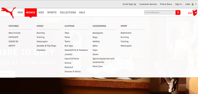
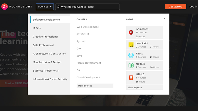
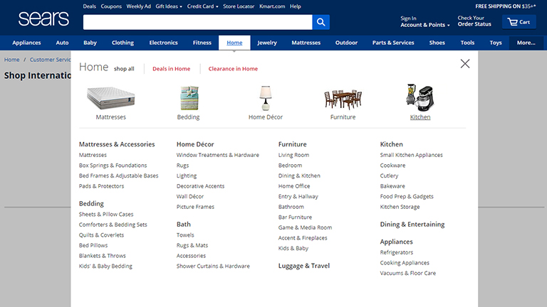
Hamburger Menu

Hamburger menus have gained a lot of popularity over the last few years. It is a great design solution that hides the basic links of data categories behind the hamburger button. The horizontal lines of the icon look like a typical hamburger, and that’s why the name.

This button is mostly placed in the header and is a typical element of user interaction. Today, most of the users are familiar with the Hamburger menu and expect the core categories of data under it. So, there’s no need for additional explanations and prompts. Hamburger menu leaves a lot of free space to place other important layout elements, and also provides a minimalistic design feel. This design technique benefits the responsive and adaptive design as it hides the navigation elements so that the interface looks the same on different devices.

Although hamburger menus are widely used as header elements, they are still a debatable issue of modern web and app design. A lot of design experts argue that a hamburger menu can be confusing for people who do not use websites regularly. So the decision of using a hamburger menu should be based on extensive research on users and target audience’s needs.

Fixed Header

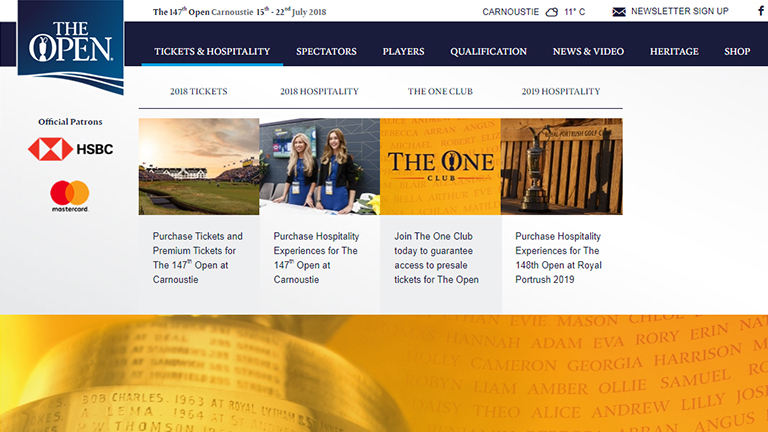
Fixed headers is another header design trend that boosts usability if applied effectively. There are a lot of websites nowadays that use a fixed header. Take an example of Facebook. When you’ve logged into Facebook and scroll down you still see the header with the search bar and some other core functions at the top. 

The benefit of a fixed header is that if the user needs to use a function they can easily jump to the header without the need to scroll up, as would be required for a non-fixed header. However, if there is more content then users might lose some space because the header occupies some permanent screen real-estate. It enables to provide users with navigation area available at any point of interactions, which can be helpful in terms of content-heavy pages with long scrolling.

These tips might be helpful for you for designing headers
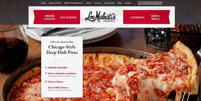
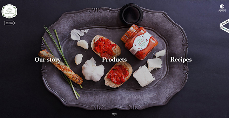
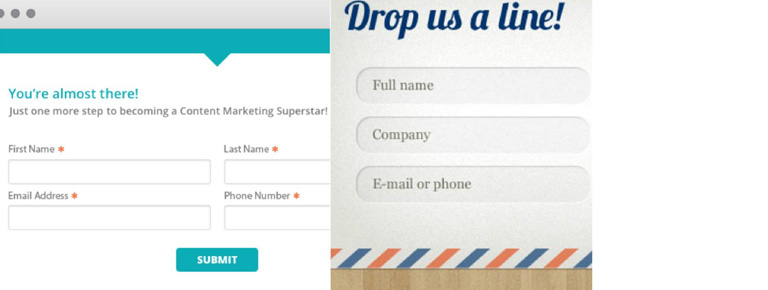
Double menu

The double menu in the header can present two layers of navigation. We have shown the example of such a trick in one of the recent case studies for a bakery website.

The bottom line is that the header is a vital zone of interaction for any website and needs careful design consideration. Each website header designs requires its own approach which fits for a specific target audience. User research is the key, based on which the decision can be made, whether to follow the traditional forms of header design or they need a new perspective. Want to know more? Ask our design experts.

Categories
Brand & Identity Design Technology Web Design

When And How To Redesign Your Website?

Design trends change at a fast pace, and you need to keep yourself abreast of the changing trends. A timely analysis of your website design will help you in taking the call if you need to redesign your website or not. If your design looks straight out of the ’90s, with functionality from the stone age, its time to redesign.

But the big question is – how to get started and from where? Therefore, we created a website redesign checklist to help you through the redesigning process.

First things first, put your website under a design microscope and analyze if it’s time for a change. When was the last time you changed your web design? With the internet evolving all the time, it’s challenging to keep your website modern without updating it regularly. If you can’t easily remember the last time your website had a makeover, it’s time to take a look at our website redesign checklist.

Is your website mobile-friendly?

Mobile-friendly websites mean offering a consistent experience for visitors across all devices and screen resolutions; whether they access your site via desktops, tablets, or mobile devices.

Everyone has a mobile these days, even the kids. Mobile searches are higher than ever. A study revealed that in 2018, 52 percent of website traffic came from mobile phones. It means that more visitors come to your website via a mobile device, rather than on a desktop. If your site isn’t mobile-friendly, you’re missing out on a substantial amount of leads and revenue.

Not to forget, in November 2016, Google rolled out its mobile-first index, which changed the Google ranking system altogether. Google now primarily looks at the mobile version of a website for indexing and ranking. 

Read More About Mobile Indexing Here

Is your website not driving revenue?

The core objective of a business is to generate revenue. Your website should be a lead-driving, and revenue-increasing machine. If that’s not happening, you likely need a website redesign. Well, one may argue that low revenue can be because of many reasons, but lack of website traffic and leads is a significant cause. And, even if your website design isn’t the main cause of your low leads and traffic, it won’t hurt upgrading the design.

Has Your business changed?

Your website should be an accurate representation of your business. If you have changed your business or modified some part of it, then redesigning is a good option. If you offer new products, or you’ve changed locations, or changed your branding, your website should reflect that.

Read More About Startup Business Branding Here

Now, if you decide to redesign your website, you need to follow the below-mentioned process:

1. List down what’s wrong with your site

It is the foundation of the redesigning process. You’ll want to make a list of everything that you feel is wrong with the current version of your website. The list should be comprehensive, covering everything from the design to the verbiage, and everything else. This step will not only help you in uncovering all the design shortcomings, but it can also help you discover other site performance issues. 

For example, you may find that your page upload speed is sluggish. This may not be a design issue, but it’s a problem nonetheless, which could repel visitors from your website.

2. Create a plan

Once you have made a list of all the aesthetic design issues, you need to come up with a game plan. Brainstorm some aesthetic elements that you’d like to implement instead of the present ones. Like, if you have listed that the color of your text doesn’t stand out against the background, write a suggestion against it of how you might want to fix it.

Or maybe you’ve decided that your navigation bar is overcrowded with too many components. You could make a note suggesting streamlining the navigation.

3. Take services of a web design agency

Not everyone is proficient in web designing, or has web designers on board. If you have experience with web designing, nothing like it; however, if you don’t have the resources and knowledge, it’s best to take the professional services of a reputable design agency. 

Not only will they create a stunning website for you, but they can elevate the user experience of your website to the next level. Not only they will do a great job, but they will also do it much more quickly than a fairly new and inexperienced team.

When you’re looking for a website agency to redesign your website, find one that has been in the business for a decent amount of time. Review their portfolio and list of clients to get an idea about their work. A couple of meetings can set the right expectations, and will help the design house to offer a custom quotation to you, based on the requirements.

4. Communicate your brand, goals, and taste to the design team

If you don’t communicate your brand, your thinking and what you wish to achieve, you will never reach your dream design. Sit down and talk to your website designer about the lists you’ve made and let them know how you’d like to go ahead with the changes to better fit your style.

Web designers have tons of ideas floating in their head; keep an open mind and explore all possible options, tailored for you. After all, they are experts. Ensure that you share your current style guides with them. This will help them to implement your existing color scheme, fonts, and styles in the new design.

5. Provide feedback to the designer

Your website designer will likely start with a wireframe or a watered-down version of your website. This is the best time to be open with them about what you like and what you don’t like about their design. It will help them to come up with a perfect design in the least number of iterations.

6. Conduct user testing

After users have had a chance to use your website, it’s time to do some user testing. This can help you understand user behavior on your site so that you can determine what users’ perception of your website. 

Conduct click analysis to understand which buttons are getting the maximum number of clicks, and which are the ones hardly getting any traction. The color or verbiage on the button can be the problem. User testing can help you determine the small details that can make or break your design in the eyes of your audience.

7. Ready, set and go

After the user testing is completed, you’re all set to fly high with your revamped design. Continue the analytics for the initial phase to determine the success of your redesigning exercises. Minor adjustments can be made based on these observations.

Need help redesigning your website? Talk to us.

Categories
Brand & Identity Design UX Web Design

Best Practices For Designing A Search Box

Site search is one of the most important yet most overlooked functions of a website. Search acts like a convertor between the user and the app or website. It is highly unlikely to predict and offer all the information, that users may look for, on the landing page itself. The user expresses their information need as a query, and the app or website communicates its response as a set of results. Users expect smooth experiences when searching. They are typically judgmental about the quality of a website, primarily based on the effectiveness of its search results. Hence, it’s essential to give thought to some things while designing the UI behind search and results. In this article, we will discuss some of the best practices for designing search, which will not only simplify your UI but will also enhance the user experience.

You may want to explore the roadmap of website design

Designing Search: First of all, let’s understand when do we need a search feature on the website?

The essential determiner is the amount of content on a website. Smaller websites, with a limited amount of content, are better off without the search option. Search becomes increasingly central as websites grow in size and complexity.

E-commerce sites are probably the most common use cases for utilizing search because users are searching for specific products. In large e-commerce websites, search bars move out of the header and take on a central role in the UI. According to research, about a third of total visitors use the site search tool. People who use the search tool are looking for something specific; they know exactly what they’re looking for and are generally more aware as compared to other visitors.

Read more about designing the E-Commerce Product Pages

Few Useful Tips:

1. Show Search Field Notably

The most important rule in designing search box is to make it easily noticeable. If the search is an essential function for your website, it should be displayed prominently. Search can be the fastest route to discovery if users can quickly locate it. Retain an open text-entry search field. Users want a place where they can quickly go to type in their search query.

Search hidden behind an icon has negative consequences. It makes the search feature less noticeable. When used without an open-entry text field, the icon takes up less space. Visually, it’s less prominent and, therefore, less noticeable. Users have to take extra action to access the search box, which creates a negative user experience.

2. Strengthen Your Predictive Text, Autocomplete and Error Correction

How often have you typed a word in the Google search box and got amused by the suggestive results it shows? It’s amusing at times, but there’s a super-strong algorithm behind it, based on the searching patterns of billions of users. Search options need to be intuitive and smart.

Don’t expect your users to know the product names, how to correctly spell everything or anything else for that matter. They might not even know what they are looking for. Your site search function should be intuitive and smart enough to anticipate where the search is headed. It must begin listing suggestions while the shopper is still typing. Artificial intelligence (AI) and onsite search are like perfect partners.

3. Always Pair The Search Box With A Magnifying Glass

Users are accustomed to a few things on the web, and they expect the same everywhere, like icons. There are a few icons that have mostly universal recognition from users. Icons are, by definition, a visual representation of an object, action, or idea. The magnifying-glass icon is one such icon which has a universal meaning attached to it. Users recognize a magnifying-glass icon as meaning ‘search’ even without a text label.

One of the things to remember while designing search magnifying glass is not to make it complicated. The simplest version of the magnifying glass is the most effective one because lesser graphic details speed up recognition.

4. Place The Search Box Where People Expect It

The best place for the search box on a website is a heated topic of discussion, with several theories floating around it. However, many of the popular websites such as YouTube, Amazon, IMDB, BEST BUY, etc. place the search boxes towards the top center or top right of the page. A study conducted by A. Dawn Shaikh and Keisi Lenz found that the most convenient spot for users would be the top right or top left of every page on your site, where users could easily find it using the common F-shaped scanning pattern.

Placing it somewhere unexpected means users need to put in extra effort to find the search box. That’s more like searching for the place to search, which is not the ideal thing you want your users to do. Search boxes at the expected places would reduce the search time as well and will create a positive UX.

5. Tell Users What Can They Search

It is highly recommended to include a sample search query in the input field to suggest to users what queries can be used. As discussed earlier, users are not every time sure of what they are looking for, or what all things they can search using the search box. Providing them suggestions and sample queries will smoothly guide them. If the user can search for multiple criteria, use the input hint to explain that. However, ensure to limit your hint to just a few words, else, you will increase the cognitive load.

Placeholder text gives users clues about what to look for. In some cases, placeholder text may create an accessibility issue. When placeholder text is designed to be lighter in color than regular text, it creates a contrast problem. In addition, placeholder text is not widely supported by assistive technologies, making it more difficult for these users to fill out forms accurately.

A lot of designers don’t spend the required thoughts and time while designing search box. A search box is a useful tool to elevate user experience and increase business. We hope that these tips will come in handy when you design your next website with a search box. In case you wish to discuss in more detail, feel free to talk to our design experts.

Categories
Brand & Identity Design UX Web Design

Web Designing While Accounting Human Errors

We often hear the phrase ‘To err is human’, and it can’t be truer in every aspect of our lives. We all make mistakes. Users on your websites are no different. Sure, you can’t stop them from making mistakes, but, can you follow some aspects of web designing while designing your website in a way that it leaves a scope of making mistakes?

Even the most careful and diligent users are bound to make mistakes at some point in time; others will make more mistakes. Therefore, it is critical to consider this fact while designing your website. The errors in web designing can be as simple as mistyping a URL, providing incorrect information in a sign-up form, adding info in wrong fields, etc. The mistakes could even be as disastrous as accidentally sending thousands of dollars to the wrong person via PayPal. So, here are a few tips that you can follow to account for human error while designing your websites. 

1. Provide Straightforward Instructions

A lot of times, we assume that the users are by default aware of the most basic instructions. Thus, we don’t feel it necessary to provide these basic instructions to them. Moreover, people often see basic directions as a bit snooty. It’s human to assume you know everything you need to know for a simple-seeming task. This causes errors.

Don’t assume they know what you mean. An imperative when delivering clear instructions is not to assume the recipient knows what you mean. This can be for anything from commonly used acronyms to simple navigation instructions.  Mixed messages, assumptions and multiple options mean that the message received might differ from what we actually meant.

2. Give Clear Warnings During

Just like the instructions, users must get a clear understanding of the consequences of actions taken on the website. And, sometimes they need to be informed and explained the implications, that too in detail. Still, there would be users who would keep ignoring your warnings, but there’s not much you can do for them in any case.

There’s also a second web designing approach which you can proceed with. A majority of people will leave your site when they face a warning message which they don’t fully understand. Else, they may look for help to understand the warning, which again may lead them to bounce off. You’ll have to decide whether you would rather deal with potential inaction from some customers, or more errors. Both approaches have their pros and cons.

3. Always Confirm Actions While

You may think that all users are completely sure of what they are doing on the website, or they may get annoyed with questions asking them to confirm their actions. A confirmation dialog may seem like an irritating and useless extra step; however, the truth of the matter is a quick “Are you sure you want to do that?” message can be invaluable. The user may be taking action for the first time, or the tenth time, it’s irrespective. A confirmation will only increase chances that the user takes the correct, intended action.

4. Validate Forms

Form validation may not be a full-proof solution, but a potent tool, and a great way to gently guide the user in the right direction. While proper form design can help keep users from simply putting the wrong text in the wrong form, form validation is excellent for double-checking information and catching typos and forgotten fields.

Improper validation of form data is one of the leading causes of security vulnerabilities. It exposes your website to attacks such as header injections, cross-site scripting, and SQL injections. It is important to note that client-side validation is beneficial, but it is not enough. If you’re going to implement client-side validation, it would be good to have some of the server-side too, just to be safe.

5. Use Appropriate Form Labels

In our last article, we listed out some essential tips for selecting the right button labels. The labels on the forms are equally important and can lead users to commit an error, if not used properly. There are tonnes of websites on the Internet with so many vaguely-labeled forms. Worse are the forms that use industry jargons on a client-facing website. In some of the sites, the labels and input fields are even misaligned. That’s just a strict NO-NO!

6. Improve Usability Through Color and Contrast

The colors and contrast are often used on a website most simplistically. People only go as far as using red and its shades to portray bad, and green and its shades to show good. But that’s not enough. It doesn’t necessarily help differently-abled users. A website should be usable by everyone, so various disabilities should be kept in mind. Disabilities can include but are not limited to, the inability to use a mouse or see the screen.

When someone has low visual acuity, specific color palettes on websites may make it difficult for that person to see and understand the website content fully. You must find a way to add contrast to your elements, in such a way, that they’re clearly and easily distinguished from each other. Pay special attention to this if two options use similar text, but do radically different things.

7. Provide ‘Undo’ Option Where Possible

We all know how handy the ‘Ctrl+Z’ option comes in every day while performing various tasks. The ability to undo an action is such a boon to everyone. We wish we had an undo button for our lives. Coming back to reality though, if you’re building a web app, you might seriously consider implementing some sort of “Undo” function for just about every action with permanent consequences.

You cannot ensure error-free browsing on your website; neither can you take a generic call on the abilities of your users. But, considering human errors while web designing, will increase the chances of good user experience and fewer errors. Speak to our experts to discuss more on it.

Categories
Design Technology Web Design

5 Best Practices To Design Single-Page Websites

Single-page websites were once not a real favorite of web designers. However, things have changed over the past decade, and single-page sites have gained popularity owing to its ease of creation, simplicity and potential to deliver a rich user experience. That said, which one is better – multi-page or single-page website, is a never-ending debate. A single-page website is faster and easier to develop, but it still requires a lot of creative thinking and thorough planning.

Single-page website

No prizes for guessing, a single-page website is a website that contains a single HTML page. The entire content of the site is placed on one page. When users click on a navigation link, they are directed to an HTML anchor on the very page.

Single-page websites are responsive and provide better mobile UX. It offers a lot of freedom to web designers in terms of layouts and visual effects. They do have a few drawbacks as well, like it is not SEO friendly. You cannot index several web pages with various keywords and meta descriptions, which will negatively affect organic traffic performance. The key is to understand the target audience, their expectations, and the company’s long-term goals.

A single-page website is best suited for personal websites, portfolios, landing pages, brochure websites, single-product websites, resume pages, one-time events etc.

Single-page websites: Best practices

Break Down The Content

A single-page website is a right choice for you if you don’t have much text to display. Though less text doesn’t mean less information. Therefore, you need a clear and easy-to-follow visual structure. Create a story and break the content into small chunks and sections using different header styles, background colors, overlays etc. Well-written content along with appealing visual effects will ensure that users don’t stop scrolling on your website.

As you only have one page, try not to feed too much information to users. Use multiple sections and keep the messaging clear and concise. More importantly, ensure that you maintain a continuous and sequential flow of content. Another way to keep users following your point is to tell a story using both visual and textual content. Storytelling is a powerful way of delivering content.

Create A Visual Hierarchy

Visual hierarchy tools used for web design include size, color, contrast, proximity, and repetition. A common belief states that people read in the F-pattern when they are served a large amount of textual content, while the Z-pattern suits pages that have less text. But, it is suggested to use both of these patterns for different sections, as a single-page website contains numerous sections, and it’s essential to diversify the site structure.

The single-page visual hierarchy should be concise yet encouraging. Before selecting a particular page structure, identify your needs and keep in mind that you only have one page to scroll.

Add Alternative Navigation

Single-page websites are all about scrolling and sometimes about endless scrolling. At times, this can leave the users clueless and stranded, with no idea where to go. If your site has a complex structure and with a lot of blocks, you should think of alternative navigation.

Use a sticky navigation bar that stays on top of the page, no matter how deep you scroll. This will allow users to move to the section they are looking for quickly. Also, use anchor links and a back-to-top button to keep the UX pleasant and intuitive. Always keep the users on track. Try to combine scrolling with a traditional navigation system. Don’t forget to put a “back to the top” button if you have a long single-page website.

Add A Compelling Call-to-Action Button

A call to action button is the most influential factor in a conversion. A well-designed CTA influences users to take the desired actions; be it a mobile app download, order placement, demo request, email signup or as simple as a contact form submission. The exceptional quality of a call to action increases the chances of conversion.

Single-page websites are perfect for a CTA. Because of their structure, single-page sites are more focused as compared to multiple-page sites. The design and placement of the CTA must be around the specific purpose of your website.

Keep It As Simple As You Can

Take a look at any of the traditional, multiple-page websites and you will notice that they are created based on a particular design theme. A few templates of inner pages are added to this basic design theme to complete the overall design. However, it is much more challenging to design a single-page website.

With the recent developments in CSS3, HTML5 and Javascript, the opportunities to create a simple and engaging website are as vast as you can stretch your imagination. Adding little details, like animations and smooth transitions, also contribute to enhancing the user experience.

Don’t make It Heavy

A lot of times the goods about a single-page website are washed out by its slow load speed.
Since there is only one page to deliver the content, all information is stuffed onto one page, making it really heavy and takes ages to load. Be selective, don’t stuff the website with unnecessary information and heavy animations. Saving a user’s time should be paramount. Slow loading will also hurt your website’s SEO.

Analyse the pros and cons of a single-page website, and then make an informed choice. In case you would like to know more about it, talk to our experts now.

Categories
Blog Brand & Identity SEO Web Design

5 Annoying Things To Avoid In A Web Design

Competition over the Web Design internet is fierce. Today, there are a large number of individuals and businesses who spend money and time on digital marketing and SEO to rank higher on Google searches. It has become tough to differentiate from rivals and get users to visit a particular website over others.

Since acquiring new visitors is very difficult, providing a delightful user experience gains importance and is pivotal to retain each hard-earned customer. If a website offers an unpleasant experience to its users, forget about winning repeat visits, they might never come back on the website. Here are some of the most common things in a web design which leaves users in frustration and thus must always be avoided.

Slow Website Speed

With the boom in technology, everything has become super quick. Everyone has a smartphone these days, and access to the internet is just a tap away. Even half-baked questions or half-remembered trivia get instant answers from Google. People can contact each other, sitting halfway across the globe in a matter of seconds. Today, the speed and responsiveness of our hyper-connected world have spoiled us all. Therefore, when we click on a search result, and the page keeps loading even for only three to four seconds, it is equivalent to eternity for users.

Remember, you’re not the only one providing an answer to a query or serving what a user is looking for. If your page doesn’t load within a blink of an eye, they will click on other best available options. Get rid of all the unwanted elements which are dragging down the speed of your website. Ensuring a good page load speed is critical to create new visitors and retain them.

Too Many Popups

It’s a shared experience, wherein we click on a link in our Google search results, and we are directed to a webpage which is full of popups. So much as so that we are not even able to read the actual content available on the page. Moreover, they keep popping up, even after you close them.

Combined with a browser alert that “this website would like to send you notifications”, the overall effect is one of being barraged with irrelevant information. It ultimately kills the actual content you were trying to reach.

Some advocate the fact that popups significantly improve conversion rate, while others get put-off by their potential of pestering the users. No matter which side we stand, one thing is for sure that popups are badly planned, throwing information and content which is not relevant for users. Therefore it is better to stay away from them.

Not Mobile-friendly

According to Statistic, 52.2 percent of internet traffic was generated through mobile phones in 2018. That’s a considerable ratio, and thus it’s pivotal that the website is responsive and mobile friendly. We are in 2019, yet we come across many mobile sites where items aren’t aligned properly, overlapping, strangely formatted or subject to some additional oversight from the designer. It creates a negative impression on users. They might feel that your company doesn’t take the time to go over little details.

Coupled with the recent change in Google’s algorithm to prioritize mobile-first indexing, there is now no reason at all to ignore the mobile experience of your website. A low-quality mobile site can negatively affect your SEO performance as well as the experience of your users, so it’s essential to get it right.

Animation Overdose

We like animations. Yes, they do look good and enhance the aesthetic value of a website. A few smooth transitions, transforms, appearances, and well-deployed animation can infuse vital life into an otherwise static and dry layout.

However, animation should be used sparingly, as and when required. Overdoing it can distract the audience. The key role of animations is to draw user attention to key content and call-to-action buttons. Users should not feel confused to read the actual text.

Animated introductory screens, too, are great attention-grabbers when users first reach on to your website, but avoid making them sit through the same animation every time they want to return to the homepage. Their beautiful presentation shouldn’t dictate the function of website elements.

Users shouldn’t be waiting for an element to appear or to become interactive. Using a lot of moving parts or content that flashes can pose problems for users. Some users may have an attention deficit disorder, making it very difficult for them to concentrate on the content.

Video Autoplay

Videos are an essential aspect of your online marketing efforts. They are a good source of explaining your products, brand message and other aspects, better than text can. Designers are often tempted to put the video on autoplay when they place them on the website. There are ways to do it tastefully, but it’s so often misused and creates a negative user experience.

Many sites place a video next to the body text. Usually this is entirely irrelevant to the content of the page. Even if you close it before navigating to another page, it quickly reappears. That’s really annoying.

Even worse, many sites preface these videos with automated advertisements which, given that the videos themselves are generally advertisements in one form or another. Some web users also hate auto-play as it can ruin their user experience and would rather prefer reading the information on the page without a distraction. It is more polite and effective to let the video be turned off until the audience chooses to play it.

To wrap up

Everything which we have mentioned above is basically issues of a bad UX design. It is important to consider every element and its effect on the overall user experience. If something hinders the user in finding what they’re looking for or detract them from the actual content of the page, it should be avoided. Speak to our design experts to know more about it.

Categories
Blog Design Technology Web Design

Tips To Choose A Website Builder for Your Next Project

Every business needs a compelling website these days. We come across loads of websites on the internet, some of which we find very attractive, some not so much. A lot of these websites are developed using website builders, which are great assets and expedite the process of designing and developing a website. A website builder is an effective tool to design a corporate website, blog, landing page, an eCommerce portal and a lot more.

A good website builder is easy to understand for even novice web designers. It typically provides templates and features that are based on web design best practices. But, what should you look for in a website builder to zero down on the best one for you? In this article, we will discuss exactly on that. Irrespective of the size of your business, this article will help you choose the best website builder platform for your website.

Set Your Budget

First and foremost, examine and ascertain your affordability. There is a website builder for every pocket. Start by considering the other costs involved in building your professional website. While deciding on the budget, consider the other costs involved as well, like domain registration and hosting. The images and copy for your website will also require some investment.

A lot of website builders offer a free plan, but that has its own limitations. Mostly the services cost somewhere between $5 to $40 a month, for plans that offer features required by businesses. If your budget is limited, you can save money by looking for plans that bundle different website services you need.

Prioritize Your Needs

Every business and website will have different needs. Based on these needs, a suitable website builder can be selected. Before you can decide on the best website builder platform, you need some idea of what you want your website to do and be like. Consider the level of experience you have in designing. Most websites builders are made for people that don’t have much experience with design or website coding. Still, some of them are easier to understand and get used to.

If you’re a newbie and would be starting from scratch, then look for a builder that offers website theme templates and drag-and-drop design options. If you want a lot of options and flexibility in designing your website, then go for a website builder which offers plenty of templates and further flexible editing options.

For instance, if you’re developing an eCommerce website, think if your website will include videos? A photo gallery? A blog? A map that shows where your store is located? Make sure your website builder supports the types of content formats you plan to include.

Also, Make sure the website builder you pick provides responsive website templates or other options to make your website mobile friendly.

Look For Ease Of Use

You don’t want to scratch your head figuring out how to use your website builder. Make sure the builder you select is one which can be easily interpreted. The key thing is ease of use for your comfort and at your skill level.

If you have a background in coding and want customization, you may use slightly advanced tools like the most popular builder – WordPress; you can also buy customizable templates. The templates also vary in ease of use, so choose wisely.

To be fair, almost all independent website builder platforms are easy enough to use. However, the features provided by the builder creates a huge difference. Always go for a feature-rich website builder as it adds to the ease of use.

Consider After Sales Service And Support

A quality website builder will have a solid support and troubleshooting team in place. The team would promptly answer your queries and troubleshoot if anything goes wrong.

Generally, customer service levels vary, based on the pricing plan you choose, but is an important consideration before choosing a website builder.

The support is offered at various levels, email support, priority support via email, chat support, or phone.

Check Out The SEO Features

No matter how good your website is, it’s of no use if people are not able to find you on the web. Once you’re done building your website, you want people to easily find you. Your website should not get lost in the deep sea of countless websites over the web.

For that, you need to implement SEO best practices along with the design of your website. A good website builder should include SEO features that simplify on-site optimization. You must be able to update all the SEO meta elements, on each page, without any hassles, so as to provide your sitemap to the search engines.

On-site optimization is just one part of SEO, but surely a significant one. An SEO feature-rich website builder will help you in successfully implementing your SEO strategy into the design right from the very start.

In nutshell, the best website builder for you is the one which is easy to use, offers plenty of features, meets your specific needs, has a strong support team, and is easy on your pocket. Sounds too much of information? Don’t worry, leave your design requirements to us. Discuss with our design gurus and get your dream website designed cost-effectively.

Categories
Web Design

5 Vital Ingredients Of Designing A Delicious Food Website

It looks delicious! Has it ever happened with you that you literally start drooling by merely looking at a dish or its picture? We bet you’ve experienced this. Long gone are the days when food websites relied on PDF format menu cards and boring stock images. They have undergone a major transformation and now use a splendid UI design, magnificent photographs, vibrant colors, striking fonts, and high-quality content on their websites. So what are really the ingredients that contribute to the recipe for a lip-smacking food website? Let’s find out.

1. Drooling Pictures

It goes without saying that visuals create the best impact on users visiting a website. That said, food photography is an art; it is the base of any food website and is a major contributor to its success. The food should look delicious, full of flavors, colorful, fresh and must make everyone drool. Every food brand must give a good amount of thinking to it. It’s not just the food, but its plating, cutlery, look and feel of the ambience, everything contributes.

Drooling-Pictures
LouMalnati’s

2. Delicious Colors

Yes! Colors can create an aura of taste and can easily make a food either look tasty or boring. Don’t be afraid of playing around with vibrant colors, however, don’t go too loud and over the top. A tried and tested trick of the book while selecting a background color is to sample colors from the food itself, and darken or lighten them; the food will look attractive. For typography, do the reverse (lighter or darker) than the background.

Delores-Custer
Delores Custer

3. Appetizing Content

Content is the king, and in every context. Enticing photographs and attractive colors may make a visitor inquisitive, but its the content which will eventually engage users. Users will be interested in what value proposition you have for them and how you can increase their knowledge while providing food for their thought and interests. Content is really important, but just because it’s important, don’t complicate it. Keep your content simple, fun, and in a light tone. After all, you’re talking about food, not a world crisis.

Appetizing-Content

4. Flavorful Typography

Your food fonts should be good enough to eat. Fonts should compliment your food photographs as well as the appetizing content that you have put on your website. Draw inspiration from restaurant menus, cookbooks, or recipe books. They are an ocean of knowledge as far as the fonts are concerned. Create a unique style between the headings, subheadings and base text to create a visually pleasing style.

Flavorful-Typography
Unio

5. Yummy Interface

An effective interface is pivotal for any website, and a food website is no exception. A simple yet persuasive user interface ensures that the user is not lost on the website at any given point in time and can carry out the desired purpose without any distractions. A good UI is an unsung hero; it swiftly elevates the user experience while working in the background. All functions must be crisp, clear, and intuitive. A user must be aware of how to perform a certain action and what would be the result of it.

Yummy-Interface

The food industry is growing by leaps and bounds, competition is increasing day-by-day. It is very important for a food business to give more thoughts on how they present themselves over the web, as the internet has now become the predominant way of interacting with any sort of business. Engage in a quick chat with our web design experts to know more on how you can elevate your business through effective web designing.

Categories
UX Web Design

These Four Mega Navigation Menu Design Trends Are Here To Stay

It’s very common for websites these days to feature a mega menu and full-screen dropouts, especially content heavy websites with tons of links. But designing an effective mega navigation is a tricky thing to do. As its an emerging design trends, there are no strict Do’s and Don’ts. One must keep his eyes open to notice mega menu trends which are gaining popularity across the design world. That said, here are a few mega nav trends which are growing in popularity across the design world:

1. Deep Level Categories

The column structure is the most valuable design style for a mega navigation. Under the column structure, a designer can label “categories” for links and thus deeper links can be created without using multiple flyout menus. A mega navigation dropdown can cover the entire page and 3-4 columns can be easily squeezed in one dropdown. The below-mentioned image shows the home page of Puma.

The ecommerce shop has a columnar structure broken down into categories based on demographics and items. Inside each mega nav, there are columns featuring different types of items (featured items, shoes, clothing, accessories and sport). The columns have their own headers which are more prominent than the rest of the links.

Deep Level Categories

2. Full-Width Dropdowns

Not every site features this trend but it is gaining popularity these days. Huge mega navigation menus run across the entire width of the page hence creating enough room for desktop & laptop users. However, mobile users typically have hidden menus so the full effect is not visible anyways.

The below-mentioned image displays the menu of Pluralsight featuring a fullscreen mega menu. The content stays fixed at the same width as the page, however, the menu is spread across the screen. It’s a very eye-catching effect as it creates more room in the menu.

Full-Width Dropdowns

3. A mix of Images and Text

Visuals have a deeper impact as compared to any other type of content and hence adding more images to websites is a great idea. Visuals help in breaking the monotony of regular text we which we come across day in and day out. Needless to say, mega navigation menus work best on larger screens so there’s a lot of room for images.

Take a look at the Sears website.

A mix of Images and Text

They have smartly broken up their navigation into multi-level categories using links as well as images. A few of the top categories have images of kitchen appliances, mattresses, and home furniture. On the other hand, the deeper categories include direct links to items like cutlery and tableware.

4. Alternate Dropdown Techniques

There’s no harm in being a little experimenting with your mega navigations. It’s best to keep analyzing different techniques, methods etc. to understand what can best work in your case. Some websites don’t shy away from pushing the limits and add different aspects like animations, multiple columns, and even flyout menus that appear out of mega navs. The goal is to design a menu which is usable and works well.

The typical mega nav menu on The Open expands while hovering and the entire page gets pushed down to make room for the new menu. Unlike most of the mega navs, this one animates down while moving all the page content lower. It might not seem to be a perfect idea for every website but it’s definitely a unique one. You can run some A/B tests to compare the usability.

Alternate Dropdown Techniques


If you’re looking to design or redesign your content heavy website, talk to our design experts and understand how you can display your content in the best possible way using mega navigation menus.

Categories
Web Design

5 Pro Tips To Master The Art of Web Designing

The web designing process is as vast as an ocean. There’s a plethora of design principles and trends that a designer needs to follow while pouring down his creativity in a web design. While it’s never harmful to experiment a bit here and there during the designing process, but it’s good to keep a few tried and tested tricks at the back of your mind. Here are 5 pro tips that will come in handy while designing a visually stunning and user-friendly website.

1. Always Left Align Your Logo

The logo of your brand holds great importance. Therefore, placing it in an appropriate spot on your website becomes a pivotal task. Designers think that centrally placing the logo will ensure that it gets maximum attention as it will become more visible, however, that’s not really the case. Studies have shown that a left aligned logo grabs a lot more attention than a right or center aligned one.

Users tend to start reading a webpage from the top left-hand corner, moving left to the right bottom corner, which means users will focus more on a left aligned logo. A right aligned logo portrays weeker brand image while a centrally aligned logo hinders navigation to the homepage. Moreover, a majority of languages across the world use left to right scripts.

Left Align Your Logo

2. Never Use Pure Black for Text or Backgrounds

Colors and Types are very important to enhance the visual appeal of any website and black is one of the most commonly used colors for texts and backgrounds. But, if you’re using pure black color for your text and backgrounds, you’re going down the wrong lane. A study has shown that pure black text and backgrounds with white can cause discomfort for the eye when users read the text over an extended period of time.

White has 100% color brightness and black has 0% color brightness, which leads to a huge disparity in the light levels users see. This is very discomforting for the eyes. Instead of black, use dark gray text on a white background so the change in brightness will not be as drastic.

Text Color

3. Use Single ‘Full Name’ Field In Your Forms

If your form has two separate fields for First Name and Last Name then you must change it. It’s not necessary that every user will be able to split the name into a first and last name. The cultural aspect comes into picture here. For example, Latin Americans generally have two last names, one from each of their parents, while Chinese people use their family name as their first name and their personal name as their last name.

Bifurcating the name field into two parts can cause confusion among users. Instead, use a single ‘Full Name’ field so that users can enter their name in the manner they pronounce and write it.

Full Name

4. Always Show Error Messages On The Right

While displaying any kind of error messages, always stick to the right side. The western reading system goes from left to right. When users move their sight from the input message to the error message towards the right, it’s a natural movement of their eyesight and thus takes minimum mental and visual effort.

On the other hand, when the error messages are placed on the left-hand side, it goes against the western reading flow and also breaks the natural reading flow of the user.

Error Message

5. Use A Ghost Button As A Secondary Button

A Ghost button is a button that has an outline but no solid fill. When used in the right context, they can clarify the priority of an action and increase task efficiency. When two buttons are used together, users think about which button to click. They depend on text labels to come to a decision, however, if visual cues are provided to them, they can decide faster.

A solid button for your main action and a ghost button for your secondary action will accelerate the user’s decision-making.

Button

For more such interesting design tips you can reach our design experts who would be more than happy to discuss your design requirements.