NYX Ditech

Categories
Brand & Identity Design Mobile Apps UI Design Web Design

‘Meet The Team’ Pages: The Human Element Of Your Website

While designing a website, designers categorize all the pages into three major categories – most important, important, and least important. Their focus and efforts on improving the user experience and elevating the aesthetics of the pages majorly depend upon the categorization. One of the pages that are often overlooked and incorrectly categorized is the ‘Meet the Team’ page. It may sound insignificant, and a very small element of a website, but plays a crucial role in the user experience journey. According to various studies, the ‘Meet the Team’ page is often the most visited page of websites that do have it.

Meet the Team

It is a small section on a website that introduces the team behind your brand and business. It is a way of recognizing individuals who allow your business to bloom and prosper. It may not seem too important, however, it helps a lot to create a positive image of your brand.

The ‘Meet the Team’ not only presents the faces of workers, but it also allows users to know more about the company and its work culture. Be it the pictures of the faces, or a large panorama of the entire group, team pages are there to show the quality and commitment of business.

The personalities, qualities, and ethics of people that make up a company are equally important as are the company’s achievements. Creating a team page that offers meaningful insight into a company’s culture and character enhances the human quotient. Users want to interact with your website as they are interacting with real human beings, and this page is a perfect platform for you to develop that kind of relationship with them. It greatly adds to the credibility that builds trust with customers, partners, and clients.

Best Practices

1. Put a Face and Personality 

Most companies include professional photos of key team members on their team page so that the customers, partners and other agencies quickly connect with the team. It is the most popular way of showing the team. However, the reverse approach has also shown tremendous results. Websites that used personal photos of team members, with friends and family, instantly connected with the audience. Multiple photos of the team at social functions and office gatherings are also a unique way of displaying bonding, teamwork and the fun that the group has together.

2. Create a Mix of Professional and Personal Information

Mostly the profiles include the name, designation and bio information. But, that’s a subtle and traditional way of displaying the team. Although, professional info should be mixed with personal, fun info as well. Include fun, personal passions, and interests that make individuals approachable and showcase personalities. Details like ‘favorite moments’ or ‘fun facts’ allow their staff to highlight skills, areas of expertise and personal attributes. The key point is that it portrays the company as a group of real people.

3. Include Personal Social Media Handles

A company’s team and its philosophy are important and must shine through its ‘Meet the Team’ page. A lot of times the team members personally contribute via their personal blogs, relevant publications, and other platforms. The information shared through an employee’s personal social channels is a reflection of the company’s expertise as a whole. Including an employee’s personal social handles or links is a great way to encourage readers to get to know your staff and the knowledge they offer.

4. Include Testimonials of Team Members

Testimonial quotes of fellow team members provided for each individual’s bio page not only represent who the employee is as an individual but also the strength of their individual role and the incredible value they bring to the team. Team bio and about pages are one of the most important components of any website. Adding a human touch can help build credibility and position your company and its representatives not only as thought leaders but partners that clients and prospects will respect. 

Characteristics of a Strong Meet the Team Page

  • It has personality
  • It is full of quality images and /or graphics, including headshots.
  • It stands out from other cookie-cutter designs.
  • It highlights the people who make up your team in a professional, personal and unique way.

Read more about other pages/screens here which should be designed cautiously

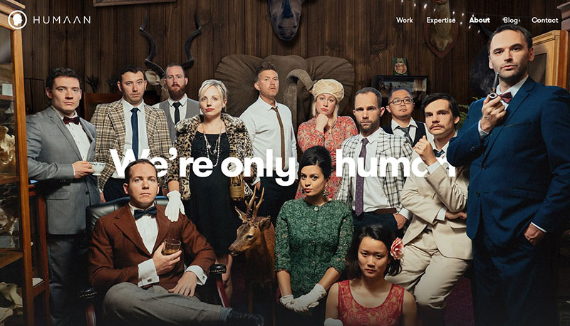
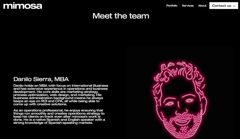
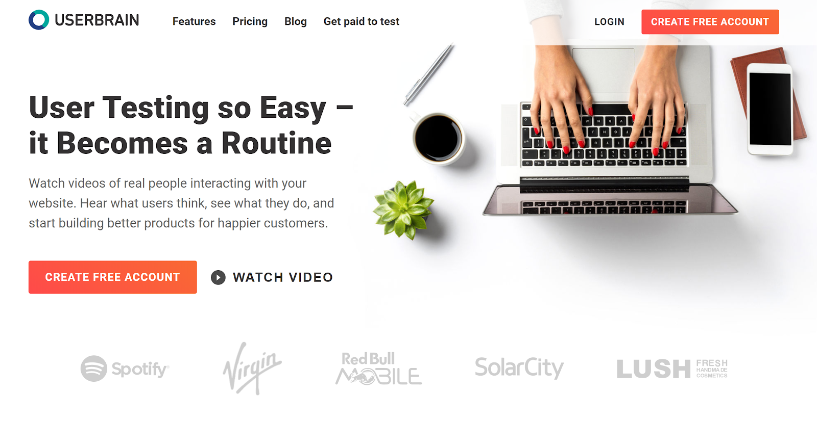
Here are some awesome ‘Meet the Team’ pages

Advantix-digital
Advantix-digital
Humaan - Our Team
Humaan
Mayple - Team
Mayple
Mimosa - Meet The Team
Mimosa

Wrap up

Creating a “Meet the Team” page expresses your company’s identity. It increases brand awareness and definitely this is something that helps your brand to grow. Contact Us Today if you think your brand’s team page needs tuning 🙂

Categories
Blog Technology UX Design

Top 10 User Testing Software To Improve Your Website

Testing is an integral part of the web development process. You may have designed a good UI and may feel confident in delivering a great user experience, but it can only be assured through proper testing. The process of user testing is pretty exhaustive and takes much time; especially when you are conducting in-house testing. Thanks to the technological advancements, today, many user testing software and tools can help you to monitor user behavior and collect vital feedback to make your design more productive. 

In this article, we’ll take a look at the top 10 user testing software, not in any particular order, which can assist you in improving the user experience of your website.

1. Userbrain

UserBrain

Userbrain is a widely-used, easy solution to monitor how users react to your website. On signing up, you get access to real-time videos of people interacting with your website. Additionally, Userbrain provides access to a big team of testers, which means you don’t need to recruit testers; neither you would need to manage and pay the users for participating in the test. 

2. Loop 11

User Testing: Loop 11

Loop11 offers usability testing for websites, wireframes and prototyping and accessibility. It aims to simplify user testing with a minimum requirement of technical knowledge. You don’t need to be a pro in HTML or CSS; however, a JavaScript solution is available for the pro developer minds. 

You can test on mobile devices, create custom themes and conduct multiple tests for all the elements. Moreover, users can get real-time reporting, look at heat maps, view clickstream analysis and watch session videos to analyze what users are doing. The best part is that Loop11 can be easily integrated with many prototyping tools, including Axure, JustInMind, and InVision.

3. Lookback

LookBack

Lookback is a simple UX recording software that can record a user’s computer or mobile device in-house or remotely. Interestingly, you can join the live testing sessions and communicate with the user while they’re exploring your design. This way, you can ask live questions or can even interview them to get first hand, real-time inputs. It is a unique feature and is absent from many user testing software. 

4. TryMyUI

TryMyUI

TryMyUI is a usability testing service that helps in discovering the ways to improve your website or mobile app by setting up your own custom test with specific tasks for users. It allows you to find out the correct user base through a wide range of demographics. There’s an option that allows you to watch the recording of the users while conducting the tests you’ve set, or you can use the TryMyUI Stream service. The service allows you to find the drawbacks in your design which results in a bad UX, using the Stream’s AI frustration finder. 

5. Crazy Egg 

User Testing: CrazyEgg

Using Crazy Egg is like monitoring your visitor interactions through x-ray glasses. It is a user testing heat map software that helps you understand what people are doing on your website and why visitors may not be converting into repeat customers. Heat maps identify the elements of your website, which are clicked on and the source of traffic. One of the highlights of Crazy Egg is the scroll map, which identifies how far visitors scroll down a page before they bounce off. It also offers the ability to monitor the numbers of clicks on each element of a page and perform A/B testing.

6. Hotjar

HotJar

Another popular user testing tool to analyze and get useful insight for your website is Hotjar. Just like Crazy Egg, Hotjar also uses heat maps to provide useful feedback. It allows you to monitor those parts of your interface that draw user attention and gets the majority of impressions and clicks. With Hotjar you can watch users’ recordings and people’s mouse trails to monitor exactly how they’re navigating on your website. The Conversion Funnels is another feature of Hotjar that lets you know at which point people are abandoning a purchase or leaving the sign-up process. Other hot features include form analysis and feedback polls.

7. Inspectlet

Inspectlet

Inspectlet closely monitors visitors’ activities on your website. It monitors what links they click on, users’ mouse movement, scrolling, and key-presses. In addition to recording user interaction on your website, it includes a heat map, which allows you to identify the most visited sections of your website. The heat map also includes eye-tracking, information on elements clicked, and how far visitors scroll down pages. The analytics tool highlights the pitfalls and trouble areas.

8. Reflector

Reflactor

Reflector is a screen mirroring app designed specifically for usability testing and it monitors how your app design works on mobile. This tool allows you to access your mobile or tablet screen through your PC wirelessly. Just like the other mentioned tools, Reflector allows you to watch how people use your app. It also includes recording capabilities so that you can review your testing sessions anytime later.

9. UserTesting

UserTesting

UserTesting is one of the best and simple ways to record and monitor users’ interactions on your website. With UserTesting, you can select your target audience and assign them tasks to perform on your website. The tests can be run on a desktop, tablet or mobile phone. UserTesting records real people sharing their thoughts and feedback while interacting with your website or app.

10. UserZoom

User Testing: UserZoom

UserZoom is an enterprise-level, adequately packaged user experience research and analytics platform. Besides capturing user interaction, it also provides robust analytics data. UserZoom allows you to test websites and prototypes, perform market research, create UX benchmarking and offer insightful reports with user actions, unique views, click information, heat maps and more.

Do you know UI and UX are connected? Read here to know more

Wrap up

These tools are perfect for getting started. Your choice of tool depends on your requirements. The best way is to use the free trial versions at the beginning to see how well each one suits your needs. Want to discuss more on user testing? Speak to our experts.

Categories
Brand & Identity Design Mobile Apps UI Design UX Design Web Design

5 Factors That Influence Readability and Legibility of a UI

No matter how exciting and compelling your story is, it will not be able to create an impact on users if it isn’t presented in a clear and readable layout. People generally focus more on the content than its packaging. No doubt content is the king, but packaging plays a crucial role in determining its success. Readability and legibility are two key aspects of user experience design. To simply put – app and web users will not read your content if it doesn’t look clean, clear, and consumable. In this article, we will cover the factors that influence readability and legibility in user interfaces and why it’s important to care about them.

Readability

As the name suggests, readability is the ease of written content perception. It refers to the comprehension of the text content. It includes – the simplicity of words and sentences, ease of consuming information, and clarity of thoughts. Readability is determined by considering your website’s typeface, which takes font size, font style, line length, and line-height into account.

Legibility

Legibility is a much narrower concept than readability. It refers to how easily your audience can recognize and differentiate between individual characters in lines of copy on your website. Legibility is determined primarily by your typeface design. We can say that legibility is one of the components to fall under the bigger umbrella of readability. It is generally analyzed by examining users’ reading speed in terms of words-per-minute.

Factors Influencing Readability and Legibility

There are plenty of factors that directly impact the readability and legibility of the content. Here are the five most important ones:

1. Typography

Typography refers to the font style. There are some fonts that are easy on users’ eyes and create a delightful reading experience. On the other hand, some fonts are not so pleasing. The choice of fonts directly impacts the readability and legibility of your copy. Font size, width, color, and text structure – every single element matters. Fonts also add to the visual element, just like images. Typography in design is the art of balancing the aesthetic aspect of the text and the ability to read it quickly.

Negative space, alignment, tracking, the spacing between baselines of text, line length, etc. are all key elements to clear typography and comprehendible content. Designers must avoid too little space between the words, very less distance between the lines or letters, tiny font size, and non-contrasting text and background colors.

2. Background

Just like printed books and newspapers, the background color has a significant impact on the ability to read and comprehend the content on websites. It allows readers to distinguish both interactive elements and content. For instance, black text on white or light background appears more significant than the white text on a dark background. An improper color scheme will mostly result in reduced readability, leading to poor user experience. Relevant content or useful data that is unreadable is of no use; users will most likely not read it.

The nature of the content also plays a role in selecting the color scheme. Text-heavy interfaces aimed at reading as the main activity should use color schemes based on light backgrounds. In contrast, the image-heavy interfaces should use dark backgrounds to amplify the pictures’ performance.

3. Writing

The UX writing must be clear, concise, useful and consistent. Text is a vital part of the visual design and user experience. The best you can do with the written content on your website, app, or blog is to make it human-like communication. When you interact with your users through text, at any level, they must feel as if they are interacting with a real human being and not a bot. 

Remember – users don’t read on the web, but scan through the content. Be short and consistent in your written copy. An extended form of writing pushes off users. You must also build a solid text hierarchy so that users can quickly scan your page content. Use numbers, marked elements, and textual variants to catch attention. Marking out specific information by using bold and italic fonts, unusual text sizes, different colors, highlighting, etc. has worked well for years and still holds its significance; however, avoid overdoing it.

4. Visual Hierarchy

Visual hierarchy refers to prioritizing the content into different levels. It is based on the Gestalt theory that deals with the psychology of visual perception of elements. The theory shows how people tend to group visual elements. It organizes UI components so that the brain could distinguish the objects based on their physical differences, such as size, color, contrast, style, etc.

As mentioned earlier, people scan content over the web. So, if we take an example of a blog, they will first notice the headline, then subheadings and only then copy blocks. This is a typical pattern. Users scan the headline and subheadings to understand if the article is interesting and useful to them. Only then will they read the entire blog. The headline and subheadings should be framed in a way that is both informative and enticing. On the other hand, if users see the vast and long sheet of text, they will be scared to read it.

To build an effective visual hierarchy, the text is divided into three levels:

  • The primary level – It includes the biggest type like in headlines. 
  • The secondary level – This is the type of element that supports scannability, such as subheaders or captions.
  • The tertiary level – This one is for the body text and additional data. 

5. White space

White space or negative space is the area of the layout that is left empty. It can be either around the objects you place in the layout or between and inside them. Negative space provides breathing space for all the objects by clearing the unwanted clutter from the page. White space is a strong tool to improve the readability of your text and thereby enhancing the user experience. It also helps in creating a connection between the text and non-text elements of a user interface. 

Many more factors influence the readability and legibility of the content of a user interface; however, these are the most important ones. If you feel like discussing them further in detail, our team of experts will be more than happy to assist you.

Categories
Blog Design Technology UI Design

The Golden Ratio For Balancing Your UI Design

The key element of an effective design is a clear UI Design. Each and every element must be well-balanced and placed in sync so that users could easily perceive the information on the screen and interact with a product without efforts.

Art, science, and basic mathematical theories, all come in handy when it comes to creating an efficient design composition. Amongst the most commonly used tools for designing is a mathematical proportion known as the ‘golden ratio’. In the article, we’ll define this technique and check out the benefits of using this ratio in design.

The Golden Ratio

The Golden Ratio is a formula that has been derived basis a general observation that everything designed by mother nature has a specific shape that’s near perfect. People enjoy everything which has a natural touch. In pursuit of discovering the secrets of shapes and the mystery behind creation, mathematicians calculated a formula that appears in the majority of things on the Earth.

In simple words, the golden ratio is a mathematical proportion between the elements of different sizes which is thought to be the most aesthetically pleasing for human eyes. The golden ratio equals 1:1.618, and it is often illustrated with seashell-shaped spirals.

UI Design Golden Ration

The golden ratio is believed to be followed for 4000 years now. The likes of Leonardo Da Vinci and Salvador Dali were known to use the golden ratio theory in their artworks.

Use Of Golden Ratio In UI Design

Striking the right composition and balance is a core part of any design. The elements need to work well with each other and complement each other to maximize the viewing experience. Also, the elements should be created with a balance within themselves. 

Graphic designers are keener to apply the golden ratio as it is a great way to understand how to work with proportions. Designers use this ratio to create various graphics, especially for the small but meaningful design elements such as a logo. The golden ratio allows creating illustrations where each element is placed in harmony and appropriate proportion to the others.

The UI design needs to have a clear visual presentation of the components so that people could use a product without problems. The golden ratio is often applied to place UI Design elements effectively. First of all, it can be used at the stage of wireframing. This way you can plan a structure for the layout placing and sizing user interface components according to the golden proportion. In addition, the golden ratio scheme can help professionals to crop images for web design so that it could make sure the composition of the photo remains balanced.

Advantages of The Golden Ratio

Well-balanced content

Designers often face the situation when a product needs to contain a great amount of various content and each part of it is vital and cannot be replaced. To unite all the components in a pleasant composition, the golden ratio can be applied. Divide the layout into different sections using a proportion of 1:1.618 and put the content in the sectors according to their importance. Such a content composition is sufficient for users’ perception and it helps to organize all the components.

Effective visual hierarchy

Speaking of the content organization, we can’t forget about visual hierarchy. As we mentioned in our previous articles, it’s a technique of efficient structuring content components. Combining principles of these two techniques designers maximize the chances of building a powerful UI design composition.

Powerful typography levels

To create efficient typography, designers need to divide copy content into different levels. They usually include various kinds of copy including headers, subheadings, body copy, caption, etc. Applying golden ratio professionals can quickly define an appropriate proportion between the typographic levels, for example, you can choose a certain size for the header and then divide it by 1.618. The result will show you the most appropriate size for subheaders.

Pleasing first impression

When users try a product for the first time, they scan the user interface to understand if they like it or not. The psychology principle known as a visceral reaction states that people decide whether they like something or not within a few seconds of looking at something. This reaction goes faster than our consciousness so we don’t even realize it. That’s is why it’s vital to make sure the first impression of a product will be pleasing. UI Design created by using the golden ratio has a positive influence on users’ minds and their visual perception and it works from the first sight at a product.

Appropriate white space

White space is the area between elements in design composition. Designers always need to care about the amount of white space in the UI since the unity of composition highly relies on it. The golden ratio can make the process of spacing much easier and faster. Applying golden proportions you will be able to define the right white space which will work well for the UI design.

To discuss more on your design needs, talk to our team of experts.

Categories
Apple Brand & Identity Design Mobile Apps

Mobile UI Design: 7 Most Common Types of Screens

There are over 2.7 billion smartphone users and 1.35 billion tablet users across the world. According to a study, on average, Americans check their phone every 12 minutes, and 90% of mobile time is spent on apps across the globe. Also, more than 6000 mobile apps are released every day. These figures are staggering and are sufficient enough to highlight the popularity of mobiles and their apps. The first thing a user notices while interacting with your app is its interface. So, it is crucial to have a pleasing mobile UI design to ensure that your user sticks around and enjoys browsing the app.

To build a useful mobile UI design, designers need to investigate its characteristics and learn their constituents and functionality thoroughly. Mobile applications indeed evolve with changing user needs. Thus, designers strive to add new functionalities every day to fulfill user needs. That said, there are still some screens that are default and are commonly used across a majority of apps. Here is a list of the top 7 most common types of mobile app screens.

1. Home & Menu Screen

The home screen is an essential part of any application. It’s the main screen from which users navigate to all the other sections and options of the application. Although home screens differ from one app to another, depending on the product and its purpose, still there are some common key elements of all home screens. Firstly, it has a search field so that users could easily search for what they are looking for. Secondly, it contains navigation elements providing access to the various content sections. There are two ways of presenting the menu in mobile applications – it can either be a part of the main screen or a separate screen. 

Note: It is advisable to keep the number of options in the menu under seven, featuring only the key sections. If the number goes beyond seven, use sub-categories to show them.

2. Log-in & Profile Screen

Creating personal accounts or profiles to sign into an app has become a standard norm these days. While this is a good way to ensure that your user gets a personalized experience, a lousy login screen could lead to people uninstalling your app. Designers must be able to understand how things work on login and profile screens. The key is to keep the login screen clear, uncluttered, and as minimalistic as it can be, to offer easy access to users. The amount of information has to be limited; otherwise, the profile screen may look too complicated. 

The UI must be intuitive, and at no point, users must be confused. The name and password sections, the confirmation button and a sign-up option must always be available on a login screen.

3. Product Screen

A product screen is most common in eCommerce apps. It displays the collection of products and when the user taps on the product they want, another screen displaying its specifications would pop up. 

The product screen shows the key information about the goods. It helps users to decide whether they want to buy the product or not. Designers usually place the product photograph at the center of the screen, with the description placed below it. The information is generally divided into small groups like size, material, weight, etc. so that users can get all the required info.

4. Catalog Screen

The primary objective of any e-commerce business is to sell products. For an e-commerce app, you would need a catalog screen to display all the products in one place. Visuals attract users and prompt them to make a purchase. So, designers must focus on designing a visually appealing catalog that will attract a user’s attention and encourage them to shop for a product. You can offer the user to scroll through the list, just like several other eCommerce websites and apps display it. The amount of merchandise/products in one row can be decided according to the width of the screen.

The product list in mobile apps can be similar to many e-commerce websites where the items are grouped and viewed via a vertical scroll. But, the products can also be displayed in a row with a horizontal scroll. To make the navigation intuitive, the last item in a horizontal row should be shown not in a full view to let the user see that this is the direction of scrolling. 

5. Check Out Screen

Nowadays, most of the shopping is done through smartphones. Therefore, it becomes crucial for companies to offer a smooth and convenient shopping experience to users. The checkout process is the final step during the buying journey of a user, and this has to be an easy task for them. 

The most fundamental aspect of a checkout screen is to have a form that captures all the personal data like name, address, contact number, card number, etc. Here, designers must ensure that their user data and sensitive information is secure. It can be callouts in a copy, icons of the famous brands who gave their approval or maybe even some certificate signs if there are such.

6. Splash Screen

The first impression may not be the last but is undoubtedly the most important impression. It influences the user’s opinion about a mobile application. When the user experience is pleasant from the very beginning of interactions with an app, there are more chances it’ll be more popular among users. That’s why splash screens should be given a lot of attention.

Splash Screen is the page in an app that demonstrates the main idea and features of the app. It must be minimalistic, displaying the logo, tagline, and name of a product. The fundamental elements must be kept in the middle of the screen for added visibility and a simplistic mobile UI design. The screen shouldn’t be shown for any more than 3-8 seconds. Users tend to get irritated after that. Also, it may be useful to show loading progress so that impatient users could know when the app will be launched.

7. Feed Screen

People typically use various social networking apps for communication and to remain updated with the news. You can take ideas from Facebook, wherein the feed is regularly refreshed, displaying the latest news and data related to the pages followed by the user. The mobile UI design should be simple and clear without a lot of fancy visual details. The stories can be presented one by one via a scroll. To make the navigation more intuitive, the next piece of news should be partially displayed.

We hope that these 7 most common UI screen designs will help you to get some clarity on how to get started with your app design. If you still have some doubts, talk to our experts NOW!!

Categories
Brand & Identity Design UI Design UX Design Web Design

7 Tips for Designing Effortless User Interfaces

The fact that simplicity is the ultimate elegance is an eternal truth. The power of simplicity can elevate any design for web and mobile interfaces. Moreover, a simple design is highly human-centric and thus creates a delightful user experience. But, a lot of times designers misunderstand ‘simple’ and interpret it as empty or monofunctional. Instead, it means clear, intuitive and helpful. The website with simple user interfaces not only solves user’s problems but also reduces their efforts.

Websites and apps are generally defined in terms of their appearance, functionality, or content. They are rarely defined in terms of respect. Often neglected, respect for the user’s time and energy is one of the vital goals that designers should aim at. In this article, we throw light on some tips and techniques which could help you in designing effortless user interfaces that reduce the time and effort of users, thereby creating an unforgettable user experience.

1. Put the essential information in headers

Quick and easy navigation is vital for any website. Website headers play a critical role in grabbing a user’s attention and stabilizing connection with the website. Clear, eye-catching details should be included in headers. Being on the top of the web page, users first see the header, before scrolling the page.

The biggest problem is to decide on what is key information? This challenge grows larger in cases of websites with a vast amount of data, like big e-commerce websites, news platforms or multi-theme blogs. The header is the first thing people notice before scrolling the page during the first few seconds of their interaction with the website. Being a sign of invitation, the header should provide the key information that users could scan it in a few seconds.

2. Use visual content to encourage actions

Strong visuals, including photography and videos, are an easy way to grab user attention, and when paired with an actionable element, it can help generate an immediate click. Various visual elements can be used to define the brand style. Guiding the user from point A to point B using visuals is an excellent way of saving time. 

Let’s understand this with the example of an e-commerce website. A user sees a pair of sunglasses on Facebook and clicks on the image to get to the website. A time-saving design would show the shoes with a button to buy now. Use the same image for off-site and on-site promotions. A different picture of those same sunglasses might not register as quickly with the user as the same image. Images are processed faster than text and thus reduces the time for users.

3. Design clear, distinct, and bold CTAs

The call-to-action (CTA) must be instantly noticeable and unmissable by the users. CTA elements are the interactive controls that enable users to take the intended actions. Common types of such interactive elements in the layout are buttons, tabs, or links. In all kinds of user interfaces, CTA elements play a crucial role in usability and navigability. When all the path of interaction and transitions are built clearly for users, but CTA element is not well designed, users are bound to get confused and need additional effort to achieve their goals. 

Bright colors and elements that are oversized can help users see what they are supposed to do with the design immediately. Further, provide content within buttons that tells users exactly what to do and what will happen when they “click here.” A CTA should have plenty of contrast so that it doesn’t blend in with surrounding elements and draws attention to itself.

4. Use numbers, not words

According to a study conducted by Nielsen Norman on user behavior, the eye-tracking studies revealed that numbers often stop the wandering eye and attract fixations, even when they’re enclosed within a mass of words that users otherwise ignore. People subconsciously associate numbers with facts, stats, sizes and distance – something potentially useful for them. So they are hooked with the numbers included in copy while words representing numerals can be missed in the bulk of the text. 

5. Cut down user forms

It is very common to end up asking way too much information from the users while they fill any form on the website. One of the easiest ways to make the design quicker for users is to cut down on asking for information that you don’t need. Forms don’t have to ask for layers of information. Always aim to collect basic, valuable information.

Only ask essential information, such as name and email address, and follow up later for forms designed to generate leads. Use forms that validate data so users know if they’ve entered something wrong, and can quickly correct. Also, minimize the typing efforts and use buttons or checkboxes in forms where possible. Lastly, don’t ask for repetitive data.

6. Be consistent

Consistency is the key to simplicity and drastically reduces a user’s efforts and time taken to perform actions. A consistent design consists of repeated elements, actions, and interactions that work in the exact same way throughout the design. In simple words, it means that a button should always look like a button, have the same color and font, same hover state and work in the exact same way no matter where the button leads the user.

It would be best if you repeated this idea for any element in the design that gets used multiple times. Not just the design elements, but other things like headlines, body text, and image usage should also follow a consistent style. Consistency ensures that the user never has to guess or experiment to figure out how something works.

7. Talk to users in their language

The copy is an integral part of user design and contributes to reducing the overall efforts of a user. It plays a crucial role in communicating with the user. Not just the aesthetics but the style, structure, and vocabulary used in the copy should also correspond to the user’s expectation from a page. 

Usage of too formal or business-like style in an entertainment app for teenagers or vice versa won’t work. A website wherein the copy doesn’t follow business goals, as well as the habits and needs of a target audience, brings down the overall user experience. That kind of content inconsistency is confusing and moves the users away from the website or app. Want some more tips on how to design effortless user interfaces? Talk to our team now!!

Read more about user interfaces here

Categories
UI Design Web Design

All You Need To Know About Interaction Design

Interaction design is creating quite a hype in the designing world over the last few years. The presence of interaction design can be seen in both web and graphic design. Creating a smooth, delightful user experience is key to the success of any design, and that has led to the growing popularity of interaction designs and interaction designers. Interaction design is a process in which designers use logical and thought out behaviors and actions to create engaging web interfaces. In other words, interaction design is the relationship between user and product and the services they use. The products can be software products like apps or websites.

Interaction Design

Interaction design is used to create a great user experience. That’s the reason why most of the UI disciplines require in-depth understanding and hands-on experience of interaction design principles. It involves designing for the whole interconnected system –  the device, interface, environment, context, and people. It’s a fact that there’s considerable overlap between interaction design and UX design. After all, UX design is about shaping the experience of using a product, and most of that experience involves some interaction between the user and the product. But UX design is much more than interaction design. It includes user research, creating user personas, performing user testing, usability testing, and a lot more. Let’s say that UX is a big umbrella and interaction design is something that falls under that umbrella.

Who is an interaction designer?

An interaction designer is a person who creates a design strategy based on his understanding and knowledge about meaningful relationships between people and the products. He can be a part of the design, development, creative or marketing team. He is required to create prototypes to test concepts and stay current on technology and trends that will impact users. Simply put, companies hire an interaction designer to make sure their digital applications work and function when users use it.

One can grow into an interaction designer by learning through formal design programs or may just develop the skills from hands-on experience and learning on the job. Either way, the two of the common traits of interaction designers are a curiosity – their passion for understanding how things work, and the ability to visualize and play with elements and concepts in new ways.

Interaction design examples

Here are a few fantastic examples of interaction design:

By Jony Vino – Dribble
By Tubik – Dribble
By Mykolas Puodziunas – Dribble
Android Wear by Ramotion
Nike by Owi Sixseven

Key interaction design principles

Consistency is the key

Striking consistency is vital for creating an interaction design. The design should be consistent throughout the process and between related applications. Moreover, people’s expectations must be matched through terminology, layout, and interactions. You are helping users learn more quickly by creating and maintaining consistency. You can re-apply their prior experiences from one part of an application to another to maintain consistency throughout the design. 

On the other hand, the inconsistencies can be used to indicate to users where things might not work the way they expect. It’s all about knowing exactly when to be unconventional and break the consistency.

Aim For a Minimalist Design

It would help if you cut down the possible actions for users to a bare minimum. The actions should not be more than the absolutely necessary ones. Offering too many options will spoil the users with choices, detract the primary function, and will reduce usability. Do not provide unnecessary features and functions to users. Also, you must break any complex tasks into smaller, manageable sub-tasks to improve usability. Lastly, limit the functions rather than the user experience.

Minimize Cognitive Load

Cognitive load refers to the mental effort that is required to learn new information. It is a process of thought. In UX design, cognitive load is the mental processing power needed to use a product. A good user interactive design minimizes the user’s efforts to think and complete a task. For example, while designing an interactive interface, we need to understand how much concentration a task requires to complete it. Accordingly, you can create a UI that reduces the cognitive load as much as possible.

Avoid Hidden Interactions

Interactions within interactions or hidden interactions must be avoided. They decrease the efficiency, usability, and user experience. At any given point in time, people should not have to guess or look for opportunities to interact. The interactions must be clearly presented to the users, eliminating any possibilities of guessing.

Interaction designers must create interactive designs where users can review an interface and identify the interaction points. No two users will interact with the interface in the same way. In the process of interaction design, always provide hints and indicators like buttons, icons, textures, textiles, etc. Let the user check if these visual cues can be clicked or tapped with their fingers. Always consider the usability and accessibility of the interactive media.

Create an Engaging Experience

When it comes to user experience, engagement is the extent to which the user has a positive experience with your product. And, not just enjoyable, but more comfortable and productive too. That said, do remember that engagement is subjective to the system. For instance, what appeals to teenagers might be irrelevant to their grandparents. Your design must engage with the desired audience. Apart from aligning your design for the appropriate audience, achieving and creating control is also critical.

If you wish to create some stunning interaction designs that offer brilliant user experiences, talk to our team of proficient designers.

Also, check-out our blog on top UI Trends for 2020.

Categories
Technology UX UX Design

Creating Fantastic Frictionless User Experience

The digital world has become super competitive, and it’s a real challenge for businesses to keep themselves ahead of the soaring competition. One of the key propellers of attaining success in the digital world is to offer exceptional, or if not that, at least a good user experience. Companies need to understand the context that aids in creating a smooth, frictionless user experience. Designers and developers have acknowledged the importance of becoming familiar with methods to develop frictionless user experiences.

What is Friction?

NO! We are not going to discuss the scientific definition of ‘friction’ here. In terms of design and user experience, friction is anything that prevents users from intuitively achieving their goals while they interact with a product. Friction is everything people complain about when they find technology challenging. High friction is one of the major causes of cart abandonment and high bounce rates.

Frictionless User Experience

Users don’t want to stress out themselves while browsing your website. They expect simplicity while interacting with your site. Frictionless designs are synonymous with simplicity as it ensures that everything is simplified for the users. A frictionless experience is the one wherein the user needs not to learn anything. Here, the interactions are very intuitive, and every action or operation is a natural, smooth process.

How to create a frictionless experience? 

The first and the foremost step for designers and developers is to deep dive into the user interaction process. They need to understand how a user interacts with a user interface. Understanding the user journey is the key. Also, friction doesn’t need to be always harmful; it can be useful at times. They must decide when friction can be helpful, where it can be harmful, and design the product accordingly. The team can indulge in user research and testing, by creating user flows, to identify the exact places where friction might occur. 

Avoiding Frictions

1. Don’t overload users with content or features

One of the most difficult tasks of user experience is to keep the users attentive and focused. With a strong focus, users can achieve their goals without taking too much effort. The problem rises when you bombard users with loads of content and features; they lose focus.

Get rid of anything unnecessary. Follow the simple yet powerful principle of minimalism, which states that less is always more. Prioritize your content and features and place them according to user expectations. 

You don’t need to put everything on a single page. Prioritize your content and place it according to user expectations. Divide your content and other elements into chunks. For example – break lengthy and complicated forms into a few simple forms and simplify the form filling process. 

2. Users must not be guessing anywhere, anytime

A lot of UIs lack the ability to provide apt and timely feedback from the system. If users initiate action and don’t receive acknowledgment of the same, they think that their request wasn’t delivered. Therefore, they keep trying again and again, which leads to what is known as ‘rapid clicks’.

Visual or audio feedbacks are the most effective forms of feedback. Also, the loading time of the feedbacks must be pretty quick. When users have to wait for content to load, they experience friction. When the users have to wait for a long time for the content to load, they start worrying whether the app is doing anything or it is stuck. It’s essential to provide information on how much time is required to complete the operation.

3. Keep the design clear and consistent

Clarity has a direct and positive impact on user expectations. When users are aware of what to expect, they happily interact with a product. Clearly label all the interactive elements, like buttons and all, with labels that describe their function. Avoid using jargon in labels and other places.

An inconsistency often creates confusion. When the same elements in UI look different in different parts of the app/website, it confuses your users. Maintaining a consistent design approach allows users to use their previous knowledge when interacting with a product.

Simplification of navigation is another way to impart clarity. Poor navigation adds a lot to user frustration. Users should be able to navigate from one place to another easily. The app’s navigation hierarchy, at all times, must tell the users – where they are.

4. Avoid too many steps

Too many steps might also cause unnecessary friction. Right from sign-up to individual operations, every step requires some amount of effort and thus can create friction. Get rid of all the extra steps in user flow and always keep the KISS design principle in mind when designing user flows.

Use default settings, as most users rarely change them. Also, use the data you have about your users to offer a personalized experience. Amazon and Netflix provide tailored recommendations based on previous purchases and viewing habits, which enhances the user experience.

5. Anticipate errors and handle them appropriately

An ideal app prevents the user from making errors by anticipating the errors upfront and eliminating them. Still, it’s not possible to eliminate all error situations. But, a clear help text, telling them the reason for the error as well as about how to resolve the issue, can be provided to them. When you already prepare yourself for the potential errors, you design better experiences. By validating user input and providing feedback as soon as possible, you help users to detect and fix problems.

Conclusion

If there are traces of friction during user interaction, the user experience will not be smooth and enjoyable. As a designer, you must always strive to identify all possible friction elements and get rid of all of them. Discuss more about your design needs with our team NOW!!

Interested in More About UX? You might like the difference between UX and CX. READ HERE

Categories
Blog Design UI Design

Checkout These 10 Useful UI Design Tools For 2020

The two key ingredients to create something spectacular are knowledge and tools. A creative, knowledgeable UI designer is helpless if they don’t have the right tools to implement their ideas. UI Design Tools allow designers to design accurate, hi-fi wireframes, mockups, and prototypes and render minimally viable products. UI designing has evolved a lot over the past few decades, and a lot of powerful UI Design Tools have surfaced. In this article, we list 10 useful UI Design Tools that help designers in creating spectacular designs.

1. Adobe XD

UI design tools - Adobe XD

The suite of Adobe products enjoys massive popularity in the world of design. Their kingdom of design products rules the creative cloud. Adobe XD offers vector-based tools to create prototypes and mockups with an interface that’s mostly like other Adobe products. The long list of features, along with real-time collaboration, makes it a go-to tool for many UI designers.

Not only does the Adobe XD has an array of tools, but it is also stocked with what designers need to improve interactions and other dynamic elements that can be integrated into prototypes or mockups.

2. Sketch

UI design tools - Sketch

One of the popular design tools for UI designers is Sketch. There’s a long list of features that make it such a useful tool. Designers can make universal changes using Sketch. Whether it’s through their library of symbols, text styles, layer styles, or through its flowing resizing and alignment features. It’s a real time-saver for designers while they deliver consistent prototypes. The tedious parts are eliminated by the tool, which allows designers to focus more on the creative aspects. Additionally, there are loads of easily integrable third-party plugins available with the tool.

3. InVision Studio

UI design tools - InVision Studio

InVison offers a full suite of applications that packs a bundle of UI design tools required to create fully functional prototypes with dynamic elements and animations. Apart from the UI design tools, they also provide accessible collaboration features that let developers share their work as they design it, receive feedback, and make documented changes at each step. They also offer a digital whiteboard that allows team members to pen down their ideas, interact with each other and sign-off before moving forward.

4. Craft

Craft

Craft is a plugin offered by InVision that works in tandem with your projects on Photoshop or Sketch. It comes with a sync function that facilitates the updating of your ongoing work; this saves much time. Craft also offers everything you need for prototyping and collaboration. Changes in styling, edits, and other tweaks gets updated across the board so that everyone is referring to and working from the same version.

5. Axure

Axure

Axure is mainly useful in prototyping and keeping track of the workflow. It provides a smooth interface for documentation as you move forward in the project. Axure has almost all the features which come with popular prototyping and UI design tools. Testing of functionality can be performed using Axure, and the tool puts everything together for a smooth developer handoff. It also furthers communication so that all the involved team members are up-to-date with the progress and changes.

6. Proto.io

Proto.io

Proto.io claims that using their UI design software results in “Prototypes that feel real”, and we can’t agree more. They provides designers with what they need to create, organize, integrate, and test accurate mockups. Like other popular tools, it also strengthens the collaboration and communication between team members through comments and video feedback, as well as integrating with some of the well-known testing products, like Lookback, Userlytics, and Validately.

7. Marvel

Marvel

Whether you’re a seasoned UI designer or just starting your design career, Marvel’s design platform simplifies the designing process for you. With the ability to create both low-detail and hi-fi wireframes, interactive prototypes, and do user testing, it gives a UI designer everything they need, all of it packed into an intuitive interface. One of its key features, called the Handoff, provides all the HTML codes and CSS styles to the developers, which are required to start the development process.

8. Figma

Figma

Figma allows designers to build dynamic prototypes and mockups, even test them for usability, and can sync up all of the progress. Multiple people can work on or view a project at the same time, much like Google Docs. Users can see who’s working on what. It’s also browser-based, making it accessible to everyone in an instant. The best part is that it’s free for individual use, so you can check it out and get familiar with the tool.

9. Framer X

Framer X

Experienced designers know that Framer X was a code-only prototyping application back in the days. However, it has evolved a lot since then, and today it offers a host of UI tools for building functional prototypes and testing for usability. Its ability to work with React makes it ideal for UI designers who like to stay on top of the newest web design innovations.

Framer X also comes with a variety of plugins, which allow UI designers to integrate social media channel players for embedding a variety of media, grids, and other useful components.

10. Origami Studio

Origami Studio

Origami was initially built by and for Facebook designers. Today, Origami Studio has become an advanced prototyping tool. This platform has the tools you need to build complete prototypes that are powered by a sophisticated patch editor, allowing designers to integrate advanced functionality. Prototypes end up looking and working like a real app or webpage. It also integrates well with Sketch. If you’re working in parallel with Sketch, it lets you bring in layers and copy and paste them directly without any hang-ups.

We hope that this list of UI design tools is enlightening for you. If you wish to discuss your UI design needs in detail, feel free to get in touch with our team of design experts.

To know the difference between UI and UX designer, Read Here

Categories
Brand & Identity UI Design UX Design Web Design

Latest Logo Designing Trends For 2020

A logo is an integral part of branding for any business. It acts as the unique identity of a company and plays a vital role in creating brand recall. The style and pattern of logos have evolved significantly over the past years. Every year certain new themes gain popularity and some of the ongoing trends fade out. So, what are the latest logo designing trends which will shape the designing of stunning, effective, impressive logos in 2020? Let’s check out.

1. 3D Gradients

Looking at the current developments in the field of logo designing, we predict that the popular gradient trend will evolve and merge with the 3D trend in 2020. This would be a tailored fit for our smartphone society. Gradients are a great way to turn any group of colors into a dynamic spectrum of color that feels like it has life and energy. In 2020, designers will boost the latest evolution of gradients creating depth and 3D effects in logos. Particularly, tapered gradients are set to top the 2020 logo design trend charts.

Don’t forget, 3D gradient logos are tough to print. That’s why they’re apt for screens. Brands that don’t need to worry too much about how their logos look in print are the ones that can best use 3D gradient logos. We expect to see designers explore the full potential of gradients this year. They can create captivating 3D effects, shadows, and depth as never before.

2. Motion graphics and videos

It’s a common assumption that that logos are still and stationary. Whether they’re on product packaging or on a business card, we think of them as images only. However, that’s soon going to change with the evolution of video and animation. Motion logos are becoming an integral part of visual branding. The popularity and use of video logos are only going to rise in 2020.

The growing popularity of social media platforms, and them becoming central points for marketing, calls for creating more engaging advertisements. Brands need to push themselves and need to switch from plain image logos to more engaging ones, like the motion and gif logos.

3. Bye-bye grids

Over the past few years, brands have been playing it all safe, when it comes to logo designing. They have been using the grids to place colors and designing the logos. But, it’s 2020, and designers are ready to take a bit of risk. There is a time and place for using a grid to guide your logo designs—it ensures your composition is symmetrical and visually balanced. But in 2020, we’re likely to see a move towards more abstract logo designs that push the boundaries.

Now you must be wondering how do you incorporate this design trend without ending up with a messy and chaotic logo? Even though you’re not using a traditional grid, it’s all about making sure the visual elements you use are distributed in an aesthetically pleasing way. The focus must be on the hierarchy of elements and negative space that makes the overall design look poised.

4. Raw, not-so-perfect logos

On one hand, there are digitally designed gradient and 3D logos which will gain popularity in 2020, and on the other hand, we feel that hand-drawn, free-flowing logos will also become immensely popular amongst designers this year. These logos reject the sleek, perfect look made possible with design programs and take us back into sketchbooks where there are asymmetry, uneven lines and shading techniques like cross-hatching and contour shading.

Just like other 2020 logo trends, raw, imperfect logos have been on the rise for a while. This year, they’re getting grittier and more sketch-like and stamp-like as brands continue to embrace the homegrown, organic look. With all the digital perfection out there people are craving the raw imperfections of hand-drawn logos. Brands can use the hand-drawn look to show off their authenticity and give their logos the personality their customers want to see.

5. Responsive logos

Functional and user-friendly design is one such trend that will always be popular. We all have seen the rise of responsive websites, and now is the time for responsive logos. Today, the brands want to be unique, they want to create an impact on their customers, they want to revolutionize their industry. Responsive logos are bold, powerful and really showcase a business’s innovation and expertise as leaders in their fields.

A responsive logo is one that adapts to different screen sizes. Generally, this will require a designer to create versions at various dimensions, to optimize their performance. That way, whether you’re viewing it on desktop, smartphone or tablet, it will always look its best. Anyone can jump on the responsive logo trend and it’s an excellent way to ensure your brand stands out as being polished and professional. The best way to use this in your own designs is to find out the correct size for that device, and use custom dimensions tool to create a logo that fits.

Read about the stories behind the logo of these famous brands

Designing the right logo is critical for a business. There’s a lot of thinking which goes behind the process. Logo designing is a process that requires an amalgamation of the brand’s vision and design trends. It has to be done right to create an impressive and effective logo. Talk to our experts and learn more about logo designing.