NYX Ditech

Categories
Blog Brand & Identity Design SEO Web Design

Top 10 Hacks To Create Effective Exit Popups

Most people don’t like popups. They feel popups are spammy and deplete the user experience. However, times have changed and exit popups are no longer the annoying spammy ads. Today, if you move the cursor to the top right or left corner of your screen, with an intent to leave the page, the website senses that you are moving away from the page and displays a last-minute popup using Javascript. These popup ads are called exit-intent popups.

These might belong to the not-so-popular popup ad family but are the most powerful and effective digital marketing tool in today’s time. And, we are not glorifying exit popups for no reason. Studies show that you can recover more than 50 percent of your abandoning visitors by implementing an exit-intent popup. It helps in reducing cart abandonment, increasing downloads, getting email signups, and a lot more.

Considering the importance and effectiveness of exit popups, here’s a list of exit popup hacks to boost engagement, sales, and subscribers.

1. Offer A Discount

Who doesn’t like discounts? The moment you offer a discount to your visitors, the majority of them will stop and at least consider your offer. The discount can be offered in many ways. A lot of websites offer a discount coupon in return of email id, signing up for newsletters, or subscribing to their email campaigns. Others may choose to simply offer a discount code that users can use upon purchasing from the website. The bottom line is that users love discounts, and thus it’s a great way to retain them

2. Personalize Your Message

Personalization creates a powerful impact. Be it email campaigns, or generic messages. It always works. Capture the name of your visitors even before you attempt to make a sale and when they are about to abandon your web page, grab their attention by exit popups with their name on it. Personal messaging will create a positive impact and users will feel more connected to your website.

3. Offer Content Upgrade

Another great way of reducing abandoning customers is by offering them an upgraded version of the content that they were reading. A more in-depth version of a particular blog post. So for instance, if your blog post is a ‘how-to’ tutorial, your visitors may want to read it in full but may leave as the content is too long to be read in one go. As they go to close the browser, present them with a free download of a PDF version of the post. Most likely they will download it for later use and will subscribe to your newsletters as well.

4. Provide Them Options

The real problem with unsuccessful popups is that they don’t really offer what the users want. This happens because the business a lot of businesses have many different buyer personas and each one of them will respond differently to a particular offering. The solution to this problem is to offer them multiple choices and allowing them to choose the one that they want. Once they select an option, an opt-in form can be used to capture the lead.

5. Add Pictures To The Offer

Images create a greater impact and make a big difference to any online campaign. A good quality offer image along with other essential information will entice the users and will increase the chances of acceptance. 

6. Optimize The Exit Popups

The user is ready to leave the page and a delay of even one second in displaying the exit popups can be the game-changer. Therefore, it’s essential to optimize the popup message and design, so that it pops up instantly. Remove heavy images and graphics, don’t use special effects, and cut down on the content.

7. Overcome Objections

One of the major roadblocks to a purchase is also one of the best exit popup hacks, especially for eCommerce products and checkout pages. A lot of times the customer is on the verge of purchasing your product but is stopped by one small objection. 

One of the biggest objections that shoppers have is the Buyer’s Remorse. Do they get doubts in their mind like what if this is not the right product for me? What if I have to return it back? Offer money-back offers, 30-day free trials, and easy returns to the customers, in exit popups, so that they can purchase with confidence.

8. Provide A Simple Reminder

Sometimes just a reminder can make a difference. When customers are abandoning your website, they must be reminded of the products left in their carts. The reminder creates a strong and irresistible desire to close the purchase. Use solid copy to create more impact. Wait! are you sure you don’t want to buy. Wait, you still have some items in your cart. Don’t leave without your items. These are some examples that you can use.

9. Offer Free Shipping

It is a fun fact that shipping cost is one of the primary reasons for customers abandoning their shopping carts. Therefore, using free shipping exit popups is a great way to retain customers. Discount coupons or direct discounts on shipping along with the link to the product they wanted to buy. 

10. Create A Sense Of Urgency

The scarcity of something makes it more desirable. If customers are informed that there are only a few units of their favorite products are left, they won’t want to miss it. Hurry up!! Only two left in stock, or Hurry up! you get it at this price only today, is something that you can use in your exit popups copy.

Few tips to Reduce the Bounce Rate of your site. Read Here

The above-mentioned hacks will surely help you in retaining your customers and increasing conversions. If you want to know more about how to create exit popup campaigns, you can talk to our team now.

Categories
Design UI Design Web Design

All You Need To Know About Website Header Designs

The landing page of your website is where the users first interact with you. It is your chance to create a solid first impression by creating impressive Website Header Designs. Undoubtedly, some areas of the webpage or mobile screen are particularly important and effective as compared to others; the header is one such area. 

In this article, we will discuss the functions of a header and different types of website header designs. 

What is a website header?

The header is the top part of the webpage. It is the area that users see for the first seconds of their introduction to the website before they scroll down or jump onto a particular section. The header should provide the core information about your business and offerings so that users could scan it in seconds. Headers are called “Site Menus” and are positioned as a key element of navigation in the website layout.

What can a website header design include?

Headers can include many layout elements  – 

  • Brand identity elements like logo, brand name, slogan, mascot, etc.
  • Search box
  • Core categories and sections of the website
  • Copy block around the theme of the product
  • Contact information
  • Language selector, in case of multi-lingual interface
  • links to the most important social networks

And many more.

That said, It’s not necessary to include all the above-mentioned elements in one web page header. You don’t want to stuff and overload your header with too much information. Too many elements and objects distract the user’s attention. Strategically pick the important elements, list them out, and choose the focused ones.

Why is the Website Header important?

There are several reasons why the header is a critical element of any website. Firstly, let’s consider the eye-scanning models which show how users interact with a webpage in the first few seconds of their interaction. When people visit the website, especially for the first time, they do not explore everything on the page. They scan it to look for attention-catching elements that convince them to spend some time on the website. 

The Nielsen Norman Group has researched extensively on determining the most common patterns in which users generally scan a webpage. Experiments on user eye-tracking showed that there are certain models along which visitors usually scan the website. Out of these, the most common patterns were the Z-Pattern, Zig-Zag pattern and F-Pattern. 

The similarity in all the three patterns is that users start the scanning process at the top horizontal area of the webpage. Displaying the core information and branding on the header helps readers quickly scan the key data. It also allows retaining users if the information is displayed properly.

Readability And Visual Hierarchy

The aspect of readability plays a huge role in the header. Therefore, a lot of thinking must go into deciding the typefaces for headers and the background color. The user must be able to scan and notice this basic information as fast as possible without any stress or distractions.

Also, remember that there are various ways for a header to transform while scrolling the page down. Some websites use a fixed header, which always stays and shows up at any point of interaction with the website; others hide the header during the process of scrolling. Some websites do not fully hide or fix the header but shrink it in size in the process of scrolling. All the secondary information is hidden and only the core elements of the layout are left active at all times.

Types of Website Headers

Hamburger Menu

Hamburger menus have gained a lot of popularity over the last few years. It is a great design solution that hides the basic links of data categories behind the hamburger button. The horizontal lines of the icon look like a typical hamburger, and that’s why the name.

This button is mostly placed in the header and is a typical element of user interaction. Today, most of the users are familiar with the Hamburger menu and expect the core categories of data under it. So, there’s no need for additional explanations and prompts. Hamburger menu leaves a lot of free space to place other important layout elements, and also provides a minimalistic design feel. This design technique benefits the responsive and adaptive design as it hides the navigation elements so that the interface looks the same on different devices.

Although hamburger menus are widely used as header elements, they are still a debatable issue of modern web and app design. A lot of design experts argue that a hamburger menu can be confusing for people who do not use websites regularly. So the decision of using a hamburger menu should be based on extensive research on users and target audience’s needs.

Fixed Header

Fixed headers is another header design trend that boosts usability if applied effectively. There are a lot of websites nowadays that use a fixed header. Take an example of Facebook. When you’ve logged into Facebook and scroll down you still see the header with the search bar and some other core functions at the top. 

The benefit of a fixed header is that if the user needs to use a function they can easily jump to the header without the need to scroll up, as would be required for a non-fixed header. However, if there is more content then users might lose some space because the header occupies some permanent screen real-estate. It enables to provide users with navigation area available at any point of interactions, which can be helpful in terms of content-heavy pages with long scrolling.

These tips might be helpful for you for designing headers

Double menu

The double menu in the header can present two layers of navigation. We have shown the example of such a trick in one of the recent case studies for a bakery website.

The bottom line is that the header is a vital zone of interaction for any website and needs careful design consideration. Each website header designs requires its own approach which fits for a specific target audience. User research is the key, based on which the decision can be made, whether to follow the traditional forms of header design or they need a new perspective. Want to know more? Ask our design experts.

Categories
Brand & Identity Design Technology Web Design

When And How To Redesign Your Website?

Design trends change at a fast pace, and you need to keep yourself abreast of the changing trends. A timely analysis of your website design will help you in taking the call if you need to redesign your website or not. If your design looks straight out of the ’90s, with functionality from the stone age, its time to redesign.

But the big question is – how to get started and from where? Therefore, we created a website redesign checklist to help you through the redesigning process.

First things first, put your website under a design microscope and analyze if it’s time for a change. When was the last time you changed your web design? With the internet evolving all the time, it’s challenging to keep your website modern without updating it regularly. If you can’t easily remember the last time your website had a makeover, it’s time to take a look at our website redesign checklist.

Is your website mobile-friendly?

Mobile-friendly websites mean offering a consistent experience for visitors across all devices and screen resolutions; whether they access your site via desktops, tablets, or mobile devices.

Everyone has a mobile these days, even the kids. Mobile searches are higher than ever. A study revealed that in 2018, 52 percent of website traffic came from mobile phones. It means that more visitors come to your website via a mobile device, rather than on a desktop. If your site isn’t mobile-friendly, you’re missing out on a substantial amount of leads and revenue.

Not to forget, in November 2016, Google rolled out its mobile-first index, which changed the Google ranking system altogether. Google now primarily looks at the mobile version of a website for indexing and ranking. 

Read More About Mobile Indexing Here

Is your website not driving revenue?

The core objective of a business is to generate revenue. Your website should be a lead-driving, and revenue-increasing machine. If that’s not happening, you likely need a website redesign. Well, one may argue that low revenue can be because of many reasons, but lack of website traffic and leads is a significant cause. And, even if your website design isn’t the main cause of your low leads and traffic, it won’t hurt upgrading the design.

Has Your business changed?

Your website should be an accurate representation of your business. If you have changed your business or modified some part of it, then redesigning is a good option. If you offer new products, or you’ve changed locations, or changed your branding, your website should reflect that.

Read More About Startup Business Branding Here

Now, if you decide to redesign your website, you need to follow the below-mentioned process:

1. List down what’s wrong with your site

It is the foundation of the redesigning process. You’ll want to make a list of everything that you feel is wrong with the current version of your website. The list should be comprehensive, covering everything from the design to the verbiage, and everything else. This step will not only help you in uncovering all the design shortcomings, but it can also help you discover other site performance issues. 

For example, you may find that your page upload speed is sluggish. This may not be a design issue, but it’s a problem nonetheless, which could repel visitors from your website.

2. Create a plan

Once you have made a list of all the aesthetic design issues, you need to come up with a game plan. Brainstorm some aesthetic elements that you’d like to implement instead of the present ones. Like, if you have listed that the color of your text doesn’t stand out against the background, write a suggestion against it of how you might want to fix it.

Or maybe you’ve decided that your navigation bar is overcrowded with too many components. You could make a note suggesting streamlining the navigation.

3. Take services of a web design agency

Not everyone is proficient in web designing, or has web designers on board. If you have experience with web designing, nothing like it; however, if you don’t have the resources and knowledge, it’s best to take the professional services of a reputable design agency. 

Not only will they create a stunning website for you, but they can elevate the user experience of your website to the next level. Not only they will do a great job, but they will also do it much more quickly than a fairly new and inexperienced team.

When you’re looking for a website agency to redesign your website, find one that has been in the business for a decent amount of time. Review their portfolio and list of clients to get an idea about their work. A couple of meetings can set the right expectations, and will help the design house to offer a custom quotation to you, based on the requirements.

4. Communicate your brand, goals, and taste to the design team

If you don’t communicate your brand, your thinking and what you wish to achieve, you will never reach your dream design. Sit down and talk to your website designer about the lists you’ve made and let them know how you’d like to go ahead with the changes to better fit your style.

Web designers have tons of ideas floating in their head; keep an open mind and explore all possible options, tailored for you. After all, they are experts. Ensure that you share your current style guides with them. This will help them to implement your existing color scheme, fonts, and styles in the new design.

5. Provide feedback to the designer

Your website designer will likely start with a wireframe or a watered-down version of your website. This is the best time to be open with them about what you like and what you don’t like about their design. It will help them to come up with a perfect design in the least number of iterations.

6. Conduct user testing

After users have had a chance to use your website, it’s time to do some user testing. This can help you understand user behavior on your site so that you can determine what users’ perception of your website. 

Conduct click analysis to understand which buttons are getting the maximum number of clicks, and which are the ones hardly getting any traction. The color or verbiage on the button can be the problem. User testing can help you determine the small details that can make or break your design in the eyes of your audience.

7. Ready, set and go

After the user testing is completed, you’re all set to fly high with your revamped design. Continue the analytics for the initial phase to determine the success of your redesigning exercises. Minor adjustments can be made based on these observations.

Need help redesigning your website? Talk to us.

Categories
Brand & Identity Design UX Web Design

CX vs UX: What’s the Difference?

CX vs UX: User experience or UX is a well-known term. Designers, even non-designers, are well versed with the meaning of UX. But, have you heard of the term CX? It’s not as commonly used as its counterpart – UX, but is soon growing in popularity. CX or customer experience is often mistaken to be the same as UX. However, the truth of the matter is that both these terms are fundamentally different and need to be treated as two separate entities. 

It all starts with how we address and define our clientele. Our users are our customers and vice versa. That’s where we start believing that user experience is similar to customer experience. So let’s clear this confusion once and for all. Let’s understand CX vs UX.

User Experience

The concept of user experience is specifically connected to your product; be it the app, software, or website. The experience of users while interacting with that product is user experience.

The design, interface, usability, navigation, visual hierarchy, information architecture, etc. are all contributors to the user experience. It can either be positive or negative for the product’s users. 

Similarly, UX design is the process of designing products that are intuitive, easy, enjoyable to use, and solve problems. The aim is to develop something that solves user problems in the simplest and most user-friendly manner possible. Success rate, error rate, task time, click to completion and abandonment rate are some of the metrics used to measure UX.

Read about UX trends of 2019

Customer Experience

Customer experience, on the other hand, is a much broader concept. It encompasses all the interactions a user has with your brand and not just your product or service. CX interactions occur across multiple touchpoints, like your advertising, marketing materials, social media channels, pricing, sales process, customer service, and your actual product. 

Customer experience is concerned with customers’ perceptions of the organization and its services as a whole, not just the usability and functionality of its products. Overall satisfaction, Net Promoter Score (NPS) and loyalty are some of the metrics that define CX.

CX vs UX

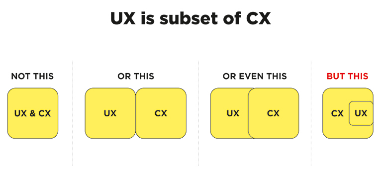
CX vs UX: The above image clearly explains that UX is a subset of CX. User experience is the experience your customers have with your product, whereas customer experience is the experience those users have with your brand as a whole.

Importance of UX and CX

Both UX and CX are equally important in today’s world. Overall customer satisfaction is no longer dependent only on the quality of the product or service; it goes far beyond that. The experience and process of buying must be a satisfying one. Not just that, even the after-sales service and support plays a crucial role in setting the brand image.

Studies reveal that more than one-third of consumers walk away from a brand they love after one bad experience, and more than half of the consumers do the same after two bad experiences. Consumers are willing to pay more for a better experience, and this fact needs to get its due importance.

The good UX design is important because users will decide within just a few seconds whether your app, software or website is worth their time or not. On the other hand, good CX is important because it goes beyond the usability and functionality of your product, and serves as a key differentiator in a competitive market. 

Both CX and UX are independent, and therefore there can be scenarios where either one of them is good. For example – Good UX and bad CX, or, bad UX and good CX. Let’s understand this with two scenarios:

1. Good UX and bad CX

Tom wants to buy a music system. He goes onto an e-commerce portal. The online store has a fantastic UI and UX. The search engine is accurate and helps Tom to reach to his desired models within no time. He compares a few models and selects the best-suited one for him. The checkout process is also seamless. Within a few clicks, Tom selected a payment method and made the payment. Great!! His new music system is on its way.

But, when he received the package, he was unpleasantly surprised. The packaging was awful, and he received the wrong product. The model which he selected and the one that was delivered were completely different. He rang the customer support and was pushed from pillar to post before he could reach the correct department. The team was not able to track his order and told him that he would receive a call back within 12 hours. No phone call for two days. He got a call on the third day and was advised to send back the music system at his own expense, then only the replacement could be initiated. The entire process took three weeks.

Tom’s experience after placing his order was nothing short of disastrous. He poured out his grievances on the company’s social media handles, product page, and many other places. No matter how good the UX was, he has no reason to remember it now.

2. Bad UX and good CX

Now let’s see the flipside. Haunted by his previous experience, Tom decided to try some other e-stores to buy a professional camera. He browses a new portal that has a poor UX. The search engine wasn’t accurate; there was no option to compare products, and lacked details on the product pages. It took him a lot of time to buy the product, but he did it finally.

However, history repeats itself, and Tom again gets the wrong product. He called customer support and was delighted with their response. The team apologized for his inconvenience and quickly arranged a pickup of the product. In the meantime, they initiated the replacement process. Within two days, Tom received the camera that he ordered. Moreover, the company gave him a 30 percent discount voucher to make him feel valued. John is unlikely to remember the lacking user experience and is highly unlikely to leave negative feedback in the comments section of the site.

UX is one of the strongest influences on the whole CX, but both CX and UX play a crucial role in the ultimate success of a business. Lacking in any of the two areas can lead to a bad overall impression of the brand. Therefore, companies must optimize both of them to stay ahead in this competitive market. Have more questions? Talk to our experts.

Categories
Brand & Identity Design UX Web Design

Web Designing While Accounting Human Errors

We often hear the phrase ‘To err is human’, and it can’t be truer in every aspect of our lives. We all make mistakes. Users on your websites are no different. Sure, you can’t stop them from making mistakes, but, can you follow some aspects of web designing while designing your website in a way that it leaves a scope of making mistakes?

Even the most careful and diligent users are bound to make mistakes at some point in time; others will make more mistakes. Therefore, it is critical to consider this fact while designing your website. The errors in web designing can be as simple as mistyping a URL, providing incorrect information in a sign-up form, adding info in wrong fields, etc. The mistakes could even be as disastrous as accidentally sending thousands of dollars to the wrong person via PayPal. So, here are a few tips that you can follow to account for human error while designing your websites. 

1. Provide Straightforward Instructions

A lot of times, we assume that the users are by default aware of the most basic instructions. Thus, we don’t feel it necessary to provide these basic instructions to them. Moreover, people often see basic directions as a bit snooty. It’s human to assume you know everything you need to know for a simple-seeming task. This causes errors.

Don’t assume they know what you mean. An imperative when delivering clear instructions is not to assume the recipient knows what you mean. This can be for anything from commonly used acronyms to simple navigation instructions.  Mixed messages, assumptions and multiple options mean that the message received might differ from what we actually meant.

2. Give Clear Warnings During

Just like the instructions, users must get a clear understanding of the consequences of actions taken on the website. And, sometimes they need to be informed and explained the implications, that too in detail. Still, there would be users who would keep ignoring your warnings, but there’s not much you can do for them in any case.

There’s also a second web designing approach which you can proceed with. A majority of people will leave your site when they face a warning message which they don’t fully understand. Else, they may look for help to understand the warning, which again may lead them to bounce off. You’ll have to decide whether you would rather deal with potential inaction from some customers, or more errors. Both approaches have their pros and cons.

3. Always Confirm Actions While

You may think that all users are completely sure of what they are doing on the website, or they may get annoyed with questions asking them to confirm their actions. A confirmation dialog may seem like an irritating and useless extra step; however, the truth of the matter is a quick “Are you sure you want to do that?” message can be invaluable. The user may be taking action for the first time, or the tenth time, it’s irrespective. A confirmation will only increase chances that the user takes the correct, intended action.

4. Validate Forms

Form validation may not be a full-proof solution, but a potent tool, and a great way to gently guide the user in the right direction. While proper form design can help keep users from simply putting the wrong text in the wrong form, form validation is excellent for double-checking information and catching typos and forgotten fields.

Improper validation of form data is one of the leading causes of security vulnerabilities. It exposes your website to attacks such as header injections, cross-site scripting, and SQL injections. It is important to note that client-side validation is beneficial, but it is not enough. If you’re going to implement client-side validation, it would be good to have some of the server-side too, just to be safe.

5. Use Appropriate Form Labels

In our last article, we listed out some essential tips for selecting the right button labels. The labels on the forms are equally important and can lead users to commit an error, if not used properly. There are tonnes of websites on the Internet with so many vaguely-labeled forms. Worse are the forms that use industry jargons on a client-facing website. In some of the sites, the labels and input fields are even misaligned. That’s just a strict NO-NO!

6. Improve Usability Through Color and Contrast

The colors and contrast are often used on a website most simplistically. People only go as far as using red and its shades to portray bad, and green and its shades to show good. But that’s not enough. It doesn’t necessarily help differently-abled users. A website should be usable by everyone, so various disabilities should be kept in mind. Disabilities can include but are not limited to, the inability to use a mouse or see the screen.

When someone has low visual acuity, specific color palettes on websites may make it difficult for that person to see and understand the website content fully. You must find a way to add contrast to your elements, in such a way, that they’re clearly and easily distinguished from each other. Pay special attention to this if two options use similar text, but do radically different things.

7. Provide ‘Undo’ Option Where Possible

We all know how handy the ‘Ctrl+Z’ option comes in every day while performing various tasks. The ability to undo an action is such a boon to everyone. We wish we had an undo button for our lives. Coming back to reality though, if you’re building a web app, you might seriously consider implementing some sort of “Undo” function for just about every action with permanent consequences.

You cannot ensure error-free browsing on your website; neither can you take a generic call on the abilities of your users. But, considering human errors while web designing, will increase the chances of good user experience and fewer errors. Speak to our experts to discuss more on it.

Categories
Brand & Identity Design Technology UX Web Design

Benefits Of A Copy-First Approach In Designing

It has been a little over six years now that I have been writing for websites, and every now and then I find myself participating in the never-ending debate between Designers, Product Managers, and Writers – Copy-first approach or Design first approach? Many writers feel that the designers should get the ball rolling and based on the design, the words should be tailored. However, I stand on the opposite side of this belief. For me, a copy-first approach to any kind of design project is the best way to go about it. 

Read More: Content Or Design First

The very first step of a design project, of any nature, or size, is to construct and shape the thought behind it. Thoughts are also content; words in our mind form the base of the very-first content, which needs to be articulated through the copy. Jeffrey Zeldman, the famous entrepreneur, and web design expert, once said “Content precedes design. Design in the absence of content is not design; it’s decoration.” This may sound a bit harsh, especially to my designer friends. However, one thing is clear to me, be it a stand-alone page, a new website, or a website re-design, the copy-first approach can make your project more efficient. Let’s discuss some key benefits of a copy-first approach to website designing.

Better Timeline Setting and Deadline Planning

The initial content doesn’t need to be written by the Content Writer or the Content Strategist. It can come straight from the client or any other team member, which can be further validated and polished by the Content Writer. If the copy and a content plan are ready, right at the beginning of the project, it allows you to think on realistic timelines. You can set accurate deadlines based on it.

There are a lot of tools available which can be used to manage tasks and their progress. High-level tasks must be clearly outlined in order of operations to move the project smoothly, and not jumping from idea to idea. No matter which software you use, the entire team should be able to see the task list, to be on the same page.

A rough draft at the beginning is good to kick-off the project. The final and complete copy takes some time, depending upon the size of the project. Moreover, it isn’t required to create all the content assets in one go. A simple indication of where you want to use a photo, or mentioning when the photo shoot may take place in the project timeline is enough to start with.

Proper Site Planning

This majorly benefits larger projects, like new websites or full-blown corporate website redesigns. Preparing the copy and content plan upfront helps the team to plan the project and lets you focus on the overall strategy. It allows you to estimate the scope of the project; it lets you understand how extensive the website and its different pages are. 

On the other hand, in case of a small project, like a single page, looking at the copy and the content plan shows how extensive the page could be. Here, you can check the user flow and analyze how well it fits into the scheme of the existing website.

With copy written upfront, we know exactly what the header, footer, and other sections will look like. We know what kind of images we need to source or create, where the CTAs will be placed, and what they were going to say. In short, we have an excellent plan for the page right from the start.

Having a site map early in the project is very fruitful; irrespective of the way it is documented, the important thing is that everyone involved must have access to it. A sitemap is the best way to keep content organized, linked, and accessible. It presents a better picture to you of what’s missing, what needs immediate attention, and what’s ready to move on to the next stage.

Offering Concise Content

Deciding what amount of copy is a good amount of copy is a very tricky and challenging task. Besides, there are specific sections on a webpage or website which needs to have more copy as compared to other sections and vice versa. Steve Krug, the author of the famous UX book ‘Don’t make me think’ once said: “Get rid of half the words on each page, then get rid of half of what’s left”. That’s a powerful statement; however, studies have suggested that too much text on web pages isn’t suitable for any of the following – user experience, usability, readability or site metrics.

That said, we still come across websites that are stuffed with the copy. Trimming the copy by more than 50 percent is a strategic move and results in some serious decluttering. Decluttering improves user flow, site map, sales funnel, and navigation. If the path to purchase is improved and becomes more accessible, removing a whole page or a whole section is worth it.

Constant Comparison Against Set Goals

As the project is moving along, you should also be always able to check the content against your set goals; both user goals and business goals. On a large scale, you’d be checking content alignment with the intended user and business goals; and if each page aligns to the goals? Similarly, on a smaller level, check if individual sections and sentences also align.

If you find deviations in the planned copy and content, from those goals, it’s best that you re-write them. Even if the content deviation is minor, this allows you to start optimizing it. Re-wording the copy and adjusting content assets to be more direct is a great way to strategize. It leads to higher conversion rates and lower bounce rates.

Clearly Defined Visual Design

A copy-first approach helps to define and set up the visual design. It helps with a variety of design aspects, especially layout. The copy-first approach is a highly collaborative process. The designers, copywriters and marketers, all need to work together while deciding the content. Even developers actively participate in the process. The plus point is that these conversations start at the early stage of the project. This leads to better collaboration and results. The copy-first approach lets the visual designing process kick off from the very first step.

Because of the collaborative and planning nature, the copy-first approach helps to eliminate revisions and strengthens the UX. By the time the visual and UI design stages come, all the pages and sections are already agreed upon, by everybody involved in the project. It’s a great way to lead design projects most effectively. Talk to our design experts to discuss more on the same.

Categories
Brand & Identity Design Mobile Apps Web Design

Designing For Kids: A Different Ball Game All Together

If you think that kids are not exploring the web, you are probably living in a different world. Technology advancements and exposure to the internet with changing times has created a rapidly increasing, new category of the audience – kids. Designing For Kids is a whole new ballgame as compared to designing a website for adults. Unlike adults, children aren’t looking for information on a website. They’re looking for some fun and happiness. A website for kids needs to focus on engagement, entertainment, and education. It can be in forms of games, videos, puzzles, or stories. Here are a few tips and tricks to follow when designing for kids.

Design for various age groups

Targeting the specific age group of children is crucial. According to some researches, children are very aware of age differences and do not enjoy engaging with something they feel is for the ones younger or older to them. Therefore, it is very important to offer tailored content. 

Ages 3-5 will be enticed by bright colors and sounds, along with cute characters, and themes around nature. Jump to ages between six to eight and things start getting tricky. Kids in this category seek recognition that they are above younger children. Bright colors still work, but with added depth. Graphics and images become denser, and the characters are more human-like.

Children aged 9-12 are much proficient with the internet and are generally attracted with websites which look more or less the same as any other website for grown-ups. The typography stays simple and color-saturated, palettes become more complex, and word structure should be more traditional.

Be bold and bright

It’s no rocket science that kids love anything and everything which has bright colors in it. Colors excite them and make them inquisitive about things. Spread your colorful, creative wings while designing a website for the kids. Use lots of vivid and vibrant colors to grab attention. Red, blue, yellow, green, purple and orange are all happy colors and must be used as primary and secondary colors. 

When designing for the kids, think like kids. Have fun with bright colors, and break the rules and monotonous approach. It’s all about grabbing those little eyeballs and making them stick to your website for as long as possible.

Use visuals more than text

Visuals have a deeper impact on humans as compared to text, be it grown-ups or kids. The impact of visuals is more on kids as compared to adults; it offers a great opportunity for designers to be at their creative best. Kids recognize symbols before the text. A six-year-old is virtually on the verge of learning to read, but older kids recognize text and visuals both. They are more inclined to visuals then grown-ups. 

Visual cues are more effective than text at some parts on the website like icons, tabs and other areas where they can, or are required to take action. Use large buttons and graphics instead of text; make them obvious and oversimplified in order to clearly stand out.

Go easy on the language

They are kids, communicate with them in a language they easily understand. There is no need to use words they are not familiar with, even if these are the most commonly used words for a particular section, tab or activity. 

One of the most commonly used words on a website is ‘submit’, which is used to capture information. However, when it comes to kids, we can replace it with another simple word, like ‘done’, which makes more sense to them, and they can easily relate to it. Similarly, ‘sign up’ is way too hard for them to comprehend and understand the purpose. A simple ‘go’ button is enough for them to understand the purpose and result of the action.

Read More about how to design CTA buttons

Avoid making them type

Which kid would like to keep tapping keys on a keyboard? Be aware of the motoric skills of your target audience. A keyboard and a mouse is very basic for adults, but that’s advanced and a cumbersome task for a kid. Young children are more comfortable with touch sensors to take actions rather than typing. Replace elements which require typing with elements that support touch or slide. 

For example, if you are trying to capture the age of the user, instead of an input field, use a slider. Kids would love sliding forward and backward rather than typing their age in the input field. It’s fun sliding, and you can cash on that.

Create a happy and vibrant mood

Children always look forward to a happy experience while they are browsing a website. We discussed earlier how bright colors make kids happy; try to create an overall happy environment on the website. Use smiling faces, cheerful characters, energetic gestures, and positive words to provide an amazing experience packed with fun and friendliness.

Almost every kid is familiar with Disney and Peppa Pig characters. Every single character wears a smile almost every time. Use these characters on the website to offer a sense of friendliness and welcome. The Disney characters are always smiling, looking directly at you, which is a very jovial feeling. Similarly, Peppa Pig characters are always doing some kind of activity, like reading, playing, dancing, etc. 

These characters are charged with energy, they are always smiling, create an engagement with the audience, and are a perfect role model for kids.

Kids are a niche audience, but they are increasing in number as fast as they can. Children centric businesses are on the rise and are expected to grow faster than ever. Understand your audience, put yourself into their shoes, think like them, and most importantly break the shackles of commonly used practices. Kids are different, and they need a tailored website. For more information, talk to our design ninjas now!

Categories
Design SEO UX Web Design

Tips For International Expansion Of Your Website

The growth of the internet has led to a world without borders. Businesses are no longer confined to specific regions. E commerce has provided an opportunity for sellers to explore new markets and attract customers from all over the globe. If you wish to grow your business to the next level, going international might be the best bet. How do you do it though? With proper homework and following the below-mentioned pro tips. These tips can significantly simplify the process of expanding your website to international markets. 

READ MORE: Infuse International Flavors to your Website

Multilingual Content

It’s very convenient for users to get the content in their native language. The first and the foremost step of global expansion is to create different versions of the website in languages, that are most commonly used in the target geographies. A global site needs to effectively communicate with the worldwide audience in the most understandable manner. An identifiable language can create the connection customers need to feel comfortable and trust your business.

Remember, more than the language, the quality of content is imperative. Poor website content presented in native languages is of no use. Never compromise on the quality of content. It’s sporadic to have a translator in the team, so consider taking services of a professional translation company. Their experience will come in handy.

Optimized Content

Ranking in Google searches is essential for businesses to grow and achieve success. It all begins with finding the right keywords through in-depth research. Different keywords may be popular in different countries. An international SEO strategy is essential for a global website. It will drive more traffic to generate leads. More visibility, more leads, better conversion ratio.

Global websites must use multilingual SEO meta tags, so that Google picks up the language of the site. In an ideal world, there should be a separate website for every country, but different languages are good enough for starters. SEO is tricky and requires constant modification in the approach; however, it’s very rewarding.

Faster Page Load Time Across Platforms

People on the internet are impatient. High-speed internet access and plenty of options have spoiled them. If your web-page doesn’t load with a blink of an eye, they will go to the next best option available. Speed is a crucial factor to consider when going global.

Moreover, your website will be accessed from many geographies and through various devices. So, it becomes crucial to optimize the site, to offer consistent performance and experience across all channels and devices like tablets and mobile.

According to a study, when a site doesn’t load in three seconds, 53% of mobile users leave the site. Losing so many potential customers is lethal for the business. It gives a wrong impression of your brand too. Users assume that you are not a serious brand and even doubt your credibility.

No Text in Images

You got to be smart while designing global websites. Translation can take care of the content in terms of text, but images can be troublesome. Avoid using text in images as much as possible. This can protect your brand image in the long-run. A website that uses too much text in its pictures can be problematic.

Design elements play a vital role in online purchasing decisions of consumers; undermining its potential is a big mistake. An appealing website is a mix of excellent content and attractive visuals.

Handling International Currency 

You don’t want your users to sit with a calculator trying to convert the dollars into pounds. A website that doesn’t display prices in local currency ends up confusing the customers. When expanding the site on a global scale, online businesses need to accommodate customers. Showing the prices in their own currency is necessary.  It creates a seamless experience for the customers and rewards your business with increased revenue. A suitable API tool can be useful for currency conversions. 

Suitable Payment Options

The payment process and options must be more accessible to a global audience. The standard payment is mostly convenient, but in some cases, they might not be suitable. For example, German consumers prefer ELV bank transfers, while African consumers prefer using phone credit. Based on the region, the website must tailor the payment process.

The checkout process is a crucial point in the customer’s journey. Ensure that all the additional charges, if any, that a customer may incur, are clearly mentioned. Making the checkout process simpler will drive more sales for your global website.

Local Laws and Regulations

Rules and regulations differ from country to country, and they all need to be abide. The formalities must be completed in full, when conducting business in different countries. Do your homework, conduct thorough research and find out the laws and regulations that might affect your business in other nations. 

A website that caters to international clients must be aware of all the legal requirements and charges, taxation, shipping, freight charges, fees etc. The more you know about these details, the better it is for your business.

The global expansion of your website will need understanding the requirements of the worldwide audience, analyzing the challenges, and tailoring the site based on it. Looking for global expansion? Talk to our experts.

Categories
Design Technology UX Web Design

Pro Tips To Offer An Amazing User Experience in 2019

We are in the middle of 2019. In the past six months, we have witnessed a few new User Experience trends blooming, while some of the anticipated trends did not live up to the expectations. Amidst all the latest growing practices and the fading out ones, some User Experience tactics and methods stand firm to amplify user experience at every level. Here are some of the best, tried and tested tips to design a ‘WOW’ user experience.

1. Design A Responsive & Mobile-friendly site

With Google enabling mobile-first indexing by default for all new websites starting 1 July, designing a responsive and mobile friendly site becomes paramount. Smartphones are driving massive traffic for several websites, making it essential for sites to be a responsive one. To cater to mobile internet users and ensure better visibility, a mobile-friendly website is a must. But, don’t compromise at the quality front while including the responsive elements. Many responsive design testing tools help check the responsiveness of websites, so use one of them and analyse your website.

2. Provide Engaging content

Content is the king; it is indeed the key ingredient to a pleasant website user experience. Browsing a website is more than a transaction; it has become an experience. Expectations of users have increased multiple folds, which makes it essential for web designers to consider these expectations while designing UX.

An effective way to accomplish this is by choosing an engaging content strategy. Effective content strategies focus on telling a brand’s story to build a relationship between a business and its client.

Content can be offered through blog posts, pictures, vlog or a separate website altogether. Using content to establish a brand identity helps to ensure that potential clients get acquainted with your brand. Tailor-made content, based on the audience, will increase users’ trust in your business.

3. Use Enticing CTA

CTA is the key element on your website, which will drive all the business. They must be strategically placed on the site, to ensure that visitors take the intended step. CTAs should be easily accessible on every page across the website. It will not only improve the conversion ratio but will also enhance the user experience.

Make sure you place the CTA above the fold. At this placement, users can easily view the button and respond. Your conversions are bound to increase if you provide an easy chance for the visitors to find and react to your Call-To-Action. Moreover, users are delighted to experience the ease of access and clarity on how and when to take actions.

4. Use Hamburger menu

Hamburger menus have gained popularity over the last few years. Hamburger is a typical icon which upon clicking opens a side menu. It indicates that there is something hidden for users. It leaves them curious to find out more about the features and functionalities of the website. It is a very effective way to keep the audience engaged on the site.

Users are not bombarded by all the information in one go, so they feel comfortable. They will reach out to the Hamburger menu if they seek more information. They can navigate their way precisely to the information they seek. It is a boost to the overall user experience of visitors.

5. Provide Concise Information In An Effective Manner

The primary objective of visitors to go to any website is to seek information. There’s something that they are looking for, and they feel they can get it on your website. Designers should design the website keeping this fact in mind. Always provide information in a structured and straightforward way.

Designers are slowly drifting towards simpler designs. Presenting information in a concise format is the best way to deliver your message. Bullet points are one of the ways to convey information and get good results. Clearly providing information is also profitable to the businesses as it helps to draw attention to relevant elements.

6. Track User Activity

One of the effective ways to improve UX design is to understand what users do on your websites. A tool like Crazy Egg can be used to track and analyse user activities. It provides visual heat maps and scroll maps that show you where users click and what they do. Basis of this study, you can add elements that improve a user’s experience.

7. Use Customer Surveys

As stated earlier, customers these days are looking for an experience and not just transaction interactions. Therefore, it’s essential to provide high-quality customer service and ensure that a proper communication channel is built between the business and its users.

Users must be able to reach your customer support team and the technical team, depending upon the nature of your business, during all hours. Immediate action on problems must be taken, and the website processes must be regularly scanned to make it better for customers.

The importance of UX has been recognized across the world of web. Designers must understand that a business’ success fairly depends on understanding and fulfilling users’ expectations and offering them an amazing user experience. Get in touch with our experts and learn more about best UX practices.

Categories
Blog Brand & Identity SEO Web Design

5 Annoying Things To Avoid In A Web Design

Competition over the Web Design internet is fierce. Today, there are a large number of individuals and businesses who spend money and time on digital marketing and SEO to rank higher on Google searches. It has become tough to differentiate from rivals and get users to visit a particular website over others.

Since acquiring new visitors is very difficult, providing a delightful user experience gains importance and is pivotal to retain each hard-earned customer. If a website offers an unpleasant experience to its users, forget about winning repeat visits, they might never come back on the website. Here are some of the most common things in a web design which leaves users in frustration and thus must always be avoided.

Slow Website Speed

With the boom in technology, everything has become super quick. Everyone has a smartphone these days, and access to the internet is just a tap away. Even half-baked questions or half-remembered trivia get instant answers from Google. People can contact each other, sitting halfway across the globe in a matter of seconds. Today, the speed and responsiveness of our hyper-connected world have spoiled us all. Therefore, when we click on a search result, and the page keeps loading even for only three to four seconds, it is equivalent to eternity for users.

Remember, you’re not the only one providing an answer to a query or serving what a user is looking for. If your page doesn’t load within a blink of an eye, they will click on other best available options. Get rid of all the unwanted elements which are dragging down the speed of your website. Ensuring a good page load speed is critical to create new visitors and retain them.

Too Many Popups

It’s a shared experience, wherein we click on a link in our Google search results, and we are directed to a webpage which is full of popups. So much as so that we are not even able to read the actual content available on the page. Moreover, they keep popping up, even after you close them.

Combined with a browser alert that “this website would like to send you notifications”, the overall effect is one of being barraged with irrelevant information. It ultimately kills the actual content you were trying to reach.

Some advocate the fact that popups significantly improve conversion rate, while others get put-off by their potential of pestering the users. No matter which side we stand, one thing is for sure that popups are badly planned, throwing information and content which is not relevant for users. Therefore it is better to stay away from them.

Not Mobile-friendly

According to Statistic, 52.2 percent of internet traffic was generated through mobile phones in 2018. That’s a considerable ratio, and thus it’s pivotal that the website is responsive and mobile friendly. We are in 2019, yet we come across many mobile sites where items aren’t aligned properly, overlapping, strangely formatted or subject to some additional oversight from the designer. It creates a negative impression on users. They might feel that your company doesn’t take the time to go over little details.

Coupled with the recent change in Google’s algorithm to prioritize mobile-first indexing, there is now no reason at all to ignore the mobile experience of your website. A low-quality mobile site can negatively affect your SEO performance as well as the experience of your users, so it’s essential to get it right.

Animation Overdose

We like animations. Yes, they do look good and enhance the aesthetic value of a website. A few smooth transitions, transforms, appearances, and well-deployed animation can infuse vital life into an otherwise static and dry layout.

However, animation should be used sparingly, as and when required. Overdoing it can distract the audience. The key role of animations is to draw user attention to key content and call-to-action buttons. Users should not feel confused to read the actual text.

Animated introductory screens, too, are great attention-grabbers when users first reach on to your website, but avoid making them sit through the same animation every time they want to return to the homepage. Their beautiful presentation shouldn’t dictate the function of website elements.

Users shouldn’t be waiting for an element to appear or to become interactive. Using a lot of moving parts or content that flashes can pose problems for users. Some users may have an attention deficit disorder, making it very difficult for them to concentrate on the content.

Video Autoplay

Videos are an essential aspect of your online marketing efforts. They are a good source of explaining your products, brand message and other aspects, better than text can. Designers are often tempted to put the video on autoplay when they place them on the website. There are ways to do it tastefully, but it’s so often misused and creates a negative user experience.

Many sites place a video next to the body text. Usually this is entirely irrelevant to the content of the page. Even if you close it before navigating to another page, it quickly reappears. That’s really annoying.

Even worse, many sites preface these videos with automated advertisements which, given that the videos themselves are generally advertisements in one form or another. Some web users also hate auto-play as it can ruin their user experience and would rather prefer reading the information on the page without a distraction. It is more polite and effective to let the video be turned off until the audience chooses to play it.

To wrap up

Everything which we have mentioned above is basically issues of a bad UX design. It is important to consider every element and its effect on the overall user experience. If something hinders the user in finding what they’re looking for or detract them from the actual content of the page, it should be avoided. Speak to our design experts to know more about it.